Saturday, 21 May 2016

TIMELY COMICS 70TH ANNIVERSARY COLLECTION COVER GALLERY - PART ONE...

Images copyright MARVEL COMICS

Back in 2009, MARVEL celebrated its 70th Anniversary by releasing 11 retro-style mags about their heroes from the '30s & '40s.  However, in 1939, Marvel was called TIMELY, and that was the name given to the collected edition which I acquired only a few days ago.  I'd actually bought some of the single issues at the time, but didn't have a complete set, so it was nice to read what I missed back in '09.

The original issues also contained reprints from the '40s, which the book doesn't include, but don't let that deter you from tracking down a copy.  I'm thoroughly enjoying working my way through these excellent tales, which are well-worth the read.  See the mighty Prince NAMOR, The SUB-MARINER, maintain all his regal nobility as he mercilessly disposes of a submarine-load of ruthless NAZIS.  See BUCKY BARNES as the new CAPTAIN AMERICA, in a story that will tug at your very heartstrings.

There's more of course, as you can see from the cataclysmic cover gallery laid before your awestruck eyes.  Cop a gander, then scamper round to your nearest comics shop or bookstore and buy this volume for yourselves.  Trust me, you'll be glad you did!

Coming in part two - the variant covers.  Don't miss 'em!


Friday, 20 May 2016

BABE Of The DAY - GILLIAN DUXBURY...


Lovely GILLIAN DUXBURY
on my luxury cruiser, waiting to greet
me with hugs and kisses, and a cool glass
of cola to satiate my raging thirst.  There's
another of my appetites she'll be seeing to
shortly, but you Crivs don't need to know
anything about that.  (No, of course I'm
 not making it up.  I wouldn't lie.)

Thursday, 19 May 2016

ERIC, EDDIE, & HAGAR - THINGS AIN'T AS BLACK & WHITE AS THEY USED TO BE...

Copyright relevant owner

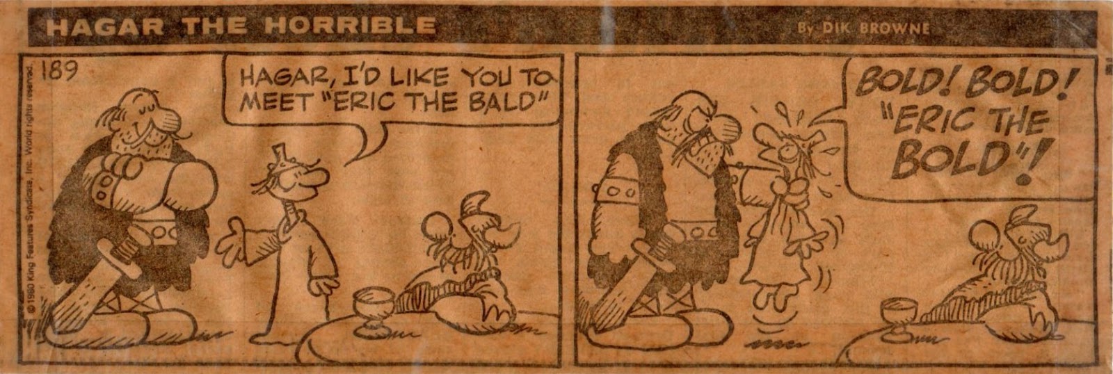
Another newspaper strip which has been on my wall for even longer than the SMALL WORLD one shown a couple of posts back is the above HAGAR The HORRIBLE two panel strip from The SUN.  Like Small World, it accompanied me to our new house in 1983 and back again when we returned to our previous residence in 1987.  The newsprint original (which you can see below) looked a bit decrepit next to the recently-restored pristine one by DON ROBERTS, so I decided to give DIK BROWNE's famous Viking warrior the same treatment.  However, now I'm faced with a decision. 

You see, great as it is to see these familiar strips from my past in their new form, I feel it would be a bit cruel just to discard the faded and browned old originals.  It's a bit like getting a new pup of the same breed as your faithful old dog and getting the senior one put to sleep just because it's past it.  Okay, it's not precisely the same thing, but it's similar - especially if you get attached to things to the same degree that I do.

So what would you do?  Throw the old ones out and not think twice?  Or carefully store them away and let them enjoy a well-deserved retirement after many years of faithful service?  Or do just shake your head and say "That guy's utterly bonkers!"?  Go on, leave a comment.

Wednesday, 18 May 2016

PART EIGHT Of DON STARR In The DRAMA Of DOOM...

Copyright relevant owner

DON STARR's DRAMA Of DOOM concludes with these three double-page episodes, Criv-ites.  We join him again in an APPOINTMENT With FEAR - coming whenever I get around to scanning the pages from my back numbers of TERRIFIC.  So don't forget to remember to join us then.  Pax Vobiscum!


Tuesday, 17 May 2016

IT'S A BIG JOB FOR A SMALL WORLD...


Copyright relevant owner

SMALL WORLD by DON ROBERTS debuted in The DAILY RECORD back in 1982.  I liked the strip, so cut it out and affixed it to my wall.  When we moved house in 1983, I rescued it and put it on the wall of my room in our new home.  Four years later when we moved back to our previous abode, I did the same thing in reverse, and there the strip has resided for the last 28 and a half years.  Until recently that is.

As you can see, over time, the strip has rippled and faded in the rays of the sun, even though it wasn't directly exposed to daylight.  Alas, such is entropy.  I can't find any information about collected editions of the strip, nor any images of it on the internet, though there is a brief mention of it.  Therefore I had no other choice but to try and restore the strip to something resembling its former pristine glory.  What you see below is the first step in that time consuming process.


Working from the above strip, I re-coloured each panel as best I could, but I was presented with a problem.  The original colours had become so faded and washed out, I simply couldn't discern what they were, except in a few isolated cases.  (I'm slightly colour blind.)  My mission then became one of making the strip look presentable so that I could restore it to its place on the wall in a readable form.  I therefore ignored trying to duplicate the original colour scheme and just aimed at making it look as good as possible.

The finished result is below.  Not perfect by any means, but it took me hours to re-ink most of the line-work.  (I had to work on an A4 printout, which isn't entirely conducive for restoring fine detail.)  That in itself was another big problem, because I wasn't entirely sure what I was looking at in some instances, even in its original version.  However, it doesn't look too bad, is readable, and due for replacement in its accustomed spot once I've published this post.  So, how did I do?

Paeans of praise are very welcome (hint, hint).


Update:  I thought the blue background was a bit bright compared to the original, so decided to paint over it with a lighter shade.  I think it looks much better.  See below.

A POWERFUL PROFUSION Of MARVEL MASTERWORK PIN-UPS...

Images copyright MARVEL COMICS

I'm a smart cookie and no mistake.  You doubt it?  Well, I'm smart enough to know that none of you are here to read anything I have to say.  No, you're all here for the pretty piccies.  So without any further ado, here are fourteen of them - enjoy!


Note that although REED is standing behind JOHNNY, his legs are in
front of his junior partner, making it look as if the TORCH is hovering


BABE Of The DAY - HEATHER THOMAS...


Well, I was all ready to shoot today's Babe
photo, but HEATHER THOMAS hasn't woken
up yet - so here's one of her fast asleep.  (Though
who's gonna bring me my cup of tea?)

Monday, 16 May 2016

THIS COMIC WEEKLY WAS AN ABSOLUTE KNOCKOUT - (DING! DING!)...

Copyright REBELLION

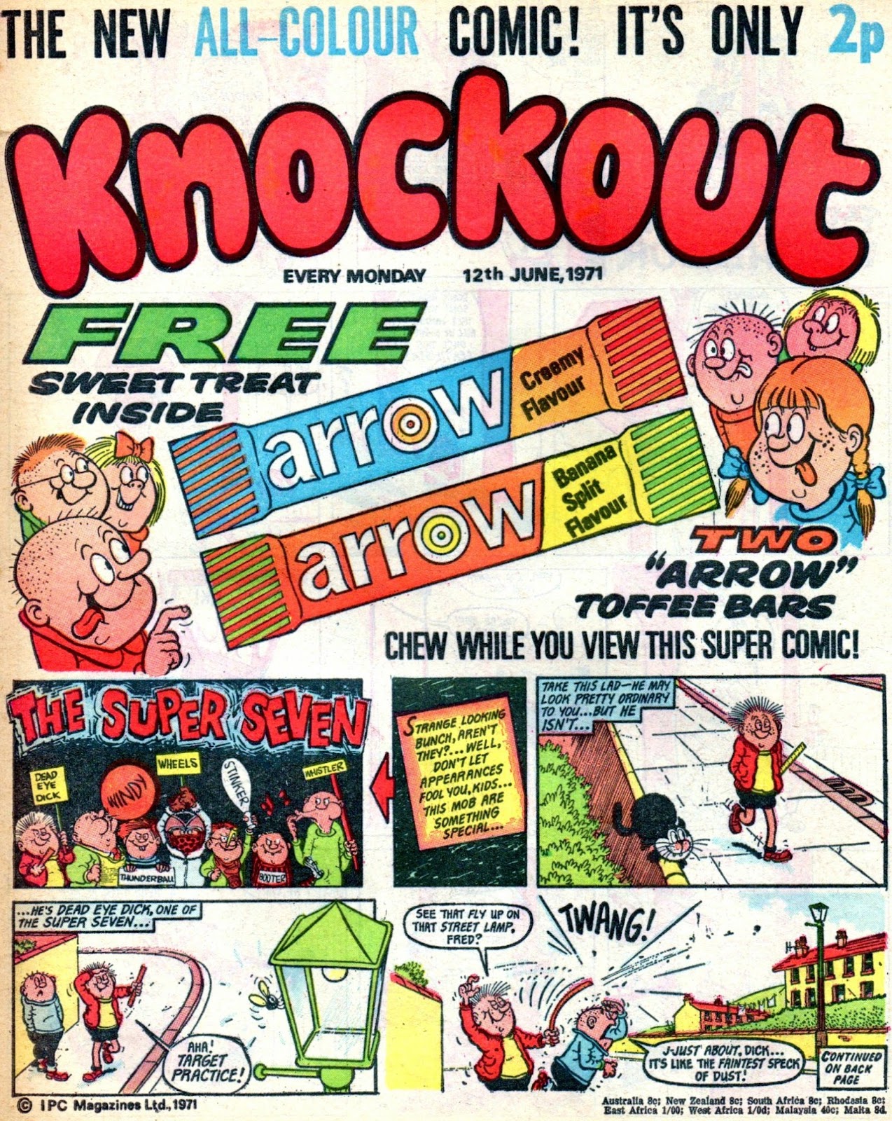
I remember cartoonist TERRY BAVE telling me a number of years ago that the '70s incarnation of KNOCKOUT was a a particular favourite of his and that he wished it had lasted longer than the two years it did.  It was also a great favourite of mine, and I recall lending a pile of them to a pal back in 1971 and getting them back some weeks (or was it months?) later in a condition you wouldn't believe.  Pages ripped, pages missing, and the issues being crumpled and ragged.  I can think of no good reason why pages would be torn out, apart from a shortage of toilet paper in that particular household.

Anyway, a number of years ago, I acquired a complete set of the comic, but the first issue was quite tatty.  I noticed recently that a copy was up for auction, finally going for nearly £30, but that was more than I would've been prepared to pay.  Luckily, I managed to obtain one from a back issue specialist for less than a third of the above price, and it arrived today, callooh, callay!  So, lucky peeps that you are, here's a few pages for your delectation.  Like to see more?  Then let me know, Knockout fans - I live to please!


I loved The HAUNTED WOOD - great REG PARLETT art

This strip was clearly based on the same premise as GALAXUS in BUSTER

Sunday, 15 May 2016

JINKSY JILL & HANDSOME BILL - IN COLOUR!


Written (okay, nicked), drawn, lettered & coloured by KID ROBSON

You may recall me saying I might get around to colouring my JINKSY JILL & HANDSOME BILL strip from a caption competition I inflicted on you a good while back - well, here it is.  I used acrylic inks to colour an A4 photocopy so it's not BEANO quality standard, but considering I had to re-ink parts of it (due to the colours obscuring the linework), I'm surprised it didn't come out looking a lot worse.  There's something to be said for computer colouring - it makes things a lot easier.  It's just a shame that I don't have access to it.

Anyway, feel free to lie and say how good you think it is (and how brilliant I am).  If I can lie to myself, one of yours isn't going to hurt.  (Click on image to enlarge to optimum size.)

"ENTER FREELY, AND OF YOUR OWN WILL..."


This is where I live on my family estate.  It's a graveyard, and I have this nice little crypt-house, which, much like the TARDIS, is far bigger in the inside than it is on the out.  There's me in the photo below emerging in time to look for something to eat.  There's always some foolish mortal passing through to provide a tasty snack, and being a graveyard, disposing of the leftovers is no problem. 

Despite its severe exterior, it's really quite comfy inside.  You may find that hard to believe so take a look at the pictures below.  There's an underground room where I keep a few of my collectables, and I thought you might like to see them.  But one word of warning - if you ever visit and the church clock starts to toll the midnight hour, get out as quickly as you can before the final chime strikes.  Otherwise you're solely responsible for whatever fate may befall you.  (Buuurrrrppp!  Pardon me, I've just had a bite of someone something.)  Anyway, enjoy the pretty pictures.