Friday 26 November 2010

RED-HOT NAKED WOMEN...


...would be nice - but here's a pic of SILVER SURFER #4 instead.  (Well, a fella has to do something to get your attention!)

THOR versus the SURFER.  Image copyright MARVEL COMICS

Seeing as you're here though, take the time to admire this fantastic piece of artwork by BIG JOHN BUSCEMA.  They sure don't make artists like him anymore!

Thursday 25 November 2010

THE POWER OF COLOUR (PART TWO)...


Pencils by Jack Kirby.  Images copyright MARVEL COMICS

Following on from the previous post, here are a few more examples of the difference that colour (or, to be more precise, choice of colour) can make to a printed page. The first example, above, is how the cover of JOURNEY Into MYSTERY #83 would have looked (more or less) back in 1962. Compare it against the much brighter, recoloured version from the first printing of MARVEL MASTERWORKS Vol. 181991/ '92.  (Note: A far superior version, more faithful to the original, appears in the recent softcover edition of THOR MASTERWORKS.)

Inks by Joe Sinnott

Now compare both of them to TOM CHU's version (below), reproduced in the TALES Of ASGARD hardcover volume, which also reprints J.I.M. #83's origin. (Unfortunately, despite the superb colouring, the art has been retouched in places, having been restored from the reprint in THOR #158.  For a more faithful reprint of this classic story, see the softcover MASTERWORKS edition, referred to above.)

Colours by Tom Chu

THE POWER OF COLOUR (PART ONE)...


Art by Walter Simonson.  Images copyright MARVEL COMICS

What a difference colour makes.  Not convinced?  Take a look at these basic, flat-coloured examples of JACK KIRBYVINCE COLLETTA THOR stories from the TALES Of ASGARD 1984 Special (Vol. 2, No.1).  Alongside are the newly coloured, multi-hued MATT MILLA pages from the hardcover edition of the same tales.  (First available as a 6-part mini-series.)  The pages are given a whole new dimension, enabling them to go toe-to-toe with many contemporary offerings available in comics shops today.


Not wishing to labour the comparison, but the difference is similar to that of an old POPEYE or BETTY BOOP cartoon compared to the almost 3D effect of the animation in WHO FRAMED ROGER RABBIT?  Last year, I bought the computer-coloured reprint of MARVEL COMICS #1 and the effect was the same.  The pages seem to have become imbued with a vitality lacking in their original printing and don't appear quite as dated in contrast to more modern presentations.


A while ago, the U.K. mag AVENGERS UNITED reprinted the Tales of Asgard series in its original form, and it was generally met with an indifferent, sometimes even hostile reaction. It seems that kids of today have been spoiled by the photo-realistic, more complex colour-art in contemporary stories, and couldn't quite take to the four-coloured classics of yesterday. I'm pretty sure that, had MARVEL/PANINI been able to present the Matt Milla versions (which hadn't yet been done), the response would've been more positive.


I think it can only be a matter of time before Marvel start colouring all their stories from yesteryear in this same fashion and then re-presenting them as 'definitive versions'  in deluxe, hardcovered volumes.  As I said, it certainly gives them a whole new dimension and might help them to appeal to younger readers not yet steeped in the company's glorious history who seem to have an aversion to older material.  (Hard as it is to believe.)

ISBN # 9780-7851-3921-8

The Complete TALES Of ASGARD is available now from all good comic shops (and has been for some time).  And here, for completists, is the cover to the original 1968 TOA Special.  (Vol. 1, No. 1.)
Art by Jack Kirby & Frank Giacoia

Wednesday 24 November 2010

THE UNSEEN DESPERATE DAN...


Written, drawn, lettered & coloured by Kid Robson

Unseen 'cos I've only just drawn it.  One or two people who responded to a couple of my previous posts (and elsewhere) said that I should have a go at drawing The DANDY's DESPERATE DAN if I wasn't too keen on a certain artist's controversial interpretation of DD.

So, first chance I got I did.  What you're looking at is a hand-coloured A4 photocopy, the result of some old acrylic inks I've had lying around for 10 years.  I didn't take the time to properly erase the pencil lines from the original before I got the page copied, so some are still in evidence.  When I have more time, I'll 'tidy up' the colours a bit.

Original, black and white, A4 photocopy

I've deliberately avoided going for the DUDLEY D. WATKINS look, preferring instead a slightly more 'cartoonish' appearance - hence my version of AUNT AGGIE looking nothing like the 'traditional' one.  It should go without saying (but I'll say it anyway) that the 'devil effect' in frame 6 is merely symbolic and not to be taken literally.

Drawn merely for my own amusement, the copyright of Desperate Dan remains the property of D.C. THOMSON & Co., Ltd.  The weekly Dandy ceased publication in December 2012 after 75 years, but Dan and all his comic chums live on in Annuals and Specials.

(Post updated on January 12th, 2014.)

Saturday 20 November 2010

THIS LITTLE ROBOT LEFT ITS MARX (EXCEPT IT'S A TOMY)...


I recently acquired this TOMY clockwork robot as a replacement for the one I had as a kid.  (I always thought it was a MARX robot, but it isn't.)  Interestingly, it was originally manufactured in two sizes - a small and slightly larger version.  It also came in different colours - red, blue or grey (and maybe even black - I'm not sure). Sometimes the red one had grey arms and blue or black legs, and I'm sure the others had variable colour schemes as well.  A thing of beauty, don't you think?  Hands off - it's MINE!

A JOURNEY INTO MYSTERY - SOLVED?


Copyright MARVEL COMICS
 
Back in 1973, I was surprised to see quite a number of copies of JOURNEY Into MYSTERY With THOR #1 gracing the spinner-racks of various newsagents in my home town.  The Annual was dated 1965, which - in 1973 - was more than half my life away at that time.  Furthermore, I had first read the main story (THOR Vs. HERCULES) in the FANTASTIC Holiday Special published by ODHAMS PRESS in 1968.

Anyway, even as a mere callow youth - I recognized that this mighty MARVEL masterpiece was a genuine collector's classic and well-worth buying.  Why had it taken eight years to make an appearance in shops though?

As most of you will know, American comics came over to this country as ballast, so could potentially lie about in the holds of ships or darkened warehouses for months or even years before eventually finding their way to newsagents' outlets - hence the occasional  spotty distribution of  some issues.  If that is what happened in this case (though it's by no means certain), then, ironically, the black and white reprint of this story was on sale a whole five years before the original colour publication.

However, regardless of whether it was the first U.K. appearance of this issue or simply the discovery of a few misplaced copies, it was a welcome addition to my growing collection of U.S. comics and I was glad of the delay.

Strange to think that erratic distribution sometimes had its advantages, eh?

Friday 19 November 2010

PEBBLE MILL AT ONE...


BBC Pebble Mill Studios, Birmingham

About six years or so ago, I accompanied a friend on a business trip to Birmingham and, whilst there, took the opportunity to visit the famous BBC PEBBLE MILL studios.  PEBBLE MILL AT ONE was a daily lunchtime show that originally ran from around 1972 or '73 until 1986.  (It was revived in 1991 to 1996 - simply titled "Pebble Mill" - with a new cast of presenters).

I remember watching the original incarnation back in the '70s, either on my dinner-break during school or work, and there was usually at least one feature or interview which was interesting enough to delay me from stirring from my chair when I should have.  The four original presenters (I think - no research spared) were MARION FOSTER, BOB LANGLEY, DAVID SEYMOUR and DONNY MacLEOD.  In fact, big Donny once presented a programme about the MOD (a huge festival about Scottish and Gaelic music) from my hometown, and - if memory serves - I think I actually saw him wandering about my local shopping centre at the time.

Donny MacLeod

Anyway, there I was, sitting in my friend's car, outside the now nearly deserted studios.  (Though there still seemed to be a trickle of traffic in and out the main gates, suggesting that it was not yet completely abandoned.)  Parked in the very street that I (and a significant portion of the population) had hitherto only ever seen through the studio windows as Marion, Bob, Dave or Donny interviewed some second-rate celebrity eager to plug his or her latest book or record.

I couldn't miss the opportunity.  Leaving my friend in the car (he was too scared to accompany me), I got out and wandered over to the unmanned security booth outside the main gates of the entrance to the car park.  I smiled into the camera, gave a thumbs-up, and - open sesame - the gates swung inward to allow me access.  I was in.  I spent the next 20 minutes wandering around the back of the studio, exploring the famous gardens from which PETER SEABROOK had presented his segment of the show.  (I now wish I'd lifted that abandoned plastic watering jug as a memento.)
Pebble Mill logo

Emboldened by my easy invasion of the Mill, I made my way around to the front of the building, just in time to see a security guard returning with his lunch from a nearby cafe or snack van.  "Any chance of seeing inside, mate?" I ventured.  "Sure, c'mon in", he replied.  (Friendly lot, those Brummie natives.)  And so it was that I found myself in the actual reception area of those iconic studios - the same reception area that absolutely every major star (and quite a few minor ones) who had ever appeared on the show would have had to pass through on entering the building.  I spent the next 10 minutes chatting with the guard and his colleague, and then - remembering that my timid friend would probably be wondering what had happened to me - prepared to take my leave.  However, not for nothing am I known as "Gordie the Bold" amongst my compatriots - I wasn't finished pushing my luck yet.  "Any chance of a souvenir?" I asked.

And that, dear readers, is how a magnificent, two foot long BBC RESOURCES magnetic-strip sign came to adorn the door of my fridge.  I came, I saw, I conquered - and I left with a trophy.  A trophy, I might add, which now resides in the very house in which I originally viewed the show back in the '70s.  Anyone who regularly watched the programme was as familiar with that Birmingham street (a cul-de-sac) as the one outside their own window - unlike most viewers, however, I was actually there.  Sadly, the building was demolished in 2006 - and thus vanished yet another iconic landmark from the '70s.

Excuse the reflection of the camera flash

The Pebble Mill site as it is today (2010)

WHO CREATED THE SURFER? (OR... THE SIMPLY SENSATIONAL SILVER SURFER SILENTLY, SOFTLY, AND SMOOTHLY SOARS AND SKIMS O'ER THE SUPERBLY SPARKLING STARRY SKYWAYS OF STARTLINGLY STUNNING AND SPECTACULAR SPACE...)

Images copyright MARVEL COMICS

Who created The SILVER SURFER?  If you know anything about comics you'll probably reply "JACK KIRBY" - but you'd be wrong!  Well, you'd be right - but you'd also be wrong.  Confused?  You soon will be!

Truly it was Jack who originated and introduced the idea of GALACTUS having a silver-skinned herald on a surfboard who searched for suitable planets to supply his master's need to feed off their energy - no argument there. However, a char-acter does not really come to "life" until he is presented in his fullest and final form to the panting public. In other words, it's not necessarily just the initial, basic idea in someone's mind which defines a character (or concept) - it's what appears on the printed pages of the published magazine which establishes how he (or it) is perceived by the world at large.
  

So - who is the Surfer?  The Silver Surfer, formerly NORRIN RADD of the planet ZENN-LA, sacrificed himself to Galactus by swearing to serve him if he would only spare the Surfer's home planet from destruction.  That was all STAN LEE's idea - even the name "Silver Surfer" is said to have sprung from Stan's fertile mind. (Apparently Jack had only referred to the character as "the Surfer" in his margin notes.)

Jack obviously envisaged the Surfer as having had no prior existence before Galactus created him by means of his "power cosmic".  That's why the Surfer had seemingly never considered the consequences of his actions on the millions of beings who had perished as a result of him serving "the big G".  It wasn't until his encounter with BEN GRIMM's blind girlfriend, ALICIA MASTERS, that he developed a sense of empathy for other living creatures - it was only then that he discovered he had a "soul".


Stan, on the other hand, thought the Surfer would work better as a noble, tragic figure if he had made some kind of heart-rending sacrifice on a quasi-religious scale.  Norrin Radd had essentially "died" in order to save every living person on his world - the comparisons to CHRIST are obvious - and serve to elevate the Surfer to an almost saint-like status - a "saviour" even.

True, there's an inherent dichotomy in this concept of Surfy's origin.  Surely one who cared thus for the inhabitants of his own world would not so randomly and recklessly doom countless billions of other intelligent life-forms to cosmic destruction?  We are left to assume that Galactus has exerted a subtle influence on the mind of his herald, clouding his conscious mind to the fate he inflicts on hapless planets as he scours the cosmos.  Galactus has caused the Surfer to forget his past, enabling him to act as his official "food-finder" with a clear and untroubled conscience. Until, of course, Alicia's tenderness helps reawaken his former and forgotten "humanity".

Well, it's arguable, I suppose, as to what version of the Surfer works best, but it's Stan's concept of the character which has permeated and defined the comic-buying public's perception of who the silver-skinned sky-rider is and how he came to be.  So, who created the Silver Surfer?

Stan Lee and Jack Kirby - but not necessarily in that order.

Wednesday 17 November 2010

TALES TO ASTONISH - BUT 100% TRUE NONETHELESS...

Duncanrig Senior Secondary School when it opened in the 1950s.
Designed by Sir Basil Spence.  Mural by William Crosbie

Well, you've read about DUNCANRIG art teacher Mr. BOB BELL in a previous post - now let me tell you about Mr. SLOSS.  Funny thing about teachers, isn't it?  Most of the ones you liked, you somehow knew their Christian names; the ones you didn't like or who were unremarkable, you only seem to remember their surnames or the fact that they were called "Sir" or "Miss".

Without meaning to be unkind, Mr. Sloss looked like a neanderthal: thick, greasy hair, a permanent 5-o'clock shadow of which FRED FLINTSTONE would've been proud, and dense, bushy eyebrows from under which he'd fix you in a Karloffian stare as if he were wondering what you'd be like to eat.  That was the other thing about Mr. Sloss.  His enormous girth (shirt hanging over his belt to complete a dishevelled appearance) was ample testament to the fact that he loved his grub and had never gone without a good meal in his life.

I should perhaps here explain (in case things are done differently nowadays) that we had several double periods of art throughout the week at our school.  One day it would be one art teacher and another day it would be a different one, and so on.  On this particular day, it was the turn of Mr. Sloss to have the unbridled joy of teaching our class absolutely nothing about art.  We were given the task of drawing a still life (various boring, inanimate objects which usually included an orange and a vase amongst them) and we dutifully applied ourselves.

A close relative of Mr. Sloss

Because I was particularly good at art (I usually got a double 'A' in exams, but more on that later) I'd invariably finish before anybody else, and such was the case on this occasion.  Mr. Sloss came over to view the result, and noticing a minuscule hole in the paper from a sliver of wood on the lid of the desk (a hole which would've been rendered invisible with the slightest pressure from a fingertip), said: "Can't you even draw without getting a hole in the paper?" - and promptly ripped up my drawing.  "Start again" was all he said.  So I did - but even given my speed, my picture wasn't quite finished before the end of the lesson.

The next art class I had a day or two later was under the auspices of Mr. McLEAN, the head art teacher.  As I was getting on with whatever I was doing, he suddenly said: "Gordon, I've been getting complaints about you from Mr. Sloss."  Noticing my puzzled look, he went on: "Don't worry - he isn't accusing you of swinging from the lightbulbs or anything, but he says you haven't been applying yourself and are well behind the other pupils."  Surprised, I explained to him what had happened and assumed that would be an end to the matter.

Cut to the next time I was in Mr. Sloss's class.  I was just applying the finishing touches to the drawing I'd started previously when along comes the man himself - who takes a quick look - then grabs it and rips it up.  "That's nothing like it!" he says, indicating the collection of objects on the table in the middle of the room.  You guessed it - the next time I'm in Mr. McLean's class, he informs me that once again Mr. Sloss has been complaining that I'm still lagging behind the others.  I was astounded - and could only mutter "Well, I wouldn't be if he didn't keep ripping up my drawings."

The art classrooms were at the back of this part of the building

Now, the usual procedure upon entering Mr. Sloss's class was this: the pictures we'd previously worked on were left in a pile on a desk near the door - for each pupil to search through for their own before assuming their seat.  (Each picture had the pupil's name on it.  Other teachers preferred to go 'round the class, placing the pictures on the appropriate desk.)  The next time we entered his class, the pictures were conspicuous by their absence.  For a moment we wondered why, but the mystery was soon solved.  "Take your seats and I'll call you out to collect your picture" he said.  This was a first - he'd never done this before.

He then proceeded to call out each pupil in turn to go to the front of the class and collect their drawing.  "Gordon Robson" he eventually announced, so out I went to claim my pencilled masterpiece.  As I approached, he held out the sheet of paper for me, and, naturally enough, I reached out my hand to receive it.  Suddenly, he yanked it back, ripped it up and threw it on the floor behind his desk.  "Absolute rubbish!" he bellowed - "Start again."

That did it - I'd had enough!  I told Mr. Sloss exactly what I thought of him in no uncertain terms, interrupting him as he was trying to address the class.  The fury of my outburst must've taken him by surprise because he didn't know how to deal with it - so he simply ignored it, as I continued my outraged vent about victimisation in my best "CALIMERO" fashion.  Surely I don't have to mention what Mr. McLean's topic of discussion was when next I saw him?  Yup - Mr. Sloss's unhappiness with my work in his class.  Curiously though, there was no mention of me having "spat the dummy".

Another view of the famous mural by William Crosbie

Hard to believe?  Wait - that's not the end of it.  There was an art class exam, held across all the different art classes we had.  In other words, part of our exam would be in one class on one day, part of it in another class on another day, and yet another part in - well, you get the idea.  Because I'd been off ill on one of the exam days, myself and some other pupils who'd also been absent, were allowed to sit the part we'd missed on the first available occasion.  I'd already received the results of the previous portions of the exam, and they were extremely respectable.  I fully expected a top score when I'd completed the remaining session, so I was looking forward to it.

Mr. Sloss oversaw the exam that day, though he must've been filling in for another teacher, because it wasn't his usual classroom - it was Mr. McLean's if I remember correctly, but I'm not 100% sure.  Anyway, myself and the few other pupils were taken into the room next door, where we were left to draw a girl posing for us on a stool.  (A wooden stool - behave yourselves.)  As usual I produced not only a good drawing, but also an accurate likeness of the girl herself.  When the time was up, we trooped back into the room whence we'd come.  Mr. Sloss looked through the drawings, then held one up - "This one's good, whose is it?"  I recognized it immediately - "Mine, Sir!" I said.  Without looking up or saying anything, Mr. Sloss quickly dropped his hand as if a wasp had stung it.

Now comes the part that still rankles, nearly 40 years later.  When I received the "final" results of my exam, the revised marks were the exact same as they'd been before - that part of the exam hadn't been included.  It's obvious that my drawing from that day had "mysteriously" disappeared and was never seen by anyone other than Mr. Sloss.  Now, who could've been responsible for that, I wonder?  Answers on a postcard please.  Remember earlier when I said I usually got a double 'A' in exams?  Looking at my report cards, I see that I got a double 'A' two years in a row, then an 'A'/'C' (the 'C' was for application in class, which means I was getting an 'A' for ability, but apparently not applying myself - according to Mr. Sloss that is), then I got an 'A'/'B', then a 'B'/'B' (due to part of my exam being withheld by Mr. Sloss), then an 'A'/'B' again.  Two art teachers thought I was the best artist in the school (for my age anyway), and I got a merit certificate for art three years in a row, if I remember rightly, so I think there's little doubt that Mr. Sloss was conducting a personal vendetta against me.

View from one of the art classes

I remember once mentioning this bizarre behaviour to Mr. Bell, whose response was simple - "Some of the art teachers are jealous of you, Gordon" was his frank reply.  He looked embarrassed by the fact - embarrassed for them, that is.  This cast my mind back to the first time I'd encountered animosity from Mr. Sloss.  The class had been instructed to acquire sketch pads, and - due to financial constraints - I'd been a bit slow in obtaining one.  My solution, after much bullying and threats of corporal punishment from Mr. Sloss, was to remove the cover and slit the spine of a spare, blank-paged jotter I had, fold it in half (to A5 size) and insert a couple of staples into its new spine.  Then, one night at home, I drew a futuristically-clad figure amidst some Kirbyesque-looking machinery (conjured up from the depths of my fertile imagination), lettered "sketch pad" along the top, breathed a sigh of relief and rested from my labours.

A day or so later, in art class, Mr. Sloss asked if I'd got myself a sketch pad yet.  "Yes, Sir" I answered quite truthfully.  He looked disappointed.  "Let me see it" he demanded.  I handed it across.  He studied the cover for a moment, and then said: "Who drew this?"  "Me" I replied.  Mr. Sloss was having none of it.  "Nonsense!" he raged.  "If you can draw like this, you should've left school ages ago and got a job."  It wasn't meant as a compliment, and at 14, leaving school wasn't an option available to me.  "I repeat, who drew this?" he demanded.  "Me - if you don't believe me, you can ask my dad" I said.  (I'd drawn it in the living-room in front of the TV, and my family had been present at the time.)

"Ask my dad," mocked Mr. Sloss - "that's what children say!"  (As I said - I was only 14.)  "I'll send it across to Mr. LAUCHLAN over at the technical block and see if he recognises what technical manual you copied this from" he threatened, as if he expected the fear of discovery to make me throw up my hands and confess to the crime of plagiarism.  "Fine" I replied, quite unconcerned.  He gave me a dirty look in return.  "Go and sit down!" he ordered in defeat, tossing my sketch pad to me contemptuously.

One of my old art classrooms in 2007 - then being used for English

Now, as you sit there reading this, perhaps you're wondering if an adult teacher could really be so spiteful, mean, bad-minded, petty and contemptible, but I can assure you that, in relating the above events, I haven't engaged in the slightest bit of hyperbole or distortion of the facts whatsoever.  It's all 100% true and accurate, and when I read nowadays of all the trouble that teachers have to put up with from pupils, I'm reminded that, back in my day, the shoe was often very much on the other foot.  Two wrongs don't make a right, of course - but you have to marvel at the irony, eh?

So - just like Mr. Bell, Mr. Sloss also left an impression on my youthful psyche.  Unlike Mr. Bell, however, it was for all the wrong reasons.  Poor Mr. Sloss - I hope he finally came to terms with whatever demons tormented him and found a measure of peace.  I've no idea whether he's still alive or not.  Nor do I much care, to be honest.

A couple of years ago, a newly-designed Duncanrig school (now referred to as a High School rather than as a Senior Secondary) opened next to the old one, which was then demolished to make way for houses and flats.  However, though the original building may now be gone, the memories still remain - and, despite any impression to the contrary you may get from reading this post - most of them are pleasant ones.  Handy thing, rose-coloured spectacles.

Tuesday 16 November 2010

IN HALCYON DAYS OF YORE...


THOR The Mighty - from the cover of FANTASTIC Annual 1968.  Copyright MARVEL COMICS

I'll probably get a fair bit of stick for this rather boastful reminiscence, but believe it or not, when I was a young lad at primary school, I was regarded as the best artist in my class, if not the whole school.  Now before you fall about laughing, that wasn't (and isn't) a figment of my imagination - it just happened to be the consensus of opinion amongst teachers and pupils alike.  Naturally, there must've been a few artistically inclined individuals who resented and disagreed with this generous assessment of my abilities, but -  if so - they remained the (silent) minority.

However, I couldn't really take credit for my place atop the heap.  After all, I was merely regurgitating the styles of artists of the calibre of KIRBYBUSCEMA, DITKO, COLAN, SWAN, ANDERSON - and a whole host of others.  Because of that, my drawings tended to have more impact and therefore made a lasting impression.  What follows is an example of what I'm talking about.

One day I and two of my fellow pupils (JULIE CUMMINGS and BILLY McCLUSKEY) each produced a drawing or painting that was regarded as so good that we were taken around the school to show them to the other classes.  Billy had drawn (in pencil) a scene of two boxers pounding it out in the ring (he was a big fan of, and maybe even related, I think, to a famous boxer of the same surname), and Julie had  drawn (also in pencil) a lake scene with swans gliding serenely over the surface.  Both were very nicely done, if I recall correctly after 40-odd years.  As for myself, I had painted a picture of THOR, standing on a mountain top and holding aloft his hammer to the heavens. 

Every class we visited, the result was the same.  We'd stand in a row whilst the teacher indulged in a bit of preamble, and then raise our pictures for the class to see - only to be met with cries of "Look - it's ThorWow!" and similar exclamations of awe and wonder.  Now, truth to tell, my picture was probably not much better-rendered than Julie's or Billy's - but the subject was more dynamic (and in colour) and, consequently, almost guaranteed to draw the attention of just about everyone in the room.  Hardly anybody took a second look at the the pictures of my two despondent classmates - some never even took a first.

Poor Julie and Billy - they must have hated me.

Anyway, what's the point of the story?  Merely that I often look back on those days and wish that I was as good an artist now for my age as I was then.  For a 9 or 10 year old I was "hot" - as an adult I barely qualify as lukewarm.  What's the old saying?  Ah, yes, I remember.

"NEVER REST ON YOUR LAURELS."

'Nuff said.

******

(Update: That's Billy below, in a photo taken at secondary school around 3 years later.)

Monday 15 November 2010

NOT FIREMAN SAM... HONEST!


Enlarged, cropped scan of image below

First of all, you'll have to forgive the quality of this painted cartoon - on account of it being enlarged from a two inch image in a photograph taken at an angle through glass, resulting in it being slightly distorted, stretched, and not too clear.  It didn't help that I used shiny gold acrylic ink to paint the helmet, buttons and belt-buckle, as it reflected the flash, but the actual framed picture is really quite nice.  It's a caricature of a friend's kid, and the proud parents were as pleased as punch with the result.  In fact, I was too.

Framed & mounted original

A TRIBUTE TO MR. BOB BELL...

    
A real Boy Wonder.  (Everyone wonders if he's a real boy)

There's an old saying: "Those who can, do; those who can't, teach."  Before we get to the main point of this post, let me now relate the tale of how I found this saying to have a fair amount of truth to it.

More years ago than I care to recall, in art class at school one day, our appointed task was to paint a portrait of the person sitting next to us.  The person sat next to me was a lad by the name of MORRIS (or MAURICE) ORR, so he consequently became the wholly uninterested beneficiary of my artistic aspirations (and I his) as I duly set about immortalizing him in watercolours, via those circular and curiously pungent tablets of which schools were once so fond (and may still be for all I know).

It was a perfect likeness (if I say so myself - and I do), but I was less than happy with my attempts at Morris's lips, which I had painted in an almost comicbook style.  That is, the line of the upper lip with the shadow of the lower lip underneath it, rendered in slightly darker flesh tones. However, I was stricken by a desire to emulate the 'Old Masters' and portray every crook, cranny, curve, crevice and crack of Morris's gob in vivid detail, so I therefore painted over my first attempt and sat back to wait for it to dry before having another go.

As the teacher (Mr. McLEAN) made his way around the class gazing over our shoulders, he mistook my temporary lack of activity for uncertainty on how I should proceed.  Looking at my painting, he said, "Having trouble with the mouth, Gordon?  Here, let me show you a little tip."  (Behave - it's not that type of story.)  Taking my brush, he then proceeded to paint an inferior version of my initial attempt at little Mo's mouth.  "There, that's how you do it" he said, in a rather self-satisfied tone as he made his way back to his desk.
 
It was at that point I realized that this teacher had nothing to teach me.  Here was I, eager to ascend to a higher plateau of artistic accomplishment, only to be hindered by someone who was content to keep me at the level from which I was trying to advance. 

Fortunately, however, not all art teachers were like that - which now brings us rather neatly to the Mr. BOB BELL mentioned in the title of this rather nostalgic - if self-indulgent - "little" piece. (Feel free to marvel at the skill with which I cleverly contrived to craft the consequent comparison.)

Mr. Bell was a different box of spiders altogether; cheery, rotund, enthusiastic and friendly - not unlike one of those jolly uncle figures in a RICHMAL CROMPTON 'WILLIAM' book.  What's more, Mr. Bell thought I was a 14 year-old artistic genius - which elicited no protest from me as, quite frankly, I was of the same opinion.  (Much like BENJAMIN DISRAELI, who once said, "My idea of an agreeable person is a person who agrees with me.")  Mr. Bell had arrived at his elevated evaluation of my artistic abilities after watching me draw a figure of a musclebound superhero in class on one occasion, prompting him to pronounce my picture as "anatomically perfect".

Ah, but there's more.  It had long been Mr. Bell's ambition to draw for comics, and he'd even once submitted some samples of his sequential artwork to D.C. THOMSON in an attempt to find favour and approval.  Sadly, it wasn't to be and he was met with polite rejection (if such a thing is possible).  He brought the pages in to school to show the class (or perhaps just show me, because I was also a comics geek) and he could certainly draw, so it wasn't a lack of ability which had led to DCT declining his services.  More likely was the fact that the influence of DUDLEY D. WATKINS - and other artists - was too pronounced (perhaps giving editors the impression that he was a mere 'copyist'), rather than because his pages weren't any good.

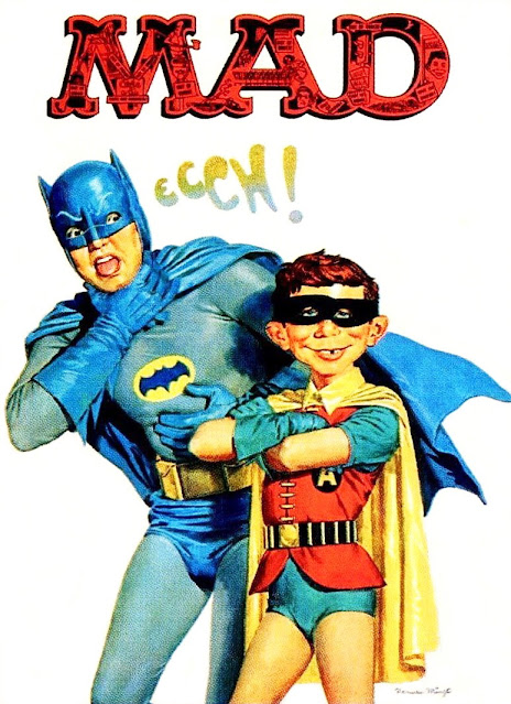
One day he brought in a box containing a pile of comics, including quite a few British editions of MAD magazine.  He kindly let me take one home with me to read at my leisure, and - when I evinced my liking for said magazine - even more kindly said I could keep it.  Wotta guy!  The magazine in question was the one illustrating the top of this very post, and contained a witty parody - drawn by the superb MORT DRUCKER - of the BATMAN television show from 1966.

He was also a great admirer of the GERRY ANDERSON programmes - and I remember him once telling me that, whenever he saw art director BOB BELL's name in the closing credits, he always felt a pang of disappointment that it wasn't him.  What a difference to his staid, stuffy, and static "arty-farty" colleagues, whom he effortlessly outclassed and outshone.

About six or seven years after leaving school, I ran into another (former) art teacher from the same period, who - when I enquired after Mr. Bell - informed me that he'd died two or three years before.  Although it's been about 30 years since I learned this, I still sometimes find myself hoping that he was mistaken and that Mr. Bell is still very much alive somewhere, drawing comic strips to his heart's content.

Sadly, I never got to tell him just how much I enjoyed being in his class, or how much I appreciated his lavish praise, encouragement, and enthusiasm - but, whenever I look at that terrific NORMAN MINGO illustration adorning that particular cover of MAD, I can't help but think of DUNCANRIG's very own Mr. BOB BELL.  He was just what a teacher should be.

Here's to you, Mr. Bell (or can I call you Bob?) - wherever you are.  You made a difference.

Friday 12 November 2010

ANOTHER KRACKING KOSMIC KIRBY (RE) KREATION BY KID...

Images copyright MARVEL COMICS

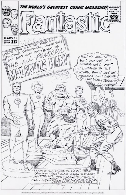
It's common knowledge that MARVEL's STAN (The Man) LEE sometimes rejected JACK (King) KIRBY's initial cover ideas and requested that he come up with another approach.  Such was the case with FANTASTIC FOUR #20, perhaps on the grounds that the good ol' FF - being covered with a coating of plaster - were not quite as dynamic (or recognizable) as Stan felt they should have been.  (And a stunted ALICIA MASTERS seemingly sprouting from the back of the menacing MOLECULE MAN wouldn't have helped.)


A few years back (1997  to be precise), The JACK KIRBY COLLECTOR printed a stat of the pencils of the unused cover, and I was consumed with a desire to see it in finished form.  I enlarged The THING slightly (Jack often drew him too small, compared to his original towering stature in FF #1) and "fixed" Alicia's position in the background.  I also decided to render the foursome without the plaster coating, the better to be able to see them.  TJCK printed it in one of their issues, but I forget which number.  Once again, there are a few areas which could stand improvement (The MOLECULE MAN lettering in the cover blurb for example) and maybe one day I'll eventually get around to doing it.

Anyway, I thought all you cavorting Criv-ites might like to see just how FF #20's cover could have looked.  (And maybe even does, in an alternative reality somewhere.)

"HEAD FOR HOME, ROBERT..."


Copyright relevant owner

Don't you just love it when someone does something really clever?  Here's an example of what I mean: feast your eyes on the cover of the very first FIREBALL XL5 ANNUAL for 1963/'64 (above).  Now cast your awestruck orbs on the cover of the DVD collection containing all 39 episodes, released a year or so back (below) - see what they've done?  I think it's really cool, and a nice way of bringing things full circle.


This is the second DVD release of this cult programme; there was one a few years back which, rather nicely, had the XL5 logo on the discs, but sadly contained no extras.  This time it's got extras galore, plus a fantastic TV CENTURY 21 booklet written by ANDREW PIXLEY, and detailing the history of this GERRY ANDERSON 1960s' classic.


If you don't already have it, add it to your Christmas list now.  (And it might be wise to start saving for the colourized collection - there's bound to be one eventually.)

DON'T ASK - JUST BUY IT!


Pencils by Kirby, inks, colours & lettering by Robson

Thirteen years ago, The JACK KIRBY COLLECTOR printed a stat of a pencil drawing of ORION - and asked readers to send in their inked version of the pic.  I never got around to it at the time, but later - and for my own amusement - I used a sheet of tracing paper to ink the piece and then decided to have a go at colouring it as well.  I only had some acrylic inks and felt-tipped pens, so that's what I used.  So here it is (above) in all its glory.

For good measure, shown below is the black and white inked version.  When I get a chance, I'll dig out the issue of JKC and post the copy of the pencils.

Inked with Windsor & Newton #3 sable brush

Thursday 11 November 2010

SUPERMAN VERSUS MIGHTY MOTH...


Pencilled, inked & lettered by KID ROBSON

Here's another unseen page from the archives.  This one's 25 years old and is scanned from a photocopy rather than the original art.  (Most of the stuff in my files comes from photocopies, the originals having been given away or misplaced over the years.)  Consequently, it's not as sharp or as detailed as it otherwise would be.  This was intended for a fanzine produced by the now defunct comics shop A.K.A. (Also Known As), run by JOHN McSHANE, the late PETE ROOT and BOB NAPIER, three luminaries in the Glasgow comics scene.  (I think little STEVIE MONT-GOMERY also became involved at a later date.)

The cover was produced in a hurry between lettering assignments for 2000 A.D. and other IPC publications, so it's not as 'finished' as I would've liked.  (The floor and cape are desperately in need of some shadows.)  The issue this cover was intended for was never published due to a lack of material, so it's languished in my files until now.  First person to say it should've stayed there gets a cheap laugh, but loses their BLUE PETER badge.  

Wednesday 10 November 2010

WILL YOU ALWAYS KEEP A DANDY HANDY?


A more polished version of Jamie Smart's Desperate Dan

As regular readers will know, there are certain aspects of the new DANDY that I'm not too keen on.  JAMIE SMART's DESPERATE DAN strip has come in for a bit of a kicking elsewhere on the internet, and I have to admit that I'm not its biggest fan either.  It's all just a little too rushed-looking and roughly-finished to suit my tastes.  (Though not so much in the above pic - read on.)

However, intrigued by those who claim to like his artwork, I had a look at his website and I was surprised to see that his style seems less jarring on characters I haven't seen before, and even has a certain rough-hewn charm.  In fact, even his Desperate Dan strips on his site seem to have had a bit more care and attention lavished on them.  (The illustrations on this page are "borrowed" from over there.  Let's hope he won't mind.)

So I had another look at the first couple of issues and - guess what?  That's right - they still didn't work for me.  Perhaps he was under pressure and had to produce his Dandy pages in a hurry; or perhaps he's experimenting with a rougher, more organic look - who knows?  Well, he does, but he's hardly likely to tell me.

Another slightly smoother look

What I will say, however, is this.  To all those old-timers who aren't too keen on his Dandy pages, take a look at his website.  Divorced from familiar characters we all know and love (and let's face it, who - with the possible exception of KEN H. HARRISON - could compete with DUDLEY D. WATKINS?), his pages don't seem as jarring as they do in DCT's relaunched comic.

If DAN had to have a new look, I think I would have preferred to see TOM PATERSON or HUNT EMERSON (I liked his LITTLE PLUM - ooer, missus) have a go at him.  I still don't think Jamie's style (or, to be more precise, the version of his style that he uses on DD) quite works.  However, if he just shaved off some of the rougher edges from the strip and it had a more consistent lettering font, I feel that much of the criticism it has received might be dissipated somewhat.

I'm sure Mr. Smart cares not a jot for my opinion - and that's perhaps how it should be.  However, I'm sure I'm not the only one who hopes that he may yet see the wisdom in aiming his strips not only at new readers, but at older ones as well.  That way everybody's happy.


Related Posts Plugin for WordPress, Blogger...