Friday, 9 September 2011

JOURNEY'S END...


Images copyright MARVEL COMICS

Here are the final two stories from J.I.M. #83 to complete the issue.  One is a text piece, of the type that was only included so that the mags qualified for 2nd class mailing rights, the other's a typical fantasy tale by STAN LEE and STEVE DITKO.


So, there you have it - the complete ish (sans ads) of one of the classic MARVEL comics of the Silver Age.  This comic would cost a small fortune to buy in decent condition nowadays, so don't ever say that I never give you anything for nothing.  As before, click on images to enlarge, then click again for optimum size.


Be sure to tune in again from time to time - you'd kick yourself if you missed anything.  And check out the previous two posts, if you haven't already, for the rest of this collectors' item issue. 

"GONNA TAKE A SENTIMENTAL JOURNEY..."


Images copyright MARVEL COMICS

Okay, peeps, today we're going to re-present the first instalment of the remainder of JOURNEY Into MYSTERY #83.  Wouldn't want your lives to be incomplete now, would we?  Looking at the last page, it's clear that Mike Morgan was actually falling to his death, but the Comics Code must've objected to this grisly ending and insisted on changes.  The first clue is the caption in the 2nd panel of page 5 - "And in those last nightmarish seconds of Mike Morgan's life..." is a giveaway that he was receiving his just comeuppance.


The last two panels have clearly been re-lettered by a different hand to give the impression that he survives, and the final panel itself seems to have been altered, as the figure doesn't look like the work of DON HECK, who drew the rest of the strip.  "Guess I might as well glide down and save him..." ?  Get real - he's splattered all over the landscape by now - unless he was falling in slow motion.  Click on images to enlarge, click again for optimum size.  And, if you haven't already, be sure to see the previous post for the origin of THOR The MIGHTY!

THOR The MIGHTY & The STONE MEN From SATURN!

Images copyright MARVEL COMICS

If you're fortunate enough to own any of the MARVEL OMNIBUS editions, you'll doubtless have appreciated the clean reproduction, the near perfect colour registration, the larger than normal page size, the attention to detail, etc., etc.  Truly they are things to marvel at (pardon the pun), but they have one drawback - they're almost too good.

A while back, I purchased The SILVER SURFER Omnibus; I went through it page by page, drinking in all the above mentioned qualities, savouring the exquisite clarity of each panel - but without reading it.  Then I dug out my original eighteen issue run of comics and read them individually over the next few evenings.

Great as the Omnibus volumes are, there's just something about the original issues which is hard to beat.  The smell of the paper, the adverts, the Ben-Day dot colouring - it all adds up to an experience which is a delight to the senses.  When you're sitting on the porcelain, an Omnibus volume can be quite heavy on the ol' thighs; a single comic is much easier to read and far less wearing on the legs.

With that in mind, I decided to treat you all to THOR The MIGHTY's origin, scanned from my very own copy of JOURNEY Into MYSTERY #83.  I could've scanned my softcover MASTERWORKS volume, which - along with the Omnibus edition - has the best reprint so far of that particular tale.  However, you folks are special - I figure that you deserve nothing but the original.
******

Plot: STAN LEE  * Script: LARRY LIEBER  * Art: JACK KIRBY
& JOE SINNOTT  * Letters: ART SIMEK


Click on any page, then click again to see the image in extra-large size.

******

BONUS DEPT:  Here's how the final panel originally looked before it was changed to the published version.

Thursday, 8 September 2011

DIRE DOINGS DEPT: Is The DESPERATE DANDY DESTINED To DWINDLE And DECLINE Until DOOMED To A DARK, DREARY, DISCOURAGING, DISPIRITING, And DESPAIRING DEATH???

Copyright D.C. THOMSON & Co., Ltd

If the reported current circulation figures of The DANDY are to be believed, the recent relaunch of Britain's longest running weekly comic must be considered a massive failure. Apparently, it's selling around half of what it did before it's massively-hyped 'reboot' back in 2010.

Of course, there are many reasons why comics today don't sell in the numbers they once did back in the '50s & '60s.  Publishers today would welcome the reduced circulation of the '70s with ecstatic glee should they ever find themselves in the fortunate position of being able to attain them.  One of the reasons for declining sales is increased competition from other things kids can now spend their pocket-money on, compounded by the fact that comics are no longer the cheapest form of entertainment available.  In fact, they've increased their prices far above the rate of inflation, year by year, for a almost a couple of decades.

Also, buying comics on a regular basis is a habit that needs to be developed and encouraged through the early stages of childhood, otherwise by the time children reach the age where they make their own decisions on what to buy, spending their dosh on comics isn't going to be their first choice.

Forgetting the spurious defence to the contrary currently expounded on some other blogs, another reason for their fall from grace is that, in the main, they're not as entertaining as they used to be.  "But wait a minute!", you cry.  "Comics aren't aimed at your age group.  As long as the kids of today find them funny then they're doing their job!"  Rubbish!  The declining sales, even allowing for other contributory factors, puts paid to that nonsense.  And besides, if you feed sh*t to those who have never tasted steak, they're not going to know the difference, are they?  Still no excuse though, is it?

There are certain comics and strips - from before I was born, or before I was reading them, or I didn't see until years after they were published (hence no nostalgic sentiment involved) - that I can sit and read (or re-read) today and they're uproariously funny.  The only strip I can think of, off the top of my head, in recent years, that's always worth reading, is TOM PATERSON's CALAMITY JAMES in The BEANO.  (Unsure if it's still in it, I'll have to check.)


There are a handful of artists who still produce solid, well-drawn, humorous work - but they're often let down by the sheer banality of the scripts.  Dennis, with a menagerie of pets in tow (GNASHER, GNIPPER, RASHER, etc.), was regularly zooming about in some futuristic rocket-ship contraption not that long ago, rendering the strip far too surreal and divorced from what readers can relate to, to be as memorable as early Menace strips used to be.

Nowadays there seems to be a disturbing trend to go for an almost abstract style of art, in some misguided mission to appear 'up to date' and 'down with the kids'.  The Dandy in particular pursues this position, to the extent that the 'fix' has resulted in it being far more 'broken' than was previously the case.

Even balloon lettering has suffered from this approach.  Not too long ago, the Dandy editor defended the switch to upper and lower case lettering on the grounds that research (of which I'm dubious) seemed to suggest that children found it easier to read.  Let's just allow the possibility that it might be true for a moment.  In what way would that justify the hard-to-read, amateurish scrawl that defaces some of the strips?  To my mind, hard-to-read lettering is hard-to-read lettering - regardless of whatever case it's rendered in.  I'm quite sure that no research of any kind has ever led to the conclusion that badly rendered upper and lower case lettering was easier to read - for kids or anyone else.


Also, D.C. THOMSON would do well to make up their mind as to precisely what business they're in - comics or lucky bags.  I suspect those cover-mounted 'gifts' deter at least as many buyers as they attract - especially as they usually add £1 or more to the price.  If someone buys a comic for the toys, then they're not buying it for the comic, and that's the market Thomson's should be aiming for - the comic reader.

I could go on and on, but why flog a dead horse (or a dying Dandy)?  The fact is, despite the claims of those who defended and applauded the new direction (that'll be downwards then) of The Dandy, the evidence suggests that the treatment is killing the patient.  Let's just hope D.C. Thomson have some miracle cure up their sleeves before it's too late.

******

Feel free to comment and share your views on the matter.  Unlike one blog I could mention, you won't be patronized or insulted for not agreeing with me.  Nor will your comments be paraphrased and distorted for the sole purpose of taking a dig at you while petulantly denying you the right of reply.

Wednesday, 7 September 2011

"WHERE WALKS THE GHOST?"


Copyright MARVEL COMICS

Here's a brilliant 5-page STAN LEE, STEVE DITKO tale from AMAZING ADULT FANTASY #11, April 1962 (which meant it probably came out sometime in January).  I've scanned it from the AMAZING FANTASY OMNIBUS, so there's a bit of spine-curl and shadow down one side of each page (tightly bound, these volumes), but hopefully it's not too distracting.  So, sit back and enjoy Stan & Steve at their very best.

And just think... a mere 4 issues later, the titanic twosome unleashed SPIDER-MAN on an unsuspecting world.


Remember... click on images to enlarge, then click again for optimum size.

Tuesday, 6 September 2011

MORE LOOPY LAPSES In LOGIC DEPT...


Images copyright MARVEL COMICS.  Cover art by JACK KIRBY

To many (if not all) mighty MARVEL readers, by far the worst THOR story ever drawn was most likely JOURNEY Into MYSTERY #90's 'The CARBON COPY MAN!' (March '63), illustrated by AL HARTLEY.  Apparently, Al was mainly a romance artist who was pinch-hitting for KIRBY, who drew almost everything else that Marvel was publishing at the time, superhero-wise.  (With the exception of SPIDER-MAN.)

It probably is the worst Thor adventure ever to appear, but for reasons other than just the art - like the plot for example.  Basically, it's a re-working of FANTASTIC FOUR #2's 'The SKRULLS From OUTER SPACE' storyline, but without the hypnotism angle at the end.  (The Skrulls transformed themselves into cows, and were then hypnotized by REED RICHARDS to prevent them from thinking of changing back to Skrulls again.)

A bunch of evil aliens from the planet XARTA land on Earth and impersonate key figures in government, with the intention of making foolish laws which will throw citizens into a state of confusion and panic.  (Isn't that what most politicians do anyway?)  Apparently this will soften up the planet enough to leave it vulnerable to invasion.  They've chosen America as the first stage in the pursuance of this plan, with the intention of conquering the rest of the world when the good ol' U.S. of A. has fallen.  (Always pays to get in a bit of practice first.)

A perfect duplicate?  Betcha he can't turn into Thor though, huh?

Thor eventually defeats the aliens in combat, then commands them to transform into trees, on the grounds that, as the Xartans take on all the traits of whatever they impersonate, and as trees can't think, the idea of changing can never occur to them.  Er, how's that again?

Firstly, Thor couldn't possibly know whether this was true or not, and secondly, on what system of logic is he basing his assumption?  For example, if Xartans take on ALL the traits of whatever they impersonate, they surely wouldn't have been able to change back from human form (regardless of whether the idea could occur to them) - because humans CAN'T DO THAT.

See, that's the proverbial fly in the ointment - taking on ALL the traits of whoever or whatever they impersonate.  They've already demonstrated that they DON'T.  They merely mimic the outward physical appearance of whatever form they adopt, not the intellectual or mental limitations of that form - so they should be able to change back to Xartans any time they wanted, whatever shape they happened to be.

Gosh!  Some of those classic tales from yesteryear sure don't stand up to scrutiny.  (Or am I just being too pernickety?)  But what the heck!  They were fun.

For more Loopy Lapses In Logic, click here.

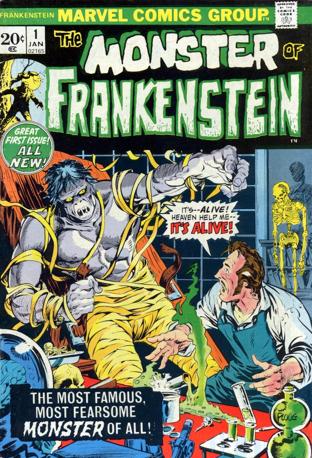
A MONSTER TO MARVEL AT - PART ONE...


Images copyright MARVEL COMICS

Being a long-time Frankie fiend, I thought I'd post the covers from the MARVEL COMICS run of The MONSTER Of FRANKENSTEIN from the early '70s.  (It changed its title to The FRANKENSTEIN MONSTER with issue #6.)  Marvel's colour comic only lasted for eighteen issues, so we'll start you off with the first six and trust you to come back and see upcoming instalments.  So stay tuned - you don't want to miss 'em.  (Click on images to enlarge, then click again for optimum size.)


GARY FRIEDRICH wrote the first eleven issues (1-4 being a fairly faithful adaptation of MARY SHELLEY's novel, first published in 1818), with DOUG MOENCH taking over from #s 12-17, and BILL MANTLO writing the final issue.  MIKE PLOOG was responsible for the art chores on the first six issues, being followed by JOHN BUSCEMA, BOB BROWN, and VAL MAYERIK (with an assist on the last issue by BERNIE WRIGHTSON). 


I know Marvel released a Frankenstein ESSENTIALS volume a while back, but I'm not sure if there's been an OMNIBUS edition yet.  If and when they do, you could spend your money on something a lot less worthy.  More Frankie covers to follow.  (To see Part 2, click here.)

Sunday, 4 September 2011

HARRY HILL And The HULK...


Copyright MARVEL COMICS

"And just what does Harry Hill have to do with The Hulk?" I hear you asking.  Let me explain.

A while back, cartoonist NIGEL PARKINSON (artist on DENNIS The MENACE in The BEANO and HARRY HILL in The DANDY - as well as a host of other stuff) mentioned a particular HULK drawing by JACK KIRBY which he had first seen in a British comic called SMASH!

The illustration in question was the splash page from the first story in #3 of the Hulk's own mag, reprinted in 1966 in the famous POWER COMIC by ODHAMS PRESS.  I said I'd post it on this blog in case Nigel no longer has that issue of his favourite comic from childhood.

Trouble is, my Smash! collection is buried deep in a cupboard which would take ages to dig through to see whether or not I have an individual copy of that particular ish.  I do have the issue in a bound volume, but I can't open it wide enough to scan the page without damaging the spine.  What to do?

Lucky that my back copies of The MIGHTY WORLD Of MARVEL are nearby.  So, above, from MWOM #5, is the drawing that Nigel so fondly remembers from yesteryear, when his career as a comic artist was still a few years ahead of him.  And below, for good measure, is the colour version of the full page.

Saturday, 3 September 2011

The PERRY RHODAN FILES - PART ONE...


Copyright relevant owner

In the mid-'80s, a departing IPC editor gifted me with various goodies which had been lying around his office for years.  One such item was a folder containing what seemed to be a 1967 pitch to British Publishers FLEETWAY (might even have been ODHAMS PRESS), to try and interest them in a science-fiction comic strip based on the character PERRY RHODAN.

Perry Rhodan is a comic strip first published in Germany in 1961.  Apart from that, I don't know too much about it, and - to be honest - it doesn't grab me enough to want to learn anything more.  Apparently there was a movie in 1967, and the folder contains black & white photographic stills from the film (I presume), as well as magazine articles, promotional material, and the first seven issues of a 1967 comic.


Although it doesn't much appeal to me (apart from the blonde), apparently it's extremely popular in several countries.  So, for all those who may be fans of the Perry whose surname isn't MASON, or anyone who may be interested, here are some of the contents from the folder I acquired in 1985/'86.


Click on images to enlarge, then click again for optimum size.

Look in again from time to time for further images from The PERRY RHODAN FILES.