Tuesday, 14 February 2012

LEGENDARY ARTIST JOHN SEVERIN DIES AT 90...

John Severin

BOOKSTEVE has reported the death of legendary artist JOHN SEVERIN.  Click here to read what Steve has written.  MARK EVANIER also has an interesting post about John here.

******

Copyright MARVEL COMICS

As for myself, I probably first saw JOHN SEVERIN's work back in the '60s on NICK FURY, AGENT Of S.H.I.E.L.D., reprinted in the pages of a British comic called POW!  John inked JACK KIRBY's pencils and, as with everyone whose art he embellished, made something that was great even greater still.  He did the same with HERB TRIMPE's pencils on The INCREDIBLE HULK in the '70s, and also his sister MARIE's work on KULL The CONQUEROR in the same decade.

John was no "mere" inker however, and was a penciller par excellence himself.  He worked on such titles as TWO-FISTED TALES, and FRONTLINE COMBAT for EC COMICS, as well as various western titles for ATLAS/TIMELY/MARVEL.  He also contributed (for 45 years) to CRACKED, a satirical magazine very much in the style of MAD, on which he had been one of the founding cartoonists when it first hit the stands back in 1952.

Definitely one of the greats, who will certainly be remembered for many years to come.

RAMBLING REMINISCENCES...


King's Reach Tower in Stamford Street

Talking of KING'S REACH TOWER reminds me of when myself and the previously-mentioned KEVIN BRIGHTON were getting into the elevator on the way down to (or way back from) the seemingly football pitch-sized IPC staff canteen.  (No doubt I exaggerate, but it was bloody huge.)  As we stepped into the lift, it was so full that there was only room to stand facing in the way as the doors shut behind us.

So we're face to face with a bunch of people blankly staring out at us, while we self-consciously stared back at them.  It was too good an opportunity to miss.  I raised my hand to my mouth, cleared my throat, then said: "I suppose you're all wondering why I've called this meeting..."  A split-second's silence while the penny dropped, then the elevator erupted into laughter.

Kevin Brighton and his pal Del in the IPC canteen

I've used that line a number of times over the years in similar situations and it always gets a response.  Casting my mind back, I even recall where I first got it from.  It was around the mid-1970s and a fellow named JOHN HATTLE (my boss at the time*), was relating pretty much the same scenario as the one above (with himself as the protagonist, obviously), in the car park outside a pub near his shop where I worked.  I don't know if he'd appropriated it from a movie for his own purposes, or it was a genuine, on the spot 'ad-lib' as he stepped into a lift.  Anyway, there I was, ten years later (though it seemed far longer at the time), regurgitating a one-liner from my past.  That wasn't even the first time I'd used the line, having done so a few times since I'd first heard it.

(*Or maybe it was just after I'd recently left his employ, but was signwriting a van for him.)

However, recalling the situation today, it made me realise how often we store things away in our minds, sometimes for decades, ready for use at a moment's notice whenever the situation demands.  As someone who sometimes sports a beard, I'm used to people commenting on it when I grow it back again, usually along the lines of: "I see you've grown the beard back, eh?"  (I guess they must lead really boring lives for such an event to be considered worth remarking on.)  I usually respond with: "This one's false - the real one's in my pocket!"  It was only when watching a MAN From U.N.C.L.E. 'movie' a while back that I was reminded of where I'd nicked the line from, so many years before.

A post this dull needs glamming-up a bit, so here's Bob Paynter's secretary, Caroline

Back in 1982, I sent a 'cassette-a-letter' to a friend who was temporarily living in Bournemouth at the time.  We replayed it about a week ago (to much merriment at the sound of my young voice) and I was surprised to hear myself tell a joke I'd only then-recently heard, and which I still tell today, thirty years later.  It made me realise how many of the jokes I tell nowadays are of a similar vintage.  (Note to self: Must learn some new material.)

So what's the point of this self-indulgent reminiscence you may be asking yourselves.  Only this:

We really are products of our past, aren't we?

******

Sadly, King's Reach Tower has lain empty for a few years since IPC Media moved out in 2007.  I understand there are now plans to add six floors, reclad the exterior, and turn it into luxury apartments.  I'll always remember it as it was though. 

Monday, 13 February 2012

STEVE THE MIGHTY STEPS DOWN...


I see that STEVE MacMANUS, one of the better editors at IPC's YOUTH GROUP until the infamous ROBERT MAXWELL bought it over, stepped down last year from his position as Managing Editor at EGMONT, after a career spanning thirty-seven or so years in publishing.  (Yes, it's old news, but I've only just heard.  I wonder if he got my last Christmas card?)

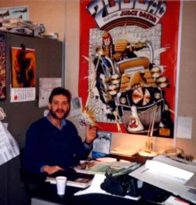
Steve was the fellow who gave me my big break at a comic mart in the MOIR HALL at the MITCHELL THEATRE in Glasgow on October 20th, 1984.  (So blame him.)  I well remember my subsequent trips down to London to the IPC offices at KING'S REACH TOWER in Stamford Street, and sitting chatting to Steve one sunny lunchtime in the garden of a cheery wee pub just up the road from IRWIN HOUSE, where the Youth Group had been relocated to in preparation for the sale to Maxwell.  If I remember correctly, art assistant KEVIN BRIGHTON was also there.

I may have told this tale before, but Steve, Kevin, and myself were standing looking out of a window on the 26th floor of KRT one afternoon (previous to the one above) in 1986, when I asked him what 2000 A.D. might be called in the year 2000.  He did a good job of hiding his boredom at hearing a question he'd no doubt been asked hundreds of times before and said something like: "Well, that's fourteen years away, Gordon - we don't have to worry about it 'til then."  And, truth to tell, it seemed an eternity away at the time.

It's a scary thought to realise that 2000 is now twelve years ago, and that moment on the 26th floor of King's Reach Tower is a whopping twenty-six years in the past.  (Almost half my life away.)  I just can't get my head 'round it - it seems like only a week or two back.

Copyright REBELLION

Strangely enough, CRISIS, a 2000 A.D. spin-off, was printed in my home town in '88, and I remember Steve coming up to watch the first issues roll off the presses, and graciously allowing me to accompany him to share in the occasion.  This may have been the final time I saw Steve in person, as I stopped going down to London in December of '87, but I still spoke to him on the 'phone from time to time for a few years after that.  (Come to think of it, I saw him at a Glasgow comic mart in the early '90s.)

So, if it hadn't been for ol' Stevie Mac, I might never have had a career in comics for as long as I did.  (Fifteen years.)  Just think - he has to live with the guilt of inflicting me on the comics' world.

Here's to Steve, and let's hope he goes on to even greater things from here on in.

******

Click here for my reminiscences of those early days.   

PARALLEL LIVES...


Copyright MARVEL COMICS

I sometimes feel that I've lived at least two different lives - and it's all down to reprints of certain MARVEL COMICS making an impression on me at various stages when I was growing up.  There are myriad examples I could mention, but I'll restrict myself mainly to one for the moment, that being the back-up tale in the nearly four decades-old issue of the U.K.'s very own best-selling SPIDER-MAN COMICS WEEKLY #7.

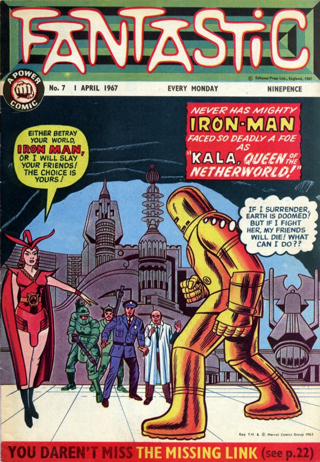
As related in an earlier post, I bought a copy of FANTASTIC #7 back in March 1967, probably around mid-week.  I never forgot the comic and the stories therein, and whenever I look at the comic nowadays, I'm back in the house I lived in at the time and still going to primary school just down the road from me.  Time travel, pure and simple.


Fast-forward to another house, almost six years later to the very day.  (Fantastic was cover-dated ahead to April 1st, but as I said, I got my copy halfway through the last week in March, more or less.)  SMCW was dated ahead to March 31st, but - for some strange reason - never appeared in my local newsagent 'til the Wednesday after the Saturday it was due.  That was when I bought it, on the Wednesday.  Funny how some things stick in one's mind.

Just like Fantastic #7, it also contained The MIGHTY THOR tale, "The THUNDER GOD And The THUG!"  (Unlike Fantastic, it printed the full story, not just the first half.)  I was only fourteen at the time SMCW #7 came out, so six years was almost half my life away.  It was certainly more than half my remembered life, so proportionately it seemed far longer than the same period would seem to me today.  (Six years nowadays seems like a fortnight back then.)


SMCW trimmed the panels of the stories they featured, and because of that and the two-tone grey on some pages, plus the red spot-colour on others, the strips had an individual aspect that distinguished them from earlier incarnations.  That's probably why, today, I can look at the Thor adventure in Fantastic and immediately recall that particular time back in 1967, and look at the same story in SMCW and be reminded of that halcyon period back in 1973.

Each printing has its own distinct identity, enabling me to associate it with two separate times in my life.  That would explain why, depending on what presentation of the tale I'm looking at, it sometimes feel as if I've lived two different, but parallel lives around it, daft as it may sound.


As I said earlier, there are other Marvel stories that have the same effect on me.  The FANTASTIC FOUR tale, "KURRGO, MASTER Of PLANET X!" also has two sets of memories associated with it.  When I look at the reprints of the story in WHAM! from 1967, all sorts of images pertaining to the time swirl through my head, and when I look at its later printing in The MIGHTY WORLD Of MARVEL from 1972/'73, a whole set of different images and recollections spring forth.  Same story, two sets of memories, two different eras.  It snaps my cap.

Now, will somebody please tell me what the hell I'm talking about.

Saturday, 11 February 2012

BARRY SMITH'S THOR...


Images copyright MARVEL COMICS

BARRY WINDSOR SMITH, when he was just plain ol' Barry Smith in 1968, drew this back-page POWER HOUSE PIN-UP for FANTASTIC #50.  He'd have been only around eighteen years old at the time.  To be frank, some of the pin-ups in Fantastic were awful, so if young Barry was responsible for them, he really had progressed in leaps and bounds by the time he started drawing CONAN The BARBARIAN in 1970.


In 1973, SPIDER-MAN COMICS WEEKLY #16 printed the pulsating pin-up, below, of The MIGHTY THOR, 'borrowed' from the splash page of The AVENGERS #66.  One can see the KIRBY influence at once of course, but it's none-the-less effective for that.


I always regarded The MIGHTY WORLD Of MARVEL and SMCW as official replacements for Fantastic and TERRIFIC, so it's kind of fitting that pin-ups of Thor by Barry appeared on the back pages of weekly comics by both publishers, ODHAMS PRESS and MAGAZINE MANAGEMENT, the latter being the parent company of MARVEL COMICS at the time.


You've got to hand it to him - didn't the boy do well?  (Though it's a shame ol' Goldilock's nostrils seem to have gone walkabout at the printing stage in that second pin-up.) 

Thursday, 9 February 2012

The MIGHTY WORLD Of YESTERDAY...


Copyright MARVEL COMICS

They say that when you're dying, your life flashes before your eyes - but there's a far less drastic (and not so final) way to achieve the same effect.  Simply flick through the pages of the comics you got as a kid (if they're still in your possession) and you'll find yourself transported back in time to when you first acquired them, with such clarity that you not only remember the past, but can see, feel, smell and taste it as well.


Such is the case with The MIGHTY WORLD Of MARVEL #51.  Look at the cover.  See the stars twinkling in the night sky?  One look, and I vividly recall the September evening when myself and one of my pals found ourselves crawling over the slated rooftops of a centuries-old public house in search of adventure.  I can remember the sudden thrill when, underneath us, someone suddenly emerged from the backdoor of the bar to obtain a fresh keg, while we hugged the roof and hoped that they wouldn't glance upwards.  Surely 'twas the exact same stars that shone down on us that night as sparkled from the cover of this comic from childhood, which I had bought the self-same morning in 1973?


Looking again at an old comic is much like rereading a half-forgotten diary entry, in as much that it invigorates the memory and spans the bridge between past and present, allowing us - for however brief a period - to revisit times and places from so very long ago.
 
The slates at left belong to the pub.  The photo is
taken from where we gained access to the roof

"I USED TO BE... HUMAN!"


Images copyright MARVEL COMICS

This is a 'luverly' little tale by STAN LEE and STEVE DITKO, reprinted in the FANTASTIC Annual for 1968.  (The story was originally published in JOURNEY Into MYSTERY #92, 1963.)  I remember redrawing the splash page in my back garden one day, with the intention of copying the whole strip, but no longer recall whether I ever finished it or gave up after the first couple of pages.

As was the custom with U.K. reprints of U.S. comic strips back then, credit boxes were deleted and certain words or phrases altered, such as "Good Lord!" to "Goodness!", and "thru" to "through", etc.  Can't take the chance of youthful readers picking up blasphemous oaths from their comics now, can we, or learning how to misspell?  That would never do!

Anyway, let's forego the customary waffle from me and get straight into the story.


Wednesday, 8 February 2012

DEFINITION OF AN EDITOR - SOMEONE WHO WANDERED IN OUT OF THE RAIN AND FELL INTO A JOB...

Copyright relevant owner

Right, Crivvies, now that I've got your attention with that provocative title, let's talk about editors.  Editors, like everything else on this planet, come in all shapes and sizes - good, bad and indifferent.  I've worked for some really good editors in my time, but I've also worked for some total incompetents.  The incompetents make for a much more interesting study, so let's focus on them.

Some incompetents may actually be quite proficient in ensuring that the whole process of comics production runs smoothly, and that the finished result arrives at the printers when it's due with as few hiccups along the way as possible.  In short, they're good traffic managers.  However, that doesn't necessarily mean that they have any particular skills for editing a comic, in the sense of choosing good writers and artists, matching the most suitable ones together, and catching mistakes - whether it be of spelling, punctuation or grammar.  Some editors I've experienced over the years have been diabolically deficient in some or all of those departments.


Let me tell you of such a tale which demonstrates the truth of the above.  I was once approached by an editor about whether I might be available to letter a Holiday Special featuring some HANNA-BARBERA cartoon characters.  I was busy at the time, but mindful of the fact that I might have a quiet period in the future, I enquired about the possibility of it leading to regular work.  "We have quite a number of upcoming projects," I was told, "so there's bound to be something or other we can send your way."


I therefore acceded to lettering the proffered project and duly received stats of the artwork.  There were three stories which required my tender attentions: The FLINTSTONES, SCOOBY DOO & YOGI BEAR.  These strips had originated as English-language tales, and then been translated into Spanish or Italian for the foreign market.  Presumably, the English versions were not readily available, necessitating the foreign editions being re-translated back into our mother-tongue to make them suitable for U.K. distribution.


The editor happened to speak whatever foreign tongue the strips were in and had enclosed a script of the English equivalent.  As most bi or multi-lingual speakers will appreciate, when one language is directly-translated into another, adjustments are often required to accommodate the rhythm and phraseology of the latter, otherwise the result are stilted.  So a verbatim translation might read: "The butter pass me please!", instead of the more natural "Please pass me the butter!"  While it wasn't quite as bad in this case, it wasn't too far removed in some instances.


Even worse, however, was that she was completely unfamiliar with Hanna-Barbera characters, which one would have thought a prerequisite for her position.  For example: RANGER SMITH was called WARDEN SMITH, PICNIC BASKETS were referred to as LUNCHEON HAMPERS, and I remember seeing another issue in which the TOWN Of BEDROCK was rendered as ROCK CITY.  In the Yogi Bear story, the veterinary surgeon's hut originally sported a doctor's sign outside.)  Going from back issues, this sort of thing was a regular occurrence, made worse by the fact that the finished strips were submitted to HB representatives for approval before publication.  (Who, it would seem, were also sound asleep at the wheel.)


On top of that, though, the dialogue and captions were just a statement of what was evident in each individual pic, while at the same time (in one particular story) suggesting an overall plot that didn't match anything shown in them.  So, if a character was running away, someone would be saying "He's running away!", while someone else replied something like "He doesn't want his picture taken!" - even if a camera was nowhere in sight.  Worst of all was that no-one ever said anything remotely humorous.


Being conscientious, I 'phoned the editor and described the all-too obvious problems with the scripts, and asked her permission to address them and to add a little humour.  She grudgingly acquiesced, recognising that I was correct, but with her nose out of joint at me detecting flaws which had escaped her attention.  The Flintstones story I amended by about 60%, the Scooby Doo tale by about 85%, and the Yogi Bear one by about 95%.  All this extra time and effort I gave for free, my chief concern being only that the stories made sense and were as entertaining as possible.


I also took time to letter some suitable story titles for the splash pages (they ruined the Flintstone's one by not adding colour), and photocopied the established character mastheads from some of my old Hanna-Barbera annuals so that the stories would look as 'authentic' as possible.  I doubt that anyone ever lavished as much attention on previous specials as I had with this one.  The finished result certainly looked far better than those which had preceded it.  After finishing a few pages I noticed another problem, so I then took special care to make the new lettering accommodate the speech balloons as closely as possible, without them looking too big (or small) for the enclosed dialogue.  (Which was often a feature of pre-computer relettering on translated strips.)

Some months after publication, I 'phoned her again to enquire about some courtesy copies she had promised to send which I hadn't received, and to ask if she might have any regular work for me yet.  She said she had sent the copies (which, going by her tone, I doubt) and frostily denied ever having suggested that she might send me other work.  Yet another example of an editor saying whatever is expedient to secure the services of some trusting freelancer, only to discard them when they're no longer required to meet a deadline and save their bacon.


Would it have been wiser if I'd said nothing and just turned in an inferior product?  Perhaps, but I was motivated purely by a desire to make the job as good as it could be, not to show off in any way.  Had she dismissed my concerns and asked me to do it as it was, I would have, but she couldn't deny that my observations had merit.  My wish to do the best job possible rather than just 'phone it in', made her look more efficient and competent than she actually was.  Trust me, some editors are absolutely bloody useless - but I'll keep their names to myself.  And if there's anybody out there who isn't as annoyed by this sort of thing as I am, then I'm a Dutchman.

(This is Kid Van Der Valk signing off.)

******
   
I should perhaps add that anything even remotely resembling humour in any of the above pages was dialogued by myself.

Tuesday, 7 February 2012

PART THREE Of FAVOURITE COMICS Of The PAST - "The WAY It WAS!"...

Copyright MARVEL COMICS

I don't want to create the impression that I was an overly-sick child when I was a lad, but I'm struck by how many comics I associate with days of school while ill in bed.  To be honest, usually my ailment consisted of nothing more than being sick of school and fancying a bit of a break, but, occasionally, I was actually suffering from some life-threatening illness - such as a mild cold or a dodgy dose of diarrhoea.  Sometimes I could even milk a slightly higher temperature and a headache for all they were worth.


So it was the morning of my 11th birthday, and my immediate fate had just been decided by my parents.  Because I was feeling 'off-colour', I didn't have to go to school that day (hooray), so I sat up in bed and allowed myself to be nourished by frequent administrations of American Cream Soda and a lunchtime bowl of tomato soup.  I was surrounded by a plethora of colourful comics, three of which I particularly remember, being the following: The MIGHTY THOR #158, MARVEL COLLECTORS' ITEM CLASSICS #6, and that week's issue of WHIZZER & CHIPS (#5 I think).

Although I now primarily recall these comics from that particular day, I had acquired the MARVEL ones perhaps a week or two before and can still remember buying them.  However, I tend to associate them more with my birthday because, in attempting to relieve my bed-ridden tedium, I completely immersed myself in their pages.  This no doubt accounts for why they and the day left such an impression on me.  Anyway, no doubt we'll someday get around to looking at MCIC #6 in more detail, but for now let's just focus on Thor #158.


"The Way It Was!" proclaims the splash page, and that's precisely what it delivers - a look back at how Thor The Mighty (as he was originally referred to) came to be.  Ol' Goldilocks' origin tale from JOURNEY Into MYSTERY #83 is re-presented, with some small alterations to its splash to accommodate a flashback scenario.  If you compare DON BLAKE's arm in the far-right bottom picture with its original printing, you'll see that it has been extended outwards to accentuate the appearance of his limp.


Interestingly, when Marvel first released their MASTERWORKS books, they recreated the splash page of Thor's debut from proofs of this reprint (as well as the rest of the pages) because they had apparently mislaid the proofs of the original printing.  Although a better-quality source has since turned up (which can be seen in the OMNIBUS and one or two other volumes), the inferior version still surfaces from time to time.  (Best to get a copy of the recent softcover Masterworks if you prefer archive quality.)


I remember my father reading this comic after me, and expressing his frustration that it was a continued story.  He never found out what happened to the 'real' Thor - mainly 'cause I never bothered to tell him when I read the concluding part of the tale reprinted in Marvel U.K.'s SPIDER-MAN COMICS WEEKLY #s 125 & 126 in June/July of 1975.  I doubt he'd have remembered ever seeing the cliffhanger ending to the first instalment by then anyway.


So there you have it!  I'll reveal the answer as unfolded in the above Thor #159 another time.  I had to wait about sixteen or seventeen years before I acquired the original American issue, so a few weeks or months of suspense isn't going to kill you.  (Update: Rejoice, you need wait no longer.  The answer can be found by clicking on this link.  So why are you still here?)
   
Click here for Part Two.  Click here for Part Four.

Monday, 6 February 2012

IS THE 'ART' BEING TAKEN OUT OF COMICS?


Front page of hand-lettered promotional leaflet. (Address
& 'phone number removed)

As regular readers of this humble blog should know by now (all four of them), your fearless host has never been one to avoid subjects of a controversial nature.  So, let's once more leap into the fray and tackle the topic of the role of computers in comics, and whether or not they've taken some of the 'art' out of the process of producing them.  With that subject in mind, I once enquired of a computer-colourist if he'd be able to colour a comic the traditional way, by hand.  "No!", was his short and honest answer.  Apparently, he didn't think he had sufficient ability and was therefore dependent on technology to enable him to make his comic contributions.

Technology has taken over in other areas too.  Lettering, for example.  Most comics nowadays are lettered by computer fonts, enabling practically anyone who can type (which is just about everyone) to overlay speech-balloons, text panels, sound effects and logos onto a comics page.  All of which most of them would be unable to create by their own hand to a satisfactory professional level.

From the reader's point of view I don't suppose it matters so long as it's done well, although I find all those perfectly elliptical balloon shapes quite tedious.  I prefer the spontaneity of hand-lettering (again, when it's done well), because it permits the letterer to accommodate the artist's layout in a far more personal and sympathetic manner than computer fonts can allow for.

When I used to earn a full-time living from lettering many years ago now, I took great delight in making speech-balloons fit in spaces that one would think had no room for them, and to do it in such a way that didn't seem forced and awkward-looking.  For the most part I succeeded, and derived immense satisfaction from making a page look as if art and lettering were an 'organic' whole.  I find that a lot of computer-lettering looks as if it isn't part of the artwork, but rather some 'disembodied' shape that floats over the surface of each panel.

Photo of promotional leaflet's centre-page spread of hand-lettered logos

A few years back, I briefly considered returning to comics work and had a go at computer-lettering with some fonts someone lent me, just to see what the process was like.  How mind-numbingly tedious compared to the joy of handling an actual page of art and affixing the lettering directly onto the page or acetate overlay (for colour work) in such a way as to make it a 'finished' piece.  I soon abandoned the exercise as it afforded me not even an iota of creative satisfaction.  I felt like a secretary.  (Which is fine if that's what you want to be.)

I should make it absolutely clear that I have no problem with genuine hand-letterers putting their fonts onto a computer programme and going down that route.  After all, these guys have been in the trenches for years and earned their stripes, so anything that makes their job a little quicker or easier is not something I'm going to grudge them.  Legendary 2000 A.D. calligrapher TOM FRAME eventually resorted to computer-lettering (I believe his deteriorating eyesight made it increasingly difficult for him to continue in the 'old-fashioned' way), but he'd earned the right to do so, and it was his own lettering style he utilised.

It niggles me though, when I see some of the newer people called letterers when they should more properly be credited as typographers - or in some cases, just plain typists.  After all, they couldn't letter by hand if their lives depended on it.

If you can't play the game, then don't wear the name.

******

(Agree or disagree?  Feel free to let me know, but try and do it without cussing.  You know how sensitive I can be.)
Back page of hand-lettered promotional leaflet 

PART TWO Of FAVOURITE COMICS Of The PAST - 'ENCHANTED' TIMES...

Images copyright MARVEL COMICS

And here's another little belter of a comic from out of the dim and distant, fog-enshrouded mists of time.  Actually, that last bit's a lie - because I can recall having my original copy of this comic as if it were only... well, not quite yesterday, but last week at least.  That's due to the fact that, not long after acquiring it, I was ill and confined to my bed for a day or two, and I remember re-reading the comic tucked up in bed with only a bedside light to illuminate my literary pursuits.


Feeling slightly better after finishing #143 of The MIGHTY THOR's Asgardian adventures, I got out of bed with the intention of going downstairs to the bosom of my family.  My brother assisted me, but I took a sudden dizzy turn at the top of the stairs and had to be returned to a horizontal position under the warm, cosy, enveloping blankets I had just abandoned mere moments before.  No wonder the issue is burned into my memory - who would ever forget a night like that? 

This tale was reprinted in SMASH! around the same time I had the American original, and I recall comparing the layout in the British comic to the U.S. one.  (MARVEL strips were resized, two pages to one, for their U.K. reprintings in three of the five POWER COMICS from ODHAMS PRESS, of which Smash! was by this time the sole survivor.)  Many years later, I learned that VINCE COLLETTA had started to ink this issue, but for some reason BILL EVERETT took over.  If you look carefully at the splash page, you can see the mix of the two different styles.

The issue was also later reprinted in ORIGINS Of MARVEL COMICS in 1974, and when I got my hands on a copy soon after it became available in Britain in '75, I was overjoyed to once again see this fondly-recalled tale from my boyhood.  True, only six years or so had passed since I'd owned the original comicbook, but that was over one third of my life away at that point and consequently seemed much longer than the same period of time would likely appear to me nowadays.  (All to do with proportions I guess, but what do I know?)


The scans you see here are from a copy I obtained more years ago than I care (or am able) to remember.  It's certainly close to half my life away anyway.  One look at that cover and I'm a child once more, back in my bedroom in Belmont again, reading the comic by the soft light of a lamp, with the outline of the room's few furnishings faintly visible as they stand guard in the gloom beyond.  (So much for those who say my childhood is behind me; truth is, it never truly left me.  It's the same for everyone, I imagine.)

Anyway, feel free to forget my self-indulgent waffle - just so long as you enjoy the scans herewith presented and are perhaps reminded of your own first, long-ago encounter with this cataclysmic comic, then I can savour the satisfaction that comes from a job well done.

Altogether now: "For Odin, for Asgard!"

******

Click here for Part Three.  Click here for Part One.