Monday, 28 April 2014

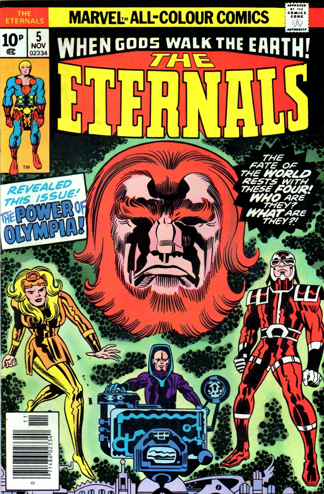
'ETERNALLY YOURS, JACK KIRBY' - COVER GALLERY PART ONE...

Images copyright MARVEL COMICS

JACK KIRBY was back - and The ETERNALS were with him!  Unfortunately, the comics buying public weren't - at least not in any great numbers, as the mag folded after 19 issues and one Annual.  Similar to the theories of ERICH VON DANIKEN, the premise also echoed elements of DC COMICS' earlier NEW GODS, in that two races (The Eternals and The DEVIANTS) were at war with one another - with human beings caught in the middle.

It wasn't JK's worst moment, but neither was it his best.  At the time, readers could be forgiven for thinking events took place in a separate universe to MARVEL's, apart from a grudging nod in its direction by the use of some generic S.H.I.E.L.D. agents and a 'cosmic-powered' HULK android.  Jack seemed to be doing his best to keep the MU at bay, and it was left to other hands to fully incorporate his concepts into the rest of the line once he'd left 'The House of Ideas' for the second and final time in his career. 

Anyway, Jack Kirby's always worth a look, so let's start the ball rolling with the first ten covers of his longest-lasting 1970s (new) mag for the place he'd helped build, but seemingly no longer had room to accommodate either him or his unique talents.

Don't miss Part Two!


"The WARLORD & The WITCH!" PART TWENTY-EIGHT Of FAVOURITE COMICS Of The PAST...

Images copyright MARVEL COMICS

From the vast and vaunted vaults of Castel Crivens, comes yet another example of an original comic and its reprint.  This time 'round it's The AVENGERS (no longer mighty it would seem, according to the cover) #75, first acquired on holiday in Largs, unless I'm very much mistaken, in 1971.  (In fact, I also seem to recall getting #76 on that same holiday, come to think of it.)  Oh, but look - the Avengers have been restored to mightiness on the splash page.

You know, having just typed that, I also seem to associate the issue with CORSON'S, a local shop from which I bought a lot of U.S. comicbooks.  (It sometimes takes a while for my memory to warm up.)  So it may well have been #76 I bought in Largs, but, being a two part tale, my mind would've jumped back to when I read #75, hence my connecting the earlier issue with the same place I bought the later one.  The more I think of it, the more certain I am that I got #75 from Corson's in my home town, and #76 in Largs.  I can't be bothered retyping  it all though - so you'll just have to live with it.  (As if you care.)

Down below somewhere (4th image) is the 1981 reprint in MARVEL SUPER ACTION #36, but I can no longer recall exactly where I got it (Glasgow or Southsea/Portsmouth), though I'm pretty sure I bought it the year of release as I've had it for absolutely ages.  Once again, the reprint comes from the time Marvel had increased the page count in their mags, so it also included the double-page pin-up shown at the foot of the post.  I love comparing these type of mags and I'm reasonably sure that the rest of you do, too.  Why else would you put up with me?

(The above question doesn't really require a response if you were thinking of being rude, by the way.)


Sunday, 27 April 2014

T.H.U.N.D.E.R. AGENTS REVISITED...


Images copyright relevant owner

Many moons back, long before the actual event came about, I was firmly of the opinion that JERRY ORDWAY would be the most obvious choice of artist on WALLY WOOD's T.H.U.N.D.E.R. AGENTS should the characters ever be revived.  His style had always reminded me of Wally's so it was a natural conclusion to make as far as I was concerned - and, luckily, DAVID M. SINGER was of the same opinion.

In 1984, DELUXE COMICS secured the superlative services of Jerry (as well as those of GEORGE PEREZ, MURPHY ANDERSON, DAVE COCKRUM, STEVE DITKO and others) for their new series of the TOWER COMICS classic characters, before the title fell foul of copyright problems and suspended publication.  As far as I can discern, there were only five issues, so here is a selection of covers and interior pages by various artists to whet your appetite.

Click here for Part Two!


SUPER SUNDAY SPECIAL SELECTION: JOHNNY FUTURE - PART EIGHT...

Copyright REBELLION

Important Notice:

Remember, all you faithful followers and frantic fans of fabulous FANTASTIC's fearsome fighter of feckless foes (that's JOHNNY FUTURE, in case you'd forgotten) - there are only three further epic episodes of this superb superhero strip from the sensational '60s to go before we finally finish our nostalgic journey through the complete run of awesomely illustrated (by LUIS BERMEJO) comic strip adventures of Britain's very own Man of Tomorrow!  (Who I rather ingeniously speculated could possibly be SUPERMANs father in part two of this cataclysmic and classic confrontation.)
  
So - don't miss 'em!


The SUB-MARINER - In TRIPLICATE...


Images copyright MARVEL COMICS

Staying with Subby, let's now take a quick look at an earlier, 1968 issue of his own mag, plus a couple of reprints.  Above is the original cover of PRINCE NAMOR, The SUB-MARINER #8, in which ol' wing-feet goes toe-to-toe with bashful BEN GRIMM, The THING.  Below is the eighth issue of volume two of TALES To ASTONISH, in which the original black background has been replaced with a green one.  (And the interior tale is abridged by a couple of pages.)


Next up (below) is a 1994 second printing of the first version, the interiors of which were reproduced from the '68 negs and are actually clearer and brighter than the original.  It has new ads, but, that apart, is a faithful facsimile of the first printing, including the indicia, Bullpen Bulletins and letters pages.  The cover is obviously sourced from a stat of the original art, taken before the highlights around Namor's outline (to make him stand out better from the black background) were added. 


Note also that the figures in covers two and three have motion lines around them which the first one lacks, showing that they were removed before it was sent to the printers.  Isn't it interesting to see all the little revisions that covers go through in the stages leading up to the published result?

"BURN, NAMOR... BURN!" FAVOURITE COMICS Of The PAST - PART TWENTY-SEVEN...

Copyright MARVEL COMICS

The sky was a bright blue, with cotton wool clouds floating far overhead, when I purchased PRINCE NAMOR, The SUB-MARINER #14 from CORSON'S (a local shop that, at the time of typing, still exists in the same place today) that summer's day in 1969 or '70.  I remember arriving back home and reading it on my front doorstep, so eager was I to plumb its titanic treasures and immerse myself in all its MARVEL-lous delights.  This was the very first Subby comic I ever bought, but, though I enjoyed it, it would be two or three years before I purchased another.  (The first Annual of the series.)


Interestingly, long before I acquired the replacement for #14 you see above, I bought a reprint of it in TALES To ASTONISH #14 from a shop in Southsea or Portsmouth back in '81.  One glance at the cover instantly transported me to the front doorstep of my old home, eleven or twelve years before.  Strange how the same image can conjure up a different set of memories, isn't it?  Nowadays, when I look at the TTA reprint, I think of the street I stayed in Southsea first, before recalling the memory it summoned back then.  Although, when I look at Subby's original issue, my mind jumps straight back to that front doorstep so very long ago.


The reprint, as well as having it's own set of recollections, also points back to earlier memories of the original, which has only its own.  You'd think it would work both ways equally, no?  You know, I'd look at the Sub-Mariner mag and be reminded of the TTA reprint, in the same way that it works in reverse?  But no, the process only operates in one direction.  It's a bit of a mystery - or is it?  Perhaps it's only natural that some things remind us of past memories, but not 'future' ones (if you know what I mean).


However, here's a bona fide mystery: Why on earth do I get so absorbed in pondering such inconsequential matters as if they were profoundly significant in some way?  That's one I'll probably never be able to solve, but at least it keeps my mind occupied.  Anyway, below is the cover to the reprint, the contents of which were recoloured, but followed the colour scheme of the original pretty faithfully. Marvel had increased their comics' page count at this time, so also included are the 'filler' pin-ups from the back of the mag.


And here's a side-by-side comparison of the covers:

Saturday, 26 April 2014

The SILVER SURFER SOARS The SEEMINGLY STARLESS SPACEWAYS In An ANIMATED STATE...


You're looking at a copy of an animation cell from either a FANTASTIC FOUR or SILVER SURFER cartoon series from the early '90s.  I seem to recall I sent some coupon or card which came with a comic off to an address in the States, and this is what eventually turned up in the mail.  I received two for some reason, but I think I gave the spare one away to someone a good while back.  Just thought you might like to see it.

MORE DOUBLE HELPINGS Of JOHNNY FUTURE - PART SEVEN...

Copyright REBELLION

Never one to rest on my laurels, I've decided to strike while the iron is hot!  And they don't come any hotter than LUIS BERMEJO's astounding artwork on JOHNNY FUTURE, from the pages of one of Britain's premier papers for boys in the swinging 1960s - FANTASTIC! And once again, I'm serving up a big double-helping - seven and a half pages - of this amazing comic strip to satisfy your appetite for one of the most fondly remembered superheroes of yesteryear.

And remember - only four more servings to go!