Friday, 14 December 2012

"EVERYONE SING HIS NAME..."


Copyright CLASSIC MEDIA/EXPRESS NEWSPAPERS

RUPERT BEAR was created by MARY TOURTEL and appeared for the first time in The DAILY EXPRESS on November 8th, 1920.  15 years later, ALFRED BESTALL took the daily newspaper mascot to even greater heights of glory, working on the strip until he retired from it in 1965.  However, he continued to draw the covers to the Annuals until 1973 (for '74) and apparently occasionally contributed to the character in some way right up into his 90s.

Although I was aware of the famous British bear, it wasn't until browsing through an old Rupert Annual in a dentist's waiting room in the late '70s or very early '80s that I found myself transfixed by the art and the magical atmosphere it conjured up.  Then in the late '80s, when I was regularly posting work to IPC Magazines in London, post office workers (seeing that I was involved in 'publishing') would continually ask me if I knew the Rupert Bear artist who also often posted work from the same branch.  I had to admit I didn't.


However, one day when I was in Glasgow's AKA Books & Comics, co-owner JOHN McSHANE introduced me to JOHN HARROLD, the artist in question.  He'd been living in my home town for quite some time looking after his mother-in-law when she was sadly dying from cancer.  We both found ourselves on the same train back home and it transpired that John actually resided only a few minutes down the road from my house.  Despite John's repeated invitations to visit him sometime, I never managed to get 'round to it (I was a busy boy back in those days) and a couple of years later, John moved, first to London (I think) and then shortly thereafter to France.

It's strange to think that the then-current Rupert artist lived just a short walk down the street from me.  Small world, eh?  Anyway, it's the work of Alfred Bestall we're looking at today, featuring art from the pages of the 1949 Annual.  I decided to publish these wonderfully evocative examples because they're so apropos of the season.  They just exude the kind of Christmas that I fancy I remember from my long-ago boyhood, although perhaps it's more a case of how I want to remember things rather than how they actually were.  Then again, perhaps not.


Regardless, I hope that you enjoy looking at them.  If you have any fond recollections of Rupert from your own childhood, feel free to share them in the comments section.     

Tuesday, 11 December 2012

The END Is NIGH...


Images copyright D.C. THOMSON & Co., Ltd

According to what some people are currently saying, based on ancient Mayan prophecies, the end of the world is nigh.  Well, personally, I don't buy it - not yet, anyway.  However, I can understand how people could be misled into thinking that such was the case.  The world - as you and I both know it - is essentially 'expiring' at an alarming rate, what with the steadily-increasing deaths of celebrities we grew up with (or their once-good reputations tarnished beyond repair), the advance of technology, the change in society's habits - and, last but not least - the death of The DANDY.


Yeah, I know what you're thinking: "You cannot be serious!"  However, it seems to me, and to those of a similar age, that the world today is far different to the one we grew up in.  And remember, we grew up with radio, colour television, the telephone, computer games, video recorders, space travel, etc., so we were hardly in the stone age.  With the demise of The Dandy, it's one more nail in the coffin for the world with which we (that is, my contemporaries and I) were once so familiar.


Every Christmas, toys such as ACTION MAN, LEGO, MECCANO, AIRFIX, CORGI, DINKY, MATCHBOX, etc., to choose from; truckloads of colourful, sturdy Annuals on sale, Yuletide numbers of seemingly innumerable, favourite comic weeklies - essential elements which flavoured our very experience of the Season and gave it the magic which we so fondly remember.  I hope that the children of today will look back in adult years on their childhoods and remember them with equal fondness, but I have a hard time believing that they could ever be as magical as my own.  Yeah, I know - I'm sure that every generation thinks the same.


Every time someone dies, the world for them has effectively ended (natch), so it shouldn't be such a difficult prospect for the rest of us to come to terms with.  However, this year, with just one remaining British comic of yesteryear left standing, it really does seem that the world we once knew is coming to an end.  The CHRISTMAS BEANO is going to feel mighty lonely this year as it peeks out from newsagents' shelves.  Will it even be here in December 2013?


Welcome to my world.  It's dead, Jim!  (Or very nearly.)  Anyway, on that cheerful note, enjoy reading the above Christmas cover stories from a time when the world of comics was in far better shape than it is today.  (Not to mention far more recognizable to people of my age group.)    

PART TWELVE Of COMIC COVERS 'SNAP'!

 
Copyright MARVEL COMICS
 
JACK 'KING' KIRBY drew the cover of TALES Of SUSPENSE #39.  RON FRENZ drew the cover of The AMAZING SPIDER-MAN #259.  H'mm, is that a resemblance I see in the design of each MARVEL masterpiece?  Yes, it is - "SNAP!"  I win.
 

STEVE DITKO'S 'RETURN' TO THE AMAZING SPIDER-MAN...

Copyright MARVEL COMICS

At last!  Sturdy STEVE DITKO's original, 'unpublished' cover for AMAZING FANTASY #15 is finally about to see print on The AMAZING SPIDER-MAN #700.  It has actually been published before though, first on the back of MARVELMANIA #2 in 1970 (in black & white), and then as a full colour pin-up on the back cover of The MIGHTY WORLD Of MARVEL #2 in 1972.

Since then it's also appeared in various publications, including on or in the back pages of The OFFICIAL MARVEL INDEX To The AMAZING SPIDER-MAN #1, plus MARVEL TALES, MARVEL MASTERWORKS and OMNIBUS Spidey volumes.  (What's with all those back cover or back-of-the-book appearances?)

This time, though, it's finally fulfilled its destiny - as the front (variant) cover of an actual Spider-Man comic.  Hoorah!   

Monday, 10 December 2012

THE WEDDING THAT NEVER WAS - (OR THREE FOR A TENNER)...

Copyright D.C. THOMSON & Co., Ltd

Way back in the dim and distant 1970s, THE SUNDAY POST's long-running BROONS strip featured a continuing storyline built around MAGGIE's engagement and upcoming wedding to DAVE McKAY.  It ran from 1977 into '79 - and was then suddenly dropped, with no reference made to it ever again. Until now, that is.  Four brand-new strips have been commissioned for this hardbound 2013 oversized Annual to wrap up the plot-threads left dangling from this hastily abandoned storyline and give it a satisfactory conclusion once and for all.  See for yourself what happened next.  Art by TOM LAVERY (with a couple of OOR WULLIE strips by the legendary DUDLEY D. WATKINS.)


The BROONS AND OOR WULLIE book, plus the other two featured here, come to nearly £34 at cover price, but I got all three for a tenner.  You could, too, if you're quick enough, as WH SMITH's have a 3 for £10 offer on all annuals at the moment.  So don't delay - get down to your nearest Smith's as soon as possible while they've still got some left.

Sunday, 9 December 2012

JUST A LITTLE 'OFF-COLOUR'...


Original colour scheme.  Copyright MARVEL COMICS

Amongst my overlarge and heaving collection of cataclysmic comic curiosities, I've got well-over 90 MARVEL MASTERWORKS volumes, 15 MARVEL OMNIBUS editions, and more than 30 reprint books featuring classic Marvel tales from the 1960s & '70s.  I just can't stop buying them, even ones I've already got on my bookshelves.

New colour scheme by Andy Yanchus

Here's the problem: When Marvel first issued their Masterworks series back in the late 1980s, they weren't quite so 'archival' in nature, seldom (if at all) following the colour schemes of their initial comicbook printings.  As the years wore on however, it was decided to make these valiant volumes more faithful to their original publications, and, consequently, they were then coloured in accordance with how they had first been unleashed on the comic-buying public.

Original colour scheme

So, when a new edition with more accurate reproduction of linework and colouring was released, I'd buy it, figuring to replace the earlier, less faithful volumes.  Thing is, some of the colouring on those early books is, in many instances, more atmospheric and effective than the original comic printing.  Consequently, I can't bear to part with them. While the 'purist' in me craves having stories as faithful to their initial appearance as is humanly possible, the reader in me enjoys seeing the recoloured stories with their more varied and interesting colour palettes.

New colour scheme by Andy Yanchus

I've included a few examples to show just what I'm talking about from the first printings of SPIDER-MAN, DOCTOR STRANGE, and IRON MAN hardcover MASTERWORKS, and the more recent softcover editions which replicate the original colouring.  As you can see, the recoloured versions have more depth, gradation in tones, and are far more atmospheric in mood.

Original colour scheme

The Spider-Man/Tinkerer splash page in particular is stunning, and amply demonstrates just how crucial colouring can be to the end result.  As I said, it's great to have archive editions of how these stories first appeared back in the '60s, but the recoloured versions are classics in their own right which I just couldn't part with. This way, I have the absolute best of both worlds.

New colour scheme by Andy Yanchus

Which versions do you prefer, Crivvies?  Or do you think it doesn't much matter which way they're coloured?  If you have an opinion on the subject, feel entirely free to share your valued views in the comments section.  

OH NO! SPARE US From ANOTHER Of THOSE 'LOOPY LAPSES In LOGIC DEPT.' POSTS...

Images copyright MARVEL COMICS

No wonder those supervillain chappies never get anywhere with their pernicious plans for worldwide, dastardly domination - they're hardly the sharpest tools in the box, are they?  (Mind you, some of the heroes aren't much better.)  Remember THE AMAZING SPIDER-MAN #1, in which Spidey attempts to join the FANTASTIC FOUR, before being impersonated and framed by the CHAMELEON?

His reasoning behind using Spider-Man as a fall-guy is as follows: Hearing a news report that the web-spinner had paid a visit to the FF's skyscraper headquarters (the BAXTER BUILDING, just in case you think I'd forgotten), and in response to speculation that Spidey is being considered for membership, he concludes:  "There is only one reason Spider-Man would want to join the Fantastic Four!  Being sought by the police, there is no way for him to earn a legitimate living!  He must be desperate for money!"


Think about that for a moment.  Not only does the Chameleon make the same mistake as Spider-Man in assuming that being a member of the Cosmic Quartet is a paying gig, he totally overlooks the fact that, for all he knows, Spidey in his secret identity may well earn a respectable weekly wage working as a manager in Woolworth's.  I mean, what other hero up to that point ever got paid as if it was his fulltime profession.  (This was before LUKE CAGE, HERO FOR HIRE, remember.)

Is the Chameleon really such a total thicko that he thinks Spidey would be looking for the kind of nine-to-five job where he arrives at work in the mornings in full costume?  Gimme a break!  I'm afraid the Chameleon's logic is seriously suspect here, the result of STAN LEE or STEVE DITKO not quite thinking things through.  Spider-Man may not be able to earn a legitimate living, but PETER PARKER certainly can - even if it's only as a paperboy (being but a schoolkid - a fact the bad guy doesn't know).


Now, I know what you're going to say.  "But Spider-Man was working as a TV performer.  The Chameleon must have meant that he wouldn't be able to continue his career in showbiz because he was wanted by the police - and that's why he couldn't earn a legitimate living."  However, the Chameleon says that there is "no way", which ignores the fact that Spidey/Peter isn't necessarily restricted to a career in showbusiness.

Entertaining as it is, it's yet one more example of those loopy lapses in logic for which MARVEL were so famous.  Join us again soon for another hilarious howler from the archives.

Friday, 7 December 2012

TO UPDATE OR NOT TO UPDATE? THAT IS THE QUESTION...

Images copyright D.C. THOMSON & Co., Ltd

Comparing the BERYL The PERIL strip in the DANDY ANNUAL for 2013 with that of the Beryl strip in the late, lamented weekly, I note that her father is different in both strips.  In the Annual, it's the 'original' father (who was surely DENNIS's Dad's twin brother), while in the weekly, it's an updated version who has a little hippy beard.  Over in The BEANO, I see that Dennis also has a new set of parents.  Perhaps, in Dennis's case, it's to tie-in with his TV cartoon series, but, if not, I'm bound to ask why they make such changes?


I can't help but think it's a misguided attempt to 'update' the look of the strips to appeal to a modern audience.  What such an approach overlooks is that kids don't bother with such things, even if they notice them.  It's adult editors who get their knickers in a twist over Dennis's or Beryl's Dad looking 'too middle-aged' for today's young readers.  When I was a kid, teachers wearing gowns and mortarboard hats in the WINKER WATSON strip weren't something that most 1960s youngsters had ever experienced outside of an old WILL HAY movie, but it never seemed anomalous in the slightest.  We probably just subconsciously assumed that schools where teachers wore such apparel existed somewhere.


There is something inherently ludicrous-looking about the way artist DAVEY LAW drew Dennis's Mum and Dad which was funny to see, so to 'update' them (and in the process diminish the visually humorous aspect of Dad's pinstripe suit and Mum's woolly jumper) is to miss the point entirely.  Leave these comic strip icons alone, DCT editors, and instead focus on making the strips funny, rather than worrying about them looking 'with it'.  Having said that, however, I've actually been getting a few chuckles from The Beano recently, and this week's Dennis strip was a nice little read.  If the comic continues in the same vein, I might continue to buy it, but I'd still prefer to see the characters with their original set of parents, rather than the new, young, trendy ones they've been given in recent years.


What do the rest of you crazy Crivs think?  Do you agree, disagree, or couldn't care less?  Then let rip in the comments section.

******

Incidentally, look at the lettering on the above pages.  Note that the easiest one to read at a glance is the classic Dennis story.  Now if only D.C. THOMSON would take note.

EXPLOSIVE POWER ACTION From The 1960s...


Copyright relevant owner

The '60s.  They say that if you remember them, you weren't there.  I say that if you weren't there, how could you remember them?  (I'm clever that way.)  What was so special about the '60s then?  "The era of the three B's", as they're described, but there was a lot more to them than the BEATLES, BOND and BATMAN.

There was also DOCTOR WHO, The DALEKS, STEPTOE & SON, Z CARS, SUPERCAR, YOGI BEAR, CRANE, The SAINT, FIREBALL XL5, The BARON, MAN In A SUITCASE, STINGRAY, The CHAMPIONS,  The MAGIC ROUNDABOUT, THUNDERBIRDS, The MONKEES, The ADVENTURES Of ROBIN HOOD, CAPTAIN SCARLET, The MAN From U.N.C.L.E., The FLINTSTONES, The PRISONER, JOE 90 and loads of other programmes that, to people of a certain age, the mere mention of will conjure up images of happy childhood days.

Then there were the toys: the MARX BUMP'N'GO DALEK, the CORGI ASTON MARTIN DB5, BATMOBILE, THRUSHBUSTER (er, don't ask), CHITTY CHITTY BANG BANG, the various DINKY GERRY ANDERSON vehicles, the AURORA GLOW-In-The-DARK MONSTER polystyrene plastic model kits, MAJOR MATT MASON, The ZEROIDS and, of course, ACTION MAN.

The swinging '60s also belonged to The MARVEL AGE Of COMICS, with such spectacular superheroes as The FANTASTIC FOUR, The INCREDIBLE HULK, The SENSATIONAL SUB-MARINER, THOR The MIGHTY and The AMAZING SPIDER-MAN, to name but a few.  In Britain, most of us discovered our Bullpen buddies through the pages of comics like WHAM!, SMASH!, POW!, FANTASTIC and TERRIFIC, published by ODHAMS PRESS.

Having just mentioned all the preceding programmes, toys and comics, you're no doubt wondering where the accompanying images are.  You'll simply have to make do with the ad from FANTASTIC #15 at the top of this post, 'cos  I ain't knocking myself out!

Thursday, 6 December 2012

A FINE And DANDY ANNUAL EVENT...

 
Copyright D.C. THOMSON & Co, Ltd
 
Just a reminder to all those who failed to grab a copy of THE DANDY's final issue that The Dandy Annual for 2013 is still available.  Currently on sale in Sainsbury's for a mere £3 (as is The BEANO Annual), the price is sure to come down the closer it gets to Christmas.  (If they have any copies of it left by then, that is.)
 
Packed with favourites old and new, it's a collectors' item as it's the last Annual to be issued while the weekly comic was still being published.  There's sure to be another one next year, so The Dandy isn't quite dead, destined to be resuscitated at least once a year for the foreseeable future.  (And no doubt there'll be the occasional 'Special' throughout the year.)
 

It's clear from the introduction and spiel on the back cover that the Annual was produced before the decision was taken to cancel the weekly, which makes it rather poignant and well-worth having.  STEVE BRIGHT's pitch-perfect imitation of DAVEY LAW's style on BERYL THE PERIL is a highlight of the book, and is to be highly commended.  About quarter of a century ago, I used to letter Steve's BRAD BREAK strip for NIPPER, and it was always a joy to do.  Nice to see he's still going strong.
 
So, don't just sit there - rush right out to Sainsbury's and buy your copy of The Dandy Annual 2013 - TODAY!

Tuesday, 4 December 2012

The DANDY - END Of An ERA...


Images copyright D.C. THOMSON & Co., Ltd

Well, here it is at last - the final print edition of the 75 year old DANDY.  I was first in the queue (of two people) at the door of my local WH Smith's this morning, waiting for it to open.  Those who mail-ordered their copy direct from D.C. Thomson enjoyed the luxury of having it delivered to their homes a few days ago, but I didn't pursue that option as there was no guarantee of the condition in which it would arrive.

So, tired, weary and sleep-deprived, I made the trek in icy conditions to collect copies for my good self.  Truth to tell, I felt like a little boy again, as the last comic I remember not being able to wait 'til morning for was either the first issue of WHIZZER & CHIPS or THUNDER, or perhaps an early ish of The MIGHTY WORLD Of MARVEL.  I was advised in stentorious tones that I couldn't buy multiple copies (not that I tried to) as it wouldn't be fair on those who'd 'phoned to ask that a copy be put aside for them.  I only wanted the two I had taken to the till (which I got), but had I wanted more, I would've insisted on them, on the grounds that all those lazy b*ggers should've done what I did and got out of their beds to buy a copy.

So how does the last issue measure up?  At £3.99, it's well-worth it, but I couldn't help but be disappointed by a lack of consistency in the selection of strips presented.  For example, WINKER WATSON is the original version by ERIC ROBERTS, and CORPORAL CLOTT looks like the style of DAVID LAW, but disappointingly, The SMASHER and KORKY The CAT are the more recent incarnations.  Competently enough drawn to be sure, but not the characters I remember.  That sentiment is even captured in one of the strips inside.


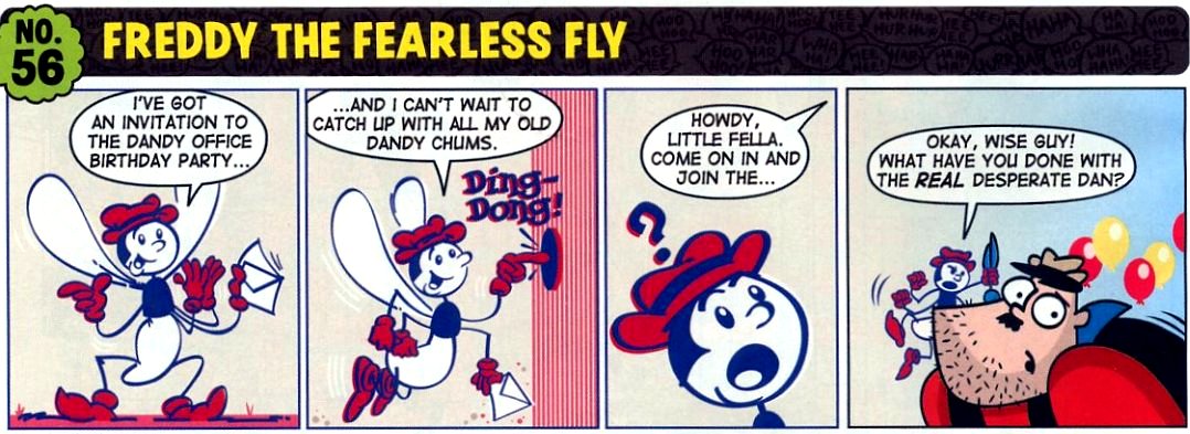
At the risk of being accused of 'pursuing a vendetta', the pages of some current artists are revealed as feeble forgeries when compared against those of the 'Masters' they appear with.  When you measure the likes of MY DAD'S A DOOFUS against BING BANG BENNY, by KEN REID, then the modern impostors are revealed in all their impotence.  At least the 'real' DESPERATE DAN returns for the last issue.  (The KEN H. HARRISON drawing on the back should've been on the front, but 'classic' Dan has been added to the cover to reassure us.)

This edition also carries a pull-out facsimile of the first issue of The Dandy, but, like the one featured in the 75th Anniversary Special, it contains only 24 pages of the original 28.  Being incomplete, we could be forgiven for wondering whether it actually meets the description, but it's still nice to have all the same.

And so the curtain comes down on a chapter of history.  I won't be following the comic's digital incarnation, as it's now morphed into something else entirely, something in which I have no interest at all.  For me, the thrill of holding an 'actual' comic in one's hands is an experience that can't be matched, never mind beaten, so nothing remains but for me to slip quietly away from the party and leave the 'youngsters' to it.


Something that annoys me about the facsimile Dandy #1 is that the lettering of the number and date on the masthead has had an outline added to make it more discernible.  Here, from an earlier presentation, is the cover before it was tampered with.

Monday, 3 December 2012

The 'SECOND' SPECTRE...


Images copyright relevant and respective owners

The SPECTRE, as you're surely all aware, was created by JERRY SIEGEL and BERNARD BAILEY in 1940 for MORE FUN COMICS #52.  (Fun?  The adventures of a dead guy?  Yeah, I can't stop laughing.)  Tough policeman JIM CORRIGAN is murdered by some hoodlums, but his spirit wreaks vengeance on his killers in a grisly, supernatural fashion.  An entity known as 'The Voice' (whom the reader presumes to be GOD, though is never specifically identified as such) then charges him with the task of eliminating all evil on Earth.  That's basically all you need to know about him, if you didn't know it already.
 

However, did you know there was another Spectre, a British one, who appeared in a comic called SMASH! back in the 1960s?  If you're American, the chances are you didn't.  JIM JORDAN was a newspaper reporter for the DAILY GLOBE, who had apparently been killed whilst in pursuit of a story.  However, he survived, and, operating from a secret hideout under his memorial statue in an old cemetery (similar to WILL EISNER's The SPIRIT), he fought crime using a variety of gadgets and a bulletproof vest which helped foster the illusion that "At Night Stalks... The Spectre!"


The strip started in Smash! #144 and lasted for nineteen weekly issues, ending in #162 when the comic jettisoned its MARVEL reprints (in 1969) and was relaunched as a more 'traditional' periodical for boys in much the same mould as VALIANT, a comic which had been on the go since 1962.

******

(Something I've never understood is why Americans usually spell the word as 'specter', but, in the case of the DC COMICS character, use the British spelling.  Can anyone enlighten me?)

FINE BY THE FIRESIDE...


Calendar illustration for January

And now it's time for a deeply depressing descent into the depths of the doldrums, as I regale you all with yet another anaemic anecdote that's sure to arouse your apathy (if that's not a contradiction in terms) and have you reaching for the Diazepam to dampen your despair at my rambling reminiscences.  (Don't you just love loads of awesome alliteration?  I know I do.)

On my wall hangs a 1985 calendar, which I purchased from a bookshop in Portsmouth back in the month of January or February of that very year.  It's a The Wind In The Willows calendar, featuring the iconic illustrations of Ernest H. Shepard, and for a month or three, it hung above the tiled fireplace of the bedsit room in which I was based at the time, travelling up to London twice a week whilst freelancing for IPC.

The calendar in March 1985

That tiled fireplace was a relic of another era, conjuring up images of the '50s or '60s when such a feature was commonplace in most houses in Britain.  I could just imagine families huddled around the roaring flames, trying to heat their cold bones on dark wintry nights, whilst listening to the radio and supping cups of Bovril or Horlicks.  (Yucchh!)  Not so in my case however; the fireplace was empty, and a sheet of hardboard covered the recess where the grate should've been.

That year ('85), it snowed in Portsmouth.  Nothing more than a light fall covering the streets for two or three days, before turning to slush and then disappearing, but you'd have thought it was a calamity of immense proportions.  "The worst snow we've had since 1963!" was the common cry of complaint from the locals.  I imagined the date to be a rough 'guesstimate', chosen merely because it was the closest approximation anyone could remember.  Imagine my surprise then, when, 20-odd years later, I heard a radio weather forecaster confirm the year of 1963 as indeed one of the worst on record for that particular part of the country - and the rest of Great Britain too, as it happens.  (And what's more, I actually remember it.)

A scan of the calendar today

All I can say is that we Scots must be a hardy lot, as such a light snowfall for so short a period wouldn't have been a big deal to us.  If anything, we'd have been disappointed that it hadn't been heavier and longer-lasting.  However, let's not mock the English for being wimps - they can't help it.  (He said, in a deeply caring, affectionate and non-xenophobic way.)

Anyway, what has all this to do with anything?  Just this: As I type these words, it's snowing outside, and glancing at that calendar reminds me of when it hung on the wall of a bedsit in Fratton on a similar kind of evening nearly 30 years ago.  The fireplace gave forth no heat back then, but recalling that room today, with the self-same calendar hanging on my present wall, the embers of memory cast a warm glow that envelops me in its radiant embrace. 

Sunday, 2 December 2012

WINTER WONDERLAND THROUGH A WINDOW - ALL THIS, AND GOOD FOOD TOO...


On my way into Glasgow on the train this afternoon, I was struck by the twinkle and sparkle of the hedgerows and trees in the wintry countryside beyond the carriage window.  Arrayed in their finest frosty apparel, there was something enchanted and magical about the scene, and I wouldn't have been in the least bit surprised had I caught sight of a Unicorn peering out from under the shimmering, diamond-bedecked canopy of the woods.  And no, I'm not on drugs.

After visiting a few shops, I took a slow stroll along to Glasgow's WEST END, and in particular, the famous ASHTON LANE.  One of my favourite Italian restaurants relocated a few months back, and I hadn't yet had the chance to sample the culinary delights on offer in the new establishment which now occupies the very same upstairs premises.

I'm happy to report that the food was most satisfying and the service warm and friendly, and I exited a few trivial pounds lighter (and some different kind of pounds heavier) than I went in.  All in all, a thoroughly enjoyable evening and I'm sure to return at the earliest opportunity.  Situated above the VODKA WODKA bar, the name of this delightful ristorante is UNA-STORIA, and I heartily recommend it to discerning diners who haven't yet given it a try.

Small and intimate, it's the ideal place to take your wife or girlfriend for CHRISTMAS.  Unfortunately, my girlfriend couldn't make it (my footpump's broken), so I took the one I love most in all the world - ME!  Give it a try - you won't be disappointed.

******

Update, January 2018: Unfortunately, Una-Storia is likewise now gone, replaced by a chicken-themed eatery called, I think, CHICKEN SHACK (or something like that).  Haven't had a chance to try it yet.

Friday, 30 November 2012

The UNCANNY TALE Of BRIAN'S BRAIN...


Copyright REBELLION

Near the end of January 1966, the first issue of a new comic went on sale in British newsagents - SMASH!  Cover-dated February 5th, it featured a mix of traditional humour and adventure strips, and was a sister publication to WHAM!, published by ODHAMS PRESS.  In April of that year, POW! was launched, but out of the three of them, Smash! was the longest-lasting, managing a relatively impressive five years.

One of the best-remembered strips was BRIAN'S BRAIN, featuring the adventures of  BRIAN KINGSLEY, a schoolboy who owned an electronic brain shaped like a skull, which he carried around in a box.  Bizarre indeed, but it proved popular with the readers at the time.  Just to give all you Criv-ites a taste of what you may've missed, here, for your eyes only, are the first two instalments of Brian's Brain.