Saturday, 3 November 2012

FIREWORKS FUN With FRANKIE STEIN (And The TIDDLERS)...

Copyright relevant owner

As a little taster for upcoming GUY FAWKES' NIGHT (seeing as how people are already exploding fireworks all over the place), here's a suitably themed story featuring THE TIDDLERS from WHAM!, cover-dated November 5th, 1966.  I'll be posting some more stories pertaining to the occasion over the next couple of days, so stay tuned.


While I'm here, you may as well have the FRANKIE STEIN story from the same issue.  (No point in prolonging your suspense.)Don't you just love that fantastic KEN REID art?


Remember, to enlarge, click on image, then click again for optimum size.  See you soon, chums!  

Friday, 2 November 2012

'THEY DON'T QUITE GET IT' DEPT...


"Do people laugh at your pathetic drawings?"  If the answer to that is "yes", then you already draw The Dandy Way.  With the comic destined to cease publication in little over a month, I think the editors still haven't quite grasped precisely where they went wrong.  They should have remembered the old adage: "You can't give what you don't have".  I picked up a copy of the latest issue today and, with a few honourable exceptions, the standard of artwork in far too many strips is distinctly amateurish.

So, do you want to learn how to draw 'The Dandy way'?  Seems the way to do that is to draw as badly as you can, but I'd aim higher if I were you - it should pay off in the long run.

Thursday, 1 November 2012

SKYFALL - HAS THE SKY FINALLY FALLEN IN ON BOND?


"The best BOND yet!" claim some reviews of 007's latest blockbuster biggie.  Is it?  Er, to be honest - no, it isn't - not by a long chalk.  It is entertaining however, and well worth seeing, but the plot is rather flimsy and Bond comes across as somewhat inept, failing to prevent the deaths of two people who were relying on him for protection.


The movie revolves around a simple tale of revenge; one man's mission to exact retribution upon the person he believes abandoned him to a fate he somehow miraculously survived.  In that sense, the premise is hardly epic in scale, but Bond plots have never been anything more than a convenient peg on which to hang some spectacular scenes, and in that respect the movie does not completely disappoint.  The views of Shanghai are simply stunning and almost worth the price of admission alone.


The pace does drag in spots though, and the finale on the Scottish moors seems glaringly out of place.  When the source of the movie's title is finally revealed, the viewer's reaction can be nothing more than an incredulous "Is that it?"  Also, Bond's plan to use a certain VIP as bait to lure the villain into his clutches is simply ridiculous.  By isolating the person from adequate security and relying only on himself to deal with the team of killers he'd expected to pursue them, his judgement is seriously open to question.  As such, the conclusion is inevitable, and 007 deserves to be forcibly retired for his sheer inadequacy in the art of strategic planning.


DANIEL CRAIG is fine when it comes to portraying Bond as a nigh-unstoppable juggernaut of destruction - his 007 can certainly handle himself in a fight.  When SEAN CONNERY made his debut in DR NO back in 1962, some critics dismissed him as nothing more than "a thug in a dinner-suit".  Craig fits this description even more than Connery did, but where he is less adept is in capturing the qualities of elegance and sophistication that Bond is also supposed to possess.  In that sense, his Bond comes across as a much more one-dimensional character than any of the previous actors before him.


However, the movie's main defects spring from the 'reboot' in CASINO ROYALE - a totally pointless exercise which resulted in more problems than it could ever hope to resolve.  (Whatever they were supposed to be - does anyone know?)  The biggest mistake with the movie was in not replacing JUDI DENCH at the same time Craig assumed the role of Bond.  Had that been done, the various paradoxes which now abound simply wouldn't exist.  Dench's M was firmly rooted in the previous continuity of PEIRCE BROSNAN's quartet of movies, even referring to her "predecessor" in one of them.  The 'new' direction now means that she couldn't have been M when 007 was a more seasoned assassin than he now is.


Another mistake was placing Bond at the point in time he'd just joined the double-0 section.  If that aspect was absent, it would make no noticeable difference to the movie as a whole.  All the producers had to do was introduce new actors in the roles of Bond, M, Q & Moneypenny at the same time. As it is, Skyfall's nod to previous Bond continuity in regard to the ASTON MARTIN is perplexing.  Clearly Bond is referencing GOLDFINGER, but didn't he just win the DB5 (with Jamaican number plates) in a card game in Casino Royale?  It just makes no sense, and results in the same state of confusion that DC COMICS perpetually inflicts upon their readers whenever they revise the origins of their heroes every few years.


It's interesting to note that, had CUBBY BROCCOLI still been alive, Craig would never have been given the role.  Cubby had a thing about an actor embodying the physical aspects of the hero; Bond had to be over six foot (though in the books he's only six foot) and Craig is around five-ten.  Apparently, LEWIS COLLINS was passed over for the part in the 1980s because he didn't 'measure up' in the height department, so it seems Barbara Broccoli has abandoned her late father's standards in regard to casting.  Cubby even lamented Connery's baldness, saying: "It's a shame Sean lost his hair", but that at least was something the make-up department could remedy.

So - Skyfall - hit or miss?  Well, hit, but far from being the definitive Bond it's touted as.  One can only hope that, with the introductions now out of the way, when 007 returns in his next cinematic outing, it will be the ruthless, witty, elegant and sophisticated Bond we've come to expect from the older movies; not the morose, surly, and - it has to be said - totally incompetent (but lucky) rookie we've seen in the last three.


Agree or disagree?  You have a licence to comment - use it.

Wednesday, 31 October 2012

BIG BAD BORIS SAYS "BOO!"


Whoooooooo!!  It's HALLOWE'EN tonight, and happy memories spring to mind of when I was still young enough to go out 'on the scrounge' every October 31st.  As well as the usual assortment of  apples, monkey nuts, oranges and stuff to look forward to, there was also a tidy pile of cash to be reaped from grown-ups who couldn't be bothered to get fruit in for the 'guisers' who came to their door.  We'd give them a verse or a song, and a shilling (or two) would be quickly pressed into our grasping little hands before the door was hastily shut so they could get back to watching CORONATION STREET on the telly.

We Brits were far more innocent in our approach to All Hallows' Eve than our Stateside counterparts.  Essentially, we were begging - but at least we also offered a few moments of entertainment in return for the treats and cash pressed upon us.  In America, it was nothing less than extortion, pure and simple.  "Trick or treat!", these masked, tiny-terrorists would proclaim, threatening to inflict some form of mischievous retribution upon any poor householders who didn't meet their demands.  Well, I don't know about you, but I know which version of the age-old tradition I prefer.

I couldn't quite think of a suitable picture to accompany this post, so in the end I decided to feature film-fandom's favourite frightmeister, BORIS KARLOFF!  However, just to be different, here he is not as the Monster or the Mummy, but as simply - himself. 

Happy Hallowe'en!

VALIANT - The FIRST ISSUE...


Copyright REBELLION

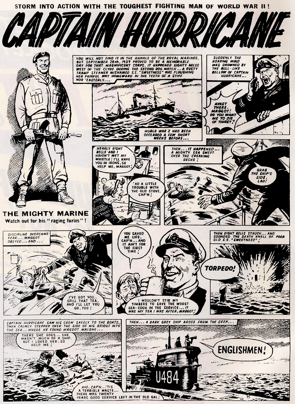
VALIANT #1, cover-dated October 6th, 1962, was an anthology title published by FLEETWAY PUBLICATIONS which managed an impressive 14 year run before being merged into BATTLE PICTURE WEEKLY in 1976.  In its time, it had consumed quite a few comics itself, including KNOCKOUT, SMASH!, TV21, and LION.

Some of the famous strips featured in its weekly pages over the years were CAPTAIN HURRICANE, The STEEL CLAW, KELLY'S EYE, MYTEK The MIGHTY, The HOUSE Of DOLMANN, The CROWS, The NUTTS, and BILLY BUNTER.

Here, for your reading pleasure, are just a few of the strips from the very first issue.  Keep your eyes peeled for the final issue, coming up in a future post.


Tuesday, 30 October 2012

THE FIRST JUDGE DREDD...


Images copyright REBELLION PUBLISHING

As a pre-Hallowe'en treat, here's the first published (but not the first produced) episode of JUDGE DREDD from 2000 A.D. #2 in 1977.  (JD had appeared in number 1, but only in an ad for the next issue.)  Note how Dredd was somewhat scrawny (if not downright puny) in this early version, and not quite as imposing as he would later become.  Makes me wonder if the citizens of MEGA-CITY ONE made comments to themselves about cops looking younger and younger.  This story was written by PETE HARRIS & PAT MILLS (who extensively rewrote Harris's original submission) and drawn by MIKE McMAHON.  Dredd was created by JOHN WAGNER and CARLOS EZQUERRA (who designed the look of the character), with input from Mills as to how the strip should be developed.

Anyway, enjoy ol' Dreddy's first appearance - 'cos he is the law!


Monday, 29 October 2012

PART TWO OF THE THING FROM THE SWAMP...


Images copyright DC COMICS

PSSSTT!!  Wanna see some pretty pictures?  Then you're in luck, 'cos here are six li'l beauties to feast your peepers on.  This was the second series to feature ol' SWAMPY, published way back in the early '80s when BRUCE FORSYTH was merely old, but not yet ancient.  (Word is, Brucie was on board the Ark, but when asked whether this was true or not, family friend and spokesman, NOAH JUNIOR, refused to comment.) 

Anyway, enjoy these half-dozen dazzling drawings by TOM YEATES, which evoke the spirit of BERNIE WRIGHTSON without being a slavish imitation of his style. And feel free to express your opinion on these covers in the comments section, if you so wish.


Sunday, 28 October 2012

GREAT COVER - SHAME ABOUT THE INSIDES...


Copyright MARVEL COMICS

When Marvel 'officially' established itself in the U.K. with The MIGHTY WORLD Of MARVEL in 1972, they had a good-looking product on their hands that readers responded to.  40 pages, 6 of them in full-colour, the remainder in spot-colour and/or Zipatone (as it was called in America, Letratone in Britain) - and all for only 5 pence.  With issue #5, the full-colour pages increased to 8 per issue, which lasted until #19, with only 4 in #20 from then on.


Over the course of the first year, the spot-colour decreased as the use of Zipatone became more prevalent, until, eventually, the interiors of Marvel's U.K. weeklies became distinctly grey.  Issue #42 was the last one to feature green spot-hues, and when the comic was awarded a glossy cover with number 67, the contents became little more than a muddy mess.  This wasn't confined to just MWOM, but was also a blight on SPIDER-MAN COMICS WEEKLY and The AVENGERS.  (Although, truth to tell, as the first British weekly Marvel comic to sport a glossy cover from issue #1, The Avengers had always been cursed with that affliction.)


SMCW, launched in February '73, only ever had 4 full-colour pages, the remainder featuring red and orange spot-colour - and Zipatone - until issue #23, which was the very last one to feature the crimson and amber hues.  With number 24, the comic became all-grey (apart from the full-colour matte paper covers), but although the tones were a bit overwhelming, the art, for the most part, was still discernible.  However, with issue #48, everything changed - and all for the worse. The comic was also given a glossy cover and, overnight, became one monumental murky morass of dark grey and pitch-black blotches.  This deplorable situation lasted for months, and I'm amazed it was allowed to continue for as long as it did.


Theoretically, it shouldn't have been a problem.  After all, as far as I can ascertain, the tones were applied to the pages by the same team responsible for Marvel's black and white U.S. magazines - and they turned out fine.  It seems obvious, therefore, that the problem was a direct result of the cheap printing process utilised by the British printers responsible for producing Marvel's U.K. weekly output.  For far too long a period, British Marvels were an unattractive and unappealing alternative to the much more popular, cleanly printed (by comparison) IPC and D.C. THOMSON periodicals with which they had to share newsagents' shelves.  It was surely only the unswerving loyalty of devoted Marvel fans that enabled 'The House of Ideas' to turn any kind of profit.  (Here's an idea - get your printing sorted out, you thickos!)


Perhaps you think I exaggerate?  Take a look at the pages illustrating this post (especially the second Spider-Man one) and you'll see how bad it really was.  In fact, it wasn't just the tones that were awful - so was the reproduction.  Look at the Spidey splash-page - his webbing is practically invisible.  Thankfully, things eventually improved.

******

BEST LAID PLANS DEPT: When I first posted this, I thought I was being original. However, I've just been browsing on STEVE DOES COMICS blog and noticed that ol' Stevie-boy had already touched on this subject (and this very comic) some time ago.  What's more, I'd even left a comment on it, yet I had absolutely no recollection of previously reading Steve's post when I came to write my own.  Spooky, eh?  Has such a thing ever happened to you?  

YIPPEEE! PART FIVE Of The MISSING LINK...


Copyright REBELLION

When I was a much younger kid than I am now, people (usually teachers) often told me that I had a 'great' imagination.  Thing is, it wasn't intended as a compliment, and carried with it the strong suggestion that I was tethered to reality by only the most gossamer and fastly-fraying thread.  Huh!  What do teachers know?  (I should've called down my alien allies from the planet XRILLFON to sort them out, but they were busy.)

It seems to me, looking at the opening panel of the above artwork, that GEORGE LAZENBY as JAMES BOND is looking out at us from the left-hand side of the page.  And isn't that the Saintly ROGER MOORE as SIMON TEMPLAR assisting a woman out of the car on the right?  Or am I just imagining it?  What's that?  You don't think it's meant to be them?  All I can say then, is that it's a much more interesting place in my world than it seems to be in yours.

And here's me being generous to you by presenting the next episode of The MISSING LINK, as drawn by LUIS BERMEJO, for your reading pleasure.  It wouldn't have hurt you to agree with me, now, would it?   Pah!  (Don't panic - it's only mock-indignation for comic effect.  You're allowed to disagree with me if you want to.)


Interestingly, I remember sitting in the 2000 A.D. offices one day in the mid-'80s and looking through the ODHAMS PRESS bound file copies of the first 50 issues of FANTASTIC (whence comes the saga of The Missing Link).  When my eyes fell upon the pages, above, I made the same observation about the first panel to ol' THARGY's team of droids.  (I also speculated on whether Bermejo used publicity photos from Bond movie ON HER MAJESTY'S SECRET SERVICE, as I felt that the girl in the pic faintly resembled DIANNA RIGG.)

Let me see now, that would have included STEVE MacMANUS, SIMON GELLER, ROBIN SMITH and art assistant PAUL AILEY.  (Paul had worked on the old POWER COMICS, which is why he had these two red-bound volumes in the bookshelf behind his desk.)  If I remember correctly, Robin Smith agreed that there was a similarity and also thought it possible that the artist had used photographic reference.

What do the rest of you think?  

Saturday, 27 October 2012

IS HE MAN OR MONSTER? OR... IS HE BOTH? (HE'S BOTH, ACTUALLY!)

Copyright MARVEL COMICS

Continuing our occasional series of DEAN WHITE's painted extravaganzas for the softcover editions of MARVEL MASTERWORKS, here's Dean's version of JACK KIRBY's illustration for The INCREDIBLE HULK #1. I happen to think that Dean's renditions of these classic covers are pretty durn hot, but, surprisingly there hasn't been much (if any, in fact) comment, either for or against them, on the previous entries in the series.  Don't be shy - let everyone know what you think of these powerhouse paintings NOW! 

Friday, 26 October 2012

MASKS AND MEMORIES - TO BOLDLY GO...


Copyright relevant owner

Memory is a funny thing, don't you think?  I don't mean 'funny ha-ha', but 'funny peculiar'.  I consider myself to have a fairly good memory (in the main), but am sometimes astounded when reminded of things I hadn't even realized I'd seemingly forgotten.  For example, take a look at the above ad for these half-dozen STAR TREK masks.  Had I merely been asked if I remembered them on the back of KELLOGG'S CORN FLAKES boxes back in 1971, I'd probably have thought they sounded familiar, but not been 100% sure whether I actually (if vaguely) remembered them or only imagined I did.

However, when I recently laid eyes on this ad on the back of one of my VALIANT & SMASH! comics, I recalled them instantly.  I definitely had the MR. SPOCK one, and maybe even one or two others.  Thing is, I hadn't thought about them in forty-one years and would probably never have done so if not for seeing the ad again.  Isn't it strange how it sometimes requires a visual reminder of something for us to realize we'd 'forgotten' it?

Who knows what memories lurk in the minds of men?  (H'mm, that's a good line - someone should have used it for something.)

Thursday, 25 October 2012

SHRIEK! PART FOUR Of The MIGHTY MISSING LINK...

Copyright REBELLION

Here we go again, as Britain's answer to The HULK goes on the rampage in the very heart of swinging '60s London.  Marvel at the mountainous might of the livid LINK as he shows his magnificent mastery of the English language; gasp in gigantic gratitude as he demonstrates just how tight trousers should be worn; stand still and be startled by his animal magnetism and his uncanny ability to make women swoon; dribble in disbelief at the amount of total tripe I can write in a single paragraph.  Whatever you do though, don't forget to notice the amazing artwork of LUIS BERMEJO - it really is something to shout about!