Thursday, 9 February 2017

BABE Of The DAY - JERI RYAN...


Seeing JERI RYAN for the
first time, I ambled up and asked
"Is it too early in our relationship to
consider marriage?"  I didn't quite
catch her two-word reply, but I think
the second one was "off".  I knew
  she was impressed though.

RECOMMENDED READING: THE AVENGERS - VINTAGE STORIES FROM DIANA COMIC...


Copyright relevant owner

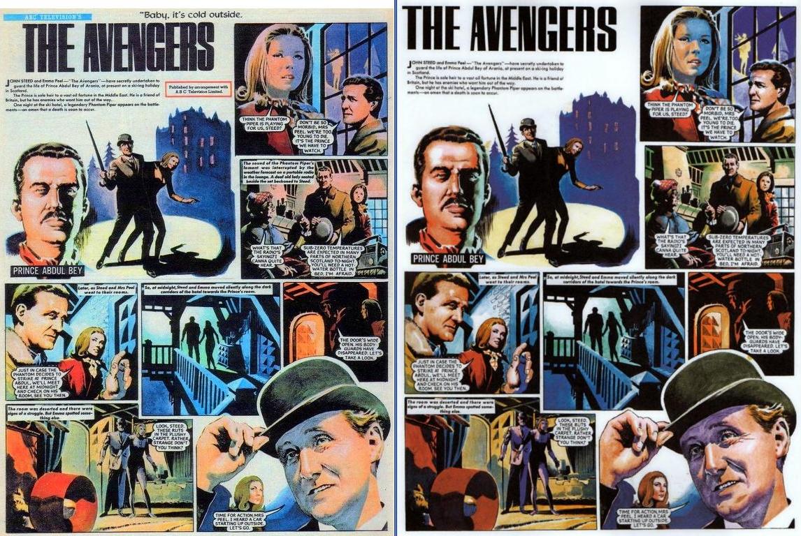
I must admit to having mixed feelings about BIG FINISH's collection of The AVENGERS strips from DCT's DIANA comic weekly for girls published in the 1960s.  While the art is terrific and more than deserving of a wider audience, the finished result could have done with more care before being released to the panting public.

First of all, the pages would greatly benefit from being printed in a larger size, so that the art by EMILIO FREJO and JUAN GONZALEZ could be appreciated at its very best.  Secondly, the book claims that the pages have been 'restored', but there are speech balloons and captions missing from a few panels.  This means that the pages were sourced from the original art, but surely the printed comics could have been used to supply replacements for the missing lettering?

(Interestingly, some of the lettering on some of the later pages looks as if it's been redone, as the balloon and caption shapes don't match the originals.)

Thirdly, the text material at the back of the book suffers from insufficient spaces between many of the sentences, and the word 'hear' is rendered as 'here' in one instance.  So while it's great to see these beautifully illustrated stories, the book has a certain slapdash air about it which prevents it being the polished publication it could and should have been.

Maybe Big Finish will do a second edition one day and do these iconic pages justice.  We can only hope so.  Still, it's worth having just to view some terrific artwork from the swinging '60s.


Below, the original printed page, next to Big Finish's version.  Can you spot the mistakes?


Above, one missing caption and three missing speech balloons on the very first page.  Talk about careless? For a better comparison, click to enlarge.


Can you spot the missing caption on the above page?  Below, a cover of Diana from 1967.

Wednesday, 8 February 2017

BABE Of The DAY - ABIGAIL RATCHFORD...


It's February, so why's it so warm
around here?  Must  be 'cos ABIGAIL
 RATCHFORD is such hot stuff.

Tuesday, 7 February 2017

RUEFUL REPOST: MEDITATIONS On BEGINNINGS & ENDINGS...


It may come as no surprise to any of you, but from a very early age I was much given to looking back on the past.  My remembered past, obviously, as I wasn't interested in or capable of reminiscing about events which pre-dated either myself or my ability to recall them.  When, aged five, I moved from one house to another just a few short minutes away, I made it a point to return to my previous street on a regular basis so I could re-experience the nearby woods in which I'd once played and again take in the expansive view from the top of the hill.

Over the years (and houses and neighbourhoods), I always found it comforting to return to the places of my youth and reconnect with them from time to time, and for almost the first three decades of my life, most of these hallowed haunts remained essentially unchanged.  Each time, the experience was akin to the hushed awe and reverential atmosphere so exquisitely described in The PIPER At The GATES Of DAWN chapter in Scottish-born author KENNETH GRAHAME's beautiful book, The WIND In The WILLOWS, first published in 1908.

It was almost like returning to the dawn of creation, when everything must have seemed magical and mystical, and from which every living thing derives its strength and power.  Revisiting the environs of my early childhood recharged and revitalised me in some way, but it also somehow made events from even only a few years before seem like a far-distant era - at the exact same time as making them, paradoxically, closer than a lover's kiss.  I suppose, to a seven year old, three years is more than half one's remembered life, and perhaps half one's life seems just as long or as short at any age.  Does that make any sense?
   
Then things started to change.  First it was lampposts being supplanted by newer, thinner models, placed on the inside of the pavements instead of at the kerbs.  Then it was the paving stones, replaced with tarmacadam, dark and dismal in the gloom of the night.  Next, it was building on fields and green areas, and the removal of swing-parks, resulting in open, spacious, well-planned neighbourhoods being transformed into crowded, claustrophobic, concrete ghettoes.

Earlier this evening I decided to retrace a certain route to my first primary school.  Sometimes, as children, we'd take a detour into a swing-park and then through some woods which led to the school.  The swing-park is an empty space and the trees were cut down some years ago, the fallen giants now littering the overgrown trail they once used to shade.  On previous occasions over the years, visiting the area was like a pleasant journey into yesterday and a salve to my soul.  That these places could always be relied upon for the same simple welcome seemed like one of life's unchanging truths, but, alas, that is no longer the case.

I'd always thought, in my declining years, the locales of my boyhood would still exist and I'd be able to revisit them one last time, and find solace in the fact these spots would yet be around for future generations to enjoy similar experiences to my own.  I'm now only too well aware when my final bedtime comes, sadly, that won't be the case.  The only hope left to me is, should I awaken on 'the other side', I'll find all those familiar places waiting to greet me and welcome me home.

Night has fallen and the daylight seems a long way off.  Is that my name I faintly hear, carried on the whisper of the evening breeze? 

REVISED REPOST: HERE'S JOHNNY'S...


Once upon a time, in a mystical, faraway land called 'The Past', there existed a magical place of wonder called JOHNNY'S.  Nothing to do with anything you got in the barber's 'for the weekend', I assure you, but rather a shop in Gallowflat Street in Rutherglen, Scotland.


My grandparents (who I irreverently referred to as 'Grunt' and 'Grumpy' - shame on me) lived in Rutherglen in the early 1960s, and it was our well-established custom to visit them every Sunday.  We had to pass through Gallowflat Street en route to their house in Hamilton Road, and we invariably stopped outside Johnny's on the way.


Johnny's was a newsagents, confectioners, tobacconists - and, as well as other sundry items that such shops always stock, also sold toys.  Oh, what treasures teased, tempted and tortured both my brother and myself from within that toy and trinket-bedecked window display.  It was there (around 1963 or '64) that I first saw an AURORA PHANTOM Of The OPERA model kit, built and painted in all its blood-curdling, gruesome glory.


I well remember being fascinated by the desperate prisoner staring out pleadingly from behind the bars of a basement window on the model's base.  Deep lacerations in his arms had exposed the bones, and blazing red blood weeped from the wounds. What four year old boy wouldn't be captivated by such a gory and macabre sight?


A few years later (if memory serves - and why shouldn't it?  I pay it enough), Johnny's had moved to bigger premises a few doors along (The Hospice Shop, I think - in the 2nd photograph from the top), and it was there I obtained my second QUERCETTI FIREBALL XL5 parachute toy in 1968 or '69 (or even '70) for a mere 2/6d.  A bargain if ever there was one, because the one I got for Christmas back in 1962 or '63 cost 10/6d.  (Now it would cost far more.)


Ah, dear old Johnny's... now sadly long gone.  It must have been around the mid or late '70s it closed its doors for the final time, but I don't know for certain.  In 1964 or '65, my grandparents moved to the town in which we lived to be closer to us, and that late '60s visit to the shop was the last I can remember.  (Might've paid it a visit around 1971, but can't be sure.)


The featured photos were taken a good few years ago, when the original Johnny's premises were a flower shop (and may still be). The reason I took them was because 'Johnny's' name was still clearly visible under the painted green board above the new sign.  At least, in real life it was clear, it's a bit harder (but not impossible) to see it in the close-up photographs.


So, if you're around my age and are familiar with Rutherglen, you may well remember this legendary landmark.  Click on the pics to enlarge, click again for optimum size.  You should just be able to discern a hint of the name of that long-gone, much-missed shop from childhood, when, I wager, each of us used to think we had forever.

Here's to Johnny's... and to us.

Monday, 6 February 2017

BABE Of The DAY - ABIGAIL RATCHFORD...


ABIGAIL RATCHFORD dresses to
impress - me that is.  Red's my favourite
colour, so it's nice to know she cares.

LYCANTHROPIC LARRY TALBOT IS A BIT OF A HOWL... (Updated)


Thought all you Criv-ites might like a look at an AURORA WOLF MAN kit I built and painted for someone.  It took me many months, as I can only apply myself to things for very short periods at a time before becoming fatigued (due to a medical condition), but I think the eventual results were worth waiting for.  What say the rest of you?


Saturday, 4 February 2017

BABE Of The DAY - JERI RYAN...


It's JERI RYAN - aka
Seven of Nine.  In that case,
it's six of one, half a dozen of
 the other, I suppose.

RAMBLING REPOST: RICH BEYOND THE DREAMS OF AVARICE...

Copyright REBELLION

Back in the 20th century - 1973 to be exact - an envelope addressed to myself popped through the letterbox one morning.  Being only 14 or so, receiving personal mail wasn't a regular occurrence for me, so naturally enough I wondered what it was.  I soon found out - a postal order for £1, along with a cover-note telling me that my "Creepy Creation" would be featured in the very next issue of SHIVER & SHAKE.

When the day arrived, I rushed out and bought a copy.  Nevertheless, thrilled as I was about my moment of fame (to say nothing of my untold wealth), I was surprised to see that it seemed to be my actual drawing that had been printed - albeit with a super-duper, touch-up inking job by the mighty KEN REID.  I'd hoped that my original drawing would be good enough to be published as is, but I was resigned to the likelihood that it would be completely redrawn by Mr. Reid himself.

But no - all the glaring imperfections of my original art were still all-too obvious - surely Ken would've fixed them if he'd completely redrawn my submission from scratch?  Honest - that really appears to be my basic drawing under the super-slick inking style of the artist of FRANKIE STEIN and FACEACHE and loads of other characters.  The wings are a bit more ornate than I would've rendered them, but what you're looking at is a genuine Robson/Reid collaboration.

Ken wasn't the only one to recognize quality when he saw it, though.  (Relax - my tongue is half in my cheek.)  A few years later, someone traced my character and submitted it to a competition in one of MARVEL's U.K. weeklies -  and was one of a 100 runners-up.  To add insult to injury, I'd also entered the competition and was amongst the top ten of those 100 runners-up, but my prize of a Treasury Edition must have been lost in the Twilight Zone because I never received it.

So feast your eyes - the only Kid Robson/Ken Reid drawing in existence.  (I suppose his name really should come first - but it's my blog.  And he got paid far more than a £1 for his share of the work.)

Friday, 3 February 2017

BABE Of The DAY - ABIGAIL RATCHFORD...


Yeah, ABIGAIL's popped up a few times
recently, but what can I say?  She's such a cutie,
 I just can't help myself.  You complaining?

KLASSIC (KIRBY) KOMIC KOVERS: FANTASTIC FOUR #51...

Copyright MARVEL COMICS

Well, we've just seen the splash page of FF #51, so I thought I may as well show you the cover.  I think the top of The THING's legs are a little too wide for the top half of his body, but I don't really care, as I'm much too busy ogling The INVISIBLE GIRL.  (Who, thankfully, is quite visible in this picture.  SUSIE, I love you!)

SPECTACULAR SPLASH PAGES #21...


Images copyright MARVEL COMICS

Okay, so The THING is just standing there doing nothing, but it's still a pretty dramatic image, huh?  When JACK KIRBY returned to MARVEL in the mid-'70s, he drew The Thing as the 'cuddly teddy bear' that some other artists had turned him into in JK's absence, and which JOHN BYRNE reversed when he became the FF's regular writer & artist in the early '80s.  However, in the '60s, The Thing still looked like a... thing, and this splash page captures that perfectly.

Thursday, 2 February 2017

BABE Of The DAY - ABIGAIL RATCHFORD...


The sensationally stunning ABIGAIL
RATCHFORD was banging on my bedroom
door for ages last night.  Finally, I'd no choice
but to get up and let her out.  (Don't ask - I've
lost count of how many times I've used that
old joke too - still funny though.)

RECOMMENDED READING: The WIND In The WILLOWS...

Illustrations copyright IDW

Never read KENNETH GRAHAME's The WIND In The WILLOWS?  If it's something you've ever planned on doing, then now would be a good time to pick up this very handsome hardback edition from IDW PUBLISHING, illustrated by award-winning illustrator DAVID PETERSEN.  Go on, let some fresh air into your life and cross one more thing off your bucket list.  Available now (I presume) from all good book shops.

Incidentally, the artist has hand-signed 2,500 copies of the first edition, so  if that's not an incentive to buy one, then I don't know what is.  Better hurry.


Tuesday, 31 January 2017

(BOND) BABE Of The DAY - JULIE EGE...


JULIE EGE - that's all the info you
need.  Your pulsatin' peepers will tell you
everything else you need to know.

PETER CAPALDI TO LEAVE DOCTOR WHO...


Well, the news is in - PETER CAPALDI is leaving DOCTOR WHO at the end of 2017.  That's a shame, because I was hoping that, under new hands when current show-runner STEVEN MOFFAT departs, Capaldi's Doctor would be treated with the respect the character deserved, and not be portrayed as the prattling buffoon that poor writing and direction turned him into.  It didn't bode well for the show when Capaldi was shown in his first episode dressed like WEE WILLIE WINKIE.

Although there were occasional hints of a serious, perhaps even sinister side to Capaldi's Doctor, writer Moffat's insistence on presenting him as a comical character exterminated any sense of danger in the show.  To begin the 2016 Christmas episode with the Doctor dangling from a rooftop by his ankle, like something out of an old BUSTER KEATON short, demonstrates the Scottish show-runner's inability to grasp the essence of the character.  The Doctor is not a clown.

I feel sorry for Peter Capaldi.  Poor writing overshadowed his stint on the show, and he deserved much better.  He did the best with what he was given, but, with an occasional exception aside, he was given banal tripe, and not even the finest of actors can make a silk purse out of a sow's ear.  I'd been hoping Capaldi would stay on for at least one more series so that he'd have the chance to do the Doctor justice.  As it was, below-par writing too often meant that he depended on the viewers' mercy.

So good riddance to Moffat.  It's just a shame that we're also losing an actor who was more than capable of giving us the Doctor as he should be - but, alas, was never allowed to.

******

How do you think Peter's stint on the show will be remembered?  Invade the comments section now and share your thoughts with your fellow Criv-ites.

Monday, 30 January 2017

SPECTACULAR SPLASH PAGES #20...


Image copyright DC COMICS

C'mon now, admit it - this is an impressive splash page by BERNIE WRIGHTSON, and if you have any artistic aspirations at all, then you wish you could draw as good as this, don't you?  Of course, I'm well-known in the comics world as an absolutely brilliant artist who's easily the equal of all the comicbook greats rolled into one.  Unfortunately, it's the me from Earth Z, but, hey - that still counts in my opinion.

BABE Of The DAY - IMOGEN HASSALL...


IMOGEN HASSALL oozes raw sex
appeal in the same way that I do - easily
and generously.  That's why women faint
at my feet.  Either that, or it's 'cos I haven't
changed my socks for over a year.  (It's
 clearly the first option though.)

Sunday, 29 January 2017

COMIC COVERS 'SNAP'! PART TWENTY. IS THERE NO JUSTICE? Or: The AVENGER DROPS IN!


Characters copyright ADVANCE MAGAZINE PUBLISHERS Inc.

This is another of those 'can't remember if I've done it before posts', but we're talking pure quality here, so if I'm repeating myself, these covers are worth seeing again anyway.  40 years to the month after DC COMICS released their take on KENNETH ROBESON's JUSTICE INC., DYNAMITE ENTERTAINMENT published their version, with a great 'homage' by ALEX ROSS to JOE KUBERT's 1975 cover.  Bloody brilliant - both of them!  Agree?


If you'd like to see all four '70s DC covers, plus the unused cover art for the first ish, click here.

FAVOURITE COMICS Of The PAST PART FORTY-NINE - E.R.B.'s KORAK SON Of TARZAN #1...

Characters copyright The Estate of EDGAR RICE BURROUGHS

I remember it was raining.  I also remember buying this comic in a local R.S. McCOLL's before wandering into another shop, W.&R. HOLMES.  "Better get back to school" I eventually thought, having taken an extended lunch break and missed a couple of lessons.  I remember taking my seat in English class and then furtively browsing through KORAK #1, secure in the knowledge that I was out of the teacher's immediate sight just so long as she stayed seated at her desk.  I remained alert though, ready to put the mag back into my schoolbag at the first sign of 'teach' standing up and going for a wander 'round the classroom.

And, contents aside, that's all I remember about this comic from the early '70s - shops, school and schoolbag (which I still have), and the fact that it was raining when I purchased it and as I made my way back to school.  Hardly a riveting reminiscence by any means, but I find myself smiling at the memory of a vanished period of my youth whenever I gaze upon the cover and internal pages of one of my favourite comics of the past.  (Especially as the original school buildings were demolished in 2007/8 after a new one had been built nearby.)

"Good for you," you say, "but what's in this for us?"  Ah, for you, the pulsating pleasure of perusing some pleasant pictures, and maybe even recalling your own memories associated with this terrific treasure from yesteryear.  Perhaps it was raining then, too, or did the sun beat down relentlessly upon you?  Can you remember?  Then share it with the rest of us in the comments section.  It's what it was invented for.


SPIDER-MAN CLASSICS COVER GALLERY...


Images copyright MARVEL COMICS

Back in December 1980, MARVEL TALES #137 (cover-dated March '81) started reprinting the STAN LEE & STEVE DITKO SPIDER-MAN classics in sequential order from the very beginning.  Twelve years later, the same plates were used again for SPIDER-MAN CLASSICS (natch), but this time with brand-new covers.  The title lasted for only 16 issues, but benefitted from superior printing compared to the Marvel Tales reprints.

So guess what, you lucky Criv-ites?  We're now going to look at these new covers by some of the top talents in the industry, and  enjoy mentally comparing them to the ASM Ditko originals.


15 was also issued with a different coloured cover, along with a 16 page 'Work In Progress'
mag featuring the animated show, plus an animation cel, both of which can be seen below