Thursday, 13 September 2018

BABE Of The DAY - CLAUDIA CARDINALE (AGAIN)...


So there was I, waiting for CLAUDIA to get
up and make me my breakfast, and all she wanted
was a "roll in the sheets" she proclaimed.  "That's what
I want too," I answered, "but make mine with bacon on
it."  Huh, modern women, eh?  They just don't seem to
know how to keep a man happy.  I'm now thinking
about trading her in for a newer model.

Wednesday, 12 September 2018

BABE Of The DAY - CLAUDIA CARDINALE...


When you're blessed with such
manly-man machismo like myself, there
are very few places you can go to and not be
met by hot babes in skimpy underwear trying
to catch your eye.  You say it never happens
to you?  Then you must be ugly - so here's
a photo of CLAUDIA CARDINALE to
 hopefully cheer you up a little bit.

Tuesday, 11 September 2018

BABE Of The DAY - LYNDA CARTER...


LYNDA CARTER shows why
she's such a wonder woman.  Well, why
not?  After all, if you've got it, flaunt it!
(I've been fined twice for 'flaunting' it
in the last month, Crivvies.)

Monday, 10 September 2018

FABULOUS FANTASTIC FOUR FIRST ISSUE FACSIMILES DOWN THROUGH THE YEARS...


Images copyright MARVEL COMICS

The debut issue of The FANTASTIC FOUR has been reprinted quite a number of times since it was first published in 1961, in books like ORIGINS Of MARVEL COMICS, MARVEL MASTERWORKS, FANTASTIC FIRSTS, MARVEL FIRSTS, MARVEL OMNIBUS Editions, MARVEL EPIC Editions, FANTASTIC FOUR KING SIZE ANNUALS, plus various UK weekly and monthly comics - and that's only the ones I know about.  (No doubt there were foreign versions as well.)

However, forget full or partial reprints that were included in other publications -  the only ones I'm interested in for this post are single issue facsimiles, of which the earliest was the 1966 GOLDEN BOOK & RECORD Set that came with an LP containing a dramatization of the comic's contents.  That's it above, and as you can see, it sports what's known as the 'missing man' cover (though there are other differences), which is the cover as JACK KIRBY originally drew it before changes prior to publication.  (The cop has been added to make it look more like the 1961 issue.)  Some of the linework had dropped out in several interior panels, though were thankfully spared the clumsy retouching that later reprints suffered from.  (See examples at foot of post.)

Next one up (as far as I know) was the 1991 MARVEL MILESTONE Edition (below), which also featured the cover as originally drawn by Kirby.  The contents were marred by some dreadful 'retouching' of the missing line-work I referred to in the previous paragraph, but it included all the original ads from the 1961 mag, giving readers a taste of the context of the times.  It was recoloured and didn't match the 1961 original.

In 2001, Marvel released the top 25 of The 100 GREATEST MARVELS Of ALL TIME, number two being FF #1, having been robbed of the top spot by AMAZING FANTASY #15.  (I demanded a recount, but as usual, nobody listened to me.)  Once more, the 'missing man' cover was used, though the caption was replaced by a neater version. 

Then, in 2005, yet another reprint appeared, this time included in a package containing a TOY BIZ articulated figure of The THING as he appeared in the debut issue.  Again, this didn't follow the original colouring and even differed from the Milestone and 100 Greatest mags.  The only reprints that follow the original colouring of the contents are the 1966 Golden Book version and the recent deluxe facsimile edition, but even then, due to the vagaries of printing, they're not an exact match in every instance.

Anyway, enjoy looking at the covers and join me again after the 2018 issue and we'll compare a couple of examples of what I referred to earlier.      


Okay-dokey, look at the two examples of the same page below (click to enlarge).  The first one is from the 2018 facsimile and is how the page should be.  In the second version (from 2001, but also used - with different colouring - in 1991 and 2005), The INVISIBLE GIRL's outline has been clumsily retouched - obviously by someone who shouldn't have been allowed anywhere near it.  It looks as if it's been done with a felt-tip marker.


Now cop a gander at the panels below.  The first is as it appeared in the 1966 reprint which suffered from missing detail, the second is how it was presented in subsequent retouched versions in 1991, 2001, and 2005, and the third is from the recently published facsimile, which matches how it first appeared in 1961.  Click each one to enlarge for closer study. 


So there you go!  Hasn't that been interesting and informative?  Eh, what's that?  Whaddya mean no?  Hey, just remember, pal, you got in here for free, so there's absolutely no refunds if you're not satisfied.  (Tourists!) 

Thursday, 6 September 2018

(BOND) BABE Of The DAY - CAROLINE MUNRO...


Let's be honest - any words from me are
superfluous with photos like this.  Suffice to
say - CAROLINE MUNRO!

Wednesday, 5 September 2018

COLOUR OR BLACK AND WHITE...?


Images copyright their relevant owner

I published this post before a couple or so months back, but then removed it to accommodate a publisher who felt it detracted from a project he was then working on.  That project has now reached fruition, so I feel the question raised in the post is a valid one, hence me now offering it up again for your consideration.

******

Which of these versions of the same strip do you prefer, readers - the original colour strip or one of the two black and white (or grey-scale) offerings presented below?  I have to declare my preference in favour of the colour strip, but if I had to pick one of the non-colour offerings, I'd lean towards the first one as, in my view, it captures more of the 'essence' of the page than the somewhat washed out incarnation below it.  Tastes will vary of course, but the closer a reprint collection is to the original appearance of the contents, the better, as it captures more fully the visual impact the strips had on their initial printing.

Feel free to contribute to any discussion that may ensue. 


Note that the little fine-line visual effects around Davy's head in the last panel
are extremely faint, as a direct result of converting the page to 'black & white'

Tuesday, 4 September 2018

BABE Of The DAY - DURHAM RED...


"That's a mighty big weapon you've
got there," says me to DURHAM RED.
"That's just what I was gonna say to you,"
she replies.  "But I'm not carrying a gun," I
respond.  "Who said anything about a gun?"
she retorts, quick as a flash.  Oh, she sure
 is a witty gal, and no mistake.

Monday, 3 September 2018

The POWER PACK Of KEN REID - NOW IT CAN BE TOLD... (Updated)

An early cover rough from before Ken's son became involved.
At this stage, I was unaware which intro was for which volume,
hence NP's name instead of SH's
  

Received my 'free' slipcase edition of The POWER PACK Of KEN REID a while back, but I've sat on my thoughts about it until now.  Having actually contributed my services (unpaid) to the production of this two volume set, my 'free' copy perhaps doesn't fit that category, but let's not get bogged down in pedantic detail at this stage.  (That'll come later.)  So, how do I rate this collection of Ken Reid's entire output for WHAM!, SMASH!, and POW! (three of the five POWER COMICS), published by ODHAMS PRESS back in the '60s?

Overall it's quite impressive as reprint collections go, but, as is always the case in these matters, the devil is in the detail.  Does it perhaps qualify as the 'ultimate' collection of these particular strips?  Well, to be honest - no.  The reason why is because some of the QUEEN Of The SEAS and DARE-A-DAY DAVY strips were originally printed in colour, whereas this collection renders them in black and white.  Forget the rationalisation of the publisher for doing this (to present them more like the way Ken drew them) because it's nonsense.  It was done for reasons of expense and expediency, because it would've been too costly and taken too much time and trouble to tidy up scans of the colour pages in their original form for reproduction.

I don't know about you, but I prefer to re-experience stories from my childhood in the same way as I first encountered them; that way, the memories and associations are 'truer' and more accurate.  Readers who never saw the original colour stories won't miss them of course, and will appreciate the art for what it is, but to those who remember their first presentation, their recollections are compromised to a degree.  There's also the matter that when colour stories are presented in monotone, some linework is lost under a muddy mess.  There are instances in the book where some captions are virtually unreadable because the murky fog that was once a colour obscures them.
An even earlier cover rough with my version of the
already completed art

Another thing that bothers me about the books is that much of the grey wash that graced the FRANKIE STEIN and JASPER The GRASPER strips is practically 'washed out' due to the contrast being upped in an attempt to clean them up a tad, with only the merest hint of it remaining.  (There are a few exceptions where the wash is more evident, thank goodness.)  Then there are instances where type-set 'next issue' captions have been removed in some strips, but not in others.  Whatever happened to consistency?  Again, I want to see the stories as they were originally presented, not messed around with at the whim of the publisher.

Nope, I'm not finished yet.  Half-page adverts have been replaced with grey line illustrations, but the ones which bleed off the page are too overwhelming in my estimation.  There are a few where there's a margin left around them and they're confined to within the original dimensions of the replaced ad, and they're much more effective and less distracting.  In the previous paragraph I mentioned consistency, and while some of you may think I'm being too pernickety, I find it annoying that the space between the line 'The Power Pack Of Ken Reid' (at the bottom of each page) and the page number is often inconsistent from one page to the next.  In my view, this sort of thing marks the difference between a professional and an amateur publication, and despite all that is good about the two volumes, they still have one foot squarely set in the amateur camp.

So what did I do on the books, and why didn't I get a mention?  I hand-lettered the cover logo (Ken Reid's name in the jaggy blurb, deliberately reminiscent of the Wham! logo - my idea - without being an exact copy), hand-lettered the stylised 'signature' of Ken on the slipcase, proposed the name 'The Power Pack Of Ken Reid' (and produced the spine, utilising the comic logos from an ad in my own ish of FANTASTIC #1, and providing the Power Comics emblem), wrote the copy for the back of the books and slipcase, proofread, edited, amended and added to the introductions (though with NIGEL PARKINSON's, all that was required was highlighting some words in bold), and suggested the chosen fonts (and sizes) of the characters' names on the covers, which were at first a bit underwhelming in appearance, due to the publisher's readiness to accept whatever his designer came up with.  'Twas I who recommended that Nigel should be contacted and invited to provide an intro, and persuaded the publisher to ask Ken's son ANTONY to do likewise, thereby facilitating permission for use of the Reid archive.

A quick 'cut & paste' to illustrate what I wanted for the
placement of the characters' names and 'Introductions'
text.  Both publisher and designer seemed incapable of
grasping what I meant, and couldn't see the difference
'twixt this and what became the published version
 

I'm still not happy with the cover to volume one as, despite my earnest entreaties for symmetrical spacing on either side of the 'Vol. 1:  Frankie Stein and Jasper The Grasper' lines, it's still out of balance.  (As is the 'With Introductions by' text.)  I would've preferred to have hand-lettered Frankie's and Jasper's titles, but time was against me and it now takes me days to do things that once would've taken me only an hour or two.  (A combination of failing eyesight, ailing health, diminished stamina, and being long out of practice, alas.  That's why I'd never be able to pursue it as a career nowadays.)  Add to that having to look after an elderly and infirm relative, and it's a miracle I was able to do anything at all.

It got to the point where I became so disappointed and frustrated with the publisher's unwillingness (or inabilty) to aspire to the same standard I did, that I requested that he remove my name from the 'credits' and I stopped promoting it.  Although, given his failure to correct a mistake on the back cover of volume one (which I informed him of in plenty of time), I suspect my name was never in that 'thank you' list to begin with.  After all, if he couldn't be bothered to change 'strips' to 'scripts' (as I had originally written, the distinction being important), then I doubt he'd have gone to the bother of removing my name as that would've required action on his part.  As would replacing my first Ken Reid 'signature' with an improved version I supplied, and which I was assured would be implemented.  It wasn't (at least not in my copy - perhaps it was a 'tryout'), leading me to conclude that he simply told me whatever he thought necessary in order to fob me off, all the while content to take the easier route.  So why claim credit now you might be wondering?  Well, my annoyance has subsided somewhat and, overall, I'm quite pleased with my contributions so there's no reason to continue concealing my involvement.

There are other deficiencies, but the publisher at least deserves a pat on the back for initiating the project (though the ultimate pat should go to Ken Reid himself) - but the books could (and should) have been even better than they are.  Below are a few examples of just what I'm talking about.  Minor things perhaps, but it's this kind of attention to detail that separates the men from the boys.  However, don't let my observations deter you from buying these two volumes; despite these shortcomings, the plusses outweigh the minuses.  (Though it's a shame there are any minuses at all.)

The last panel originally had a caption, as you can see below...

As it was within the panel it should have been considered
part of the artwork and left where it was.  Why remove it?

Same again - though this time it's been done rather clumsily as
part of the letter 'M' still remains.  Now that's what I call sloppy

The caption draws the instalment neatly to a close and should've been
left where it is.  A trivial complaint?  Perhaps, but they all add up

This page has missing border lines on the sides of the first panels on
the first and second tiers, as well as on the last panel in the bottom
tier.  There's no excuse for this kind of sloppiness

The dividing line between the bottom tier and the deleted indicia has been removed,
but part of it is still evident on the left-hand side.  On other pages, the line remains.
Whatever happened to consistency?

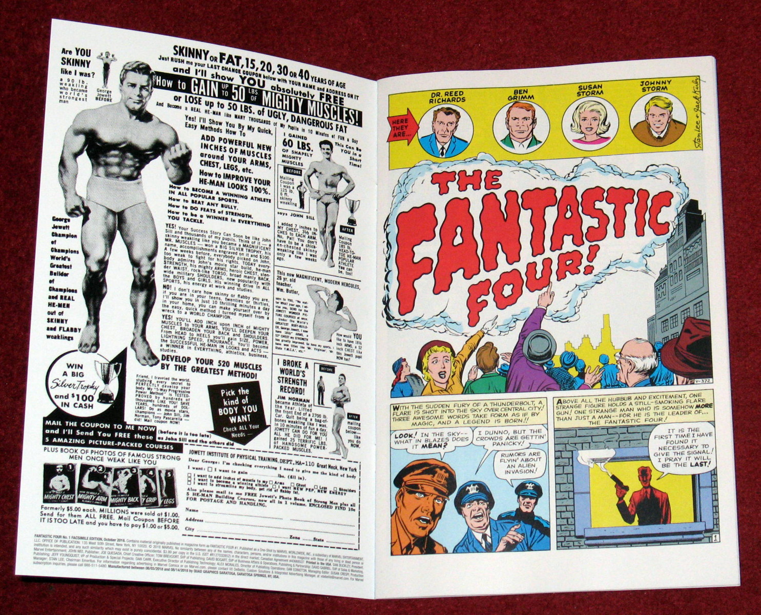
FANTASTIC FOUR #1 FACSIMILE EDITION... (Updated)

Images copyright MARVEL COMICS

If you've long-yearned to own an original issue of FANTASTIC FOUR #1, unless you win the Lottery, the closest you're ever likely to get is this amazing facsimile edition just released by MARVEL COMICS.  It even reproduces the original adverts in a stunning clarity that avoids the poor photocopied look of the earlier (1990s) MARVEL MILESTONE edition.  As well as the complete original issue, there's a bombastic bonus section in the back of the mag with lots of extra goodies.  This is a 'must have', and you should buy your copy now before the price escalates to ridiculous levels on the collectors circuit.

Incidentally, if you own any of the previous individual reprints of this issue published over the years, this one is sourced from superior proofs with no clumsy 'touch-ups' like its predecessors.  It really is the best single reprint of this cataclysmic classic produced to date.  (A planned TRUE BELIEVERS reprint of the issue was cancelled so as not to impact on the sales of this incarnation.)

But this wouldn't be a Crivens! review unless there's an element of criticism about it. STAN LEE's introduction from ORIGINS Of MARVEL COMICS is included, but where he refers to himself as 'yours truly', it's been rendered as 'you truly', thereby compromising the sense of the sentence.  The FF Omnibus also made this mistake, but I alerted them to it several years back so there's no excuse for repeating it here.

And, a minor thing perhaps, but I'd like to have seen the 'Continued After Next Page' line restored to the pages preceding the ads, just for the sake of authenticity.  Not too much to ask is it?  Having said that though, it really is 'The World's Greatest Comic Facsimile'!  Buy one while you can. 


Bonus:  As mentioned in the comments section, below are the three scans that Barry Pearl sent me, taken from his very own original issue of The Fantastic Four #1 which he bought back in 1961.


Saturday, 1 September 2018

GIGANTOR The SPACE-AGE ROBOT...


"Gigantor the space-age robot, he's at your command,
Gigantor the space-age robot, his power is in your hand..."

TETSUJIN 28-GO was his real name, but we Brit-kids never knew that back in the '60s.  The articulated (that means poseable, Melvin) toy pictured above is one that I acquired on the way back to my house after having my dog ZARA privately cremated in November of 1998.  I'd seen the robot and his human chum (JIMMY SPARKS) in a shop a week or two before, but I was undecided whether to buy them or not.  Now I was decided so I bought 'em!  Gigantor and Jimmy sat atop the box containing my dog's still-warm ashes all the way home; I scattered the ashes in my back garden in 2002 (no, it didn't take that long for them to cool down), Gigantor and Jimmy I still have, 20 years later.


And I'd like to thank Gigantor and his young pal Jimmy for posing out in the rain for these photographs.  Do you remember the show's theme song?  If not, that's it below to refresh your memory.  Tetsujin 28-go?  Nah, he'll always be Gigantor to me.


In the '90s, an updated version of Gigantor appeared on US TV (don't know if it was shown in Britain), adapted from the 1980 Japanese show.  The opening credits are below.

Friday, 31 August 2018

MARIE SEVERIN & GARY FRIEDRICH - R.I.P.


Sad news that MARVEL legend MARIE SEVERIN has passed away at the age of 89.  One of the greats, and I'm lucky enough to have her autograph on a KULL The CONQUEROR comic (#6 I think).  More sad news - GARY FRIEDRICH, who co-created GHOST RIDER and wrote a whole kaboodle of mags has passed away at the age of 75.  We of a certain age can take a measure of consolation that their work will live on, and that we can return to it again and again whenever the fancy takes us.

For a fuller account of their careers, take a look at MARK EVANIER's blog - the link is in the sidebar on the right.

Tuesday, 28 August 2018

REWORKED REPOST: SUE AND ALICIA - PEAS IN A POD?

Images copyright MARVEL COMICS

When the November-dated first issue of The FANTASTIC FOUR debuted in August of 1961, there was a suggestion that BEN GRIMM carried a torch (no pun intended) for his team-mate SUSAN STORM.  That was repeated in FF #4, but I can't recall if there were ever any further examples between that fourth issue and the eighth, in which we were introduced to ALICIA MASTERS.


You all know the story.  The PUPPET MASTER lures The THING into his clutches via one of his radioactive clay figures, and is then surprised to find that SUSAN STORM has also turned up in his lair, having invisibly followed Ben there to see where he was going in his trance-like state.  Gassing Sue into unconsciousness, Alicia's step-father persuades her to (unwillingly) impersonate Sue, to whom she fortuitously bears an uncanny resemblance, and then sends her back to the BAXTER BUILDING with Ben - as a "little prank".  (And gasp at just how quickly The Puppet Master knocks up a duplicate costume.)


It's pretty clear from JACK KIRBY's art that Alicia has her hair cut 'n' dyed (by her father - is there no end to the man's talents?) to match that of Sue's, but STAN LEE's dialogue refers to it as a wig.  (However, when Alicia pops up again later in the tale, although her hair is back to its natural colour, it's still styled after Sue's, which is shorter.)


But why does The Puppet Master go to all this bother?  What does it achieve, other than to send his step-daughter into possible danger?  As he later reveals, he had the 'foresight' to create a puppet of Sue, so why not just put her under his control and send her back to the Baxter Building with Ben?  In fact, why even bother to do that?  Why didn't he just put all four of them under his power and have the FF come to his apartment, where he could destroy them at his leisure?  Or just have them 'top' themselves in their skyscraper headquarters.


Anyway, Ben might not win Sue's love, but he does end up with a Sue Storm lookalike, which is an interesting scenario I'd like to have seen explored to some degree.  However, no one ever referred to Sue and Alicia looking like twins after that one issue.  (Years later, in a back-up tale in FF #118, writer ARCHIE GOODWIN revealed that, in an alternate universe, Ben actually did marry Sue, as, on that world, he was Mr. FANTASTIC, and REED RICHARDS was The THING.)


H'mm, one thing's for sure.  I'm either giving the matter too much thought, or Stan and Jack didn't give it enough.  Which do you think it's likely to be?  (Be gentle with me.)

Sunday, 26 August 2018

BABE Of The DAY - LYNDA CARTER...


It's lovely LYNDA CARTER to remind you
what a beautiful woman looks like.  You lot won't
know this, but Lynda has a framed photo of me by
her bedside to remind her what a handsome hunk of
man looks like.  Naturally, she won't be the only gal
who does that.  (Oh, have to go - here comes the
 nurse with a trolley of all my medications.)

Friday, 24 August 2018

OVER The HILL, MICHAEL... (Updated)


This will no doubt be described as a 'personal attack' by the individual concerned, but it's actually nothing more than a justifiable response to someone by the name of MICHAEL HILL, who seems to have a fondness for misrepresenting (and outright distorting) facts, instead preferring to veer off into fantasy in his rabid attempts to impose his view of things on the rest of comics fandom.  I'm not necessarily describing his rationalisation for vilifying one of the chief architects of the MARVEL AGE, but rather his way of dismissing those who don't share his views.  

A few posts back, I republished an old piece about STAN LEE, JACK KIRBY, and STEVE DITKO.  You can read it here, and I would ask you to pay particular attention to the comments section, and specifically the submissions of Mr. MICHAEL HILL, who absurdly accused me of being 'disingenuous', 'moving the goalposts', and all sorts of other skulduggery, all the while maintaining throughout his arrogant and disrespectful accusations that he was engaging in a civil debate.  Clearly his idea of civility is different from mine.

Then someone calling himself 'TRUTH' left a comment taking a little dig at me.  I clicked on the name and the Blogger Profile it took me to was that of Michael Hill.  He appears to have changed the name on his comment before submitting it, but had carelessly neglected to change the name on the Profile linked to it.  When I clicked on the name of a comment submitted under his own name, it likewise linked to the very same Blogger Profile (Michael Hill's), exactly the same in every detail (set up date and number of visits) as the one linked to 'Truth's' name.

Access to the Blogger Profile linked to both names (Truth and Michael Hill) has now been removed, as you'll discover if you click on them, doubtless a pathetic attempt to try and cover the trail back to his door.  Too late!  He now denies that Truth was him, thus ironically proving that he is indeed a stranger to the truth, but not in the way that he intended.

When someone goes to such extremes, they demolish any shred of credibility they may have (even if only in their imagination) and stand revealed as someone who simply can't be trusted.  He is now trying to bluff it out, claiming that someone else must have used his Blogger account, which he claims not to have used in years.  However, all his comments to this blog are submitted from his Blogger account, which, as far as I understand, he has to sign-in to in order to do that.  (I know I have to.)

So, as to who did exactly what in the Stan, Jack, and Steve controversy, well - that's still a matter of hotly-contested opinion, and each man is entitled to his own view on the subject.  However, on the question of disingenuity, moving the goalposts, distortion, fabrication, and outright lying, there's no doubt as to who did that on my earlier post - that was Mr. Michael Hill, whose meagre shred of credibility (if indeed he had any) is now in tatters.

Well done, Mr. Hill - the best 'own goal' I've ever witnessed.

******

Perhaps Mr. Hill would like to properly explain and demonstrate the method by which someone could 'hijack' his Blogger Profile.  Also, he should complain to the relevant channels about his alleged 'identity theft' and ask them to investigate and identify the culprit - there must be a trail.  I certainly have nothing to fear from such an investigation - him, on the other hand...  He should either put up or shut up!  But he won't, will he?  Nah!