Tuesday, 27 November 2012

TAKE A LOOK AT THIS LOLLY...


Back in 2004, I was shopping in my local supermarket one night ('twas the servants' day off), when I espied a box of FAB iced lollies in the refrigerated display cabinet designated for such items.  The box featured a promotional tie-in to the THUNDERBIRDS film released at the time, and I was heartened to see that this humble iced lolly had not forgotten nor abandoned its 1960s roots.

You see, dear reader, this particular item of frozen confectionery was linked to Thunderbirds from its very inception, being named after the GERRY ANDERSON programme's 'call sign' and touted as "The First Iced Lolly For Girls".  Of course, such sexist distinctions have long since been forgotten and, as far as I'm aware, this LYONS MAID favourite is still around today.  I know ZOOM iced lolly (as advertised by FIREBALL XL5's STEVE ZODIAC) was likewise obtainable a few years ago, but does anyone know if that's still the case?

I must look in the fridge the next time I'm in SAINSBURY'S.

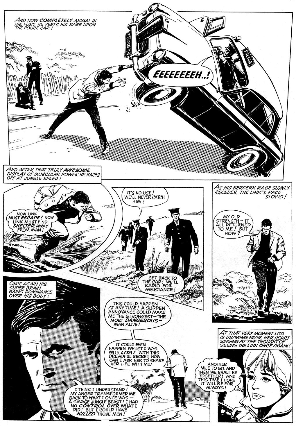
YET ANOTHER LINK In The CHAIN - PART FOURTEEN...

Copyright REBELLION

The MISSING LINK is in serious trouble, so let's not waste a second!  How is this exemplary example of evolution going to extricate himself from his problematic predicament?  Sit back and see how artist extraordinaire, LUIS BERMEJO, draws all the dangling threads of this FANTASTIC story together.  And don't miss the next instalment, when events take a twist in a new and fascinating direction!


Monday, 26 November 2012

YET ANOTHER Of THOSE LOOPY LAPSES In LOGIC DEPT - STRANGE TALES...

Images copyright MARVEL COMICS

DOCTOR STRANGE, Master of the Mystic Arts is aptly named - better by far than DOCTOR DROOM, the 'prototype' who preceded him, despite their very similar origins.  Strange by name, strange by nature - and also in logic if his third story in STRANGE TALES #114 is anything to go by.


So here's the plot: The mystic master receives a telephone call from Sir CLIVE BENTLEY, asking him to come at once.  Faster than QUICKSILVER can run to the loo, Strange is next seen stepping out of a British taxi (presumably having grabbed the fastest 'plane to England) and paying off the driver.

However, turns out it wasn't Bentley, but rather BARON MORDO in disguise who'd summoned Strange - who has now stepped into a trap.  Here we see what seems to be yet another infamous discrepancy between what artist STEVE DITKO drew, and what writer STAN LEE scripted.


It looks to me that Strange is trapped between a pair of mystic candles, the incense of which paralyzes him.  When the candles have burned out, Strange's life will also end.  However, Stan's scripting seems to indicate that Strange's dire predicament is caused by only a single candle.  It's just as well it wasn't four candles, or we could've found ourselves in the middle of the classic sketch by the TWO RONNIES.

Anyway, the good Doc, by the power of his mind, summons the nearby VICTORIA BENTLEY (Sir Clive's daughter), to come and extinguish the candle(s), thereby prematurely ending the spell which would've killed him.  (They had to burn out in their own time, apparently, for the spell to be effective.)

Mordo returns to gloat over Strange's death, and - on discovering him still alive - mentally saps his will, making him his slave.  But then the real Strange turns up, and reveals that Mordo had only enslaved his mental projecto-image, as he's just stepped off the 'plane from America.  Only his ethereal self could've arrived so quickly, explains Strange.

But here's where it all breaks down.  At first, it appears that Strange's 'mental projecto-image' is something entirely different to his metaphysical spirit which can float through walls, and is ghostly in appearance.  (We'll assume he can make himself visible to whoever he wishes, but I'm unsure if the 'rules' were ever established.  Wasn't The HULK supposed to be the only person capable of seeing him?)  However, he also refers to it as his 'ethereal self', suggesting that the two are the same.

Now I'm confused.  Why would Strange's ethereal self require a taxi to get to the castle?  (He could've simply used his mystic powers to take him where he was needed.)  Where does the dosh for the fare come from?  And how does his 'actual' body function independently when his mind is elsewhere?  If his mind was in his metaphysical self when Mordo enslaved it, how could he switch it over to his actual body upon arrival?  (And would these candles even be able to affect his non-physical form?)

The impression given is that both forms have independent thought, which we know from later tales just isn't so.  Also, why doesn't his ethereal self (also called ectoplasmic in subsequent stories) look, er - 'ethereal' - as opposed to a solid manifestation?  It has to be said that the conclusion seems rushed and is rather unsatisfying, depending, as it does, on the reader ignoring more holes than a vat of Swiss cheese.


As the denouement of the story depends on readers thinking Strange is there in physical form, these apparent discrepancies are maybe nothing more than deliberate misdirection, which - with a little mental exercise - can be reconciled to some degree, no?  Perhaps, but readers shouldn't have to work that hard; the best plots are always those which tie up loose ends, not leave more straggly bits than a plateful of spaghetti.

H'mm, cheese, spaghetti - all this talk of food  has made me hungry.  I'm off to raid the fridge.

Sunday, 25 November 2012

JACK KIRBY'S JIMMY OLSEN...


Images copyright DC COMICS

When 'Jolly' JACK KIRBY jumped ship from MARVEL to DC in 1970, the repercussions didn't really reverberate in Britain (or, at least, my part of it) 'til around 1972.  (Comics still mainly came to these shores as ballast in ships, sometimes resulting in a delay of several months - and even years in some instances.)


I recall leafing through issues of NEW GODS and FOREVER PEOPLE in my local newsagent's and, although recognising Jack's artistic style as the same one which had drawn most of my favourite Marvel characters, being unimpressed by the rather drab colouring and underwhelming characters.  (The BLACK RACER anyone?  Surely an attempt to replicate the popularity of The SILVER SURFER, but being far too way-out - even for Kirby!)


I later came to appreciate Jack's series of FOURTH WORLD mags, but I thought his best comic at DC was SUPERMAN'S PAL JIMMY OLSEN, where the dialogue was closer to the STAN LEE-scripted collaborations Jack produced at Marvel.  Sure, there were still examples of Jack's clunky turn of phrase from time-to-time, but they didn't seem quite so glaring as in his other DC books of the period.


To me, the Fourth World panoply of New Gods would've worked better as supporting characters in FANTASTIC FOUR, much like The INHUMANS, who I never thought interesting enough to have their own series.  Jimmy Olsen, however, worked like a dream.


In tribute to 'the King', here, then, are all 15 covers to the most enjoyable run of comics that he produced for Marvel's 'Dynamic Competition'.  They're available in a couple of full-colour softcover volumes entitled JIMMY OLSEN ADVENTURES By JACK KIRBY - well-worth checking out.  (Update: The stories have now also been issued in a single softcover volume.)


Relax!  Issue #140 was a non-Kirby Giant reprint issue, unconnected to the regular comic's storyline, so isn't included here.  (And yes, I do have it.)


In the second volume, the inking of this cover is mistakenly attributed to
VINCE COLLETTA, whereas it's actually by MURPHY ANDERSON

In the same volume, SUPERMAN's face is inked by MIKE ROYER,
not the MURPHY ANDERSON one (above) as published


O, MERRY MAID Of MIGHT, PLEASE WON'T YOU MARRY ME?

Images copyright DC COMICS

A while back, in a rare mad moment of indiscretion, I somewhat impetuously revealed my schoolboy crush on SUSAN STORM (aka The INVISIBLE GIRL), but I have an even more shameful confession to make.  I could never quite remain faithful to sweet Susie, swiftly switching my fickle infatuation 'twixt a succession of four-colour cosmic cuties whenever my attention was diverted by some slinky, seductive temptress provocatively posing and pouting at me from whatever captivating comic I happened to be rabidly reading at the time.


SCARLET WITCH, SATURN GIRL, The WASP, and MARVEL GIRL were just some of the many superpowered seductresses to whom I felt oddly drawn - unlike them, who were awesomely and alluringly drawn (little pun there) and stirred such strange sensations in my stomach.  Another was KARA, alias SUPERGIRL (who actually bore a striking resemblance to both Susan and Saturn Girl), and - whether drawn by JIM MOONEY or KURT SCHAFFENBERGER - she set my young pulse racing with passions I didn't quite understand and would've been unable to 'express' had the divine diva magically sprang to life in front of me.  (7 year old boys are probably much more clued-up on such 'affairs of the heart' nowadays, I imagine.)


Anyway, in tribute to Kara, here's a selection of images carefully culled from my comic collection to hopefully give you an idea as to why the heavenly honey so transfixed me.  Curiously, I never found her secret identity of LINDA DANVERS quite so attractive.  Strange what effect long blonde hair and a short skirt can have, eh?  (Looking at Linda now though, she's actually quite striking.  (Oh no!  I thought I'd grown out of it.)


ADVENTURE COMICS #384, which heads this post, is an odd little tale, lounging in the 'land of latent lesbianism' (and transvestism), perhaps without even being aware of it, and presumably going straight over the heads of kids who read it back in the day.  Reading it today as an adult, however, it seems unbelievable that the editors didn't spot the inherent implications of the story at the time.


Anyway, did anyone else out there harbour such secret desires for sexy statuesque superheroines, or was I the world's only paper pin-up perv?  Please tell me it ain't so!  (Go on, 'fess up.  You'll feel better for it.)


For another reminiscence in a similar vein, click here.

Saturday, 24 November 2012

CLICK ON THIS LINK - NOW! (PART THIRTEEN)...


Copyright REBELLION

Here's all you Crivvies need to know: The MISSING LINK drawn by LUIS BERMEJO, published by ODHAMS PRESS in FANTASTIC back in 1967.  There, short and sweet - why waste words?


Thursday, 22 November 2012

PART TWELVE Of The MARVELLOUS MISSING LINK!


Copyright REBELLION

A while back, Sturdy STEVE HOLLAND - of BEAR ALLEY BLOG - was going to publish a book reprinting every MISSING LINK episode (plus the series it morphed into with its 16th episode) originally featured in FANTASTIC in the late 1960s.  Unfortunately however, for various reasons, the project was abandoned, meaning that a lot of frustrated POWER COMIC followers were deprived of a rare treat.

Hopefully, presenting the initial adventures on my blog might lead to renewed interest, and result in a revival of Steve's project, either by him or other parties.  LUIS BERMEJO's art deserves to be sensitively coloured and presented not only to former Fantastic Fans, but also a brand-new generation of readers who would be sure to welcome Linky into their hearts.  What do all you Criv-ites think of the strip thus far?  Feel free to let me know in the comments section.


HOW TO BE A COMIC BOOK ARTIST - THE MARVEL WAY...

Images copyright MARVEL COMICS

From NOT BRAND ECHH #11, Mirthful MARIE SEVERIN shows how to accomplish the goal of becoming a 'comic book' artist.  Funny text, humorous, well-drawn illustrations.  If only some artists I can think of were this good, how different might the fate of a certain beleaguered U.K. comic have been.  Sigh!  Too late now though.
   

Wednesday, 21 November 2012

The GOOD, The BAD, And The UGLY...


Images copyright D.C. THOMSON & Co., Ltd

What's the point in flogging a dead horse?  Or even a dying DANDY?  Well, it's not until we admit our mistakes that we can ever hope to learn from them.  Case in point: some of the content in this week's issue of the terminally-ill comic from the stable of D.C. THOMSON.  Firstly, though, disregard any claims that The Dandy is going to a 'better place'; that it's not dying, it's merely 'evolving'.  Pants!  That's what we tell children (and sometimes ourselves) when someone dies.  "Granny's not dead, she's only gone to Heaven."  No, ol' Granny's definitely dead - at least from our earthly perspective.  The Dandy is also dead (or will be in three issues) - whether or not it's going to a better place yet remains to be seen.

The above comic cover is taken from the 1967 (released in '66) Dandy Annual, and it's a cracker.  Definitely what I'd place in 'The GOOD' category.  Recently, I was advised that, over on another blog, someone was dismissing me as a 'nostalgist' (which while true, is hardly something that invalidates my opinion).  The BEANO is well-drawn, they conceded, but not funny; whereas The Dandy is funny, but perhaps not quite so well-drawn.  They'd rather have funny and not so well-drawn than the other way around.  However, to my way of thinking, it needn't be a case of 'either-or' - why can't we have both?  (Incidentally, I don't necessarily agree with this person's assessment that The Beano is less funny than its sister publication.  Not when it's got CALAMITY JAMES.)

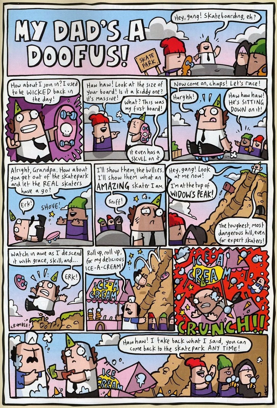
We all recognise that there are various reasons for the decline of many once-popular publications over the years, but The Dandy suffered disproportionately because, after its 2010 relaunch, it had become so unattractive that it deterred readers from buying it.  What's more, half of its former readers abandoned it once they'd seen what it had become.  What's the point of a comic being funny (presuming for the moment that it is) if it's so poorly and amateurishly drawn that it drives customers away in droves?  QUASIMODO could well have turned out to be the life and soul of the party if the crowd had only taken time to get to know him, but who wants to be laughing while simultaneously vomiting their guts into a bucket?  So, with that in mind, let's take a look at 'The BAD'...


First of all, the logo is basic, unimaginative, and has too much black space.  Much more could've been done with it.  One of the drawbacks of the 'new' Dandy is that the overall design was down to one man, resulting in a lack of variety throughout the comic.  Not necessarily a problem if the designer is a genius at his craft, but the logos are hardly prime examples of what can be achieved in the art of calligraphy, being rather roughly-rendered as well as uninspiring.

The strip itself is an exercise in how not to draw a comic strip.  Empty backgrounds, flat-looking characters, not enough variety in perspective (in fact, no actual perspective) - the result is nothing more than a series of talking heads not saying anything particularly amusing.  As I've said before, this looks like the work of a fourteen year old with a hint of promise that requires developing, not the work of an adult 'professional' artist who gets paid for it.  When I last made this observation, I received an email telling me that I was wrong!  "More like the work of a four year old!" claimed the correspondent.
        
Let's now take a look at 'The UGLY'...


Yet another extremely poor logo with severe limitations in execution (an apt word - "It's dead, Jim!").  Crammed panels with flat figures seemingly growing out of the ground, static positioning and no real sense of movement.  Add to that the fact that the drawings appear to be fighting for space with the dialogue and captions, and you have a recipe for an underwhelming example of so-called 'sequential' art.  (And don't start me on just how ugly the lettering is in both this strip and the one which precedes it.) Having said that, however, I've seen far worse from this artist.  I think his style would be more suited to greetings cards - sequential art doesn't seem to be his strong point. 

Now let's look at how it should be done (art-wise, that is - the story is nothing great).  In the strip below, there's a sense of space in the layouts, and the panel borders don't seem to be constricting the content within.  The figures have 'depth', appearing 'rounded' (almost 3D, as opposed to the paper-flat scribbles above), and there's a sense of movement, plus a natural progression from one panel to another.  What's more, the lettering fonts are clear and easy to read, and don't overpower or obscure the art.  Note that I'm not saying all strips should be drawn in the same style employed by CHARLES GRIGG, but observance of his storytelling principles is something that quite a few current Dandy artists would benefit from paying heed to.

(Also, bear in mind that this is essentially a black and white page with some spot-colour, as opposed to the full-colour pages above.  If the previous examples were in black and white, they'd be even more one-dimensional than they are.)  


Okay, that's my two cents worth.  Hopefully, any response will be something other than the same old tired insults and vitriol which usually follow.  Got an opinion?  Agree or disagree?  Let rip in the comments section, but try and keep it clean, eh?

Monday, 19 November 2012

G.I. JOE WAS ORIGINALLY A SOFTIE CALLED 'HAIR-LIP HARRY'...


You're looking at the very first prototype of G.I. JOE, hand-carved by designer DON LEVINE back in 1963.  Just as well  they chose another face for the finished article, as the fella in the photo looks about as hard as a soggy cornflake.  BARBIE's boyfriend KEN could've given this milksop a good kicking - and he's about as tough as wet noodle.  Ah, how different would've been the fate of all mankind had the constipated clown above turned up in shops instead of the real deal that made his debut in '64.  ('66 in Britain - and with a different name - ACTION MAN!)