Friday, 21 January 2022

RED SONJA COVER GALLERY... (Updated)


Copyright relevant owner

You may be surprised to learn that the comicbook Red Sonja isn't really the same character that Robert E. Howard created.  For a start, Howard's heroine was named Red Sonya and was a female swashbuckler who lived in the 16th century.  Writer Roy Thomas tweaked her name from Sonya to Sonja and borrowed aspects of her character from another Howard creation, Dark Agnes de Chastillon, and transplanted the warrior woman into the Hyborian Age as a sort of female Conan.

Marvel's Red Sonja first appeared in Conan The Barbarian #23, and then starred in Marvel Feature for seven issues, before being given her own mag which lasted for 15.  Her history becomes a bit muddled after that, as when Dynamite Comics acquired the rights to publish her, they killed her off in #34, replacing her with a reincarnation in the next issue.  Then in issue 50, Dynamite started following Marvel continuity, just in case we weren't all sufficiently confused already.  While uncharacteristically doing a little light research into the character, I gave up at this point as my brain is befuddled enough without subjecting it to further strain.

Anyway, that's a brief background summary for those of you who didn't already know, so let's cut to the 'meat and potatoes' - the covers.  In this post are all 22 from the colour mags published by Marvel back in the '70s.  The interiors (not seen here) of numbers 12 & 13 featured art by John Buscema, with his brother Sal drawing the next issue.  Big John returned for the 15th and final ish, though it wouldn't be until 1983 before Sonja turned up in her own Marvel mag again (Vol. 2, two issues, Vol. 3, 13 issues, and in 1985, a two-part movie adaptation of the Red Sonja movie), her last Marvel appearance being a one-shot in 1995 called Scavenger Hunt.

Anyway, you ready for the fabulous feast of cover artwork that awaits your impoverished orbs?  Then let's go!  And remember - comments welcome.

******

Incidentally, looking at these covers now, the only issue I actually recall owning is #1 of her own mag - I either never saw the others or simply wasn't interested enough in the character to buy them.  So recently acquiring these issues is a bit like returning to the '70s to remedy an oversight by now having them in my collection, as an aspect of the 1970s that wasn't part of my teenage experience now feels like it was.  (Or, perhaps more accurately, as I say in my reply to TF's comment, I now feel part of something I wasn't privy to at the time.)  I find that fascinating for some reason - how about the rest of you? 


Pin-Up from #5


Drat!  Now I've got to wait for an Epic Collection to find out what happens between issues


Thursday, 20 January 2022

AND THE AWARD FOR THE DAFTEST SPEECH BALLOON ON A COMIC'S COVER GOES TO...


Copyright relevant owner

"Kill her!  Kill Red Sonja!"  "Over my dead body!"  Er, that's right - that's exactly what it would be, girlie - what a daft thing to say.  Someone got paid for writing that?  Strewth!  What's the daftest thing you've ever read on a comic's cover, Crivvies - can you remember?

BLUE PETER BOOK COVER OMNIBUS...


Copyright BBC TV

BLUE PETER first appeared in black and white on our television screens on October 16th, 1958, but it wasn't until September of 1964 that the very first Blue Peter Book/Annual was published by LUTTERWORTH PRESS in association with the BRITISH BROADCASTING CORPORATION.  It presumably sold well, for the next edition in 1965 was published by the BBC itself, and continued to be so for many years until WORLD INTERNATIONAL Ltd., then PEDIGREE, took over.

In 2011, it was announced that there would be no more Blue Peter books, as yearly sales had declined from around 100,000 - when they were at their peak - to around only 13,000.  (In fact, there'd been none in 1987, '91 and '94-'98.)  There was also a Blue Peter Yearbook - actually a magazine - in 1993, but it may have been a 'one-off' as I never saw any further issues in subsequent years.

The best-known presenters were CHRISTOPHER TRACE, VALERIE SINGLETON, JOHN NOAKES, PETER PURVES and LESLEY JUDD, and few presenters since then have been as memorable or as highly esteemed by viewers as the 'famous five' were in the '60s and '70s.  Several years back now, I was sitting in my garden shed listening to the radio, when LAST WORD paid tribute to a famous cyclist who'd passed away.  John Noakes had once interviewed him on Blue Peter, and to hear a clip of the younger Noakes' familiar voice emanating from my radio took me right back to the '70s when he had yet been a regular presenter on the show.

Christopher Trace had been the main man from the programme's inception in 1958, of course, and it was sad when he left on July 24th, 1967, leaving Val and John to present the programme alone until Peter Purves joined in November.  Curiously, the Fourth Blue Peter Book makes absolutely no reference to Christopher Trace's involvement in the show that year, perhaps because (as legend has it) the production staff found him difficult to deal with and, secure in the knowledge that Noakes had proven a hit with the viewers, accepted Chris's oft-threatened resignation when he again offered it during some spat or other.  No photos, no mention, which seems unnecessarily spiteful considering that Chris had spent nine years with the show, being the longest-serving presenter at that time.  (Incidentally, Chris had been CHARLTON HESTON's stand-in/body-double in BEN-HUR.)

The Seventh Blue Peter Book is also a bit unusual, in that it's the only one I have in my collection which has a 'wraparound' photo on the cover, all the other ones using the same photo on the back as on the front, though there may well be other exceptions to this practice of which I remain unaware.  (Yup, there was, which I discovered when I acquired Book seventeen from 1980, which also has a similar style of cover - as do at least the next three.) 

This gallery includes all 15 books that featured Chris, Val, John, Peter and Lesley on the covers (though not all at the one time, obviously).  Without the original 'famous five' presenters, Blue Peter was never quite the same - at least to those of a certain age.  These pics will hopefully stir a few happy memories in the hearts and minds of those who grew up in the '60s and '70s, and to whom the programme was a regular part of their lives.  I have to confess I never bought any of them at the time of publication, not really getting into the BPBs until around the early '90s, I think (but can no longer recall with anything approaching accuracy).  Why?  Pure nostalgia.  They were a means by which I could revisit my past, having been a semi-regular viewer over the years - particularly when BLEEP And BOOSTER were a feature of the show.

Talking of Bleep and Booster, in 2008 there was a lavish Blue Peter 50th Anniversary book which explored practically every aspect of the programme's history, but apart from a one-line mention of Bleep and Booster, it was as if they'd never existed. The author of the book (and former editor-in-chief of the programme), RICHARD MARSON, later explained to me in an email that he was pressed for space and couldn't include everything, but for kids in the '60s, B & B were probably the main draw of the show.  At least they appeared in the first 14 books and had three annuals of their own back in the '60s.

I have a few other Blue Peter Books, but the ones featured in these two posts represent the programme in its heyday when it was broadcast from BBC TELEVISION CENTRE (which should never have been sold off), and where the spirits of many a Blue Peter pet no doubt still romp around the spot of the famous (and original) BP garden.

"Get down, Shep!"

Speaking of whom, Border Collie dog SHEP was probably BLUE PETER's most famous pet in a long and varied line.  Not only was he and his 'master', JOHN NOAKES, regarded as one of the nation's finest double acts (of a sort), they also inspired a record single by the group The BARRON KNIGHTS based on Noakes' continual admonitions of "Get down, Shep!"

John Noakes departed Blue Peter in 1978 after almost 12 and a half years, and Shep was 'retired' from the show at the same time.  Their association continued for another two years in the programme GO WITH NOAKES (which had started in 1976) and, according to some histories, John and Shep lived together happily ever after until Shep passed away in 1987.

Except that's not what happened.  Shep belonged to the BBC, not John Noakes, though the Corporation was prepared to make a gift of the dog to John on the undertaking that he didn't use the pet for commercial purposes such as advertising.  (The Collie who appeared with John in adverts for dog food in 1978 was a 'ringer' called SKIP.)  Also, the allowance which the BBC paid to John for looking after the dog would be discontinued.

John Noakes apparently later claimed that Editor BIDDY BAXTER wouldn't allow him to keep the dog; Biddy Baxter, on the other hand, claimed that once John found he couldn't financially profit from exploiting his canine chum in the lucrative world of advertising (though some accounts say he accepted this condition) and would no longer receive his regular allowance for the dog's upkeep, he promptly relinquished Shep back to the BBC. 

The dog was cared for by EDITH MENEZES, the official Blue Peter pet keeper, who also 'looked after' PETRA (one of Shep's predecessors) and a variety of other animals from the BP menagerie.  I've been unable to determine with whom Shep resided between 1978 and '80, but he stayed with Edith for the rest of his life from 1980 to '87.  (John revealed the dog's death while appearing on TV two or three days later and shed a few tears.)

So, sadly, despite the legend, John and Shep didn't walk off into the sunset together like ANDREW GLENN & BLACK BOB.  Shep stayed in Britain with Edith, while John and his wife moved to Malta in 1984, where they resided until John passed away in 2017.

So not quite the happy ending BP viewers would've wished for, or that some sources would have us believe.  Sad, eh?

Anyway, enjoy the covers - a gateway to an earlier time.


Interestingly, the above cover came in for a bit of attention, as related in BIDDY BAXTER's book, DEAR BLUE PETER.  Letter follows:


Wednesday, 19 January 2022

BABE Of The DAY - EMER KENNY...


Glamorous Emer Kenny
debuts as 'Babe of the Day' today.
Father Brown wouldn't approve, but
I've got three words for him - "On yer
bike!"  (Which would seem to be his
main mode of transport.)

Tuesday, 18 January 2022

TO TOUCH OR NOT TO TOUCH? (OR RETOUCH TO BE MORE PRECISE)...


It's a fact of life that tin corrodes and discolours over time.  I no longer have my original Chad Valley pillar box money bank (bought in Southsea in December 1978 and owned until its demise in 1989), but going by the above old photo, the gold coloured base, though dulled, doesn't look corroded.  However, in the second photo (actually taken a short time before the third), neither do the two replacements I obtained around a year or two back - whereas in the third photo, the corrosion is obvious (I showed them out of sequence to better illustrate my point).  That means, despite not being visible in the first photo, my original bank may've been similarly affected, though I can never know for sure unless I have other, clearer and sharper versions somewhere.  (Probably best to enlarge each photo to better see what I'm talking about.)


Anyway, look at that third photo again and then compare it with the fourth photo (below) taken only today.  Last night I decided to improve the look of the bases, so I masked off the upper part of each bank and applied some gold acrylic spray paint - what a difference!  However, this post isn't just to blow my own trumpet, it's also so I can ask a question of fellow collectors of toys and comics, etc.  Which is - would you attempt to improve the cosmetic appearance of something (assuming you had the skill to do it), or do you believe that things should be left as they are, despite any flaws, imperfections or damage?  I know that when it comes to preserving monetary value, some people believe that collectable items should remain untouched, but the financial aspect has never been a concern of mine.  I just want things to look as good as they can.

That's why I colour touch comic covers, discreetly repaint parts of toys, and generally try to maximise their cosmetic appearance, but I wondered what the rest of you crazy Crivvies think.  To retouch or not to retouch?  If you have an opinion on the subject, feel free to share it in the comments section.

And just to more fully demonstrate exactly what I mean, below is a comic cover in 'before and after' condition.  Achieved by the application of acrylic inks, I think it looks much better after I've worked on it.  Agree or disagree?  Click to enlarge for a clearer comparison.

MARVEL AT RED SONJA #1 - IT'S DYNAMITE...


Copyright relevant owners

I recently showed you the Dynamite Comics facsimile of Red Sonja #1, but then I decided to obtain the original Marvel Comics version to replace the one I had back in the '70s.  So that's it above and also below, alongside the Dynamite copy.  I've just acquired issues 2-14 as well, so once I track down #15 (last ish) I'll do a cover gallery for all you cavortin' Crivvies to ogle at.

Right, hands up all those who fancied Red Sonja when they were a teenager?  Tell all in the comments section.  Go on - you've got nothing better to do at the moment anyway.  (Or you wouldn't be reading this load of ol' mince, would you?)

The BATMAN 'FORGERIES'... (A FABULOUS FLASHBACK)

Images copyright DC COMICS

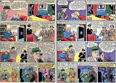
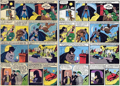
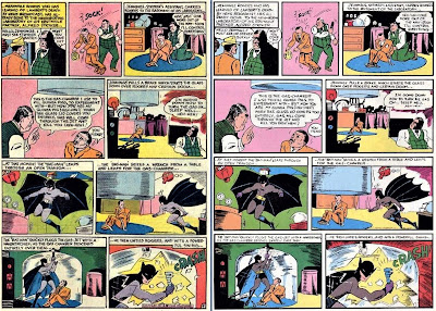
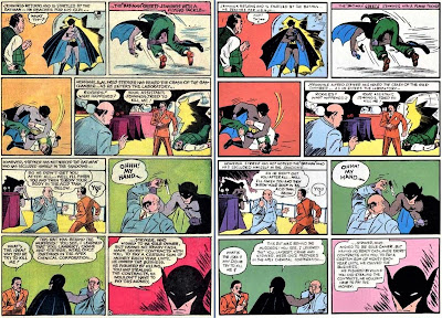
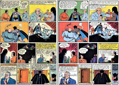
In the May 1969 issue of DETECTIVE COMICS #387, the first BATMAN adventure was re-presented to readers of the time.  Note that I said 're-presented' and not 'reprinted', because the story featured was a re-creation, a 'tracing', effectively, of enlarged copies (in all likelihood) of the printed pages from issue #27 in 1939, and not from surviving period-proof copies from the editorial files.


At the time, this was common practice whenever NATIONAL/DC didn't have proofs or original artwork from which they could reprint a particular tale. This tracing was reused in Batman FROM The '30s To The '70s, Detective Comics #627, and Batman ARCHIVES Vol. 1.  I don't recall whether it was used in the FAMOUS 1st EDITION, so perhaps someone out there can let me know.


Out of all the 'reprints' of this tale, the only one I've got which seems to come from more accurate proofs is the MILLENNIUM edition published in 2000.  Strange that it took 31 years for DC to republish the original story (in standard comic-sized editions at least), instead of what was essentially a forgery.


Anyway, just for you, here's the original (left) and re-created pages (right) side-by-side, so you can play 'spot the difference'.  Also included is a photo of a page from an actual, original 1939 issue (as printed in Batman THE GOLDEN AGE), so that you can compare it to the other two examples on view.


Go on, play 'Dark Knight Detective', and see if you can spot all the subtle (and not-so-subtle) distinguishing points between both versions of the pages.  Unfortunately, the fact that a tracing of the premiere story was used in the Archive Editions volume makes a mockery of its claim to be the "definitive collection".


If you happen to own the aforementioned Famous 1st Edition issue of this tale, take a look at the story's second page.  If the middle of the top two tiers are out of alignment then the tracing was used as the source, not proofs of the original printing.  Unfortunately, I can't remember if I've got it or not, otherwise I'd check for myself.


As promised, below is a slightly angled photo of page 3 from an original 1939 issue, as reproduced in the excellent book on Batman by writer and comics historian, the late LES DANIELS.


So there you have it.  Unless you're lucky enough to own an original issue of Detective Comics #27 or the Millennium Edition reprint (the jury's still out on the Famous 1st Edition), then the chances are that you've never actually seen the first Batman tale - only a mere paltry imitation.  Just think - "You wuz robbed!"  Better call Batman.  Oh, and just for completists, here's the cover to ol' Bats' debut appearance.


******

Click on images to enlarge, then click again for optimum size.  Unfortunately, the interior comparison pages are not quite as sharp as I'd like, 'cos I enlarged them from smaller sized images.  They'll still do the job though.