VICKI was an attempt to attract ARCHIE and MILLIE The MODEL female readers I assume, but the odd thing is that all four issues were reprints from TOWER COMICS '65-'69 title TIPPY TEEN, with a little bit of redrawing to update the hairstyles and clothes fashions of the day. Having said that though, the cover of issue #4 was clearly cribbed from KATHY #1, published by MARTIN GOODMAN's original incarnation of ATLAS in 1959.
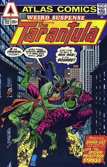
I didn't much like TARANTULA for the same reason that I didn't care for TIGER-MAN - I just can't relate to heroes with heads like animals or insects. After The GRIM GHOST, WULF The BARBARIAN, despite similarities to MARVEL's CONAN, probably had the most potential to succeed. In fact, I think I should read them again to remind myself of what they were like, by Crom! (Oh, hang on - that's the other guy.)
Don't miss the final part in which we take a look at ATLAS/SEABOARD's black and white magazines. Isn't this fun! See you soon, Criv-ite chums.
 |
| Compare this cover to the one below |
 |
| KATHY #1 (1959) published by the original ATLAS COMICS |
 |
| And here's an ad for the unpublished (as far as I know) 4th issue |


4 comments:
I’ve been enjoying reading the Atlas post as I really loved these books at the time, despite their obvious flaws they seems to be fresh and exciting (well I was only about 15 at the time) – I had every one of the colour comics (and still have a few of them in the loft) at the time with the exception of VICKI which was just never available in the shops I got the other Atlas books – but I picked the “Vicki” issues up in the early 80s and for a short time had every colour Atlas comic (hey it felt good to me).
I liked Iron Jaw, Grim Ghost, Planet of the Vampires, Phoenix and Bog Beast the best but some characters were a bit strange like “Morlock 2001” (strange that then 2001 considered the distant future” and now it’s the distant past - the “Tarantula” was probably strange as well but I liked that one mostly due to Pat Boyette’s art but it was a brave concept for a “hero” in a colour comic when you think about it having a big ugly spider that ate folk and actually looked like a spider.
I think Atlas panicked (or just gave up) at one point as they ended up turning all their main characters inot traditional Marvel/DC type costumed superheroes like the Scorpion , Man- Hunter (John Targitt) etc. Even the Phoenix, who was already in a costume became the “Protector” (a more obvious costumed character). Their black and white range was pretty good with “Thrilling Adventure Stories” issue 2 being one of the best b&w I’ve ever read.
I guess that Goodman realized he was losing too much money and just threw in the towel, McS. Or if you prefer, gave up (The Grim) Ghost. (Oh, I'm so clever.) Not waiting to see what the sales figures were on the first issues before making changes wouldn't have helped. It's interesting to me to wonder how long I'd have stuck with the titles had they survived a bit longer. Probably not too far beyond where they finished, I suspect.
I think had they survived a bit longer I would have continued picking up their black and white comic range (I thought they were all pretty good) and a most of their colour comic horror line as I thought the likes of Grim Ghost, Demon Hunter, Bog Beast etc were as good as Marvel & DCs similar output (excluding classics like Tomb of Dracula, Swamp Thing of course) They had no chance with most of their superheroes (all pretty bad) and their barbarian titles whilst having promise could not hold a candle to Marvels Conan, Kull etc and I would have stopped picking these up after the final issues (had they survived that is) I must admit I would have loved to have seen Atlas' version of the JLA/Avengers etc, that really could have beena train wreck, But it was a really exciting times for a comic book geek ( Ithink Red Circle comics expanded started up again around this time as well)
The covers generally looked good - like '60s Marvel mags - but the insides of the colour line didn't really hold up to much scrutiny overall, I think. I wonder if Goodman's plan was to establish the characters first (difficult to do when he kept ordering alterations in early issues), then launch a team book with some of them? I don't suppose we'll ever really know.
Post a Comment