 |
| Art by Walter Simonson. Images copyright MARVEL COMICS |
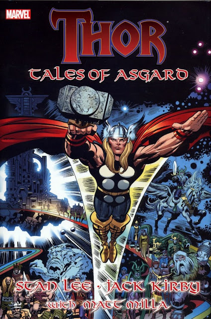
What a difference colour makes. Not convinced? Take a look at these
basic, flat-coloured examples of JACK KIRBY & VINCE COLLETTA
THOR stories from the TALES Of ASGARD 1984 Special (Vol. 2, No.1).
Alongside are the newly coloured, multi-hued MATT MILLA pages from the
hard-cover edition of the same tales. (First available as a 6-part mini-series.)
The pages are given a whole new dimension, enabling them to go toe-to-toe
with many contemporary offerings available in comics shops today.
Not wishing to labour the comparison, but the difference is similar
to that of an old POPEYE or BETTY BOOP cartoon compared to the
almost 3D effect of the animation in WHO FRAMED ROGER RABBIT?
Last year, I bought the computer-coloured reprint of MARVEL COMICS
#1 and the effect was the same. The pages seem to have become imbued
with a vitality lacking in their original printing and don't appear quite as
dated in contrast to more modern presentations.
A while ago, the U.K. mag AVENGERS UNITED reprinted the Tales of
Asgard series in its original form, and it was generally met with an indifferent,
sometimes even hostile reaction. It seems that kids of today have been spoiled
by the photo-realistic, more complex colour-art in contemporary stories, and
couldn't quite take to the four-coloured classics of yesterday. I'm pretty sure
that, had MARVEL/PANINI been able to present the Matt Milla versions
(which hadn't yet been done), the response would've been more positive.
their stories from yesteryear in this same fashion and then re-presenting
them as 'definitive versions' in deluxe, hardcovered volumes. As I said, it
certainly gives them a whole new dimension and might help them to appeal
to younger readers not yet steeped in the company's glorious history who
seem to have an aversion to older material. (Hard as it is to believe.)
 |
| ISBN # 9780-7851-3921-8 |
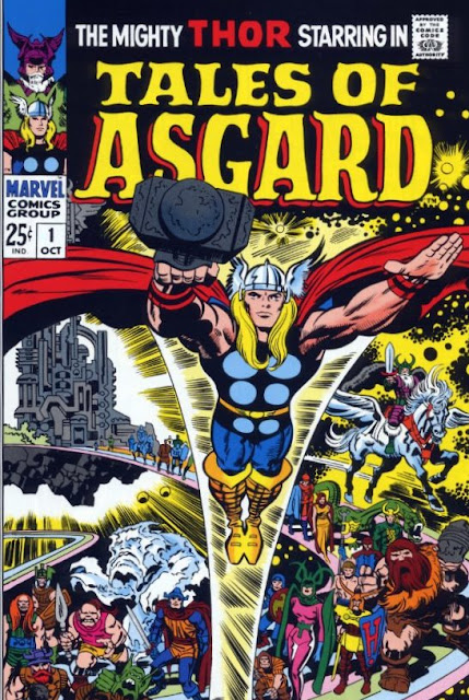
The Complete TALES Of ASGARD is available now from all good
comic shops (and has been for some time). And here, for completists,
is the cover to the original 1968 TOA Special. (Vol. 1, No. 1.)
 |
| Art by Jack Kirby & Frank Giacoia |
******
 |
| Pencils by Jack Kirby |
Following on from the previous post, here are a few more examples
of the difference that colour (or, to be more precise, choice of colour)
can make to a printed page. The first example, above, is how the cover
of JOURNEY Into MYSTERY #83 would have looked (more or less)
back in 1962. Compare it against the much brighter, recoloured version
from the first printing of MARVEL MASTERWORKS Vol. 18, 1991/
'92. (Note: A superior version, more faithful to the original, appears
in the recent softcover edition of THOR MASTERWORKS.)
Now compare both of them to TOM CHU's version (below), repro-
duced in the TALES Of ASGARD hardcover volume, which also re-
prints J.I.M. #83's origin. (Unfortunately, despite the superb colour-
ing, the art has been retouched in places, having been restored from the
reprint in THOR #158. For a more faithful reprint of this classic story,
see the softcover MASTERWORKS edition, referred to above.)
 |
| Colours by Tom Chu |


14 comments:
While I appreciate the 3 d effects of the new colors, I like the bright colors of older comics. I find modern comics literally so dark I can't see what's going on. Particularly when you have shiny paper which reflects light and light bulbs. What I do like about modern color is its doesn't bleed and you can tell true colors. If you look at Gabe Jones or any Asian characters in old comics, you often went , hey. I think thafs a human why are they coloring him that way? Why is Gabe grey? Why does Shang Chi look orange ?
I've noticed that the paper itself in the Masterworks and Omnibus volumes is matt, Phil - however, the ink comes out glossy on it for some reason. If they could get that sorted and get rid of the glare, things would be just about perfect.
The new colours look great but I have to nail my "luddite" credentials to the mast here I prefer the originals.
Ah, but how would you feel if the pages had the original colour scheme, but done in the modern '3D' effect? Best of both worlds?
I appreciate it looks very nice but I really do prefer the origianl colouring I like my comics to look like comics (willing to check them out all the same)
You're not talking about just the original colour scheme, but the actual printed result I take it? I'd like to see the original colours, but in the modern format. It gives the pages so much more depth.
Yeah I do like the whole package the original paper, colours etc - I do think the new better paper needs the 3d type colouring as I recall picking up a "glossy" paper version of Adams Green Latern/ Green Arrow run and for me it was awful compared to the classic original version and that was probably because the original colouring wasn't up to the new paper.
Getting the right paper for the colour is the trick, McS. Years ago, the 2nd Masterworks volume of the FF suddenly switched paper from glossy to matt for part of the book (must've been a mistake at the printers), and the colour looked far better on the matt than the glossy paper.
Preach it brother! I hate gloss paper it's unreadable particularly with modern comics.
PS I didn't get any tickets for San Diego so no costumes or original art purchases this year .,...
Never mind, Phil - that means you'll have twice the money to spend next year.
That Tales of Asgard one-shot was a blockbuster book in my young collecting history. Loved it through and through. And I quite enjoy the new volume with the recoloring, though I know some who have objected. Like the old practice of colorizing movies, it's not a problem for me since to colorize the vintage flick they had to pretty much restore it first. Having different versions is no problem at all.
Rip Off
Colourizing movies doesn't bother me either, Rip. One can always turn the colour down to see it in its original form. I thought 'It's A Wonderful Life' looked good in colour.
Okay, there are two kind of recoloring comics : the first one has been done for decades in comics that were reprinted and you can find it in any hardcover or trade. The best example of this is in stuff like Marvel´s Premiere Edition hardcovers and Marvel Masterworks where the original coloring is touched up, mistakes are corrected and the end product looks better than the original comic floppies.
Then there is this 3D coloring where the old comics are recolored to sell them to a modern audience who could not cope with the regular recoloring and where the comics are colored as if they were produced Today. While it does look good and shine very often the art gets buried under the colors and sometimes you can´t even see what´s happening on the page.
Now I´m not saying this is a bad thing but I think the second form of recoloring is better for people who don´t know much about comics and just want to read the story. If you have any interest in the art though you should avoid it. This may sound harsh and " old time guy - ish " but I recently bought a hardcover with the first issues of Walter Simonson´s THOR issues and you can barely see his art. I did not spend fifteen bucks for shiny colors, I wanted Walter Simonson THOR.
I think they sometimes go overboard with some fancy effects on the recolouring, SZ, but the Tales Of Asgard recoloured series (and book) really gave the stories new life, I thought. The old pages look really flat in comparison. What they need to do is compromise 'though. Keep the original colour scheme, but add the '3D' effect where needed.
Post a Comment