Tuesday, 12 March 2019

DO YOU TRULY BELIEVE IN CAPTAIN MARVEL? (Updated)

Copyright MARVEL COMICS

CAPTAIN MARVEL seems to be getting a lot of attention at the moment due to the latest blockbuster movie doing the rounds in cinemas.  Haven't seen it, but I've been buying some of the TRUE BELIEVERS reprints by MARVEL COMICS and thought you might like to see them.

Got a favourite from when you read the originals back in the day?  Be sure to say so in the comments section.

(Oops!  Overlooked two - now added.)


Monday, 11 March 2019

MIGHTY MARVEL CHECKLIST! ON SALE NOW!!!


MIGHTY WORLD OF MARVEL #13

Copyright MARVEL COMICS.  Published by PANINI

100-page special!  Four awesome tales!

New series!  A fighting-mad Captain Marvel uncovers a secret in her past that will change her life forever!  By Margaret Stohl & Carlos Pacheco!

The Thing confronts the Reed Richards of a parallel universe!  By Chip Zdarsky & Valerio Schiti!

Hawkeye and Jessica Jones tackle a very unusual dragon!  By Kelly Thompson & Michael Walsh!

The Guardians of the Galaxy face an army of killer Groots!  By Gerry Duggan & Marcus To!

Featuring material first published in Life of Captain Marvel #1, Guardians of the Galaxy #149, Marvel Two in One #5 and Hawkeye #6.

On sale now!

£4.99.

 * * * * * *

ESSENTIAL X-MEN #12


100-page special!  Two mutant masterpieces!

A new saga begins!  A select team of X-Men face the challenge of one of their deadliest enemies: The Shadow King!  By Charles Soule, Jim Cheung & Mike Deodato Jr!

The Gold X-Men team struggles to survive on a hostile alien world!  By Marc Guggenheim and Diego Bernard!

Featuring material first published in Astonishing X-Men #1-3 and X-Men: Gold #19-20.

On sale now!

£4.99.

 * * * * * *

DEADPOOL UNLEASHED #25


76 pages of Marvel’s hottest hero!  Two stunning stories!

Deadpool picks a fight with everyone – but why?!  Don't miss a new story: ‘The Marvel Universe Kills Deadpool’!  By Gerry Duggan & Mike Hawthorne!

With Weasel's life at stake, Deadpool takes the fight to the Assassins' Guild!  By Cullen Bunn & Mark Bagley!

Featuring material first published in Despicable Deadpool #297-298 and Deadpool: Assassin #4-5.

On sale now!

£4.99.

THE BUMPER BOOK OF ROY OF THE ROVERS...


Copyright relevant owner

Bought the above ROY of the ROVERS book the other day in a charity shop.  I'm not (and never have been) a football fan, but the volume fairly sings of another age, and being a nostalgia freak (no, I insist you retain the word 'nostalgia' in the sentence), I thought I'd add it to my collection.  What follows is a few pages to show you what I mean.


Sunday, 10 March 2019

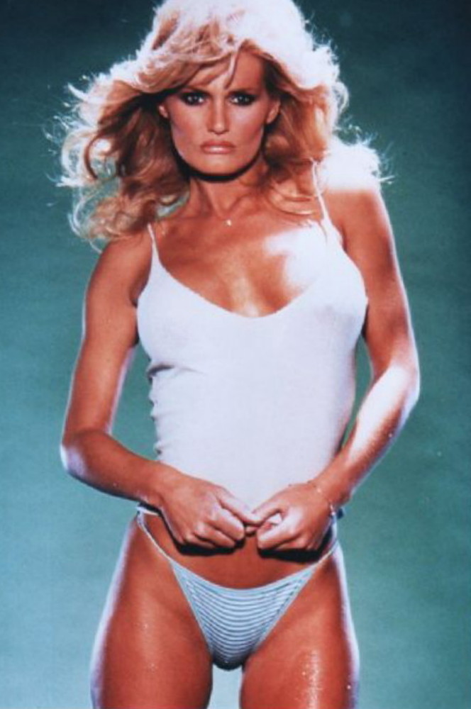
BABE Of The DAY - RANDI BROOKS...


RANDI BROOKS is angry 'cos
she sent me to buy her a fish supper,
and by the time I got back I'd finished
half the fish, most of the chips, and worst
of all - I'd scoffed her pickled onion (no,
that's not a euphemism).  She's none
 too pleased, but ain't she cute?

RETELLING REPOST: From The PAST To The PRESENT - An UNTOLD 'TALE' Of DOCTOR WHO...


DOCTOR WHO & TARDIS copyright BBC TV

Way back at the start of the '80s (wow, more than 30 years ago) I purchased two brush pens with which I hoped to practise my inking.  I'd had them for a while before I got around to using them, and when I did, it was on a DOCTOR WHO drawing of the original and best Doctor, WILLIAM HARTNELL.

I pencilled the figure and TARDIS and then inked them in, rather too thickly in places, due to my unfamiliarity with the pens, which, unlike most brush pens of today, had flexible, rubber-tip 'points' to them.  In the end, I abandoned the drawing because, although I was happy with the likeness, the pose was a little too rigid and not quite natural enough to my eyes.

Part of the problem was that I had done the drawing A4 size, which was far too small to allow for a finely-detailed finish, so I put it away, resolving to draw a larger version at some time in the future and give it the loving attention it deserved.

Well, the future came and went, and I never did get around to redrawing my Bill Hartnell 'masterpiece'.  However, a few months back, I discovered an old, actual-sized photocopy of my initial drawing (dunno now what happened to the original) and decided to finish it.  I'd already added a logo back in 1983 (photocopied from a 1979 ish of DWW), so all I had to do was complete the background, which I did over the course of a few days when time, inclination, and energy levels allowed.

I still possess my original brush pens after all this time (STAEDTLER MARS GRAPHIC 3000) and, amazingly, they both still work, although the ink in one of them is no longer quite as black as it once was.  (A bit purple in fact.)  However, I didn't want to compromise their nigh-pristine condition by subjecting them to the rigours of artistic application, so I used an actual brush and a combination of different markers.

What you see above is the finished result.  Now, perhaps I'm biased, but I'd say it's not too bad for a 30-odd year old drawing.  Maybe one day, I'll enlarge it to A3 size, tidy it up a bit and add some colour.  Or who knows?  I may even start from scratch and do the thing properly.

And, just in case you're interested, below can be seen my original brush pens from the early '80s.


******

Should anyone with the requisite skills feel like colouring  the illustration, go ahead - as long as I get to see the result. 

FIFTY YEAR FLASHBACK - THIS COMIC WAS A TWO-TIME SMASH!...

Copyright relevant owner

I reckon it was around March 8th, in 1969, that the 'new' SMASH! made its debut on newsagents' counters.  ('Cos comics were usually cover-dated a week ahead.)  It was sad to see the last of the MARVEL reprints come to an end in the final issue of the title's prior incarnation the previous week, but the revamped comic was not totally without its charm.  The relaunched version only lasted a couple of years (with a few week's break in publication due to a printers' strike) and was eventually merged into VALIANT in 1971.

So in tribute to a once-great comic, lift a glass of fizzy pop in memory of this friend from childhood (if you're as ancient as me), and once again relive - if only for a moment - the heady days of your youth.

And look - I've even included the free gift for you to drool over, plus its very own envelope.  Got a printer?  Then you need no prompting from me.     


ARE YOU READY FOR YOUR CLOSE-UP, COMMANDER ZERO...?

Copyright relevant owner

Recently obtained this THUNDERBIRDS Annual for 1967 (released near the end of '66, and with a cover by FRANK BELLAMY by the looks of it), and was pleasantly surprised to see throwaway cameo appearances by COLONEL STEVE ZODIAC, COMMANDER ZERO, and COMMANDER SHORE (who, strangely, looks like he's standing up and not in his hover-chair).  Only Zero is mentioned by name, but it's obvious (if you're a fan) who the others are.  The cameos are completely unnecessary to the plot and could easily have been three unknowns, but it was nice little touches like this that gave gave the stories that little something 'extra' which readers so enjoyed.


Of course, the GERRY ANDERSON TV shows didn't really share the same time-line or continuity, but the TV CENTURY 21 comic strips set in the future did, thanks to editor ALAN FENNELL realising the storytelling potential of a 'shared universe' and such crossover appearances.  In fact, some of the comic strip plots contradicted events in the TV shows, but it probably went over the readers and viewers heads at the time.  I seem to remember reading somewhere that the Annuals were edited by someone other than Alan Fennell, which, if so, might perhaps explain why the art, though good, wasn't of quite the same high standard as of that in the weekly TV21, but maybe it simply had a higher budget than the books - anyone know for sure?

Saturday, 9 March 2019

I'VE GOT IT COVERED - WELL, ALMOST...


Characters copyright REBELLION

As a rare treat (I hope), I thought I'd give you an insight into a little of what goes into preparing a cover for a book - or in this case, two covers for two books.  What you're looking at, above, is the first rough of the cover that a part-time publisher sent to me when he was looking for cover ideas for a two volume set he was preparing, containing all the strips KEN REID had drawn for ODHAMS PRESS back in the '60s.  Below is the art by a young female artist, based, I'd hazard a guess, on specific panels or pictures by Ken that appeared in WHAM!, SMASH!, and POW!  (If you've got the time [and the books] to trawl through the strips to check, be my guest.)  
   

I was invited to suggest a title for the set and also to produce a logo, which these days, takes me far, far longer than it used to during my 15-year career as a lettering artist for IPC, MARVEL, REDAN, and USBORNE.  (We're talking days, when once it would've been hours.)  Trouble was, the publisher wanted the books out in a hurry, and I was really pushed for time, which meant I couldn't hand-letter the text, instead having to rely on WORDPAD for the task.  I'd have preferred to use something resembling (where feasible) the original strips' logos.   


I also thought that it would be nice if the covers gave a flavour of the mastheads of the comics that the strips had originally appeared in.  The publisher wasn't too keen at first, but once he saw what I came up with, he softened to the idea.  I didn't want (nor did the publisher) the mastheads to be outright copies of the originals, merely similar, so above is what I produced, by hand, basing it on Wham!, as that was the first comic of the three.  The 'His Complete Wham!, Smash! and Pow!' line was a combination of computer font and the comics logos taken from an ad in an issue of FANTASTIC.  If I'd had time, I'd also have done a version with Ken's name not quite as tall, and the line underneath actually within the jaggy blurb, but time was a luxury I wasn't given.  


However, before I actually set to work on lettering the logo, I did a pencil rough (above) of the already finished illustration for the first volume, which included the contents in a banner underneath the art, but the publisher didn't favour this layout, preferring (for some reason) to place the info directly onto the illo.  Next, I produced a colour rough, with the cover copy in two circular blurbs, but as I didn't yet know which introduction was for which book, I used NIGEL PARKINSON's name for the first volume.  (Note that Ken's son ANTONY isn't mentioned, because the publisher was reticent about approaching him for a contribution until I urged him, saying it would lend an air of 'approval' to the project.  I'd read Antony's intro in the REBELLION FACEACHE volume and thought it quite poignant, which is why I thought it would be a good idea to get him to do the same for these two volumes.)  I actually think that something more like the cover below would've been better than the published version, but the publisher seemed determined to place the text over the art.


Below is what the publisher's designer came up with, based on my roughs.  Note the thick colouring within the jaggy blurbs, as opposed to the more subtle, tapering touch that I'd suggested (and which was more in the spirit of the original Wham! logo).  At this stage, without going through a pile of emails, I no longer recall if it was me or the designer that came up with the particular font for the 'Volume 1' text, but whoever it was, I soon realised it was too small to have the required impact.  The publisher acceded to my suggestion that the jaggy 'highlights' should be more like my rendition, but disagreed with my view that the 'Volume One' text was too small, saying that he'd shown it to various professional artists and designers who all approved of it.  I told him (in my usual understated way) that, in my opinion, they were talking out of their @rses and that the names needed to be bigger. 


It wasn't until I sent him amended versions, below, that he saw the wisdom of my advice.  I also increased the width of the mastheads.  However, despite my pleas for spacial symmetry on either side of the text, neither he nor his designer seemed capable of comprehending what I was on about, which is why the published versions are less than perfect in their lettering layout.  I must confess to having a few reservations about the covers, which I'll share with you.  The Volume 1 and Volume 2 lines could have been punchier - something like the same font used in my 'Crivens!' masthead, but I just wasn't given enough time to explore alternate options.  Also, I'm not convinced that static medium shots of the characters is an exciting enough visual; perhaps it would've been better to have full figure shots (preferably coloured art by Ken himself) of the characters capering about in a daft way, like the covers of the Odhams Annuals.


Getting back to the symmetry though, the first 'box' below is the best that his designer could produce (after numerous interventions from me), but still wasn't perfect.  The second one is a 'cut & paste' of how I thought it should look.  They just couldn't see the difference, regardless of how often I brought it to their attention.  It was like banging my head off a brick wall, and it sure as hell didn't do my blood pressure any favours.  I wanted the covers to be as good as they could be, but the publisher was prepared to settle for 'good enough' in his haste to get the books out. Sometimes, quality takes second place to expediency it would appear.


Below is a couple of colour versions of the slipcase that the publisher was considering using.  It seemed to me that Ken's actual signature was a bit too rough, so I came up with an 'idealised' version, which - to my eyes at least - captures the spirit of Ken's signature while being more aesthetically pleasing to the eye.  (Though that more orangey red might've been better.) 


Ken's actual signature can still be found within, so it's not like it was completely omitted.  It doesn't look so bad reduced, but if you click to enlarge, it looks just a bit too scratchy.  I just felt a tidier finish was the way to go - others may disagree.  (I'm sure they'll tell me soon enough.)


Below are other early cover suggestions I made when the publisher didn't like the idea of the circular blurbs.  I wasn't too keen on these new ones myself, but was trying to find inspiration by throwing out ideas and seeing what would stick.  I suffer from a medical disorder which leaves me in a state of near-constant fatigue, and was also looking after an infirm elderly relative at the same time, so it was extremely hard going, but I didn't want to let the publisher down.  Unfortunately, he started to fob me off by saying he'd make certain amendments and corrections I'd suggested (and in some cases insisted on - after all, I want the fruit of my labours to look as good as it can), and then, in the end, simply not doing so.  I made it clear from the start that I wasn't looking for any financial remuneration, but although I received a slipcase edition of the books, I'm yet waiting for prints of two of the original art-scans I supplied to promote the project, despite promises I'd get copies of everything of mine that was used.  Publishers, promises and p*sh, eh?
  

Again, these roughs were produced before I knew which intro was for which book, so that's why they're the opposite of the published versions.  Antony J. Reid's name was added after the publisher saw the sense in my suggestion to invite Ken's son to be involved by contributing some personal reminiscences about his father.


Finally, the spine of the slipcase.  I'd considered 'The Power Pack of Ken Reid', but my original suggestion was 'The Power of Ken Reid' and then 'The Power Pack Output of Ken Reid', and, I think, one other that I can't recall without referring to my email correspondence with the publisher.  He eventually went for 'The Power Pack of...', but later expressed reservations due to the fact that he thought the 'Power Pack' referred to the readers and not the comics themselves.  I wasn't 100% certain, but suggested that it might sometimes have been used in reference to both, but, in any event, I considered his fears redundant.  After all, he wasn't bound by what it meant back in the '60s, and was free to use the term in any way he wanted to apply it.  (It's called artistic license.)  The way I saw it, the books contained a 'pack' of strips by Ken Reid so the title was therefore entirely appropriate.     


The books are worth having, though I don't regard them as being 'ultimate' versions of Ken's Odhams work.  Once the greyscale pages are restored to their original colour incarnations (which I hope some more archival-minded publisher might do in the not-too-distant future), then we'll have a definitive visual tribute to the genius of Ken Reid's Power Pack strips.  These volumes will do for the moment, but we must look forward to the time when they're finally done 'right'.

Incidentally, in the unlikely event you were considering asking me to be involved in some artistic project or other - don't bother.  It's too stressful, too draining, causes far too much grief, and I'm not prepared to put up with 'publishers' saying any old thing to get me on-side and milk some free work out of me - only to treat my contribution in any way they like, with no regard to its artistic integrity.  Stuff that for a game of soldiers!

Friday, 8 March 2019

BABE Of The DAY - RANDI BROOKS...


Here's ravishing RANDI BROOKS
to put a smile on your face and lead in your
pencil.  And speaking of pencils, I've got a big
one - and no quips about it having a rubber on
the end.  (US Crivs in particular should get that
joke.)  Eh?  I just meant my HB pencil, you
 smutty-minded lot.  Soap and water!

Saturday, 2 March 2019

WHEN YOU CAN TAKE THIS PEBBLE FROM MY HAND, GRASSHOPPER...

Copyright MARVEL COMICS

For old times' sake, I recently bought the above EPIC COLLECTION of SHANG-CHI, MASTER Of KUNG FU - mainly because I recall reading the first half of his debut tale in The AVENGERS #28 back in 1974 (as well as the second half in the following issue).  I particularly remember the cover (below) because I had the comic with me when I visited a pal, and whenever I look at it, I'm once again back in the house that he moved from not too long after, around 44 years ago.  Hard to believe I was yet a schoolboy - ah, memories.


I acquired the actual US comic in which Shang-Chi first appeared (SPECIAL MARVEL EDITION #15) a few years ago, but I thought it would be nice to re-read the rest of his early adventures now that Marvel have re-acquired the rights to use SAX ROHMER's supporting characters once again.  Apart from SME #15 (below), I haven't read the tales since the b&w reprints in The Avengers UK weekly, published back in the '70s.  They actually hold up pretty well, and it's good to see JIM STARLIN's and PAUL GULACY's art from near the start of their careers.

I reckon you'd enjoy this volume too, so check out your local comics shop or bookstore at the earliest opportunity.  Were you a fan of Shang-Chi all those years ago?  Why not share your memories of the Kung Fu fighter in the Crivens! comments section?