A cascading cornucopia of cool comics, crazy cartoons, & classic collectables - plus other completely captivating & occasionally controversial contents. With nostalgic notions, sentimental sighings, wistful wonderings, remorseful ruminations, melancholy musings, rueful reflections, poignant ponderings, & yearnings for yesteryear. (And a few profound perplexities, puzzling paradoxes, & a bevy of big, beautiful, bedazzling, buxom Babes to round it all off.)
Friday, 23 January 2015
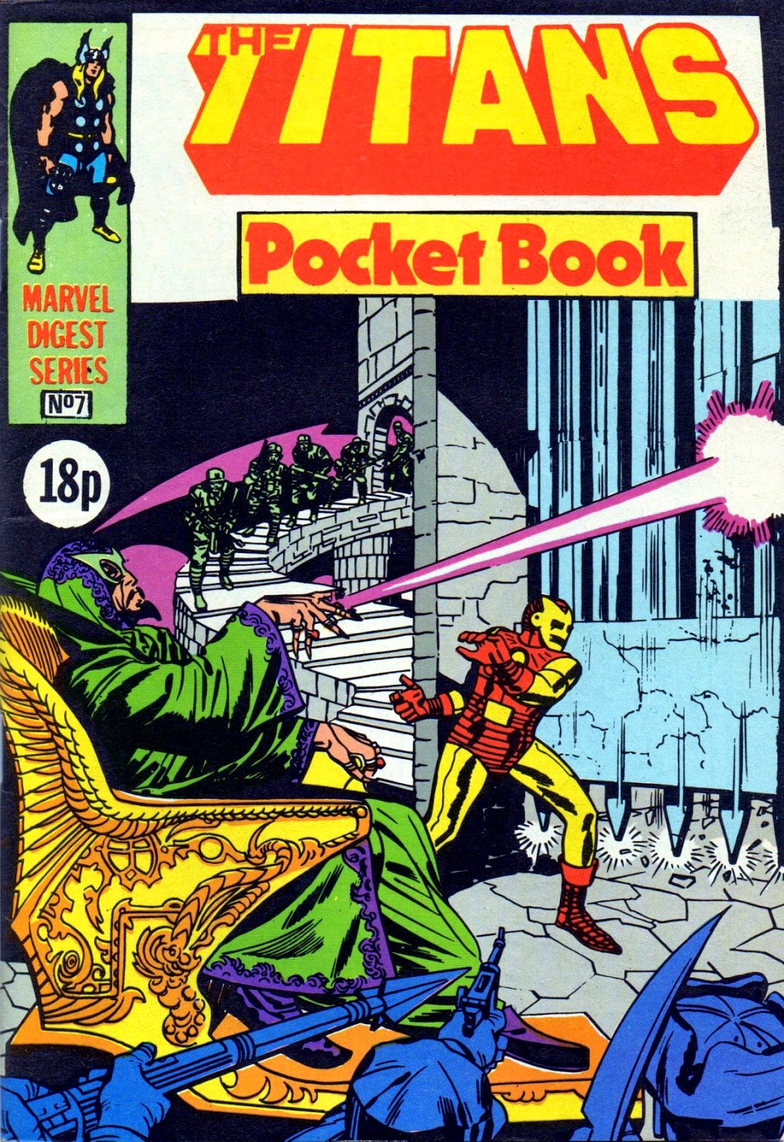
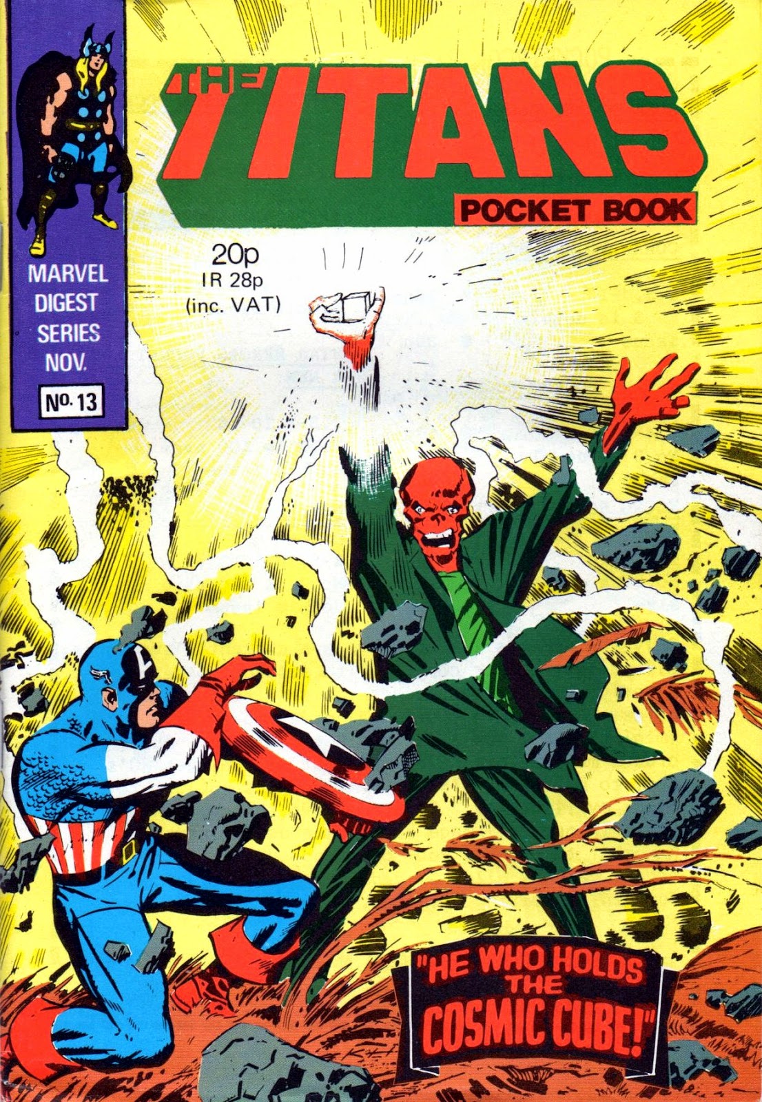
The COMPLETE TITANS POCKET BOOK COVER GALLERY...
When THE TITANS first appeared in shops in the mid-'70s, it was a weekly comic in what was called the 'landscape' format. That's to say, a normal-sized upright comic that had been turned sideways, with what had been its bottom edge now being the stapled spine, and featuring two (reduced) reprint pages side-by-side on a single page.
When the monthly Pocket Book version of the title debuted in 1980, it was 'digest'-sized (like a DCT COMMANDO mag) - so the dimensions of the printed artwork on the page were of a similar size to its earlier incarnation, except for having only one reprint page (not two) per actual comic page. Clear? No? Well, you can't fault me for trying.
This was a great little mag, featuring early tales of THOR, IRON MAN and CAPTAIN AMERICA. Just like its HULK counterpart, it conjured up memories of weekly '60s comic FANTASTIC, due to the fact that the contents were two-thirds the same. Also, just like the Hulk PB, The Titans only chalked up a run of thirteen monthly issues.
And - yup, you guessed it - you lucky Criv-ites can now enjoy looking at the cataclysmic covers for every single ish. Do I spoil you or what?! Comments extolling my generosity to the heavens will be most welcome! (In a modest way, of course.)
![]() |
| The caption is a tad misleading. The origin is the '60s MARVEL one, not the '40s TIMELY one |
The CRUNCH COVER GALLERY - PART ONE...
![]() |
| Images copyright D.C. THOMSON & Co., Ltd |
Well, look what I found in the same box as my MARVEL POCKET BOOKS - now that's what I call a bombastic blast from the past. I was working in the warehouse of BAIRDS department store in the main shopping area of my home town in 1979 when the above comic hit newsagents' shelves, but not for long. A few weeks later and I'd be working in the Central library just a short walk away. Ah, happy memories of a time so long ago, but which somehow seems like only yesterday.
I always felt that D.C. THOMSON's 10p comic The CRUNCH was, to a degree, intended as an answer to IPC's 2000 A.D. It was a good-looking comic and one would've thought it was destined to survive for far longer than the meagre 54 issues that it actually managed. Looking at the 'cheap' paper, it convinces me that the argument that today's comics need to be printed in full colour on glossy paper in order to compete for the attention of readers is arrant nonsense. If a comic in this format were published today, I'd buy it - and I bet I'm not the only one.
I'm sure I still have the free gifts somewhere - I've certainly got the poster and the skull pin-badge. I used to have the poster up on my wall - more to fill a space than anything else, because I'm not a fan of motorbike racing or BARRY SHEENE - nothing against him though. Anyway, if you bought this short-lived weekly comic back in the day, here are a few images to refresh your memories of 36 years ago. If you weren't born at the time, don't blame me - I was out most weekends doing my best to increase the population. Why, I could pull any girl I pleased. Trouble was, I just didn't please any. (And thanks to BENNY HILL for that joke!)
Pin back your peepers and away we go!
Subscribe to:
Posts (Atom)

.jpg)
.jpg)
.jpg)
.jpg)
.jpg)
.jpg)
.jpg)
.jpg)
.jpg)
.jpg)
.jpg)
.jpg)
.jpg)
.jpg)
.jpg)
.jpg)
.jpg)
.jpg)
.jpg)
.jpg)
.jpg)
.jpg)
.jpg)
.jpg)
.jpg)
.jpg)
.jpg)
.jpg)
.jpg)
.jpg)