Friday, 18 October 2013

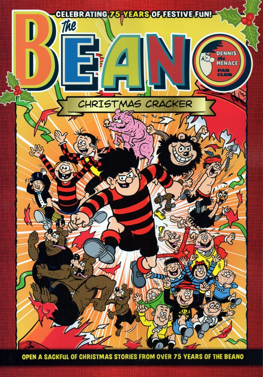
BEANO & DANDY CHRISTMAS CRACKERS...


Images copyright D. C. THOMSON & Co., Ltd

Why does DENNIS The MENACE on the above cover look like a 20 year old, powerfully-built man in short trousers?  Not quite sure, but he does, wouldn't you say?  In the shops now - The BEANO and The DANDY CHRISTMAS CRACKERS, priced £4.99 each.

While it's great to see so many classic strips, it has to be said that they look extremely washed out.  Perhaps this is to give them an authentic 'old' look, but it makes them less attractive than they could be.  If I were a cynic, I might think they were made to look like this in order to make the current strips in The Beano weekly look even more colourful and exciting than they actually are by comparison.  Surely not though?  


Either way, D.C. THOMSON have taken the lazy route to producing these bookazines, merely scanning and printing by the look of it.  I'm certainly no expert and hardly have the technology available to DCT, but even with my limited resources, I've managed to make the examples on this post much brighter and slightly less ancient looking.  Cop a gander at that Dandy logo - wouldn't have hurt them to tart it up a bit, surely?


Anyway, probably designed to appeal more to grown-up former readers than today's current crop of kids, so if you've got a spare tenner, you could probably spend it in worse ways.

ARCHIE GOODWIN'S GLASGOW 'ADVENTURE'...


Art by STEVE DITKO, copyright MARVEL COMICS

As I gad about the streets of Glasgow, the city of my birth, I'm often struck by its similarity to other countries.  Depending on exactly which street one happens to be, the architecture resembles New York or Chicago, Prague, Russia, Berlin, Austria - and no doubt quite a few other places.  In fact, the city has stood in for a few of these locations in various movies over the years, so it would seem that I'm not the only one who thinks so.

As I mentioned once before, back around the mid-'90s, a small group were taking a stroll around George Square in the centre of Glasgow.  Amongst the assembled company was no less a personage than ARCHIE GOODWIN (anyone who doesn't know who he is can leave the room now) and his wife ANN, and no more a personage than my good and humble self.  As we all chatted amongst ourselves on our way to dinner, Archie and myself at first continued a conversation we'd begun earlier, and then expanded onto other matters.


I mentioned to him that, as a young boy, whenever I was in the city centre with my parents, invariably I would be bought a comic (one of the POWER COMICS usually) containing reprints of JACK KIRBY or STEVE DITKO tales, and had no problem at all imagining that they were taking place in Glasgow.  This, of course, was because the buildings that Kirby and Ditko drew in their strips were identical to those of my birthplace.  'Twas Archie who pointed out that it was no surprise, as many of America's city blocks had been designed by some of the same architects, who had emigrated to the U.S. in the early part of the 20th century.

There's an alley I pass just along from Glasgow's Central Station, and I swear to you, if I were ever to see a Steve Ditko SPIDER-MAN climbing up or down one of the walls, I doubt I'd be in the least bit surprised.  In fact, I almost expect to see him every time I look.  Maybe one day, eh?


"WHERE DEMONS DWELL!"


Copyright MARVEL COMICS

As I gyrate through the streets of Glasgow, I have only one destination in mind - a comicbook shop!  Within its cool interiors I'm immediately met by a plethora of power-packed periodicals, books, and collectables, the very things to prompt my pulse into overdrive and bring me to the brink of a heart attack.  So many goodies, so little room left in my seemingly shrinking house.

THOR MASTERWORKS Volume 12 was a book I simply had to have, as well as the third printing of FANTASTIC FOUR OMNIBUS Vol 1.  Marvel now have all their books printed in China, and the new Omnibus volumes are much thinner than they used to be, meaning that they take up far less space on a bookshelf.  That's not the only reason I bought it though, so let me explain why I did.

Despite claiming to feature the 'highest quality reproduction ever', FF #1 apart, the issues presented in the first two printings were the same as in previous Masterwork editions, which left a little to be desired if I'm being completely honest.  However, this latest release is using the superior source material first utilised in the relatively recent Masterworks softcover books.  Everything is still not 100% perfect in a few of the later issues represented in this newest hardback collection, but it's probably the closest they'll get to anything near perfection for quite a few years yet.

Take a look at the first image below.  This is the dustjacket to the second printing from a few years back - look at SUE's face and hair (and other details, like the policeman and pedestrians) and then compare them with the second image below, this time from the newest printing.  See the difference?  I've even included close-ups to help you.  


As you can see, in the first pic, Sue's face and hair are far less detailed, and there are some slight differences between the two pics of the cop and bystanders.


To some people, of course, differences like these are trivial, but to conscientious collectors like myself, we prefer to have everything as near to the original printings of the mags as possible (as far as accuracy goes), but obviously on better quality paper.

But let us not forget the Thor book at the top of this post.  Containing issues #206-216, it features 11 titanic tales of Marvel's mightiest immortal, written by GERRY CONWAY and LEN WEIN, and illustrated by such legendary luminaries as JOHN and his brother SAL BUSCEMA, MARIE SEVERIN, DON PERLIN and JIM MOONEY.  A couple of pages is your lot, I'm afraid, as I've spoiled you enough for today.