.jpg) |
| Images copyright MARVEL COMICS |
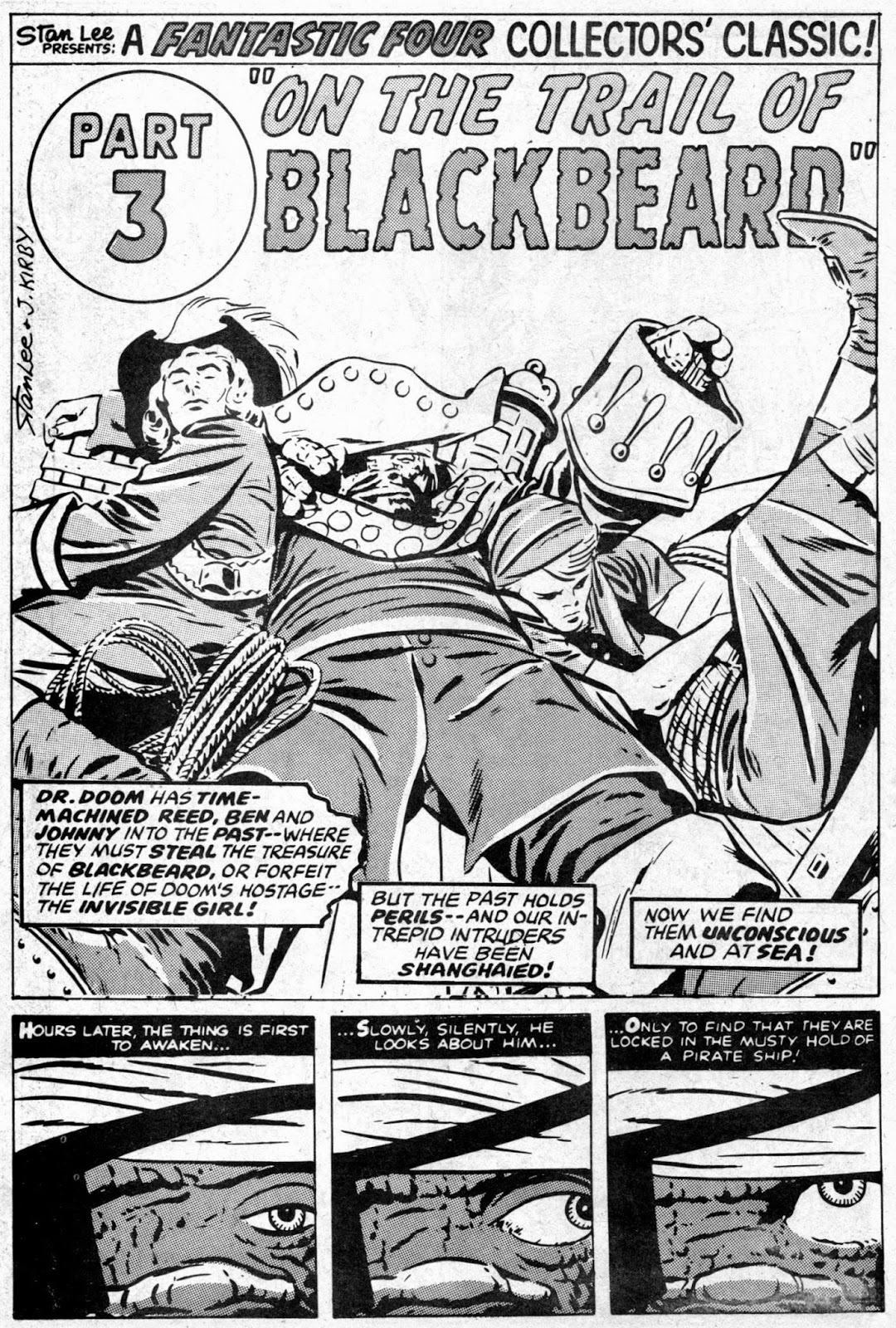
"Oh, good!" I hear you cry. "Another batch of COMPLETE FF covers and images for us all to feast on." Yes, your generous host has caved in to popular demand (he lied) and served up another helping of one of MARVEL U.K.'s better comics from the 1970s. I was totally delighted when this comic first came out because I hadn't kept my early MWOMs and this mag gave me another chance to collect the classic FANTASTIC FOUR adventures.
Years later, of course, I re-acquired all the paper covered issues of Marvel's first foray into U.K. publishing, but I still kept my Complete FFs, as they had their own charm about them. It's just a shame that PANINI's FF monthly was discontinued a year or two back, as I was looking forward to seeing JOHN BYRNE's tales of the cosmic quartet in uncut, full colour reprints in a U.K. magazine.
Anyway, until part five in this sensational series, enjoy the pulse-pounding pages on view before you - on this, the best blog you've ever read in the history of an alternate universe somewhere. (I hear it's popular on the BIZARRO World.)
.jpg)
.jpg)
.jpg)
.jpg)
.jpg)
.jpg)
.jpg)
.jpg)
.jpg)
.jpg)
.jpg)

9 comments:
Iwant you to continue with these FF galleries Kid, because I LOVE LOVE the FF, and in particular the British weeklies, which I collected avidly from week one way back when.
I loved the full-length 'novel' [giggle] story every week, plus half of a vintage FF tale, and seeing the dramatic contrast. Plus the pin-ups, esp in the centre pages where we had the most extraordinary singular posters of each FF member. I even loved the new FF logo for the weekly also.
What I especially liked about the British weeklies was seeing the artwork in glorious black and white instead of the lurid colour of its American cousin.
I too miss the monthly FF British mag of a couple of years ago too.
I love love love and yes love anything FF related and hope to see plenty more on here!
And no doubt you will, Karl, 'cos I'm a bit of an FF fan as well.
Kid, you'd have waited an extremely long time for the Byrne era to appear in the Panini FF - the last time I read it they were still printing the Kirby era stories and they were being reprinted chronologically so the entire 1970's would have to come first. I wonder why there's an article about The Eagle - what's that got to do with Marvel ? I like the way it says "the comic your dad used to read"- well, my dad was born in 1927 so he wouldn't have been reading The Eagle. I'm sure he told me he used to get copies of American newspapers and he'd read "the funnies" as he called them. I'm not sure I agree with Karl about the "glorious" black and white of the UK comics - I felt it was second rate compared to the colour of the U.S. mags but I did like the Complete FF with its' reprints of the early FF stories which I'd missed the first time in MWOM - in fact I think I preferred the original Lee/Kirby stories to the newer ones.
Yeah kid-great to see these. And a bit of the underrated Rich Bucker's work. He's copped a bit of flack over the years from various quarters for drawing a bit too much in the manner of other artists, in the eyes of some, but I have no problem with that particularly when the artists concerned are Jack Kirby, Neal Adams and John Buscema!. Have to admit that there's a bit of a big John vibe going on with these images, especially the splash pages - but what's not to like? There is a definite Buckler style though even if you can still tell who inspires his work. Thanks for sharing.
Actually, Col, the Panini FF mag was considering jumping ahead a little bit with the stories, depending on reader reaction. So it could have had a recent(ish) tale, a Byrne (or Buscema) tale, and a Lee/Kirby tale in the same issue. As for The Eagle, I'm sure it must've had some readers in their 20s, so it's not impossible for your dad to have seen and read it occasionally - if he ever read comics at all, that is. What's Eagle got to do with Marvel? It's a natural informative follow-up to having printed a couple of centre-spreads by Frank Hampson. Colour is good, of course, but the black and white British editions had a charm of their own.
******
Yeah, Buckler had his own charm, PC, and I guess he must have been instructed to give the FF pages a Kirby (or Buscema) feel otherwise he wouldn't have bothered. Glad you like them.
This was one of the UK Marvels I didn't really pick up (only the odd issue) as by 1977 I was getting a bit fed up with UK Marvel weeklies (except MWOM) but it looks like I missed out on a good comic - I really liked Bucklers art but the way he switched styles within a series was a bit annoying a times as you could settle into enjoying his art in one style then he changed it as can be seen it the samples shown here where he changes from a Buscema to a Kirby style in 2 issues ( but imho both look great).
Ron Frenz did the same thing, McScotty - mixed his styles, so that a page had Kirby-looking figures in one panel and Buscema-looking figures in another. I like Ron Frenz's art (as I do Buckler's), but the mish-mash of styles did irk me a tad. I wouldn't mind so much the style changing from one issue to another, but from one panel to another was going over the top.
I love that 'Terrible Triumph of Doctor Doom' splash page. Nice stuff from Buckler. Frank Giacoia maybe doesn't have the high-profile reputation of, say Joe Sinnott or Dick Giordano, but he was a terrific inker.
I don't think that's one of his better splash pages, DD, as Doom seems a bit stunted, but Frankie Ray/Giacoia was certainly a good inker.
Post a Comment