 |
| Copyright REBELLION |
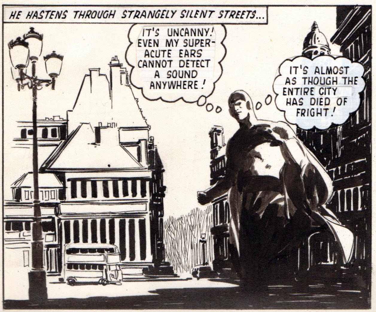
Thought you might like to see a page of LUIS BERMEJO art from FANTASTIC's JOHNNY FUTURE strip and compare it against the published result. I've actually got the complete episode, but the other pages don't really lend themselves to a panel-by-panel breakdown. (At least, not without a whole lot of work on my part.) Note that Luis has indicated where the name of the strip should go, but misspelt 'Johnny' as 'Jhonny'
Fantastic, as readers of a certain age will know, was a weekly periodical published by ODHAMS PRESS back in the 1960s, which mainly featured MARVEL reprints, but also included the fondly remembered MISSING LINK/JF strip that you see before you. Well, what are you waiting for? Enjoy!


9 comments:
Absolutely beautiful.
These are stunning and I am really impressed.
Tell me Kid ,are these actual size?
I have commented before on this art,it is still a masterclass in every panel.
Thanks for these.
What I mean is ,how do I look at these in their actual size.
Is the full page jpg. at the correct size ?
I scan them at 150%, Baab, so they're bigger than actual size, but what size you view them at really depends on the size of your computer screen.
Once again - the true masters of their art make it all look so easy!- which it ain't. Getting up close to comic art reveals a whole world of detail that just gets lost on the printed page. Reduced size and newsprint reproduction quality (or lack of) hiding the amount of detail. Co-incidentally I've been looking at a lot of original art lately (online, not actual pieces) from the likes of Leonard Starr, Stan Drake, Alex Raymond and John Prentice - they really put in detail that they must have known would not survive printing, I guess that's just the way they worked. Thankfully there are enough originals around for us to appreciate the effort years later.
I don't think the true masters could help themselves when it came to detail, PC. They just had to do the best they could, whether it would be seen on the printed page or not.
You KNEW I would love these, didn't you?
Of course I did, JP - but then again, who wouldn't?
He's got a deft hand, there are -very- few artists I've seen that can handle blacks with such alacrity.. I think the camera guy would've baulked at spotting some of the blacks on panel 4, so this artwork offers an interesting insight.
What amazes me is that his art gives the impression of being far more detailed than it actually is. That's a true master.
Post a Comment