 |
| Copyright MARVEL COMICS |
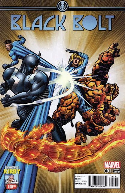
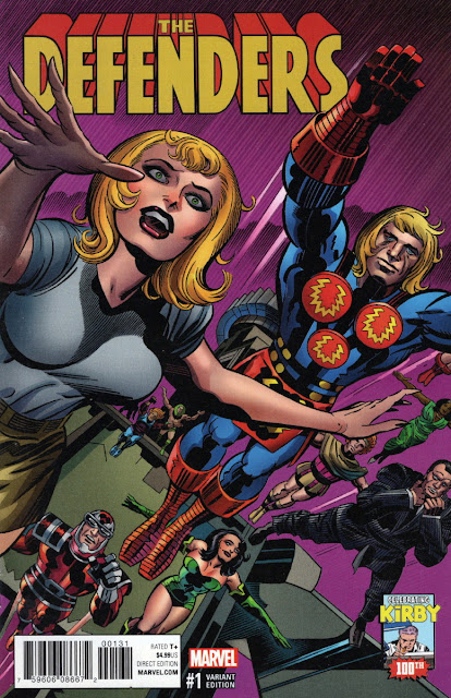
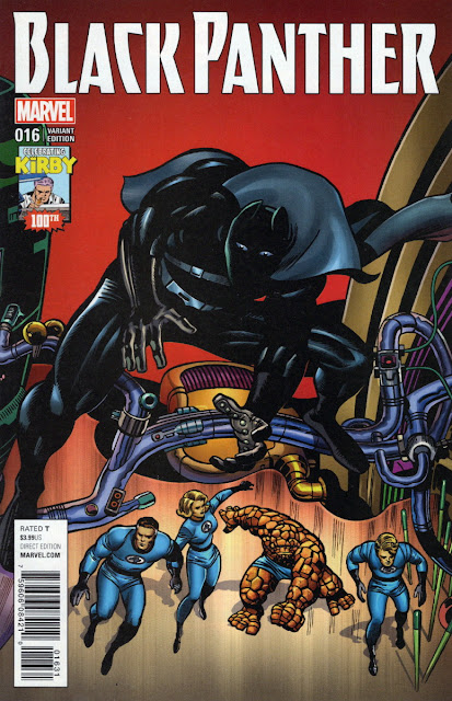
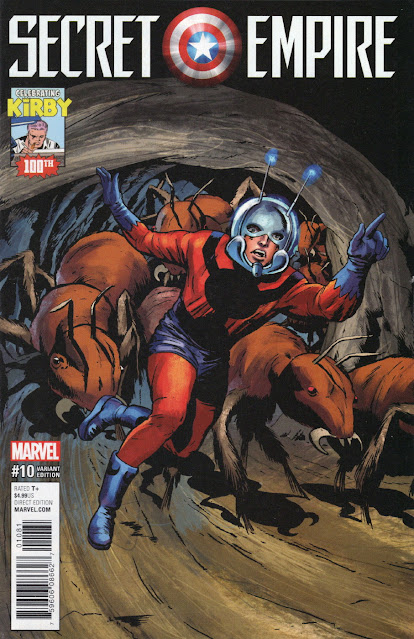
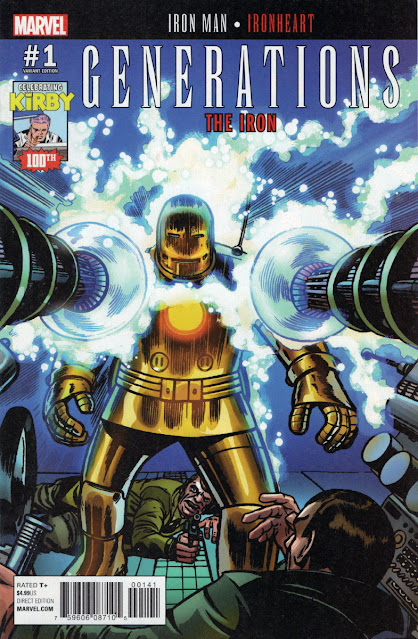
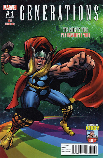
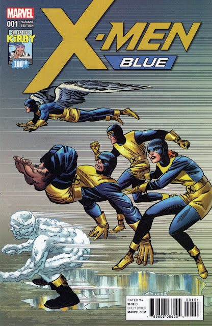
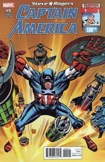
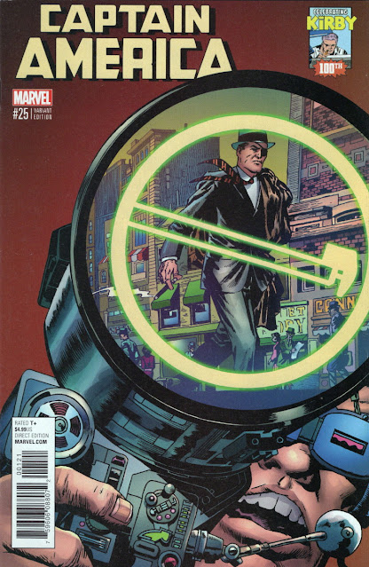
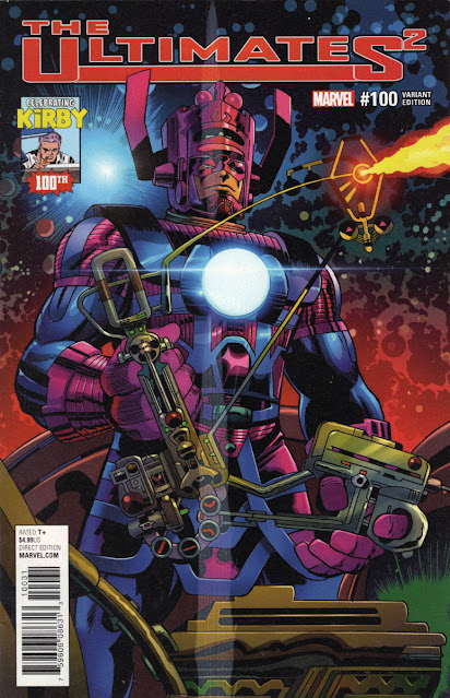
In 2017, had Jack Kirby still been alive, he'd have celebrated his 100th birthday. Marvel commemorated the event by adorning a batch of covers with recoloured JK art, which had originally been covers or splash pages, and mighty impressive they were too. I'm unsure if they all accurately reflected the contents of the mags they graced (Eternals on a Defenders cover?), nor do I know precisely how many there were, but I'm quite willing to share the 16 in my possession with all you cavortin' Crivvies.
I've shown most (perhaps even all) of them before, but I thought it would make a dynamic post to feature every issue in my collection in one go. This is the result, so I hope you enjoy refreshing your memory if you're already familiar with them, and if not, seeing them for the very first time. (I don't mean in their original form, but in their recoloured format.) So, you wild and crazy bunch - over to you. Got a favourite? Any memories stirred by seeing these images again? If so, you know where the comments section is.


8 comments:
Love looking at some "King"! Thanks!
Rip Off
Nae tother a' ba', RJ.
Some nice covers. I particularly like the Captain America\ Nick Fury one. The Defenders cover seems a strange ( but nice) choice as it only features the Eternals.
Yeah, they're nice. Some people don't like that sort of recolouring, McS, but when it's done right, I think it gives 'old' art a new lease of life.
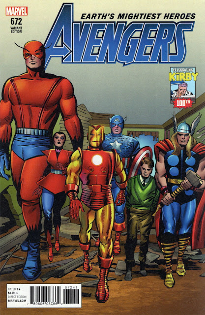
Rick Jones (I assume it's him) looks tiny on the Avengers cover - even the Wasp towers over him.
What makes you think Rick Jones isn't tiny anyway, CJ? And remember that The Wasp is a grown woman, while Rick is just a teenager. To be frank, Kirby hasn't been consistent in the way he's drawn the characters in relation to each other, in regard to where he's placed their feet on the floor.
Nice stuff, although some of them look a little odd out of context (the This Man, This Monster splash, for instance).
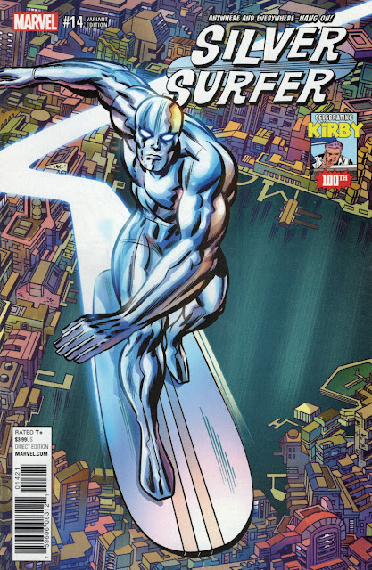
The Silver Surfer cover looks lovely, only ruined by a logo that- in my opinion- is pretty awful.
I'd say that 'awful' is overstating the case, DS, but it was the regular logo being used on the mag at the time and readers would've been familiar with it. It does the job, I'd say.
Post a Comment