 |
| Copyright REBELLION |
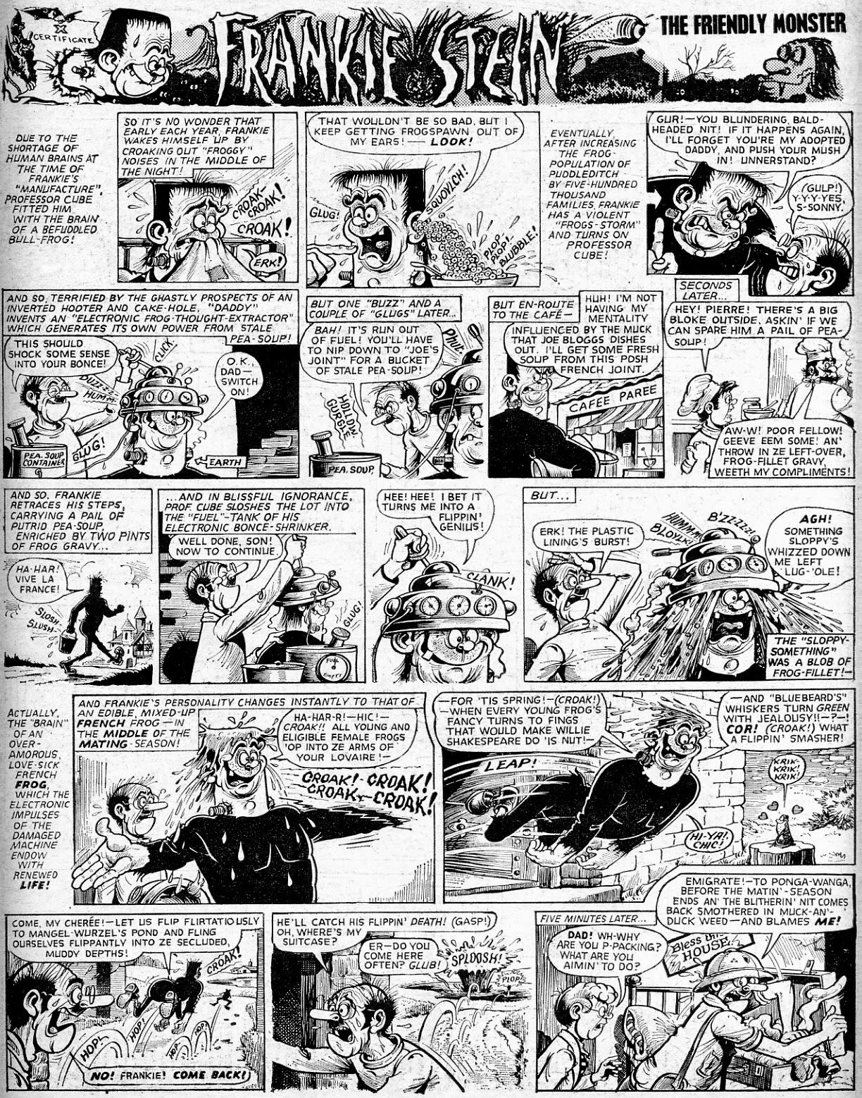
I've featured this FRANKIE STEIN page before, but this time I thought I'd scan it from the original artwork and present it panel-by- panel, the better for you to appreciate the mastery of KEN REID's awesome artwork. It's when you see art of this high standard that you realise how woefully inferior some of the pages in the last incarnation of The DANDY were. (Regardless of the feeble protestations to the contrary of some misguided souls.)
To enjoy each panel at its best, click to enlarge.
And below is the published page from WHAM! #134, cover-dated January 7th 1967. Brilliant stuff!


10 comments:
I rarely save images from other people’s blogs and sites but this time I will do just that, thank you for showing these! Have you seen the two pages of Ken Reid sketches that are up for sale on eBay this week?
Don't worry, Irmantas - unlike some, I'm not 'precious' about that sort of thing. I haven't seen the sketches of which you speak, but I'll look them up right now.
These originals look even more detailed than the original published pagee ( although I assume they cant be they mut be the same) nice to see - I had a look at the art on Ebay Irmantas mentioned - The "Big head" character doesn't look quite right (for Reid) to me (although not doubting it is by him). I wonder what these 2 illos were part of as the characters (from memory) Fudge the Elf and Big Head were drawn a few years apart (don't think Reid overlapped on doing these 2 strips)were the just warm up sketches etc??
I think the reason the original art look more detailed, McScotty, is because there's a subtlety in the application of linework and variation in the depth of the blacks, which is lost in the printed version. Fine linework can either break up or thicken up, depending on the quality of reproduction, which, in this case, was printed on the equivalent of blotting paper.
That Big Head drawing looks more like a Frank MsDiarmid attempt to emulate Reid's style, but I assume the seller must know what he's talking about. I suppose the 'difference' is down to being a sketch rather than finished art.
Surely the original inspiration is Mary Wollstonecraft Shelley's 1818 novel "Frankenstein, or the Modern Prometheus?
I think you meant to leave your comment on the Frankenstein CGI clip, but you need to read the post again. I said that Ken Reid's Frankie Stein was inspired by Frankenstein - that's all. However, had I been asserting that the strip had been based on the movie, I'd have been correct. Inasmuch as the visual look of Ken's Frankie is clearly based on Jack Pierce's makeup for Boris Karloff. (Flat head, bolts [electrodes] through the neck.)
Ken Reid, like all true greats in their fields, makes it all look so easy! Given the quality, or lack thereof, of the paper the strips were printed on it's amazing that so much detail came through onto the printed page. I guess there was so much in the original art that some could get lost along the way and the end result could still look as good as it does. Great to see the originals - white-out, pencil lines, ink variation and all.
Glad you enjoyed seeing the original art, PC. I might show some more when I get the time - it's quite time-consuming preparing all those individual panels.
Absolutely brilliant! Have you ever seen "guided view" on Comixology's digital comics? It's just like that!
I haven't, JP - I just thought it would be a good idea after posting a slice of original art on my recent previous Frankie post. Glad you enjoyed it.
Post a Comment