 |
| Images copyright relevant and respective owners |
The MAN WHO DREW TOMORROW was published in 1985, but I think I probably acquired it a few years after that - though I've had it for so long that I can now no longer recall exactly when I bought it. It's all about FRANK HAMPSON, the man behind DAN DARE, and it's a thoroughly entertaining and informative read. However, I have to be honest and say that I don't think the art on Dare was particularly outstanding at the start, but it got better over time, and at its height, the strip contained some of the best art ever seen in comics, then or now.
I still have a few reservations about the shape of Dan's head - too long and too thin, especially in profile shots, and just how much credit for the high quality visuals belongs to Hampson is perhaps debatable, as he used assistants like DON HARLEY, ERIC EDEN, HAROLD JOHNS, JOAN PORTER and others. Could Hampson have done it on his own? The studio system that he utilised was self-indulgent in the extreme, especially for what amounted to two pages of artwork a week. Hampson would sketch out a rough, his assistants would then photograph each other according to the positions indicated in the rough, redraw the page using the photos as reference (including specially constructed models of spaceships and buildings), then Frank would go over it and bestow the finishing touches.
 |
| FRANK HAMPSON's original rough |
That's how it was done in its most basic terms, though there were variations on that formula, but it was considered an unnecessary procedure by his assistants, who thought that Frank's roughs, with a little more polish, would be good enough to print without losing two days in the photography aspect of the operation. True, it was Dan Dare who sold EAGLE, but the strip could probably have been produced to an equally high standard without all the painstaking palaver that Hampson deemed necessary. Other artists could do it, so why, seemingly, couldn't he?
Anyway, just thought I'd throw that in for your consideration. Around ten years ago, the author of the aforementioned book, ALASTAIR CROMPTON, wrote another version of his tome, this time titled TOMORROW REVISITED, and yesterday I took possession of it. It's touted as being a 'complete rewrite', but I'm not sure (after a cursory comparison between the two) whether that's entirely accurate or not. While the new version has images not seen in the old, the old has images not used in the new, which, considering that Tomorrow Revisited has four blank numbered pages at the back of the book, makes me wonder why. All the original images, plus the new ones, would have fitted with no problem.
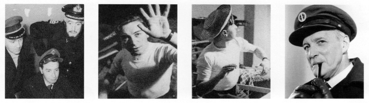 |
| Photos taken for reference, presumably after the rough was produced |
The new book (if you can call a ten year old book new) has an odd quirk, in that hyphens and dashes are used indiscriminately and interchangeably, though this happens less towards the end of the book. For example, hyphenated words like 'brand-new' would be rendered 'brand--new' (imagine the two dashes there as one long one, 'cos my keyboard doesn't do long dashes), and sentence breaks have a hyphen instead of a long dash - with no space either side of it like I've used here. There's not even any consistency in the size of the hyphens or dashes - sometimes they're both long, other times they're both short - which is a bit irksome at times.
More minor problems (perhaps) are spelling errors. DICK TRACY's surname is rendered as Tracey, and PAUL GRAVETT, though mostly correct, is once rendered as Gravatt. And TOMMY WALLS is described as a blonde (feminine) instead of a blond (masculine), again making me wonder about the quality of proof-readers on such publications. Overall, though, the book is a good read, but I don't think it can rightly be regarded as better than its predecessor. The one thing it does have going for it is the inclusion of unseen strips created by Hampson which have (until now) never been published. But even here, there seems to be a mistake.
 |
| Finished art by FRANK HAMPSON & DON HARLEY |
On Hampson's MODESTY BLAISE try-out strips, the text introducing them says that each Hampson example is followed by one by JIM HOLDAWAY, though all of them seem to be by Hampson as there's no difference between them - aside from pencilled strips also being shown at various stages of the inking process, though none are fully inked. Perhaps copyright permission couldn't be secured to reproduce Holdaway's strips, but surely there was plenty time to amend the text? Also, infuriatingly, two of the three more interesting pencil versions are reproduced far smaller than their inked equivalents.
Anyway, is there any point to buying the 'new' edition if you already have the old one? I'd say the new version complements the old one rather than replaces it, but, considering that you can currently buy it direct from the publisher for £14.99 (half its original price of £29.99), it's hardly going to break the bank and will look nice on your bookshelf. And, of course, if you've never read the original edition and you're a Dan Dare or Frank Hampson fan, you'll love looking at the many fine examples reproduced directly from the original art.
 |
| Limited edition dustjacket |

2 comments:
How’s the art reproduction? I have one Dan Dare trade and I’m not crazy about the quality. It’s got that slightly fuzzy look as if they xeroxed some old comics.
The reproduction in regard to the pages taken from original art is excellent, DS, and there's a good number of them. There are a few images taken from printed comics, but not too many. For £14.99 from PS Publishing, I don't think you'd be disappointed. The art isn't reproduced original size (the book is 11 and 3-quarter inches by around 8 and a half), but it's nice and clear, and some panels are printed separately in an enlarged size for greater effect.
Post a Comment