Saturday, 12 November 2016

SPECTACULAR SPLASH PAGES #11...


Images copyright DC COMICS

A double-spread spectacular splash page by JACK KIRBY for your appreciation, peeps. MIKE ROYER supplied the inks, and readers experienced the comics equivalent of a wide-screen movie image - something that the 'King' excelled at.  I've applied a little computer 'magic' to disguise the gutter between the two pages, so lap it up, Crivvies - this one's for you!

ROBERT VAUGHN - R.I.P.


Sad news for all MAN From U.N.C.L.E.
fans - actor ROBERT VAUGHN has passed
away after a short illness (leukemia).   He was
83.  Condolences to his family and friends.

(Click here for Mr. Vaughn's
New York Times Obituary.)

Thursday, 10 November 2016

BABE OF THE DAY - IMOGEN HASSALL...


At times like this, words fail me.
Nothing I write would do justice to
the awesomeness of the amazing 
IMOGEN HASSALL.

SPECTACULAR SPLASH PAGES #10...


Copyright MARVEL COMICS and CONAN PROPERTIES, Int.

Young BARRY SMITH was still finding his own style 'on the hoof' with CONAN The BARBARIAN when he drew this page.  Now and again there was still an occasional hint of JACK KIRBY in some panels, but that wasn't to last.  JOHN BUSCEMA would have been the first artist on the mag had it not been for his higher page rate, but though he eventually came to draw more issues of Conan than Smith did, there was something about our boy Barry's pages that captured the sorcerous HYBORIAN AGE like no other artist ever could.

Tuesday, 8 November 2016

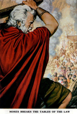
THE BIBLICAL ILLUSTRATIONS OF JACK HAYES (UPDATED)...

Copyright relevant owner
 
No, don't panic you lot - you're not about to get a BIBLE lesson.  Here's the scoop.  Back around 1971 or '72 (certainly no earlier than 1970), my mother took me to a Town Centre shop by the name of W. &. R. HOLMES after school one day and bought me 'The Good Book'.  (She'd told me earlier that morning of her intention, but I forgot and went to a pal's house, and my mother had to 'phone to remind me.)  I no longer remember exactly what became of it, but I do recall inadvertently inflicting some damage to the cover under the dust-jacket, which bothered me somewhat.

A few years later, in 1976 or '77 (no later than '78), I saw its double in another local bookshop and, purely out of a sense of nostalgia, bought it for myself.  I'd always been fascinated by the interior illustrations of JACK HAYES, a very talented artist.  In my original copy, there was a note on the inside of the dust-jacket which said that a 4-colour photogravure process had been used to reproduce the colour plates, which, to my mind, rendered them almost photographic in appearance.  (In my youthful ignorance I thought that's what 'photogravure' meant.)

And, to my eyes, it was true!  I used to look at these plates and marvel at the fact they'd been created by human hands, rather than being (it seemed to me) captured by a camera.  In my new copy there's no such note (being an edition from 1975), and the illustrations aren't quite so photographic as I seem to remember them being in my first copy, but they're still exceptional examples of artistic accomplishment.

When I bought the new edition, I no longer had my original so couldn't do a direct comparison, alas - but, like I say, there appeared to be a subtle difference (though it may've been my imagination).  Still, it was great to see the pictures again after all this time.  'All this time'?  In fact, it had only been about six years, but seemed like a lifetime away, such is the puzzling passage of time when one is still a relative youngster.

Anyway, I thought I'd share the illustrations with you here, just to push the parameters of this blog's content.  Aren't they fantastic?  I don't know much about the artist, apart from the fact that he did some paperback book covers, and some illustrations for LOOK & LEARN magazine by IPC.  Let's hear your views about Jack Hayes' work in the ever-lovin' comments section.

******

Looking at these pictures now, I'm back in the bedroom of my old house, so strong is the association in my mind between the illustrations and where I lived at the time. However, considering that I had this Bible for only around a year (perhaps approaching two at the very most) before we flitted elsewhere, I'm amazed that it now feels like I owned it for the entire 6 years 7 months I stayed there, rather than just the short period of time it actually was.


(Update:) Not counting the cover, there were 15 illustrations in my replacement Bible, though I've only just discovered that there were 17 in my original edition bought circa '71.  Below is the intro on the flyleaf as I recall it (image sourced online), though the 2nd and 3rd paragraphs are absent from my late-'70s replacement copy; probably because, being a later printing, the 'first time' claim about the photogravure images no longer applied to this size of Bible.
 
The two absent illustrations were likely omitted due to the Church Hymnary being added, requiring the cost being offset by reducing the colour content.  I've added them (in sequence) to the pictures above (3 & 4, ignoring the dustjacket), taken from a different edition only recently acquired on eBay.  (Moroccoette, yapp, gilt edges, housed in a slipcase.)  I'm amazed that I didn't realise before now that my late-'70s copy was 'missing' two images, as the moment I saw them again, I remembered them immediately.
 
Compare the spine below from an earlier dust-jacket (image sourced online) with the one at the top of the post - as you can see, the Church Hymnary isn't mentioned on the earlier version.  And, since typing the previous sentence, I've now acquired a copy of the very same edition as the one I originally had - and can now confirm that the Church Hymnary was indeed not included.
 
However, astoundingly, I now see that my impression about the illustrations in my earlier edition seeming almost photographic was largely correct.  There's one picture in particular that, when compared to its later printing, has a decidedly photographic aspect to it that isn't captured in its subsequent presentation.  It's more pronounced in that one illustration, but can also be detected in some of the others, so I wasn't entirely imagining things back in the day.  Whether there's a difference in the paper or the printing process between the two versions I'm not sure, but whatever the cause, there's definitely a discernible distinction 'twixt the two publications.  
 

Below are two other Jack Hayes illos from two different issues of Bible Story.
 

BABE OF THE DAY - DANA GILLESPIE...


It's always the same!  Someone
wants to take your photo and up pops
some 'wannabe' trying to get in on the
action.  Nobody wants to look at you,
Beret-Boy, it's DANA GILLESPIE
we're all here to see.

SPECTACULAR SPLASH PAGES #9...


Image copyright DC COMICS

JACK KIRBY was a master at producing power-packed pages, but he was equally adept at portraying quiet scenes.  This is one such scene, where five people do no more than crouch in a Time Cube, yet the air of impending action is practically palpable.  WALLY WOOD's inks enhance the page in a way that very few inkers could emulate, but that was the magic of Woody.  Together, he and Jack made a formidable team.

Monday, 7 November 2016

RECOMMENDED READING: THE CHAMPIONS...


Image copyright MARVEL COMICS

For those of you didn't dash out and purchase The CHAMPIONS Masterworks volume when I recommended it a little while back, you now have another chance to re-read a little piece of history.  This cardboard covered Special contains #s 1-3 of the original '70s series, plus #s 14 & 15.  This will, this will rock you - buy today!

BABE OF THE DAY - DANA GILLESPIE...


Here's one of my favourite Babes
from the 1970s - DANA GILLESPIE.
And the odd-looking bloke with the beret
might be FRANK SPENCER.  (DAVID
BOWIE?  Nah!  Don't be so ridiculous
now - it just couldn't be.)

Sunday, 6 November 2016

WHAT A DIFFERENCE A YEAR MAKES...


Images copyright D.C. THOMSON & Co., Ltd

Here's something I'm deliberating over, with which you might be able to help me.  The very first DENNIS The MENACE book came out in 1955 (for '56).  It then came out every second year until 1977 (for '78), and then took a holiday for five years.  In 1982, the '83 book was issued, and again there was a two year gap between the next two books ('85 & '87, issued in '84 & '86 respectively).

The next book (for '88) came out a year after the previous one, and they were released annually right up until the last one in 2010 (for 2011).  So here's what's bothering me: Which one would you say qualifies as the first 'Annual'?  The '87 book, which came out a year before the next (but two years after the one before), or the '88, which came out a year after its predecessor?

What's your view on the matter?

SPECTACULAR SPLASH PAGES #8


Image copyright DC COMICS

A cracking BERNIE WRIGHTSON illustration is the latest in our splash page series, which I trust all you cavortin' Criv-ites are following and appreciating in equal measure.  What will the next one be?  Well, there's only one way to find out, so don't stray too far - you'd hate yourself if you missed anything!

Saturday, 5 November 2016

BABE OF THE DAY - ADRIENNE BARBEAU...


ADRIENNE BARBEAU is a sexy
gal and no mistake.  Talking of mistakes,
I wish I hadn't misplaced the 'phone number
she slipped into my hand when she was asking
me for my autograph.  (I also wish my doctor
would stop giving me anti-hallucinatory
drugs - I enjoy my delusions.)

Friday, 4 November 2016

SPECTACULAR SPLASH PAGES #7...


Image copyright MARVEL COMICS

Behold - the mighty GALACTUS!  But hold on a mo!  It's Galactus as pencilled by JACK KIRBY sure enough - but not as inked by JOE SINNOTT.  Nope, 'twas the valiant VINCE COLLETTA who delineated this page, demonstrating that he was just as capable of doing justice to the KING's pencils as some of his more fan-favourite peers.

When approached for a comment, Mr. Galactus declared himself to be extremely pleased with Vinnie's contribution to this portrait, so if you wanna argue - take it up with him!

CAN YOU SPOT THE DIFFERENCE...? (UPDATED)


Images copyright MARVEL COMICS

Believe it or not, Ripley, there are three main differences (not including the colouring) between these two versions of the same page.  Can you spot what they are, frantic ones?  Go to it!


And below is a side-by-side comparison to help you out a bit.  (Click to enlarge - we don't want you suffering from eyestrain.)


Update:  Okay, you've all had enough time, so here's the list of differences.  The recoloured page was re-created from the reprint (below) of Thor's origin in #158, as the original proofs of JOURNEY Into Mystery #83 had been mislaid.  As you can see, the logo protrudes over the border in the original, but not in the reprint, Thor's dialogue balloon has been relettered or retouched (or both), and DON BLAKE's cane arm extends further from his body.  Those are the three main differences, but there are others:  The story number at the bottom of the page and the corner page number have been deleted, and the 'energy' lines around Thor's hammer (under 'and the', and above the first panel) are slightly different.  Luckily, superior proofs of the original tale were rediscovered and utilsed for most future printings (but not always).

SPECTACULAR SPLASH PAGES #6...


Copyright MARVEL COMICS

Yet another spectacular splash page, folks - drawn by JACK KIRBY and VINCE COLLETTA (pencils and inks respectively).  What a team they made on THOR during the 1960s, and looking at this particular page makes me wonder why some people didn't like Vinnie's inks on Jack's pencils.  Could it be because he left the zips off The RECORDER's boots perhaps? Anyway, let's not dredge up that ol' controversy again, let's just appreciate a great piece of art by two of comicdom's finest.  Comments welcome.

Thursday, 3 November 2016

BABE OF THE DAY - JANE RUSSELL...


The sultry JANE RUSSELL gives
me the eye.  However, I think I'll hold
 out for the rest of her.  (Guffaw!)

RECOMMENDED READING: THOR EPIC COLLECTION VOLUME TWO...

Images copyright MARVEL COMICS

Here's a big belter of a book, frantic ones - The MIGHTY
THOR EPIC COLLECTION Volume Two.  As per usual, I'll
let the back cover spiel tell its own story, as it can do it far better
than I ever could.  Doubtless you'll all be wondering just where you
can purchase this valiant volume, but wonder no more.  Your local
comicbook store will doubtless be more than happy to supply you
with a copy in return for mere money.  Well, what are you
waiting for?  Grab one now before they all sell out!

AMAZING! MAGICAL! ROBOTIC! IT'S THE AMAZING MAGIC ROBOT (THOUGH NOT NECESSARILY IN THAT ORDER)...


Who remembers this classic toy from their childhood?  Originally manufactured by MERIT in the early '50s, it had a good long run over the years, and, although I never owned one as a kid in the '60s, I always wanted one.  It's original name was The Amazing MAGIC ROBOT, but RETRO-RANGE's version is called The Magical AMAZING ROBOT, but is practically identical to the first in every other way, even utilising the box art of one of the earlier editions.


The robot is bronze-coloured (or is it dark green?) in the current release, as opposed to the silver one I recall as a child, but Merit may also have used variant colours down the years, as they produced different editions of the game during its heyday.  Anyway, it may have taken me 50 years to eventually get one of these classic items, but it was worth the measly fiver it cost me from a Glasgow 'bric-a-brac' shop.


If any cavortin' Crivs have any memories associated with this 'toy', feel free to reminisce to your heart's content in our 'amazing magical' comments section.  (Incidentally, there was another version called The DALEK ORACLE by BELL TOYS, which did the exact same thing.)  Bring the past back to life today, before tomorrow becomes yesterday.  (H'mm, now doesn't that sound almost profound?!)

Wednesday, 2 November 2016

SPECTACULAR SPLASH PAGES #5...


Image copyright DC COMICS

Another JACK KIRBY-WALLY WOOD splash page, folks, one which actually precedes the previous CHALLENGERS page I showed you, as they're both from the same story.  I always thought that Jack often drew horses too small in relation to people in the same panel, but whether that's the case here or not, no one can deny the powerful impact of the above scene - not even me.  Enjoy!

Tuesday, 1 November 2016

(BOND) BABE OF THE DAY - JULIE EGE...


Now JULIE EGE is what
I call a woman.  If only she'd call
 me, I'd be a very happy man!

RECOMMENDED READING: STAR WARS EPIC COLLECTION - THE ORIGINAL MARVEL YEARS VOLUME ONE...

Images copyright LUCASFILM Ltd

Are you a STAR WARS fan?  Are you a comicbook fan?  Then this is the book for you!  I'll let the spiel on the back cover (below) speak for itself, so instead, let's look at ROY THOMAS's introduction to the OMNIBUS volume, reprinted as one of the bonus features in the back of this book.  Roy recalls seeing a rough cut of the film, wherein DAVE PROWSE's voice hadn't yet been dubbed by JAMES EARL JONES, and describes him as having a "thick Scottish accent".  Well, slap me with a wet kipper and call me 'Bob' - Prowse comes from Bristol, and sounds nowhere near Scottish.

It reminds me of the time BOB HOPE's writers had actress JILL St. JOHN describe SEAN CONNERY as a "typical Welshman" in a show for a U.S. Air Force Base in Madrid.  I'm sure Sean wouldn't have been well-pleased, proud Scotsman that he is.  So what, if anything, have we learned from this?  One thing at least - Americans seem to be total crap at distinguishing accents, simple as that.  However, they have been known to produce some very good comicbooks, so we forgive them for their 'tin' ears.  Big of us, eh?

Okay, back to the book.  You can buy your very own copy at your nearest comics shop or bookstore.  Remember - last one there is a big girl's blouse!


Related Posts Plugin for WordPress, Blogger...