Friday, 31 August 2012

THE VANISHING STONE MEN - COMIC COVERS 'SNAP' - PART TWO...

Copyright MARVEL COMICS

Back in 1985, the layout of the cover to JOURNEY Into MYSTERY #83 was dusted down and reused for X-MEN ANNUAL #9.  JACK KIRBY's artwork for JIM #83 originally featured several more STONE MEN From SATURN descending from the sky, which were deleted before publication to lend greater emphasis to the figure of The MIGHTY THOR.  However, ART ADAMS and WALTER SIMONSON's cover was closer in design to 'King' Kirby's unaltered version.  (That's the published comic below.)


And, for all the completists amongst you, below is a production photostat of how Jack originally drew the cover (inked by Joltin' JOE SINNOTT) before STAN LEE decided that it was just a bit too crowded for the star of the book.


But it's not over yet.  Below is a coloured version which appeared in ORIGINS Of MARVEL COMICS in 1974.  I suspect that the white spaceship and hammer were supposed to have been coloured grey, but were missed due to an oversight.  It also looks as if the colourist mistook Thor's tuft of hair for one of the wings on his helmet.


Well, you can't say that you don't get your money's worth on this blog, now can you? More COMIC COVERS 'SNAP' soon!

FAVOURITE COMICS OF THE PAST PART ELEVEN - THE AMAZING SPIDER-MAN ANNUAL #18...

Images copyright MARVEL COMICS

I was buying a lot of comics in 1984 - from any place I could get 'em.  Newsagents, comicbook shops, Glasgow's Virgin Mega-Store; you name it, if it sold comic-books, I was probably in there at some stage scooping them up.  The AMAZING SPIDER-MAN ANNUAL #18 was one I purchased from R.S. McColl's in the main shopping centre of my home town.  Its primary attraction for me was that it was scripted by STAN LEE (from a TOM DeFALCO plot) and that Spidey was drawn in an imitation DITKO-style by RON FRENZ.


What an utter joy it was to read this tale - it simply sang, such is Stan's mastery of words when it comes to making a story move along at a rip-roaring pace.  I enjoyed it so much that I actually read it again the next day, and could only rue the fact that Stan didn't write more often.  Say what you like about 'The Man', but he sure knows how to inject an infectious sense of fun and adventure into almost any tale and this one was certainly no exception.  Over the years, whenever I've wanted to re-experience the thrill of seeing just how well a superhero comic can be written, I've returned to this issue again and again.


I know I've bored you with the topic of time before, but it really amazes me that I first read this story a kick-in-the-pants off 30 years ago - it just doesn't seem like it. The R.S. McColl's shop I acquired it from is long, long-gone, the premises having housed several different businesses in the intervening years between then and now. Yet, when I look at the cover, I can clearly remember buying it as if it were only a couple of weeks back, so distinct is the memory of it in my mind.
  

As I said, back in the early '80s, I was buying a whole lot of comics, but I only regarded two of my regular titles as being absolute 'must-haves'.  The first was The FANTASTIC FOUR, written and drawn by JOHN BYRNE, and the second was MARVEL TALES, reprinting the classic run of Lee/Ditko Spider-Man stories.  These were the 'dynamic duo' of the monthly Marvel output, but occasionally there would be an issue of another mag which was up there with the best of them.  Such a one was The Amazing Spider-Man Annual #18.


I can honestly say that my copy is in practically the same condition as the day I bought it, which is more than I can say about me.  It's at times like this that I find myself wishing I had a hideous portrait up in the attic of the same mystical properties as Dorian Gray's.  Of course, some wag is sure to say that any portrait of me is bound to be hideous.  It reminds me of the time an artist asked his subject whether he thought his newly-completed portrait did him justice.  "It's not justice I require," said the eminent subject - "it's mercy!"

And on that note, I'll leave you to look up the price of the above ish on eBay.  If you don't already have it in your collection, now's the time to track it down and treat yourself to a fun read.

Thursday, 30 August 2012

LIVE DINOSAUR SEEN IN GLASGOW...


That'll be me then.  (My friends think I'm a bit of a dinosaur and I often feel that I'm heading for extinction.)  However, as we're on the subject...

In the grounds of Glasgow University, near the entrance to the Hunterian Museum, there once stood a Tyrannosaurus Rex.  I think the ol' chap had been part of a display and was placed in that spot around the year 2001, where he soon became a popular tourist attraction and interesting backdrop against which students posed for their graduation photos.


A few years ago, the museum was extensively renovated, and old 'Dino' disappeared.  I've no idea whether he was quietly put to sleep or still exists somewhere in storage, but fortunately I had managed to take a few photos of him a year or two before he was removed.


For all those who miss ol' Dino as much as I do, here's a few snaps of him to remind you that Glasgow once had its very own prehistoric pal who guarded the grounds of the fourth oldest university in the English-speaking world.

******

Since I first posted this, I've discovered that 'Dino' is actually a female dinosaur called 'Millie' (the Millennium tyrannosaur) who was lifted into position on January 22nd, 2001.

JACK'S BACK...


Images copyright MARVEL COMICS

When JACK KIRBY returned to MARVEL in the mid-'70s, the only existing mag he resumed drawing was CAPTAIN AMERICA.  Apart from lending his artistic prowess to some covers (usually designed by MARIE SEVERIN), he steered clear of the heroes he'd helped make famous back in the '60s.  So - no FANTASTIC FOUR, THOR, HULKAVENGERS, X-MEN, etc.  He did draw the Hulk in a couple of issues of The ETERNALS, but it was a 'cosmic powered' mechanical figure - not the genuine green-skinned goliath himself.

I have to confess to not being overwhelmed by many of the covers Kirby drew during his '70s period.  His art style by this time had become a little too 'cartoony' and not quite as realistically rendered as in former years.  JOE SINNOTT inked quite a few of them, but even he couldn't entirely disguise Kirby's looser, blockier, more abstract way of doing things compared to his triumphs in the '60s.

However, there was one cover in particular I remember being impressed by when I first laid eyes on it back in 1975 - MARVEL PREMIERE #26.  Inked by VINCE COLLETTA, the cover looked like it could've been a '60s piece discovered in the Marvel Vaults.  GEORGE TUSKA did the interior pencils, and Colletta's inks on them may not have been quite as successful as on the cover, but they didn't have to be.  I purchased that issue for the cover alone, and wished Marvel would assign more of Jack's art to Vinnie's magic brush and pen.  (Although the placement of the figure with the axe is somewhat suspect and his right leg needs a little work - but that's down to Jack, not Vinnie.)


Examine the cover at the top of this post and then compare it to the Fantastic Four one inked by Sinnott, above.  The perspective is all wrong and the background figures' sizes aren't consistent to one another.  And is that car parked up on the pavement?  Also, look at where the windscreen is positioned and the sparse detail on the chassis.  One hesitates to use the word 'lazy' in relation to Jack Kirby; after all, every line that Joe inked was there in the pencil stage, Jack certainly didn't stint in that department.  I often wonder though, if, later in his career, he'd simply passed the point of caring whether his art reflected reality or not, and it was only the overall effect he was concerned with.

Maybe it was just a case of Jack getting older and less interested in sustaining the near-perfection of earlier days.  After all, at this stage he'd been drawing comicbooks for close to 40 years, so could perhaps be forgiven for being somewhat worn down by the 'conveyor-belt' production process of the medium.  And who could blame him?  Life has a way of sucking the soul out of even the best of men. 

However, I come to praise Kirby, not to 'bury' him.  So, take another look at that HERCULES cover and enjoy what Jack was still capable of when combined with an inker who knew how to dilute his later weaknesses and enhance his strengths.   

Tuesday, 28 August 2012

HAPPY BIRTHDAY JACK KIRBY...


Art by Jack Kirby & Vince Colletta

His life enriched us.
His legacy sustains us.
Few gifts are as precious.
Here's to you, Jack.
You will be missed.

JACK KIRBY would've been 95 today.  Co-creator of MARVEL's FANTASTIC FOUR, INCREDIBLE HULKASTONISHING ANT-MANMIGHTY THOR, UNCANNY X-MENAVENGERS, NICK FURYCAPTAIN AMERICA & many others, plus sole creator of DC COMIC's NEW GODS, FOREVER PEOPLE, MISTER MIRACLE, KAMANDI, DEMON, OMAC, etc., he was probably involved in more comics than almost anyone else in the medium.

Let's all take a few moments to remember the 'KING' - he deserves it. 

LONDON CALLING... (Updated)


There are certain things I miss doing as I get older, even though I know I probably couldn't do them any more even if I wanted to.  One of the things I miss most is visiting London once (sometimes twice) a week - as I did in the mid-'80s for a couple of years - to collect and deliver artwork from and to KING'S REACH TOWER, the (former) high-rise headquarters of IPC MAGAZINES Ltd.  I usually made the journey by coach, which was around eight and a half to nine hours each way and pretty fatiguing, as it was almost impossible to sleep for the duration of the trip.

Normally I was working from the moment I got in to the moment I left for the return journey home, but, occasionally, I found myself with a bit of time on my hands and could go off and explore parts of London during my lunch hour (when I wasn't too busy to take one) or after working hours.  I was usually accompanied on these little excursions by KEVIN BRIGHTON*, an IPC art assistant (for 2000 A.D. and other titles) and/or MARC JUNG, the sub-editor of BUSTER comic.  (*Sadly, Kevin passed away on September 8th 2021.  'Twas Marc who informed me in a comment to the blog.)

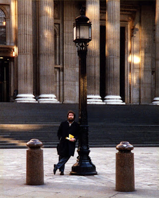
I remember going to The IMPERIAL WAR MUSEUM in Lambeth Road, not far from the ELEPHANT And CASTLE tube station, and (on another day) COVENT GARDEN, although, if I recall correctly, that may've been early evening on that occasion.  I also visited St. PAUL'S CATHEDRAL (designed, as we all know, by Sir CHRISTOPHER WREN) and took quite a few photos inside.  The one above of me outside its steps was taken by either Kevin or Marc.  The NATIONAL THEATRE on the SOUTHBANK was another place I enjoyed having a look 'round in one lunch hour.

I was in my mid-20s at the time, and it was only my youthful energy and enthusiasm which kept me going after a near-sleepless trip down to London.  Nowadays, I severely doubt I'd be up to the rigours of a nine hour journey without taking a long kip on arrival, but the mere thought of having to sit on a coach for that length of time leaves me exhausted and reluctant to repeat the experience - even though I'd like to see the city again and just how it's changed in the intervening years.

So, why'd I stop going to "The Big Smoke" (after December of 1987) if I enjoyed it quite so much?  After all, I was surely still young enough to have endured the ordeal of travelling there for another few years.  Well, truth to tell, I was a bit of an anomaly in the world of comics.  At that time, editors preferred to have their freelance letterers close to hand, which was why I made the journey at least once a week.  (I lived in Southsea for the first few months, so the trip wasn't as long or as arduous.)

However, once I proved reliable, editors didn't mind entrusting the POST OFFICE to deliver strips to my door in Scotland, and for me to return them the same way.  (Occasionally I would use RED STAR when a deadline was looming.)  I think I may've been the first letterer (certainly outside of London) to be allowed to operate this way, but no artwork was ever lost in the post so there was never a problem.  That meant I simply had no need to go to London after a while - it came to me.  In fact, I could probably have ceased my excursions earlier than I did, but I could always pick up some extra work from simply being on the premises, hence my continued sojourns over a two year period.

One day I'll post photos of some of the IPC staff I snapped on my trips to 'the office', but in the meantime you'll have to be content with the one of myself which adorns the top of this rambling reminiscence.  Ah, those were the days! 

Monday, 27 August 2012

HOW TO BAKE A DALEK...


DOCTOR WHO makes a welcome return to U.K. TV screens this Saturday, along with his arch-enemies The DALEKS.  To celebrate, I thought you might like to try making some chocolate Daleks to munch on while watching the show.  So, step back in time with this recipe from the pages of TV CENTURY 21 #28, cover-dated July 31st, 2065 - a comic well and truly a hundred years ahead of its time.

Incidentally, TV21 editor, the late ALAN FENNELL, copied the above recipe directly from his own issue of the comic and sent it to me back in the early '90s, as the one I'd cut out as a kid and which was kept in my mother's cook/bake book had been misplaced over the years.  Nice of Alan to kindly supply a replacement.

LET'S PLAY COMIC COVERS 'SNAP'!


Images copyright DC COMICS

You'd be amazed at how often a good cover design is reused by other artists in 'homage' to the original.  It's happened quite often over the years, so welcome to the first in an occasional series which throws the spotlight on comic covers and their 'copies'.  First up is SUPERMAN #243 from October 1971, and JONAH HEX #91 from June 1985.  There's a respectable interval of 14 years between these pieces, but I recognized the source immediately when I bought the latter in a shop in London's Victoria Train Station back around the mid-'80s.

More covers to come in the future.
    

PAST, PRESENT OR FUTURE?


Imagine that scientists were able to devise a means by which humans could relive any point in their past as if experiencing it for the first time.  Working on the premise that more detailed memories of every moment we have ever encountered are embedded in our subconscious than was previously realized, we could reconnect to them with such potency that they seemed real in every way.  We'd see, hear, feel, and taste with a clarity so vivid it would virtually be time travel, except that it'd be happening only in our minds.

If such a thing were possible, how many of us would then stop seeking new experiences in the future, instead preferring to relive previous ones from the past in the here and now?  Never mind going to the dancing on weekends and trying to chat up some brash, drunken nymphet - you could re-experience that night sixteen years back when you pulled the best looking girl at the work's dance and got up to some hanky-panky in a stationery cupboard.  You could read again any comic you ever had as a child, faithfully recreated from your memory-banks for you to peruse any time you felt like it.

Deceased friends and relatives could be 'resurrected', and once again you could sit and converse with them just as you did when they were alive.  Any conversation, any kiss, any holiday, any vanished toyshop from childhood could once more be as real to you as it used to be in bygone years.  What's more, in your mind, you'd be the same age that you were when any incident you wish to relive first happened.  You could spend a day as a seven year old, with all the vitality and enthusiasm that was yours when you were that age.

The only drawback would be that it happens in 'real' time. For example, every moment you 'relive' of your past would require the equivalent time in the present.  That is, an hour would take an hour, a day would take a day, etc.

So, would you spend your future reliving various memories of yesteryear in your mind (but which felt entirely real), or would you rather spend your tomorrows experiencing new sensations in the flesh?  The past or the future beckons to you from the present.

What would your choice be?

Sunday, 26 August 2012

THE FINAL FRONTIER - NEIL ARMSTRONG: 1930 - 2012...


It's a curious paradox of time that past events can seem, at the point of recollection, both recent and long ago at almost the same moment.  I'm not quite sure how the process works, I only know that it does.  Perhaps when remembering something, one's memory leaps right back to the event, making it seem as fresh and immediate as when it first happened.  Then the intervening years instantly resurface in the mind's eye, shifting the focus and thereby placing events in their proper perspective, time-wise.  All this transpires in a split-second of course, creating the illusion of experiencing two diametrically-opposing sensations simultaneously.  Does that make any sense?

Regardless, New Year's Eve (Hogmanay), 1970, seems like only a short time back (despite being a lifetime away) when I look at my AIRFIX APOLLO LUNAR EXCURSION MODULE, which I first acquired shortly before (or maybe even on) that December 31st of 42 years ago.  Of course, I no longer own my original one, but rather a re-issue from the early '90s.  Fortunately, unlike more recent re-releases, this one features the original box art from the '70s.

I recall, while my parents prepared for the unlikely arrival of any 'First Footers' on the stroke of midnight, putting the finishing touches to my LEM and sitting it atop the sideboard behind the settee.  Let me tell you something about that sideboard.  Not that I imagine you'll be interested, but the past weighs heavily on my mind and I suddenly feel compelled to unburden my soul.  (As Poe would put it.)

I had grown up with that sideboard; it had been in every house I remembered (I was then in my fourth house and had only just turned 12), and it was a main feature of our living-room.  Several years and yet another house later, either when I was out at work one day or living down in Southsea for a few months, my parents acquired new display units for either side of the fireplace and gave the sideboard to a relative.  When I returned it was gone - without me ever getting to bid it farewell.
Yup, that carpet certainly needs hoovering

A couple of years on, we moved to yet another house, the first I'd ever been in without the sideboard.  Four years later, we returned to the house from which we'd flitted, and - six years after that - I bought the sideboard back from the relative and installed it in my back room, where it now sits just to the side of me as I type.  (That's why it's called a sideboard.)  At around the same time, I also acquired a replacement Airfix Lunar Module, and you can be sure that, when I finally get around to building and painting it, I'll display it on top of the aforementioned item of furniture - just as I did those many years ago.

However, believe it or not, I didn't start this post with the intention of discussing sideboards, regardless of how enthralled by the topic you may be.  (No?  What's wrong with you?)  It was astronaut NEIL ARMSTRONG's passing that prompted me to put digit to keyboard.  In 1969, the year that Neil first set foot on the surface of the moon, he was only a relatively young man of around 38 or so.  (That's quite a bit younger than I am now.)  40-odd years later, the man is gone and I find myself amazed at just how recent the events of 1969 suddenly, for the moment, appear to me.

One day, when I finally build that LEM, I'll no doubt recall three things.  Firstly, Neil's historic achievement back in 1969.  Secondly, that particular New Year's Eve of 1970 and my original Lunar Module sitting atop the sideboard.  And, thirdly, just how fleeting time is and how, nowadays, there never seems to be enough of it.  I've still got quite a few unbuilt model kits to assemble before I'm ready to take that "giant leap" into "the final frontier".

I suppose I'd better get started on them pretty darn soon.

******

In memory of NEIL ARMSTRONG.
August 5th, 1930 - August 25th, 2012.

SON OF ORIGINS...


Copyright MARVEL COMICS

In 1975, FIRESIDE (Simon & Schuster) released the second of their MARVEL ORIGINS volumes, entitled SON Of ORIGINS Of MARVEL COMICS.  Sporting a fantastic cover by JOHN ROMITA Sr., the book was a major disappointment compared to its predecessor from the year before.  STAN LEE's text was as witty and sparkling as ever, but the book was let down by some of the worst reproduction of classic comics that it was possible to see.


I can only assume that some strips were sourced from foreign reprints, then had the original English lettering from published comics dropped in.  Significant areas of the art were obscured by over-sized, irregular balloon shapes, suggesting they'd been enlarged at some stage to accommodate more verbose dialogue, which is usually a feature when English-language comics are translated into another idiom.  (In a few instances, some speech balloons were left totally blank.)

DAREDEVIL #1 (below) seems to have utilised the proofs for its U.K. reprinting in The MIGHTY WORLD Of MARVEL #s 20 21, with cropped panels and the overuse of Letratone in quite a few places.  Other issues affected were X-MEN #1, AVENGERS #1, and SILVER SURFER #1, which were utterly appalling in their reproduction, rendering the intended 'archival' aspect of the book redundant.


Thankfully, not all stories were ruined in this way: TALES Of SUSPENSE #s 39 & 97, DAREDEVIL #47, STRANGE TALES #135, and "The WONDER Of The WATCHER!" back-up tale from SILVER SURFER #1 were more or less perfect, though IRON MAN's origin was taken from the reprint in MARVEL TALES #1 and featured a different final caption running along the bottom of the last page.


John Romita's cover is the book's main redeeming feature, and is arguably even better than the previous volume's.  One thing I do know  is this - whenever I cast my gaze upon it, I'm instantly transported 37 years into the past - when teenage hope was still aborning and dreams were not yet the stuff of nightmare.

Saturday, 25 August 2012

"BEAM ME UP, SCOTTY..."


Copyright relevant owner

It suddenly occurs to me that in all the time I've been running this blog, I've never really done a post on any of the comicbook incarnations of STAR TREK.  This is mainly due to the fact that, apart from a reprint of half of a GOLD KEY Star Trek strip given away in the second issue of NEW MIGHTY TV COMIC, and some strips in a few TV21 comics and annuals, I'm very far from being spoilt for choice.

I'll dig them all out one day perhaps, but in the meantime, here's a strip from the New Mighty TV Comic Annual for 1978.  (Although, going by the 1969 copyright date, it could possibly have been a reprint from an earlier Annual or Special.)  Ready?  "Warp factor six - second star to the right and straight on 'til morning..."


And, just in case you should ever want to track down the book on eBay, here's what its cover looks like.  Happy Hunting.

Friday, 24 August 2012

DANDY 75th ANNIVERSARY SPECIAL - ONE TO LOOK OUT FOR...

Images copyright D.C. THOMSON & Co., Ltd

Due out sometime in September - The DANDY: 75 YEARS - a card-bound Special containing a reprint of the first issue, as well as lots of other classic strips.  (The decision to include #1 was made before the weekly's fate had been determined.  The final edition in December will also include a facsimile of the first issue.)


The Special will be in the same format as The BEANO one (above) from 2008, with DESPERATE DAN seen through the hole in the card cover.  Let's hope they publish another Beano Special when the comic celebrates its 75th birthday in 2013.

The Dandy special is priced at £5.99 and is exclusive to WH SMITH's.  Keep your eyes peeled.

******

UPDATE: And here's what it looks like (below).  It's currently available in some branches of WHS earlier than anticipated.  Contrary to information supplied to me earlier, the reprint contains only 24 of the original 28 pages.


******

FOOTNOTE: Apparently, The Dandy's circulation has increased by over 60% as a result of all the recent publicity surrounding its fate, but it's unlikely to be enough to earn it a reprieve, sadly.  Incidentally, around 90% of sales of certain DCT magazines are due to them being sold in WH Smith's, so the claim from some apologists that The Dandy's failure was mainly down to factors other than readers' dissatisfaction with the content appears to be somewhat tenuous.

******

Looking for the post about the last issue of The Dandy?  Click here.

Thursday, 23 August 2012

ORIGINS OF MARVEL COMICS...


Images copyright MARVEL COMICS.  Art by JOHN ROMITA Sr

In the beginning Marvel created the Bullpen and the Style.

And the Bullpen was without form, and was void; and
darkness was upon the face of the Artists.  And the Spirit
of Marvel moved upon the face of the Writers.

And Marvel said, Let there be The Fantastic Four.
And there was The Fantastic Four.

And Marvel saw The Fantastic Four.  And it was good.

******

The first hint I had was in a BULLPEN BULLETINS page in 1973, perhaps '74. Just a passing reference in a brief sentence of a MARVEL ORIGINS special or book in the works that might one day see fruition.  "That'd be nice!" I thought.  Comics were often described as 'books' in those days (and probably still are) so, truth to tell, I expected it to be a 72 page KING-SIZE SPECIAL which I'd be able to pick up for no more than about 25 pence.

Time passed.  I kept an eye on the shelves and spinner-racks to see if this proposed publication was ever going to materialize, but no joy.  I'd left school and was working when, in October of 1975 (I think), the back pages of the British Marvel weeklies carried an advert for - wait for it - ORIGINS Of MARVEL COMICS, a softcover book containing the origin tales of The FANTASTIC FOUR, The HULK, SPIDER-MAN, THOR, and DOCTOR STRANGE, as well as later tales to show how the characters had developed since their inception.

I sent off the required amount and waited, wishing my life away with each new day. Eventually, a padded envelope arrived containing the sought-after treasure - and indeed, treasure was the word which described this pulsating paperback to a tee.  I pored over its contents innumerable times, drank in the four-colour fantasies which I'd only ever seen in black and white or spot-coloured reprints in U.K. comics, a poor second to the fabulous volume I now possessed.

American advert for Origins

I later learned that there was a hardback edition and wondered why we Brits never got the chance of one, but that was a minor niggle.  Two things, however, bothered me about the titanic tome and slightly detracted from its Marvellous magnificence.  The first was that the corner page numbers of each and every strip had been clumsily pasted over to obliterate their existence, and the second was that some panels bore evidence of 'touch ups', where thin lines at risk of not reproducing too well had been 'enhanced' by another hand - though one far less skilled than the original inkers of the art.

STAN LEE's behind-the-scenes accounts of how these tales had been created read just like a dream - which was ironic, considering that was how some cynics later described Stan's version of events.  But you have to hand it to 'The Man' - he knew how to keep his readers glued to each page.  Interestingly, first editions mixed up the Doctor Strange section, printing the stories and their accompanying text out of sequence, but this was corrected for subsequent printings.

Even today, the book is a delight to read, thanks mainly to Stan's mastery of words and his ability to spin a good yarn, even though his recollection may be a little faulty at times.  It's certainly a book worth having, but for a more faithful presentation of these cataclysmic classics - without the inferior 'restoration' evident in Origins - readers are advised to try and obtain MARVEL FIRSTS: The 1960s, a massive volume published about a year or so back.

However, for its time, Origins of Marvel Comics was a well-deserved best-seller that had comicbook fans everywhere screaming "Make Mine Marvel!"

Wednesday, 22 August 2012

THE ULTIMATE BEANO SUMMER SPECIAL #3...


Copyright D.C. Thomson & Co., Ltd

A few weeks ago, I read somewhere that there was a third ULTIMATE BEANO HOLIDAY SPECIAL due to go on sale, so I went looking for it in my local WH SMITH's.  The previous two had been placed next to The Beano weekly and therefore I'd had no difficulty in securing copies for myself.  However, when I went hunting for the third volume, it was nowhere to be seen - although, curiously, there were new copies of the second edition located on the same space on the shelf where I had obtained mine.  These were actually in a special display tray attached to the shelf, clearly marked "Ultimate Beano Holiday Special".

I asked an assistant, but she didn't know anything about it - nor where the new copies of #2 had sprung from.  Over the next few weeks I asked again - no joy, nobody could help.  I was in WH Smith's again today and asked one of the women responsible for the magazine section about it and she led me along a trail to where obscure magazines were located - in a corner of the shop and on a shelf at adult eye-level, marked "Bookazines".

"Wouldn't you be better placing them next to The Beano where kids are more likely to look for them and where the first two editions were situated?", I enquired.  "Head office said they were to be stocked where they were put!", she replied.  "Well, why don't you put some of them next to the weekly where Beano fans can see them, and leave some of them where they are, and that way adults can see them and buy them for their kids?", I suggested.  "Might do!", was the reply.  (Incidentally, the special display tray at the comics section was now completely empty.)

It seems to me that the obvious place to position them is where comic fans will automatically look for the thing, but also have some where casual browsers can see them and perhaps buy a copy on impulse, either for themselves or for their kids.  (How come nobody else seems to have that much common sense?)  However, it seems pretty bloody stupid to put them all where absolutely nobody who is actively looking for a copy can actually see it - especially when a shelf-tray specifically designed to display the mag is lying forlorn.  D.C. THOMSON would be just as well printing the damn things with invisible ink on invisible paper.

Anyway, if you've been looking for a copy in your local Smith's, chances are that they're not where common sense dictates they ought to be (the comics section), so keep searching.

THE ONLY GOOD ALIEN - PART TEN OF FAVOURITE COMICS OF THE PAST...

Images copyright MARVEL COMICS

Returning yet again to the theme of memory, The AVENGERS #89 is a comic which I associate with two places: the first being the seaside town of Largs, which is where I purchased this esteemed publication in June or July of 1971, and the second being my living-room back in my home town, in which I sat by the fireside and re-read the comic and soaked up SAL BUSCEMA's art.


What's surprising is that the issue is dated for June 1971 (though in the States, it would've come out around March), so for me to have actually obtained the mag when I did is quite amazing.  Usually, U.S. comics didn't show up in Britain until many months, sometimes years later, so this seems to be one of those seemingly rare occasions when distribution here wasn't so far behind as was frequently the case.  Not quite sure why, but it occasionally happened with other issues too.


My family were holidaying in Largs that year, and my father had gone into a newsagent's to buy some tobacco for his pipe.  Also inside was a spinner-rack of U.S. comicbooks from which I chose this collectors' item issue.  Apparently, it was the first episode of what would later become known as the KREE/SKRULL WAR, but I was ignorant of that fact at the time.  I didn't get to see subsequent issues until they were reprinted in a weekly British MARVEL comic several years later.  By then, I was living in another house and that holiday in Largs seemed like an inordinately long time in the past.


What I find curious is that the cover instantly transports me back to the newsagent's and surrounding environs, but the splash page (and others) summons up images of my living-room, with me sat beside a big brass log box next to our fireplace back home.  Isn't it funny how one comic can carry associations with two different places, eh?  As far as I know, I've not been back to Largs since.  I wonder if that newsagent's still exists?  If so, it's most likely had a refit by now and looks nothing like it once did.  Wouldn't it be nice though, if it remained the same?  That way, if ever I should return, crossing its threshold for the first time in over 40 years would be like stepping back into yesteryear.


Although, funnily enough, whenever I hold this comic in my hands and pore over its four-colour pages for the umpteenth time, the exact same experience is achieved.  Spooky, huh?

******

UPDATE: On June 26th 2014, I returned to Largs on a day trip, but could see no sign of the newsagent's/tobacconists from 1971.  It was an odd experience because, although having last been there 43 years before, it seemed to me like I'd been only yesterday, making the changes that had occurred in the intervening period all the more difficult to accept.  Strange indeed.    

Monday, 20 August 2012

TOMMY OR JOE? FIGHT! FIGHT! FIGHT!


Isn't it funny how some things can make such an impression on you that other things are swept from your mind?  Here's one such example of just what I'm talking about.  Imagine, if you will, that it's Christmas Day, 1966.  My brother and myself had snuck downstairs in the very early hours to see whether 'Santa' had fulfilled our expectations in the 'gifts' department.  Then we returned to our beds, each clutching a toy as we couldn't bear to be parted from them.  I well-remember my sleepy sibling dozing off snuggled next to the articulated action-soldier he had received.  Thing is, it wasn't ACTION MAN (by Palitoy) - it was TOMMY GUNN (by Pedigree).

I can no longer recall what presents I got that year - it's a complete blank.  It's entirely possible (likely even) that I remember some of the toys, but I just don't associate them with that Christmas.  My one, big, over-riding recollection of that event is my brother's delight when he first cast his eyes on Tommy, and him holding him fast as he dropped off to sleep.  Oh, and also the smell of the plastic, which was quite distinctive.  Yet another of those smells which instantly whisks me back to childhood.  Luckily for me, my brother was a little older than me and soon outgrew his appetite for such things, so Tommy relatively swiftly passed into my hands.

Surprisingly, Tommy Gunn was better than Action Man in a few respects.  His face looked more natural (modelled after a real person apparently) and his skin tone seemed a bit more realistic at the time, though, curiously, he now appears a tad over-tanned.  (Perhaps a result of the 'ageing' process over the decades.)  Same goes for his physique, which wasn't quite as 'stylized' as Joe's (to give A.M. his 'real' name.)  Also, his equipment was more detailed and in scale.  Tommy had close-fitting, flexible boots with real laces - Joe had oversized ones in a thicker plastic with moulded laces.  Tommy's grenades had pins which could actually be pulled out - Joe's didn't.  In fact, although never quite as popular as Action Man, Tommy Gunn was probably the superior toy in all ways but one, which was this:


Action Man had swivelling ball-joints at the top of his thighs, allowing him to sit with his legs folded, or to rest either foot on the opposite knee.  Poor ol' Tommy's thighs were one-piece* affairs which didn't allow for such a relaxed position, although in every other way his joints were the same as Joe's.  Apparently, Pedigree had made a bid to Hasbro (the company behind G.I. JOE, who was Action Man in everything but name) for the rights to the figure at the same time Palitoy did, but failed.  Instead, they decided to produce their own version and Tommy Gunn was the result.  The figure enjoyed reasonably good sales from 1966 to '68, but never attained the same heights of success or popularity as his better selling rival.

(*The thighs on the earliest versions were two pieces glued together to make one, which allowed no swivelling where they met.  It may be that the seam was originally intended to be moveable, but then changed at the last moment for reasons of cost or simplicity.  The thighs were later amended to one piece parts with no join.)   


In 1968, Tommy's body was re-used for Pedigree's CAPTAIN SCARLET figure, yet another fondly-remembered toy from the swinging '60s.  Around 1978, a company called ZODIAC TOYS bought the moulds from Pedigree and started to produce Tommy Gunn, but using a much cheaper plastic.  This time around, Tom's skin colour was more like Action Man's, but, sadly, because of cheaper production techniques, he could no longer claim to be Joe's superior, or, indeed, even his equal.  According to some sources, Tommy was retired in 1985, taking his place in history, and in the memories of those who had been fortunate enough to own him during his brief spell as Action Man's main competitor.


Related Posts Plugin for WordPress, Blogger...