Saturday, 31 December 2011

AND NOW - A WORD FROM OUR SPONSOR...


Hard as it may be for many of you to believe, this particular Scotsman is and always has been a complete teetotaller - never touched a drop of alcohol in my life, nosirree.  So I won't be part of the drunken revels that'll no doubt be taking place all across the country (and the world) later on tonight.

I'll be tucked-up in bed well before the Bells, with my cocoa and an Annual (I'll put on my slippers and walk SALMA to the bus stop first, of course - after all, I know how to treat a lady), before settling down, hopefully, to a peaceful slumber, undisturbed by any Bacchanalian orgies occurring in my neck of the woods.

So, to all those deserving of it - have a happy and prosperous new year.  See you in 2012.

Friday, 30 December 2011

MOEBIUS AT MARVEL... A RUEFUL REFLECTION ON AN EPIC DISAPPOINTMENT AND DISASTER!


Images copyright MARVEL COMICS

Behold - The SILVER SURFER!  Yup, here's the shiny, chrome-domed sky-rider himself in the 1988 hardback graphic novel entitled PARABLE (plotted and scripted by STAN LEE), which first appeared in a two-issue comicbook presentation that same year.

Behold, also, what MOEBIUS (the non de plume of artist JEAN GIRAUD) writes about his rendition of the character in his reflections at the back of the book:

"From a strictly academic standpoint, some might say that my Silver Surfer may be better than that of other American artists.  But I think this is a very incomplete and arguable point of view."

In fact, I'd go further.  I'd say it's so unlikely a point of view that it would never have occurred to anybody had he himself not cleverly implanted the suggestion into people's minds, while pre-emptively protecting himself from accusations of vanity (or delusion) by 'modestly' claiming not to subscribe to the idea.  However, the notion of him perhaps being the best Silver Surfer artist to date has doubtless now taken root.

Obviously, not everyone will subscribe to the view, but - with one sentence - he has probably ensured his inclusion as a contender in any future discussions as to who the best illustrator of the former herald of GALACTUS might be.  And (clever him) he's the one who introduced the thought - which had to be 'articulated' first, as it could never have come from merely looking at the book itself.  (Don't get me wrong - there are some nice pictures, but overall it's disappointing.)


So, well done Moebius.  The fact remains though, that while Parable is a nicely written story, it hardly rates up there with the classic issues illustrated by JOHN BUSCEMA.  The art is professional enough, and it is interesting to see another 'take' on the character of NORRIN RADD, but Moebius's ego is the main reason why Stan's plot and scripting are so drastically diluted in their impact, and why the finished product is so disappointingly underwhelming.

His ego?  Yes.  Consider what he has to say about lettering for example:

"To me, the lettering is a form of graphology.  It reflects your own style and personality."

"That's why I don't really understand how an artist can entrust something that important to a hired hand, no matter how good he may be."

"To me, it's monstrous to have an important part of the look of a page determined by an outsider."

"My letter is alive.  It dances on the paper.  It reflects my personality."

"I'd... rather have my own letters than the intrusion of someone else's style on my page.  I really fail to understand how artists can tolerate this."

"The excuse of legibility is, I think, a very poor one.  It is something that can be done away with."

Hark at the conceit of the man.  If you're reading this and happen to know Moebius, kindly give him a good hard slap across the kipper the next time you see him for talking utter b*ll*cks.


Parable is extremely difficult to read.  The balloons and captions are too big and intrusive, and the lettering is sloppy and scratchy, making it hard to decipher in many places, resulting in a start-stop-go back again reading experience.  It's the comics equivalent of watching a DVD which drags, sticks, skips and suffers from sound drop-out.  Incidentally, don't be fooled by these enhanced scans from the superior-printed book edition - the comicbook printings are farFAR worse.

Clearly Moebius's main mistake is in thinking that a story exists for the purpose of reflecting the artist's personality.  I'm not interested in Moebius's personality (or that of any other writer or artist, come to that).  At least, it's not my primary concern when I buy a comic, book, or DVD.  I bought Parable because I'm interested in the Silver Surfer, not Moebius.  The purpose of a comic, or any other form of storytelling, is to say "Look at that, look at him, look at them, look at the premise, the storythe situation" - not "Look at me!". 

Of course, it goes without saying that any body of work - whether it be comics, books, music, movies, poetry, sculpture, any form of art, in fact - will reveal, to a greater or lesser extent, some aspect of the creator's personality, whether he wishes it to do so or not.  However, that should be a secondary result, apparent only after enjoyment of - and reflection on - the work itself.

It's a bit like looking through a window at an exquisite view beyond.  As one stands there, drinking in the scene, after a while one's focus shifts and the image of one's own reflection in the glass suddenly makes itself known, even if it is somewhat indistinct and transparent.  In a vaguely similar manner, that's how one should regard an artist in comparison to his work - it's the work that should be the main source of interest and fascination, not the artist, though that may (and often does) follow.

Moebius's views on lettering are simply absurd.  All that his own lettering reflects about him is that he isn't very accomplished in the art.  He even admits that "...my lettering on some pages is not always as good as I'd like it to be."  Also, "...maybe I rushed a little too much in places."  Yeah - all the way through the book by the look of it.  What this reveals about the man is that he's more interested in projecting and promoting his 'personality' at the expense of the story.  Or why else would he settle for something less than it could be?

The best products are (usually) produced by the best craftsmen.  This is true for every field of endeavour.  Sometimes one man can do more than one task well, but rarely can one man do all tasks as well as a team of individual specialists.  If Moebius feels that comics exist for the purpose of reflecting the artist's personality, not only should he draw and letter them, he should create his own characters, write his own stories, colour his own strips, design, edit and publish the things to boot.

In illustrating a story by another writer, he acknowledges the collaborative nature of comicbooks, so it seems misguided (to say nothing of egocentric) not to allow someone better qualified than himself to render the script in a way that makes it more readily accessible to the reader, and also complements the art more effectively than his own sub-standard attempts at 'graphology'.

Most artists don't "tolerate" what Moebius complains about - they're grateful for it.  They understand that producing comicbooks is a business, not a conceit, and that the published product is better for having a variety of professionally proficient practitioners participating in the project.  A good penciller benefits from having a good inker, and they both benefit from having a good colourist and a good letterer because they all realize that the end result is greater than the sum of its parts.  (To use a well-worn phrase.)


In conclusion, Moebius admits that his art is "erratic" and his lettering is "a little rushed" and "not always as good" as he'd like it to be.  His art in the book is serviceable at best, his lettering diabolical, and his attitude insulting.  Had JOHN BUSCEMA drawn the book, it would've been a more than worthy addition to the seventeen issues he was responsible for in the '60s.  How could it fail to be, given that Stan plotted and scripted it?

As it stands, however, the power, fluency and relevance of the story have been so compromised by the art and lettering as to reduce it to nothing more than a mildly interesting-but-unsatisfying footnote in the hitherto noteworthy (in the main) annals of the Star-Spanning Sentinel of the Spaceways.

Let's hope that MARVEL one day re-letters the story to an acceptable professional standard, and gives Stan's story the justice it deserves.  Meanwhile, Big John can rest in peace, his reputation fully intact.  When it comes to drawing the Surfer, there's little likelihood that Moebius will ever steal Buscema's crown - despite his self-serving semi-suggestion to the contrary.

Here's how it should be done.  Art by John
Buscema, lettering by Phil Felix

Thursday, 29 December 2011

NO CONTEST - ARE YOU NUTS?


About ten days back, I decided to do something new (as far as I know) in the world of blogging - hold a comics competition, with a superb collectors' item book about DENNIS The MENACE as the prize.  All that was required was answering five easy questions, the winner to be picked from amongst the correct respondents.

Going by the stat counter, the post got a fair amount of interest - but no one actually ventured to answer the questions.  I have to ask - why?  This was a genuine offer - the book really would have been despatched - at my own expense - to the winner.  Surely the questions weren't too difficult for anyone who knows anything about British comics?

Anyway, the closing date was yesterday (28th), so I'll save the pristine condition, unopened, unread book from 2001 for another time.  That should give you all a chance to do a bit of swotting up on the subject in the meanwhile.  (Am I good to you, or what?) 

Wednesday, 28 December 2011

STAN LEE - AND ME...


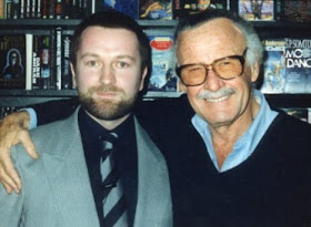
It's STAN (The Man) LEE's birthday today, and that's the only excuse I need to show this photo of the MARVEL MAESTRO and myself again.  (I was freelancing for Marvel when this pic was taken so, in effect, Stan was my boss at the time.)  He's eighty-nine today, which means he's probably only got about another 50 years of productive life ahead of him.  (Everyone knows that comicbook heroes age at a slower rate than the rest of us, and Stan's the biggest comicbook hero of them all.)

HAPPY BIRTHDAY STAN!


Now, as it's Stan's birthday, why not treat yourself to this nice book all about him?  It's published by TWOMORROWS PUBLISHING, and is likely still available at your local comics shop.

Monday, 26 December 2011

BELMONT ON BOXING DAY...


My old primary school in 1984/'85

Christmastime tends to make me sentimental - usually for the Christmases of my past, but also for the past in general.  Above is a photo taken back in the mid-1980s (on a 110mm camera, hence the less-than-sharp image) of the view across the road and down the hill from the house in which I lived from 1965 until '72.

Thirteen years later, things were pretty much the same as they'd always been, apart from the absence of the annexed huts in the grounds of my old primary school.  Around four years later (1989), amenity housing for the elderly was built on the field in the foreground, and - currently - a new school is being built on the football pitches in the background.  When it's completed, at some as yet undetermined time, the old school - my old school - will be demolished and houses and/or flats will be built in its place.

I attended this school for nearly five years (between '65 and '70) and, due to its proximity to my house, I also played within its grounds 'after hours' and at weekends.  Even after moving from the neighbourhood, I found myself back in its hallowed halls on many occasions over the years; at coffee mornings, jumble sales, and Christmas fayres and the like.  It's strange to think that one day, in the not-too-distant future, this small but reassuring pleasure of reconnecting with this particular aspect of my childhood will be denied me when the school is no longer there.

The view from the upstairs hallway

I often take a walk along to my old school of an evening (weather permitting, and sometimes even when it isn't) and, if no one else is around, sit on a bench in what's left of the playground for a while and lose myself in memories of yesteryear, recalling what it was like to be a boy with eternity in his grasp.  (Or so it seemed at the time.)  Strange as it may sound, I just want to spend some time in its company while I still can, before it's taken from me forever.

It's a bittersweet experience, not unlike sitting at the bedside of a terminally-ill friend or relative who hasn't even been told he's dying, never mind that it will be soon.  (Happened to a friend of mine, believe it or not.)  I sit and look at my old school and just remember - and when I take my unwilling leave, I feel like a cad for pretending that everything is as it was and always will be.

The school doesn't know its fate, you see.  It welcomes me in the same simple, honest, 'glad-to-see-me' way each time, unaware of the secret I'm keeping.  It probably regards the new building under construction as a companion, not a replacement.  (I wonder if old dogs think the same when a new puppy is brought into the house, or do they somehow know that this presages their inevitable end - and resent it?)  Each time I leave, I hope I have enough time to come back again before... well, you know - 'before'...

Photo taken by departing teacher Mrs. Tighe in 1967.  The annexed
 huts sat at the edge of the playground directly in front of the school
 

But hark at me, imbuing inanimate objects with sentience and feelings.  Just can't help it though.  Each time I learn that a landmark from my childhood has (or is about to) become a victim of 'progress' (and there've been quite a few casualties over the years), I feel diminished in some way; almost as though my very essence is being eroded along with those monuments to my youth, as - one by one, year by year - yet another of my life's 'signposts' falls by the wayside, never to be seen again.  (Except in faded photographs and dim and distant memories of younger and happier times.)

Perhaps that accounts for the compulsion of collectors like myself to seek out and surround ourselves with tangible reminders of the past.  Each treasure from childhood that we succeed in reacquiring is an attempt to compensate in some way for everything else that is lost to us over the years, and somehow helps to close the gap between then and now.  

Soon, the New Year will be upon us, and we'll toast it as the harbinger of new hope and new beginnings, conveniently forgetting that it's a false friend who promises much, but delivers little - with each and every visit leaving us only less time to look forward to than we had before.

******

If you enjoyed this post, you may also like this one.

Saturday, 24 December 2011

A VERY MERRY CHRISTMAS & A HAPPY NEW YEAR TO ALL CRIVVIES...

Image copyright D.C. THOMSON & Co., Ltd

Here's hoping you've all found something worth reading in your visits to
this humble site.  Hope to see you back in the New Year - if not sooner.

BEANO AND DANDY BARGAINS...


Although it will probably be possible to pick up the 2012 BEANO and DANDY Annuals for around £1.99 each after Christmas as shops try to offload leftover stock, if you're still looking to put a little something extra into wee Jimmy's stocking before the 25th, then get yourself down to SAINSBURY'S today (Christmas Eve) while there's still time.  Why?  Because they're currently selling their Annuals for a mere £3 each, which is a pretty decent bargain - both of them for £6.

 Remember, you read it here first. 

CHRISTMAS WITH BIG HEAD AND THICK HEAD...


From The Dandy, issue dated Feb 8th, 1964

I'm actually ancient enough to remember when KEN REID's artwork appeared in D.C. THOMSON comics, before he later became a mainstay over at ODHAMS PRESS, then FLEETWAY/IPC.  The original artist of ROGER The DODGER, he also drew JONAH and GRANDPA for The BEANO, as well as the adventures of BIG HEAD And THICK HEAD, which appeared on the back page of The DANDY every week.

After departing for Odhams, he was replaced by FRANK McDIARMID, who - going by the example below - managed to imitate his style very well indeed.

From The Dandy, issue dated Dec 25th, 1965

So, here's another Christmas treat for all you discerning Criv-ites - two Big Head and Thick Head back-page Dandy delights for your personal perusal and appreciation.

THE BEANO'S BIFFO THE BEAR'S HOME MOVIES...


Image copyright D.C. THOMSON & Co., Ltd

A lovely Christmas cover from the December 1954 issue of The BEANO to drool over this time around, Crivvies.  Although printing technology has advanced in leaps and bounds in modern times, there's just something about that old 'Ben Day' dots colouring technique which adds to the atmosphere in a way which modern colouring simply can't quite match - despite its superior reproduction.  Look at that snow-clad logo - absolutely great, isn't it?

To read the strip, click on the image to enlarge - then click again for optimum size. 

Friday, 23 December 2011

SLEIGHBELLS IN THE SKY... (UPDATED)


Art copyright REBELLION, poem copyright ME*

For many years, visitors to various 2000 A.D. fan sites (and even the official one) researching the works of writer GORDON RENNIE, would have seen the name of one story attributed to him that wasn't his.  Upon discovering this, I decided to own up and take the blame, thereby removing the blot on his otherwise sterling reputation.


Yes, dear reader, 'twas I who penned this particular episode of THARG'S FUTURE SHOCKS, entitled SLEIGHBELLS In The SKY.  Frankly, I thought the lettering was a bit too big, the colouring too dark, and some slight editorial revision detracted from the consistency of the meter, but otherwise it was a nice-enough little Christmas filler.


The cover doubled as the 2000 A.D. Christmas card that year, sent from the office of THARG The MIGHTY to all contributors.  I still have mine tucked away, in case it ever becomes valuable.  Watch out for me on the ANTIQUES ROADSHOW in about 30 years.

*In case you're wondering, I never submitted an invoice for the 'script', so consequently was never paid for it.  That means IPC/FLEETWAY, EGMONT, or REBELLION never acquired the copyright for it.

******

There's a wee story behind this poem, so in case any of you are interested, here it is.  One day back in the late '70s or early '80s I was browsing through some old Reader's Digest mags stored up in the loft and happened to read an article by someone lamenting the loss of magic from their adult Christmases in comparison to those of their youth.  It struck me as being a good theme for a poem one day (when I could be bothered), but I never got around to writing it until, weeks or months later, one of my pals 'phoned me and said he was writing a poem, but was stuck on how to end it - could I assist?  Sure, I said.

He popped along and showed me what he'd done.  The last verse was incomplete, lacking either two or three lines to draw things to a close.  I therefore made a few suggestions, including the title, and he was delighted, incorporating my contributions into his poem, and off he eventually went, pleased with the result.  However, his meter wasn't exactly perfect in places and his rhyme was a bit forced at times, so I essentially rewrote the poem overnight and made what I considered improvements in those areas.

When I 'phoned him the next day and read him the result, he said "Huh, it's not my poem any more, it's yours!" and I suppose he was right.  My version was inspired more by the Reader's Digest article, but there's no denying that my friend's poem was also an influence.  I typed 'Inspired by lines of verse written by MC' on any copies I made so that he wasn't completely deprived of acknowledgement, but, of course, 2000 A.D. credit boxes don't accommodate more than one name at a time in the space allowed for each contributor, so he didn't get a mention.

I've still got his version somewhere (with my original assistance), and when I find it I'll let you see it so that you can compare their merits.  His first verse is punchier than mine, but unfortunately, his meter isn't consistent, which is why I rewrote it.  Because he'd said it was now my poem, I subsequently made further amendments so it reflected my 'voice' rather than his, but his incarnation will forever belong to him.

And that's the story behind the poem - hope it was of interest.

Thursday, 22 December 2011

WHEN CHRISTMAS WAS JUST DANDY...


Image copyright D.C. THOMSON & Co., Ltd

As anyone not living on the outer reaches of Tatooine or recovering from serious brain surgery can tell you, the content of The DANDY's current incarnation (with a couple of exceptions) is a big putrid pile of pongy poo, thus rendering it redundant for any practical purpose.  It's not even fit for lining the bottom of Polly the parrot's cage, as the idea is to take sh*t out, not put it in.

So, let's return to an earlier era when The Dandy still sold in many multiples of thousands and, unlike today, didn't have cheap plastic tat attached to help it sell to those who don't actually want the comic itself.  Kids and bigger kids - I give you the cover of the Christmas Dandy from 1947.  (Round of applause.)

Back then, KORKY The CAT was the cover star, and had been since issue #1 in 1937, eventually being replaced by DESPERATE DAN in 1984.  Until then, he had missed only one cover - in 1945 when KEYHOLE KATE grabbed top-billing for an issue.    

WHAT DO CAPTAIN BRITAIN AND WD-40 HAVE IN COMMON?

Image copyright MARVEL COMICS

Behold!  The ever-lovin' tenth issue of CAPTAIN BRITAIN from 1976.  Although it's dated December 15th, it actually went on sale the week before (8th), as is the way of British weekly comics.  (No, they don't all go on sale on Dec 8th - I mean they usually hit the shops a week before the date on the cover.  There are exceptions of course.)

In my mind, I've always associated this issue with Christmas 1976, although the actual Christmas number didn't appear 'til a couple of weeks later.  The reason I remember this one though, is because the day I bought it there was snow on the ground - just like on the cover.  Also, I was signwriting a pickup truck in a garage forecourt that day, and, because of the cold, I couldn't work quite as fast as I would've liked.  Plus, it was also a month to the very day since I had packed in my job at BOOTS The CHEMISTS.

Another thing I remember is a visiting rep expounding the advantages of a 'new' product to the garage owner (Mr. McTIER), while demonstrating its properties on a large nut and bolt.  The product?  WD-40.  I say new, but actually WD-40 was developed in 1953 and first became commercially available in San Diego in 1958. I can only assume it was still pretty much a 'secret' in Britain in 1976 though, for the rep to be pushing it as the 'next big thing'.

Funny the things that stick in one's mind, eh?  That's why CB #10 will always remind me of Christmas 1976 (and WD-40) more than just about anything else.  I was young, the world lay at my feet - and the future was mine for the taking.  

DENNIS HAS SNOWBALLS - WALTER HAS NO - ER, LET'S LEAVE THAT THERE, ACTUALLY...


Image copyright D.C. THOMSON & Co., Ltd

One can never have enough of DENNIS The MENACE in my opinion.  Of course, I mean when he was funny, not the anaemic, cutesy-looking, wimpy impersonator who's taken his place in recent years.  (Sigh.)  Never mind - at least we have nearly 20 years worth of classic Dennis strips as drawn by his original artist DAVEY LAW to enjoy - like the one which graces this very post.

Hard as it may be for some people to believe, I know of one comics collector who has never cared much for the exploits of the indomitable Dennis.  Doesn't like humour strips about 'rough boy' apparently.  The irony involved in his being the living embodiment of WALTER The SOFTY is obviously lost on him.  We rugged, manly, he-men type collectors can look down on his effete wimpishness with well-deserved contempt.  We're Menace fans and proud of it.  

Wednesday, 21 December 2011

DENNIS'S FIRST CHRISTMAS...


Image copyright D.C. THOMSON & Co., Ltd

The above three-quarter page strip from 1951 was the first one to feature DENNIS The MENACE in a 'Christmas' setting. That this was early in his BEANO career is attested by his diminutive size.  Later on, when artist DAVEY LAW was under pressure, Dennis became elongated because of the speed at which Law was compelled to draw him.  He eventually shrank back down a bit, but here's the Menace before he first gained the look that made him appear as if he'd been on the rack.

A RAINBOW AT CHRISTMAS...


Copyright relevant owner

Following on from the post about TIGER TIM'S WEEKLY, here's another comic-paper he and his chums, the BRUIN BOYS, appeared in - the Christmas Double Number from 1915.  Lovely and Christmassy, ain't it?  Enjoy.

FURTHER FESTIVE FROLICS WITH FRANKIE...


Images copyright relevant owner

Speaking of ROBERT NIXON (as we were in the previous post), and continuing our Christmas theme, here's a wonderful FRANKIE STEIN illustration from the back cover of the WHOOPEE softcover book of the same name from 1975/'76.  This one's a 'must have', so if you don't, get straight onto eBay with you.  If you're lucky, you may even be able to get the 1976/'77 book too.

CALLING CHRIS B - ROBERT NIXON'S OOR WULLIE...


Copyright D.C. THOMSON & Co., Ltd

Reader CHRIS B - in response to a previous post - was recently asking about artist ROBERT NIXON's artwork on Oor WULLIE and The BROONS.  Robert could draw anything, but somehow, to me, his style - wonderful as it was - didn't quite fit the The SUNDAY POST's iconic strips.  When DUDLEY DEXTER WATKINS was drawing the pages, though they were comic enough, I always felt they belonged more in the category of humorous illustration than outright cartoons.

Nixon's style was a bit more cartoony in the classic sense, and therefore not a perfect match for the long-established look that preceded him.  Which is not to say that his style was bad - it was just a tad out of sync with what readers were used to and expecting.

However, Watkins is a hard act to follow (as was Nixon in 99% of his output).  I'd go so far as to say that the only artist ever to come close to Watkins (if not actually equal him, in fact) is KEN H. HARRISON, who drew Wullie and the Broons back in the late '80s and '90s.


Anyway, I can't find any Broons by Nixon in a cursory browse through my library, but, here - for Chris B (and anyone who's interested) - are some panels of Bob Nixon's Oor Wullie from the 1995 book (published in '94).  I couldn't scan the full page without cracking the spine, so hopefully these examples will suffice in giving you a taste of his take on the character.    

Tuesday, 20 December 2011

YOGI BEAR'S EXPRESS CHRISTMAS...


Copyright relevant owner

Here's a couple more HANNA-BARBERA strips from a 1960 edition of TV EXPRESS WEEKLY.  The first features YOGI BEAR, followed by two tiers of Mr. JINKS with PIXIE & DIXIE.  Strictly speaking, Yogi's strip isn't Christmas-related, apart from being set in Winter, but I doubt that you'll hold that against me.  The comic's cover logo doesn't necessarily come from the same one as the strips, though it just might do.  (When I scanned the images I didn't bother noting the specifics of which came from what.)  Due to the page-size, I had to scan it in two halves so you'll need to view each section separately when you click on them to enlarge.  (Remember to click again for full size.)  Well worth it though.

For all those interested in Hanna-Barbera cartoons and related topics, be sure to jump over and check out the most excellent YOWP site here - you'll love it.

WHOOPEE - IT'S THE CHRISTMAS REPRINT NUMBER...

Copyright REBELLION

Looking through my back issue files recently, I uncovered this Christmas ish of The BEST Of WHOOPEE MONTHLY from 1985 - over a quarter of a century ago.  I was buying the title at the time, but I was given this copy by BOB PAYNTER, the group editor of IPC's humour division, when I was down in London on business.  Why do I remember?  See the little number atop the right-hand corner? 2014 - that means it was Bob's personal copy.  An unmarked spare must've found its way into his file cabinet.  A lovely ROBERT NIXON illustration adorns the cover, no doubt culled from one of the weekly editions as the monthly was all-reprint.


The back cover features a nice BOOK WORM tale, drawn by SID BURGON, and complementing the approaching Festive Season, which would still have been around a month away when the comic first came out.  Although dated December, it probably went on sale in November (at the latest), to give it plenty of shelf life and a greater chance of selling.  These magazines were really very good value for money and it's a shame they're not still around today.  

TIGER TIM'S WEEKLY CHRISTMAS NUMBER...


Copyright relevant owner

TIGER TIM made his first appearance in a one-off comic strip in The DAILY MIRROR on April 16th 1904, before getting his own spot in The MONTHLY PLAYBOX, a children's supplement to The WORLD And His WIFE MAGAZINE, in November of that same year.  He was also featured in The PLAYBOX ANNUAL, the first of which appeared in 1909.  Then, when The RAINBOW was launched in 1914 (dated February 14th), Tim had the front cover spot, along with his chums The BRUIN BOYS.  So far, JULIUS STAFFORD BAKER had been the artist, but before long, S. J. CASH and then HERBERT FOXWELL took over the artistic reins.

Under Foxwell, Tiger and his pals became virtual superstars, with Tiger getting his own comic, TIGER TIM'S TALES, the first issue of which was dated June 1st 1919. Around eight months later, the comic was relaunched as TIGER TIM'S WEEKLY (issue dated January 31st).  Tiger may well be the longest-lasting regular comic character ever, as, even after the demise of his own starring titles, his last appearance was in 1985 in JACK And JILL WEEKLY

Anyway, all that aside, I thought you may appreciate seeing a Festive number of ol' Tiger's title from 1923 - just to give you a taste of Christmas past.  Apologies to any Glaswegians who thought this post was going to be about the former RADIO CLYDE DJ, also named Tiger Tim. 

CHRISTMAS DENNIS HAS TO GO - SAY GOODBYE WITH A "HO HO HO"...

Copyright D.C. THOMSON & Co., Ltd

And here's the final part of our DENNIS The MENACE 'Christmas' cover gallery. As mentioned previously, out of 39 books over a period of 55 years (1955-2110), only the five that I've featured in this and two previous posts have had anything resembling a Festive-themed cover - and any hint of such has been entirely due to the use of a 'snowy' scene in which Dennis got up to his usual mischief.  (Though, as can be seen on the back cover below, it wasn't snow in this instance but ice cream.)


No sign of baubles, choir singers, Christmas cards or Santas - or any other traditional images associated with the Season were utilised in suggesting the time of year.  Who knows, but if the Dennis books ever reappear in the future, perhaps Santa may show up yet.  And if he does, no doubt Dennis will be pulling his beard or stealing his reindeer for a ride 'round the block.  Now wouldn't that be something?


The above two painted illustrations would make a great Christmas card.  Are you listening, DCT?

Monday, 19 December 2011

MORE FESTIVE FUN & FRIVOLITY WITH DENNIS THE MENACE...

Copyright D.C. THOMSON & Co., Ltd

Continuing our DENNIS The MENACE book covers with a hint of Christmas about them, we now present two, count 'em - two - from a few years back. There isn't a Menace book for 2012, though that's maybe because DCT don't want to detract attention (or sales) from the BEANO/DANDY Dennis Celebration book which is in the shops even as I type these very words.  Perhaps there'll be a Dennis & Gnasher book next year - we'll just have to wait and see.


In the meantime though, enjoy this reminder of when Dennis and his chums occasionally played in the snow.


Another two still to come.  Don't miss 'em!