Saturday, 23 November 2013

IS FIRST ALWAYS BEST?


Look at the outline around Sue Storm in panel 5 - as it should be

Like most bibliophiles and collectors, the allure of a first edition is a strong one for me, but, increasingly, it's one I'm finding easier to resist.  Why?  Well, the first edition of EDGAR RICE BURROUGHS' TARZAN had the jungle ape-man battling a tiger, but when it was brought to E.R.B.'s and his publisher's attention that tigers were indigenous to India and not Africa, subsequent printings changed 'Tony' into 'Leo'.

Also, the 1974 first printing of ORIGINS Of MARVEL COMICS presented the DOCTOR STRANGE section completely out of sequence, thereby confusing readers no end, and it wasn't until the second printing that the book attained the completely coherent form intended from the start.  And the 1987 first edition of the FF MARVEL MASTERWORKS volume printed page 3 of issue #5 after page 5.  Which brings us rather nicely to the MARVEL OMNIBUS editions.

Now look at the clumsy 'restoration' in the 1987 FF Marvel Masterworks

The FANTASTIC FOUR OMNIBUS Volume 1 has now been issued three times, but the third version is the only one worth having, and even that could stand some slight improvement. 'Twas only with the third attempt (categorised as the 'first printing' of the 'second edition') that superior proofs for issues 2-9 were utilised, finally validating the claim that the book has (in the main) been printed from the 'highest-quality sources available'.  (Pity they still manage to screw-up the re-presentation of Stan's introduction to his '74 Origins book by rendering 'yours truly' in one sentence as 'you truly'.  However, it was worse in the first edition, where they omitted a line of text.)

The AMAZING SPIDER-MAN OMNIBUS Volume 1 is another book whose 'second edition, first printing' is superior to its predecessor.  Not only is it thinner and lighter (while maintaining the same page count), the 'reconstructed' page by MICHAEL KELLEHER of the first Annual's splash-page seems to have been replaced by the original STEVE DITKO one.  (Though you'd really need to look hard to be able to spot any difference.)  Why this page was ever re-created to begin with is a mystery, as I'm pretty sure that the original had been used in an earlier edition of Marvel Masterworks.  They must have misplaced it, I guess. (Unfortunately, they haven't yet located a superior set of proofs for ASM #1, which is still sourced from inferior re-touched ones.)

The splash-page from ASM Annual #1, as drawn by Steve Ditko

So, yesterday, I travelled into a local Glasgow comicbook store and bought the above-mentioned latest Omnibus edition of STAN LEE's and STEVE DITKO's Spidey stories.  Being a slimmer volume, I can now fit 14 Omnibus books on my shelf - as opposed to only 13 - so I might well consider updating some of my other Omnibus treasuries as and when they're published.  Once 'pon a time, I wouldn't have been able to bear parting with earlier releases, especially first printings, but I now find that the prospect doesn't perturb me as much as it once would have.  In fact, one of my pals has already made an offer on my two, now surplus, books and I've accepted it. (He should have worn a mask - the robber.)

So, my advice to all of you would be to consider a book on its merits, rather than its publishing history (unless its worth a fortune, obviously), as later editions can often be better than earlier ones in terms of reproduction of comic strips and artwork, etc. There are exceptions of course, as sometimes the plates of some book illustrations can be noticeably less sharp in contrast to their original printings.  I recently purchased a 1983 U.S. edition of The WIND In The WILLOWS and all the colour illustrations were extremely washed-out in comparison to U.K. printings.

The splash-page from ASM Annual #1, as re-created by Michael Kelleher

Fact is, recent softcover Masterworks are far more 'archival' in nature than their hardback original editions.  It all depends on what you're looking for, of course.  If you buy such books merely to read and familiarise yourself with the characters' history, I don't suppose it much matters to you if the reproduction quality is less than 100% perfect. However, the historians and archivists amongst us probably prefer reprint volumes to be as close to the original comicbook releases as possible.

If that's the case, don't be afraid to divest yourself of earlier, inferior editions and replace them with brand-spanking new (and superior) volumes.  Always check first though - sometimes there's no discernible difference until a good while down the line.

Friday, 22 November 2013

The SOUND Of BOND: SOUNDTRACK COVER GALLERY - PART ONE...

Copyright relevant owner

I saw my first BOND double-bill at my local cinema on Saturday afternoon, November 25th 1972.  I know for sure because I had The MIGHTY WORLD Of MARVEL #9 with me, newly purchased that very morning.  It was dated December 2nd, but as everyone knows, comics were usually dated seven days ahead of when they went on sale to give them a full week's shelf-life in the newsagents.

What I can't tell you is precisely what two movies I saw, but there's a reason for that. My local cinema had a Bond matinee every Saturday afternoon for what seemed like months, and they repeated the same movies, but always in a different sequence from one screening to the next.  For example, one week it was FROM RUSSIA WITH LOVE and YOU ONLY LIVE TWICE; the next week might then be DR. NO and THUNDERBALL; the week after, it could be any combination of those flicks, including GOLDFINGER and DIAMONDS ARE FOREVER flung into the mix.

One day, I'll have to see what movies were listed in my local newspaper for that date and ascertain once and for all what were the first two I saw.  I'd like to know for certain, just to satisfy my own personal curiosity if nothing else.  At least I got to see all six SEAN CONNERY Bond films on the big screen before they were sold to TV, even if the new boy, the saintly ROGER MOORE, had already begun filming his first entry in the iconic series by the time I did.

One thing's for sure though - one of the ingredients that helped secure the success of the franchise was the music.  MONTY NORMAN recycled a tune he'd previously composed for some other purpose to become the James Bond theme, but while his original version is recognisable, it was really rather a tame little tune.  It was JOHN BARRY's arrangement and orchestration that gave the theme its power and passion, its might and majesty, that has endured down through the decades to this very day.  And Norman is big enough to admit that Barry was the man responsible for the definitive sound.

Who amongst us hasn't felt the hairs bristle on the back of our neck and our heart pound a little faster in joyous anticipation upon hearing the opening bars of that rousing theme?  However, it wasn't just the theme tune that stirred (but didn't shake) one's blood; the incidental music was also a force to be reckoned with, and John Barry left a legacy of which he can be proud.  I soon started collecting the soundtrack LPs of the films, as much for the covers as the music itself, and, a few years ago, I updated to CDs.  (Don't worry, I kept the vinyl.)  It's from those CDs that I now present the first instalment in a cover gallery of JAMES BOND original motion-picture soundtrack albums.


Thursday, 21 November 2013

PAY TO SHOP? VOTE WITH YOUR WHEELS...


Here's an aerial shot of my local town centre taken, I'd say, sometime between 1968 and around '73.  That's the way I remember it when I was a kidlet, up to my early teenage years until, slowly, surely, it began to change into something completely different. 

Were a new photo to be taken today, all you'd be able to see is a roofed-over, soulless shopping complex built over the car parks and most of the grassy areas on the right-hand side of the picture.  The building you can see in the middle of that area used to be a cinema, but is now a bingo hall, the front part of which is roofed over and incorporated into the shopping centre.

The tall building right smack-dab in the middle of the photo is now demolished (apart from the first two floors) and, again, just about every open street around it is nowadays covered by the aforementioned shopping complex.  However, as the company which owns it charge for parking, most sensible people shop in a retail park just outside of town, or use other shopping centres in or around Glasgow which don't levy parking charges against them.

When you think about it, it's an entrance fee by stealth.  You go to do your shopping and you have to pay for the 'privilege' if you're a car owner.  In my book, if you want people to shop in your complex, then you provide the parking space which enables (and encourages) them to visit and spend their dosh in the stores, not charge them for doing so.

No wonder so many of the units have been vacated or lain empty since they were built a few years back - those who can travel to shop elsewhere, do so.  Let's hope the landlords wise up soon, before the centre becomes a 'ghost-town'.

Any gripes about your shopping centre?  Let's hear 'em!

I DREW MONTY'S DOUBLE...


Some years ago, I worked in my local MOTOROLA plant and, upon turning up for work one night, I was charged with an unusual task.  One of the staff was retiring (though certainly not shy) and, knowing of my artistic leanings, my boss, MARIE, asked me to do a caricature to be presented to the soon-to-be former worker the next day.  It was a bit short-notice, but I was supplied with a photo of the individual and let loose.

What you see above is the result, drawn during my half-hour lunch break in the wee small hours of the morning.  Done with a gel pen if I remember correctly, I took a bit of care inking this one as it was going to be framed before being given to the 'lucky' recipient, but it was still drawn pretty fast, hence the name of DUNN KWIK, my pseudonym employed for all pieces that circumstances (or laziness) dictated being produced in a bit of a hurry.  It was a good likeness and I hear the subject was more than pleased with the the finished article.

I can see what needs improved, but, all-in-all, it isn't too bad and adequately fulfilled the purpose for which it was created.  Can't ask for more than that in half an hour, can you?  Obviously it would've been far better in colour, but not having been given any advance warning, I had nothing with which to colour it.

******

In fact, on reflection, scratch that modest assessment above.  That drawing is pretty darn good considering the circumstances under which it was produced, drawn off the top of my head with no reference material as a prompt.  And it's a good likeness, given that all I was provided with was a thumbnail-sized photo on an ID card.     

HOORAY! PART TEN Of SPIDER-MAN COMICS WEEKLY COVER GALLERY...

Images copyright MARVEL COMICS

Within a year of The MIGHTY WORLD Of MARVEL being launched in Britain, STEVE DITKO's back-catalogue of SPIDER-MAN stories had been exhausted, the last of them appearing in SMCW #32 - released 15 days short of a full 12 months since the first issue of MWOM had gone on sale on September 30th, 1972.  Had the early Spider-Man adventures been reprinted in complete instalments, they'd have been used up far quicker than they were.

Just goes to show that U.K. weekly comics consumed far more material that their U.S. monthly counterparts.  In fact, I believe that the Stateside PLANET Of The APES was kept going in later issues mainly to provide material for the British POTA because it was so popular, thereby adding to the merry Marvel coffers.

Like its companion title, SMCW by this time was completely devoid of colour - apart from front and back covers - and had lost some of the visual appeal that earlier issues had.  Nonetheless, at 40 pages for 5p, it still represented good value for money, and was to prove the longest-lasting title in the British Marvel stable.

However, a surprise was lurking around the corner.  Maybe I'll tell you about it in our next Spidey cover gallery post.


'DOODLE Of The DAY' - PART TWO...


Characters copyright MARVEL COMICS

Here's one I really shouldn't show you.  Why?  'Cause there's just so much wrong with it on so many different levels.  By the way, ignore the credits - the page was never inked.  What you see before you is a scan of an A4 photocopy of the A3 original art, with the contrast increased to make the pencil lines look like ink lines. Yeah, I know, it doesn't quite work.  The lettering and border lines are in ink though. (And you're right - it really doesn't qualify as a 'doodle' - but it is unfinished art and I like the title.)

So what's wrong with it?  For a start, the lettering is too big, the gutters are too large, the figures in the first panel are all standing on different levels, Reed Richards tilts at an odd angle, Sue Storm is a bit stiff and unnatural, while the folds in her lower arm's sleeve are overworked.  In its original, softer, pencilled version, some of these faults were slightly less glaring, but with the contrast turned up they hit the reader smack dab in the kipper. 

This was drawn for my own amusement back around the end of April, start of May 1983.  It was intended to be the first page of a 5 page origin tale, but, as usual, I soon lost interest and didn't proceed any further with it.  Don Gordon and Percy H. (for Hinkle) Pinkerbottom are both names I've used on occasion, the latter being adopted as my legal name for a number of years back in 1982.  (Remind me to tell you that story sometime.)

However, despite its faults, I'm proud of the pencil work on Ben Grimm.  His left arm in the first pic is a bit stiff, but I think I mostly did a decent job with the creases in his jacket in all 3 panels.  I also believe there's a definite suggestion of 'solidity' in the 2nd pic of Ben, as opposed to the rather flat one of Sue in the first.

Am I going to utter those immortal words?  Yep, you betcha!  "One day I'm going to sit down and redraw the thing properly."  Of course, it would've been smarter to have drawn it properly to begin with, but that's often easier said than done.

Wednesday, 20 November 2013

NO NEED TO WONDER - SHE'S DEFINITELY A WOMAN...

Lynda Carter as the wondrous Wonder Woman

If anyone out there is considering
buying me a Christmas present this year,
the above photo is a little hint as to what I'd
like to find in my stocking.  In fact, if I were
to find myself in her stockings, that would
be perfectly acceptable as well.

The DAREDEVILS COVER ROUGH...


Characters copyright MARVEL COMICS

Don't be fooled - you're looking at a photocopy of a 100% pencil drawing (lettering included), not an inked piece of art.  Way back in 1983, MARVEL U.K.'s The DAREDEVILS held a competition to design a cover, so I dashed off this rather plain cover-rough for their consideration.  Looking at it now, it's not too bad, but the highlights on SPIDER-MAN's thighs need some work.  Had I ever inked the piece, I would've sorted out all the little imperfections, but, overall, it's not the worst drawing I've done.  (Or seen - no names, no pack-drill.)  Obviously, it would've had much more impact in colour - might add some one day (and fix those thighs).

No, I didn't win.  I'll have to dig out my back issues and see what did.  I think at least I should've got a runner-up prize.

YOWZA! MIGHTY MARVEL COVER GALLERY - PART EIGHTEEN...

Images copyright MARVEL COMICS

Well, we're very nearly there.  In our next cover gallery post in this series, we'll feature the first Birthday issue of The MIGHTY WORLD Of MARVEL (#53) as the comic celebrated a year of publication.  The early issues had been impressive, with their spot and full-colour pages, and reprints of the best classic stories that STAN, JACK & STEVE had to offer.  However, the later issues, with their sombre grey tones, weren't such a visual delight, but I continued to buy them like the good little Marvelite I was.

Cop a gander at the cover of #51: This is one of my favourite covers, as it has its own personal associations for me and because it's an extremely evocative illustration in its own right.  But take a closer look at ol' HULKIE.  He appears to be stuck in mid-transformation and not quite as 'incredible' as he should be.  He looks just like a powerfully built, normal human (one with green skin, I grant you) and not the 'hulking' seven foot creature with which we're all familiar.  Still a good drawing though.

Anyway, feel entirely free to share your own memories of these early British Marvels in the comments section.  Most of the responses are a good deal more interesting than the posts which inspire them, to be honest with you, so put your digit to keyboard and get typing.


Oh dear, what a terrible 'paste-up' job. Even allowing for foreshortening and
his crouching position, The Thing looks as if he's only about four foot tall

Tuesday, 19 November 2013

'DOODLE Of The DAY' (FROM TEN YEARS AGO)...


IRON MAN copyright MARVEL COMICS

Look what I found lurking amongst some papers the other day. I know what you're thinking: "That's not up to much!"  And you'd be right - if I were offering it as a prime example of my drawing skills, but I'm not.  The above sketch was produced during a tea break in the early hours of the morning when I worked as a supervisor in my local MOTOROLA plant some years back.

I put down some faint, rough guidelines with a blue pen and then finished it off with a black biro in about 10 or 15 minutes.  It's simply a sketch - a doodle - drawn for my own amusement - not a finished piece of 'proper' art designed to impress editors or anyone else.

But still - not too bad for what it is, eh?  The name?  DUNN KWIK is a non de plume I affix to any quick sketches dashed off in a hurry.  I couldn't possibly put my actual name on anything less than my best, now could I?  And yes, one day I intend to draw the thing properly - maybe even a painted version.  Anyone like to see that?

Okay, okay - keep your hair on.  I only asked.

SPIDER-MAN COMICS WEEKLY COVER GALLERY - PART NINE...

Images copyright MARVEL COMICS

SPIDER-MAN COMICS WEEKLY was a slightly odd name when you think about it.  As well as being a bit of a mouthful, two words were redundant.  We knew it was a comic that came out weekly, so why labour the point?  AVENGERS mag wasn't called The AVENGERS COMICS WEEKLY, neither were any other U.K. titles similarly named.  True, in 1979, when DEZ SKINN grasped the editorial reins, MWOM and SMCW were renamed MARVEL COMIC and SPIDER-MAN COMIC, and HULK COMIC featuring ol' Jade Jaws popped up not too long after, but at least the names were consistent.

Looking at the black, white and grey pages below, you may be wondering why I've been critical of them in previous posts, but I've cleaned and brightened up these pages for their presentation here, so they actually look better than in the published issues.  Though it's not so much the tones that I objected to, but the printing quality, which rendered them muddy, murky and completely unattractive.

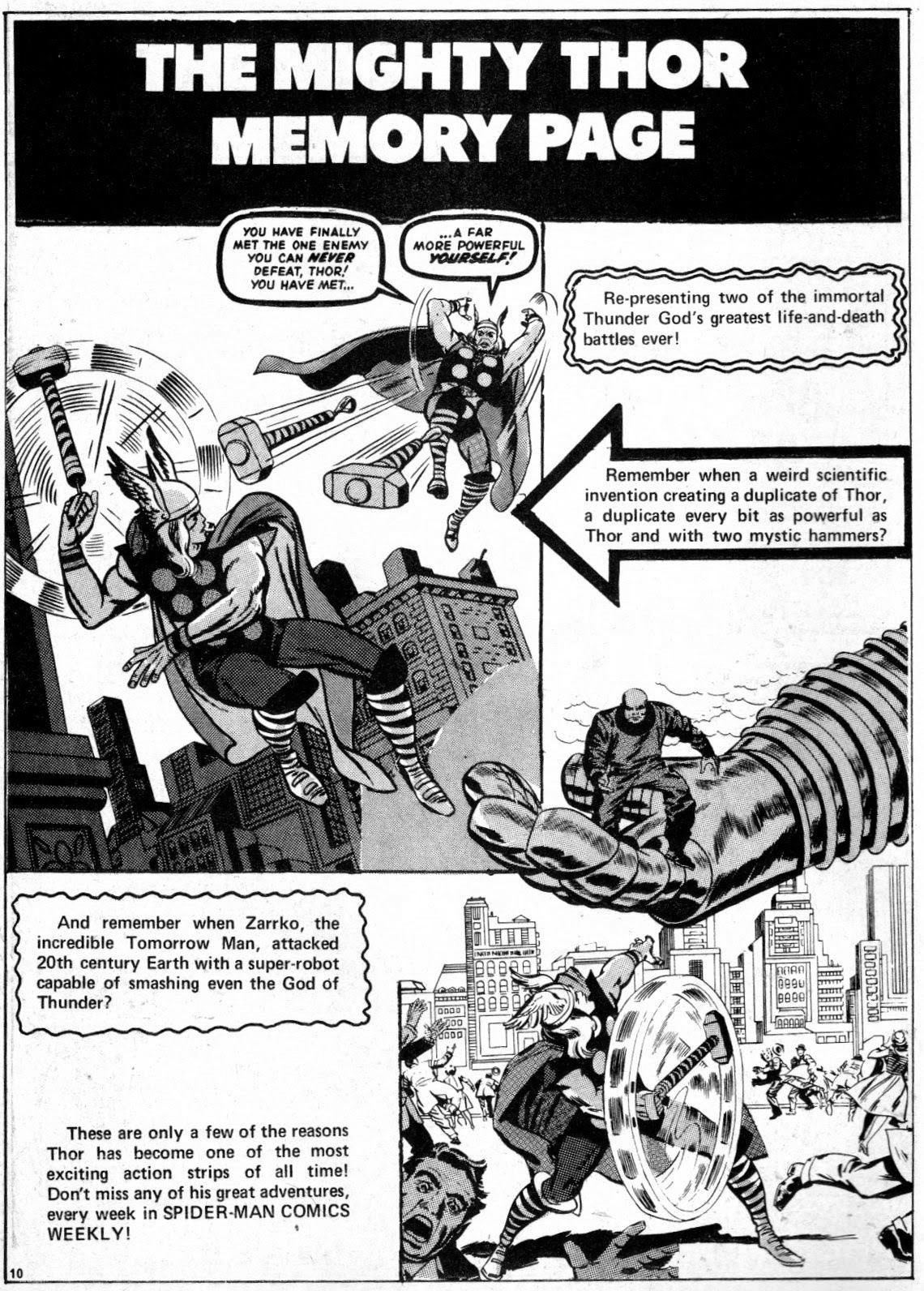
The TALES Of ASGARD pages from #25 don't seem so bad, and had they been printed in a U.S. b&w monthly mag, they would've looked far better.  After all, it was the same team who applied the tones to the British mags as the American ones (which were softer on the eye) so it's fairly obvious it was the cheaper printing on the U.K. titles that let them down, not the application of the tones themselves.

Eventually, Marvel sorted things out and, for a while at least, managed to subdue the tones somewhat, before eventually doing away with them altogether.  When they did work, they worked well, but, as a glance through various back issues attests, too often they didn't work at all.  Never mind though, they're now part of history and, to many kids who grew up in the '70s, these grey-toned tales are meant to look that way.  Are you one of them?  Then who am I to say thee nay?!


Related Posts Plugin for WordPress, Blogger...