Friday, 25 January 2013

MIGHTY MARVEL COVER GALLERY - PART THREE...

Images copyright MARVEL COMICS

Beyond my window, the swiftly swirling snow bestows its sparkling splendour upon the stark and startling scene outside.  Inside, I return to over 40 years ago to relive the heady days of my early teens, which were themselves a re-experience of an even earlier time in my boyhood.  You see, dear reader, the tales contained within the covers you see here, I'd previously perused in the pages of the ODHAMS PRESS publications known as POWER COMICS, in this specific instance the weekly periodicals entitled WHAM!, SMASH!, and POW! 

Although these stories conjured up recollections from an earlier period in my life (and the myriad associations which accompany them), I was not so over-familiar with them to be immune from a new set of memories being formed within my impressionable mind.  As I once explained, that's why I can look at certain stories from my childhood and teenage years and have two distinct sets of recollections connected to the same tales, depending on whichever particular printing of them I'm pondering at the time.

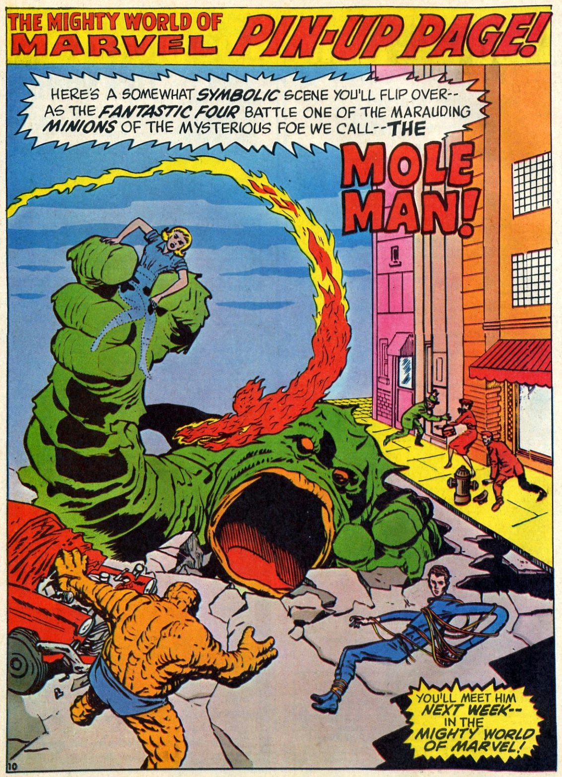
But enough of such self-indulgent musings, let's look at the goods. JIM STARLIN awes us with two simply sensational covers to The MIGHTY WORLD Of MARVEL #s 6 & 7, inked, so I believe, by JOE SINNOTT.  Issue #7's FANTASTIC FOUR adventure contained only one chapter from the cosmic quartet's first encounter with DOCTOR DOOM (from FF #5), so we were presented with a preponderance of pin-ups and puzzle pages to pad out the issue to the required page count.  Not that anyone was complaining, mind you, as they lent themselves more to the usual contents of a 'typical' British comic.  (Not that MWOM was ever really that, of course.)

Anyway, enjoy these iconic images from more than four decades in the past.  As you immerse yourself in their spell, I return to the window to again recall the snow from a long-ago, but never-forgotten period of my life which, though behind me, is ever before me.  Now beat that for a perplexing piece of paradoxical philosophical profundity.

Part Four coming soon.


Thursday, 24 January 2013

THOR The MIGHTY - LOOKING For TROUBLE...


Here's ODIN's lad, THOR The MIGHTY, out in the frozen wastes of JOTUNHEIM, looking for a Frost Giant or two to have a snowball fight with.  Nah!  Actually, it's Thor who's been hanging on my wall for a few years (hence the string around his waste which loops up through his cape), whom I took down earlier today to wipe the dust from.  As there was still snow on the ground, I thought I'd snap a photo of the ol' Thunder-god in my back garden before restoring him to his accustomed place on the wall.

Doesn't he look mighty?  That's why I decided to share him with you here.  Hope he doesn't catch cold without his scarf. 

Wednesday, 23 January 2013

UNPUBLISHED JOURNAL ENTRIES...


Images copyright D.C. THOMSON & Co., Ltd

Following my recent posting (here) of an unpublished article I originally wrote for The ILLUSTRATED COMIC JOURNAL back around 2004, I thought readers might be interested in seeing the follow-up I wrote for the planned subsequent issue which, along with its predecessor, never actually materialized.  (For a variety of unexplained reasons.)  Here it is mostly as originally written (with a few edits) for the lost-in-limbo ICJ.

******

Last issue, I spoke at length about the relaunched, revamped DANDY and I'm going to continue with that topic (or at least the topic of D.C. THOMSON) in this column.

At the time of writing, we haven't yet received your opinions (if any) on the matter, so we'll have to consider them at a later date.  In the meantime, however, let's talk about what I think needs to be done to inject new life into an ailing publication.

This might be a totally radical, highly controversial notion, but why not try and make the stories funny, just for a start?  When was the last time you actually laughed (not merely smiled) at a DANDY or BEANO comic strip?  (Assuming that you still read either of these titles, o venerated ICJ subscriber.)

Chances are it was at something by TOM PATERSON, NICK BRENNAN or HUNT EMERSON.  (And the editors of both periodicals deserve a chocolate BLUE PETER badge for having the smarts to acquire the services of these gentlemen.)  Am I right?  Unfortunately, more could be done - such as hiring LEO BAXENDALE as a scriptwriter for other artists to illustrate.  After all, it wouldn't hurt to ask.  Has such a possibility even been explored?  If not, why not?  

I'd absolutely love to see Tom Paterson draw DENNIS The MENACE in his pseudo-Baxendale style - it would be magnificent.  In fact, let's consider Dennis for a moment.

I'm lucky enough to own every Dennis The Menace book ever published.  The early Dennis books were riotously, side-splittingly, gut-wrenchingly, rib-achingly funny.  The stories were funny to read and the art was funny to look at.  (Think of Leo Baxendale's WILLY The KID and you'll have an idea of what I mean.)

So how do the present-day Dennis books compare to those early masterpieces?  To be honest, if not blunt, by and large, each new book over the last few years has been but a pale shadow of the 'classic' ones from the 1950s, '60s and '70s.  As the reprints became more recent, the transformation of Dennis from a surly, contemptuous, unruly, roughly-rendered, magnificent menace into a smiling, rounded, ever-so-slightly mischievous, cutesy, cuddly little boy becomes increasingly obvious.

Absolutely nothing wrong with the art by any means, but to me this simply isn't Dennis

DCT have lost their way with the character, in my opinion.  I can relate to Dennis rebelling against authority in everyday situations, but flying around in a red and black striped 'Menace-mobile' is a bit too much of a stretch of the imagination.  The character just isn't 'real' anymore - the strip has wandered too far from its original premise.

Decisions on the strip's direction are now made on the basis of how much publicity can be generated in the press rather than on doing anything original.  For example, take the introduction of BEA - in what way is she significantly different to IVY The TERRIBLE?

In fact, come to that, in just what way is Ivy different to MINNIE The MINX, Minnie to BERYL The PERIL, Beryl to Dennis?  (Apart from being a girlie, that is.)  Considering that Beryl is the direct female equivalent of Dennis brings the similarities into far sharper focus.  The philosophy of D.C. Thomson seems to be 'imitate' - not 'originate'.

Take Dennis's pets.  First there was GNASHER - then came GNIPPER, the result of which serves only to negate Gnasher's uniqueness.  RASHER?  A pig too far, I'm afraid.  Would Dennis really be allowed all these pets?

Dennis the Menace is a British icon - just as SUPERMAN is an American one.  When the MAN Of STEEL first appeared he was unique, exciting, amazing!  Then along came SUPERGIRL, SUPER-DOG, SUPERCAT, SUPERHORSE, SUPER-MONKEY and - retroactively - SUPERBOY and SUPERBABY; not to mention the BIZARROS (a whole planet of them) and thousands of potential superbeings in the bottle city of KANDOR.  Each new super-addition didn't open up unexplored vistas of creative opportunity; rather it narrowed them until they withered on the vine.  Result?  The strips became repetitive and boring.

Nowadays, writers seem to take the easy option.  Have you noticed how often they resort to a 'reader's voice' word balloon ("Where are you going with that elephant, Dennis?") to ask a question that could just as easily be asked by a friend, neighbour, bystander or passerby?

This constant reminder to the reader that he's reading a comic ruins the sense of internal 'reality' required to make a strip believable.  (Even 'funny' strips require an element of reality to accentuate the humour of the piece.)  The inclusion of a 'reader's voice' word balloon can sometimes be used to good result in certain instances, but it loses it's ability to surprise, amuse and entertain when it's resorted to as a matter of course rather than for a specific and surreal effect.

Anyway, that's my feelings on the matter.  Think I'm talking a load of pants?  Write and let us know at once - we want your letters.

Next issue, Kid Robson examines the differences between the ambition to work in the world of comics publishing - and the reality.  Be here.

******

So, that was my impressions from almost ten years ago.  The Dandy is dead and The Beano seems to have improved recently, but writers shouldn't get complacent.  I can't remember if I ever got around to writing the finished version of the subject mentioned in the last paragraph, but I touched on it here.  If you're interested, click on the link and give it a read.

Tuesday, 22 January 2013

SIX SENSATIONAL HULK COVERS...


Copyright MARVEL COMICS

Thundering out of the night in the cover-dated May 1962 issue of The INCREDIBLE HULK #1 (actually released in February), the 'half man, half-monster' that was MARVEL's newest creation only managed to last six issues before being cancelled due to disappointing sales.

However, the Gamma-ray spawned Hulk was kept alive in a guest-star appearance in The FANTASTIC FOUR #12 (dated March '63, but published in December '62), before becoming a founding member of The AVENGERS in the September '63 cover-dated first issue of their own mag.  He quit the team in the second issue (but continued to appear in #s 3 & 5, before taking over half of TALES To ASTONISH with issue #60, dated October '64 (published in July).  This followed a full-length encounter with GIANT-MAN the previous month, possibly to introduce ol' Hulkie to new readers and remind old-timers just who he was.

After that, there was just no stopping the green-skinned behemoth (grey in his debut number), and ROBERT BRUCE BANNER's alter-ego went from strength to strength.  Presented here, for the historians amongst you, are the covers of all six issues of the Hulk's original, short-lived run.  Wouldn't it be great if Marvel reprinted all six as individual issues, instead of just in collected editions?  I'd certainly buy 'em.


Monday, 21 January 2013

PART TWO Of The MIGHTY WORLD Of MARVEL COVER GALLERY...

Images copyright MARVEL COMICS

And now, yet another cataclysmic collection of MAGNIFICENT MARVEL cover and pin-up images from the pulsating pages of MWOM.  Some of the colouring is a bit 'off' in the pin-ups from issue #4, but this was something which afflicted the entire print-run, I believe, and wasn't just restricted to my classic copy.  The cover art to all four issues featured here is potently pencilled by Jaunty JIM STARLIN and india-inked by Joltin' JOE SINNOTT, and was produced exclusively for we Brits.  The interior pin-ups are by Jolly JACK KIRBY and Sturdy STEVE DITKO, respectively.  What more can I say but - enjoy!


Sunday, 20 January 2013

'PUBLISHERS', PROMISES & P*SH - (I'VE HEARD THAT SONG BEFORE)...

I didn't know what to illustrate this post with, so here's a photograph of me looking young,
windswept and interesting in 1976 0r '77.  What a handsome chap, even if I say so myself

Sometimes I'm too soft for my own good.  Allow me to elucidate.  There's a small-time, part-time comics 'outfit' who produce the odd publication every few years, for whom I once did some lettering.  I did it for half my usual rate, on the understanding that if any future issues were to be produced, I'd get to letter them at something closer to a more realistic amount.  A few years went by, and I happened to meet the self-styled 'publisher' (it's not his real job - he's got a nine to five one doing something else), who mentioned that he was going to produce another issue featuring the same character.

"And will I be lettering it?" I enquired of him, mindful of his previous promise to me.  "Er - well, I'd like that," he said, hesitating, "but because you do hand-lettering and everything's done on computer these days, there'd be a few practical problems to sort out.  If we can work our way around them, I don't see why not.  Leave it with me - I'll do my best."  I was left with the strong impression that he was going to go all-out to facilitate my participation on the project.

On a couple of subsequent occasions when I ran into him (in an art studio in Glasgow), it was pretty much a repeat of the same.  A few minutes after our last chat, I walked into another room in the studio to find him and another fellow hunched over a computer, lettering the strip with a computer font.  The same fellow to whom I had given my lettering samples (for nothing) on a previous occasion so that he could letter his own artwork.  I don't think he ever got around to transferring the fonts to computer.  If he did, at least he had the 'decency' not to use them on the job which I'd been led to expect I'd be doing.

"I thought you said I'd be lettering these pages once you'd worked out the practical problems?" I put to him.  "Well, that's not quite what I said" he lied, in finest weaselly fashion.  Obviously, he'd only been stringing me along and had no intention of involving me, but was just too spineless to say so up-front.  Even allowing for a genuine misunderstanding of our recent exchanges however, he was clearly in breach of the promise he had previously made to me when I did my first lettering job for him.

Which just goes to show that some people are full of p*sh and will say whatever is expedient to get what they want at the time.  Never mind - what goes around comes around, so they say.

******

I found a review of the publication I lettered for this outfit which originally appeared on a website and thought you might be interested in this relevant extract: "The whole thing (is) capped by a bravura hand-lettering performance by Kid Robson who, in these heady days of Blambot Fonts, PCs and iMacs shows us what can still be done by a talented human."  So, no question I did a good job then - and for a vastly reduced rate.  I can only assume that the short, bald 'publisher' resents me for being tall, with a full, luxuriant head of hair.  It won't be for my obvious integrity - that's clearly not something to which he aspires.
   
The end of the world, from a signboard outside The Salon Cinema on the corner of Highland
Rd and Festing Rd, Southsea, in 1981.  The cinema closed in '83 and was demolished in '85


However, it's not only people playing at being publishers who let you down: those with less exalted pretensions are also prone to taking advantage of folks of a helpful disposition such as myself.  Case in point: Someone I knew had started up a business somewhere in Glasgow.  It was a Fish & Chip shop with an adjoining cafe, and business had been slow.  Would I go in and bestow the benefit of my professional calligraphic skills upon their fitted menu boards and thereby improve the look of the place?  They couldn't afford to pay me much, but....

"Say no more" I ejaculated (behave), "I'll help all I can - and won't charge you a penny!"  I had a job at the time which was three days on and three off, so at the first available opportunity, I was driven into Glasgow and set about my task.  I was busy until early evening, at which time I was asked "So - how much do we owe you...?"  "Nothing," I said, "I told you it wouldn't cost."  "Would you like something to eat then?" enquired the grateful hubby.  "Well, I wouldn't say no to a fish supper" I replied, salivating at the prospect.  And what a huge fish it was - with loads of chips and a can of Coke to wash it down. 

However, the chap's wife wanted a few more signs up around the place, so I consented to return the following day.  Again, it took a good few hours, and when I finished I was once more asked if I wanted a fish supper.  "Lovely, thanks very much" I said, dribbling at the mouth.  However, just then the hubby's attention was required elsewhere for a few moments, so he asked his wife to attend to my seafood sustenance.  As she was instructing the assistant behind the counter, I heard her mutter "Just give him a small fish."  The supper I was handed was a poor second compared to the generous helping I'd been given the night before - with fewer chips, to boot.

But there's more!  A sign needed a finishing touch, so I agreed to return the next day.  The wife said she'd pick me up at a certain time in the morning, to which I assented, but said that if she wasn't there for that time and I didn't hear from her to say why, I'd assume she wasn't coming and go out for the day.  I made that very clear because it was the last of my three days off and I didn't want to be sitting around the house waiting for someone who wasn't going to arrive.

The next day dawned with no sign of her at the appointed hour.  No 'phone call was forthcoming, so as I was all washed and dressed I decided to go out and hit the shops and perhaps treat myself to a fry-up breakfast.  Later that day when I returned home, there was a message on my answering-machine apologising for the 'no-show' and saying that she would be along for me shortly.  This had been left a good hour (perhaps more) after the agreed time, and as I'd been out when it was left I never heard it - nor was I in if or when she'd come chapping.

There was no point returning the call as it was now far too late in the day to do anything.  Besides, she'd probably 'phone back and arrange another time.  As I was the one obliging them on my days off for nothing more than an ever-diminishing meal, I wasn't about to put myself out any further - it was really up to them to contact me.  (And I was irked by her meanness the day before.)  Never heard from either of them again, which goes to show how truly appreciative they were of my generous nature.  It was as if they thought they were doing me a favour.

One thing I've learned in this life is that the more you do for for nothing (or next-to-nothing), the less people respect you for it.  So charge the full price whenever you can.  Then you'll have your self-respect - and some cash in your pocket into the bargain.  

The MIGHTY WORLD Of MARVEL COVER GALLERY - PART ONE...

Images copyright MARVEL COMICS

The MIGHTY WORLD Of MARVEL.  Savour the sound of those wondrous words.  To sensation-starved kids in the early '70s, the release of this power-packed periodical was welcome indeed.  I, for one, could re-acquaint myself with the ace adventures of my favourite superheroes first read in the pages of ODHAMS PRESS' POWER COMICS - WHAM!, SMASH!, POW!, FANTASTIC, and TERRIFIC - while experiencing for the first time any tales I'd missed as a 'sapling' back in the '60s.


Amongst the many great things that MWOM had going for it were the covers.  The first one was by JOHN BUSCEMA, and subsequent covers were by JIM STARLIN and JOE SINNOTT, and later, various other Mighty Marvel artists.  A couple of years later (when some of the cover artwork was perhaps less impressive then earlier issues), Marvel enquired of its readers whether they would like to see more original covers.  I, and I'm sure many others, answered in the affirmative. However, I think this resulted in a state of confusion.


By 'original', Marvel meant new.  In readers' minds, however, 'original' meant the original covers which had graced the first U.S. printings back in the '60s, not new ones.  Just goes to show how some words can mean two different things at the same time.  (Of course, it was a few years before the explanation as to why we kept seeing more new covers on the comics finally dawned on me.)


So, welcome to Part One of a new series on this blog - a rapturous re-presentation of covers and pin-ups from the early issues of The Mighty World of Marvel. Trust me, the world will never again be the same!


And don't forget to join us for Part Two - coming soon!

Saturday, 19 January 2013

DAN DARE - PILOT OF THE PAST...


Copyright relevant owner

Some time back, I purchased the DAN DARE 1:6 scale articulated figure manufactured by DAY2DAY TRADING.  This was supposed to be the first in a series, but I still haven't seen any others (a prototype of the flight-suit Dan was made, but never put into production).  However, I understand that this first release was met with a lukewarm reception and, to be honest, it's not too hard to see why.


The figure itself is as good as you'll get anywhere and Dan's spacesuit and insignia are very well made.  However, the likeness of Dan is far from an exact one, and his eyes are a little too close together.  What's more, the helmet is asymmetric, and gives the impression of being a prototype that was rushed into production, rather than a refined and 'finished' piece of the standard one has a right to expect from an expensive collectable of this kind.


One only has to remove the helmet three or four times before the gold paint starts to chip, and because of its ill-fitting nature, Dan's head is permanently cocked to one side - accentuating the lack of symmetry between the clear visor and the band above it, which is out of alignment.  The ray pistol is without detail and roughly hewn, and the trigger prone to breaking-off when placed in the gloved hands.  Dan's boots are too large (although this is doubtless to enable the figure to stand without toppling over) and too flat, giving his feet a curious appearance.

While it's nice to see Dan being accorded this honour, the actual finished result could and should have been better.  This is a Limited Edition, but sadly I'm afraid it's limited in more ways than one.  Having said all that, however, it's still well-worth having in your collection if you can afford it.  Let's hope they don't produce a DIGBY figure though - it'd surely never sell enough to make any money back. 

Friday, 18 January 2013

INCIDENT IN ARGOS! (NO, NOT THE SHOP WITH THE SMALL BLUE PENS)...

Characters copyright CPI

You may remember me telling you about a pal, to whom I used to give loads of comics whenever I was making some space for new ones.  Occasionally, I'd regret having parted with an odd comic or two (usually when re-reading them in his house) and ask if he'd mind terribly much relinquishing them back into my possession.  I know what you're thinking - Indian-giver!  (Is that considered racist these days?)  However, it was only a handful in total, so he still came out well ahead in the long-run.


One such ish was CONAN The BARBARIAN #57 - "INCIDENT In ARGOS!"  There was just something about that wonderful MIKE PLOOG splash page that so evocatively conjured up the smell of the sea, the heat of the sun, the hustle and bustle of the busy port of Argos - sang to me, in fact, and practically transported me to that enchanted time between the sinking of ATLANTIS and the dawn of recorded history that is the legendary HYBORIAN AGE. 


I've still got that very same issue from 1975 and it still resonates with me in the exact same way even after all these years.  Being the kind and generous person I am, I thought I'd share a few pages with you here.  If you're smart, you'll get straight over to eBay and try and track down a copy of this classic issue for yourself.  Just look at that splash page again.  I swear I can almost hear the cry of the gulls swirling in the sky above, calling to me not only across the years from the '70s, but also from centuries ago when the tale is supposed to have first taken place.


Go on - grab yourself a copy as soon as you can!  And just so you know exactly what you're looking for, below is a picture of the cover in question - by GIL KANE, no less!  Excelsior, by CROM!


Related Posts Plugin for WordPress, Blogger...