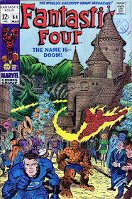
When MARVEL UK published The TITANS weekly back in the mid-'70s, because of the landscape format, some covers (and splash pages) were redrawn to fit the different dimensions of the page. I thought it would be fun to compare the original covers with their new versions (usually drawn by LARRY LIEBER), so here's the first in a short series. Any comments, you know where they go.
A cascading cornucopia of cool comics, crazy cartoons, & classic collectables - plus other completely captivating & occasionally controversial contents. With nostalgic notions, sentimental sighings, wistful wonderings, remorseful ruminations, melancholy musings, rueful reflections, poignant ponderings, & yearnings for yesteryear. (And a few profound perplexities, puzzling paradoxes, & a bevy of big, beautiful, bedazzling, buxom Babes to round it all off.)
Saturday, 30 December 2017
The TITANS COVER COMPARISONS - FANTASTIC FOUR #84...
When MARVEL UK published The TITANS weekly back in the mid-'70s, because of the landscape format, some covers (and splash pages) were redrawn to fit the different dimensions of the page. I thought it would be fun to compare the original covers with their new versions (usually drawn by LARRY LIEBER), so here's the first in a short series. Any comments, you know where they go.
8 comments:
ALL ANONYMOUS COMMENTS WILL BE DELETED UNREAD unless accompanied by a regularly-used and recognized
name. For those without a Google account, use the 'Name/URL' option. All comments are subject to moderation and will
appear only if approved. Remember - no guts, no glory.
I reserve the right to edit comments to remove swearing or blasphemy, and in instances where I consider certain words or
phraseology may cause offence or upset to other commenters.


Thanks for doing this Kid - the Titans FF covers were so good and I’ve often thought about comparing them. Looks like you’ve saved me the job! Isn’t that No27 cover a peach. I prefer it’s colouring to the original and the black and yellow logo combination looks sharp. This was one of the unexpected strip transfers from those days with the X-Men moving in the opposite direction to the Mighty World of Marvel just prior to its merger with The Avengers.
ReplyDeleteI've been meaning to do this for ages, CN, but somehow just never managed to get around to it - so it's good to know someone appreciates it. Larry Lieber (or whoever) was quite a good copyist, considering that he wasn't really going for a slavish imitation of Kirby's original cover, being more interested in capturing the spirit of it. In the main, he did pretty well.
ReplyDeleteWhile i can admire the work involved, the two Dr. Doom covers lose a great deal when converted from a vertical to horizontal layout. No matter how skilled the artist, there's little they can do to "fix" a design that was created to maximize the other format. The Mole Man cover lends itself far more easily to such a change. Did the different model of Ben used come from an interior illustration of the same issue?
ReplyDeleteIt's quite fascinating to look at these and consider the challenges presented to the conversion artist. It might make an interesting exercise to try some time.
I've tucked both issues away again, so can't check if the different figure of Ben is from inside, but I doubt it. I think it's just down to the artist wanting to put a little bit of his own input, design-wise, into it.
ReplyDeleteI pulled out the original, and it doesn't come from the interior. Looking closer, the pose is clearly based on the original cover, just shown from a slightly different angle. So you're likely quite right on it being original to the new artist.
ReplyDeleteI love it when I'm right, but I'll settle for likely right.
ReplyDeleteThis is probably Larry on pencils, with inks by Mike Esposito.
ReplyDeleteThanks for this look at the comparisons. Fascinating stuff. I looked through them in reverse order (which is how I often do things!) and enjoyed it thoroughly.
Yeah, it looks like one of Larry's to me, Nick. His were usually closer to Jack's than some by other artists (like Ron Wilson). Glad you enjoyed the series. There are a few more sitting in my drafts file which I might publish should I ever return to blogging on Crivens!
ReplyDelete