 |
| Copyright MARVEL COMICS |
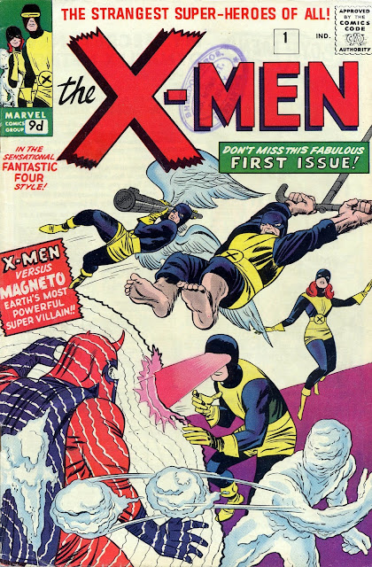
Time now for yet another game of COMIC COVERS 'SNAP', so here are the covers for X-MEN #s 1 and 104. As you can see, the latter is based on the former, although only one original X-Man remains in the lineup. When issue 104 was reprinted in CLASSIC X-MEN #12, another version of the layout saw print, but I don't have it to hand at the moment and I'm not tearing the house apart to find it - you'll just have to trust me. In the meantime, enjoy these two interesting variations on a theme.
Aha! I just remembered that the third version of the cover (below) was reprinted in my within-reach-copy of The OFFICIAL MARVEL INDEX To The X-MEN, so here it is. Phew, handy, that - saves me rummaging through boxes of comics in my attic. So, which one of the three do you prefer? Feel free to share in the comments section.


6 comments:
Whenever I see Kirby's cover, I'm always trying to figure out just why I should be impressed by Iceman and Marvel Girl. Iceman's first thought to taking this guy down is to lob snowballs at him? Really? If he's going to do that, why not throw them near Magneto's face, so he can at least obscure his line of sight? I have no idea what he's aiming for--Magneto's cape? And Marvel Girl hangs back while the rest of her team attacks? At least Colossus, in her position on the cover, is charging to meet the threat.
I'd change the colors a little on Cockrum's cover, but overall the way it's laid out makes more sense to me.
I think the idea is that Iceman IS directing his snowballs at Magneto's face, but they're being deflected my his magnetic force-field. On the original cover as Jack drew it, Marvel Girl was directing her telekinetic force at Magneto, but the outlines which represented that force were removed before being published. Presumably on the grounds that the cover was clearer without them. Marvel Girl was also moved slightly from her original position. Marvel did that sort of thing quite a lot with these early covers.
no contest.
the first cover.
I also prefer the third to the second.
Funny they should use a cut and paste from the kirby cover..
I dont mind homage but,I reckon they were not trying hard enough.
I doubt it's a cut and paste, baab - more likely a lightbox or vellum. He's certainly tried to keep it as much like Kirby as possible 'though.
y'see that shorthand language i used there?
cut n paste !
of course,you know what I meant.
i built myself a wee lightbox out of an old scanner casing and a strip- light-works a treat.
I wanted one when I was a kid,no way I could afford one though,I had to wait until technology provided me with a broken scanner...Still not using it as much as the desire to have it in the first place.
One of my old procrastinator moves!
Soon be finished my landscaping adventure,getting ready to sit down and get creative.
I might even add a couple of lines to that blog.
If I could post ten per cent of your output I would be pretty pleased with myself.
taking a break first-see you in about a weeks time.
Talking of lightboxes, Bill Nuttall, who used to letter Rogue Trooper for 2000 A.D. (and loads of other strips) used a lightbox. He had his guidelines marked on the glass (or plastic) and simply laid his 'patchpaper' (on which he lettered) over the top of it. That saved him a lot of time, apparently.
Post a Comment