Wednesday, 29 February 2012

CONAN - EIGHTEEN AND OUT! SAVAGE SWORD OF CONAN COVER GALLERY - PART ONE...

Copyright MARVEL COMICS and CPI

March 1st, 1975.  That was the day MARVEL U.K. released two new additions to their regal roster of rampaging weekly publications.  You've seen the first three covers of one mag - The SUPER-HEROES - in a previous post, but now comes the time to turn the spotlight on its companion title, SAVAGE SWORD Of CONAN.


SSOC, as it was affectionately known (in my house anyway), only lasted for eighteen issues, and I still happen to have my original copies.  Therefore, it's not exactly a stretch to dig 'em out and scan the covers for all you rabid fans out there of ROBERT E. HOWARD's Cimmerian warrior, CONAN The BARBARIAN.


As well as Conan, the mag also featured KULL The CONQUEROR as a back-up feature, along with (on occasion) KA-ZAR, LORD Of The HIDDEN JUNGLE and THONGOR Of LEMURIA.  It was quite a decent little mag on reflection, and it really should have lasted longer than it did.  When it faded from the scene, it was absorbed by another British weekly publication, The AVENGERS.  (By the way, Look at the cover above.  Due to the colouring of the grey god's bracelet, at first glance Conan looks as if he has a reptilian tail.)


Although the weekly was relatively short-lived, the title was eventually revived as a monthly in 1977, lasting for ninety-three issues before coming to an end in 1985. However, that's a whole other story - for now, sit back and savour the first six covers of the weekly title from the '70s.


Remember to keep your eyes peeled for Part Two sometime soon, when we'll feature another six covers from the series.


See part two here, and part three here.

PART FOUR OF TERRIFIC'S COVER GALLERY...


Images copyright MARVEL COMICS

It's been a while since we featured any images from the ODHAMS PRESS publication TERRIFIC, which lasted for only 43 issues back in the 1960s before being incorporated into sister paper FANTASTIC.   So, without further ado, here's another delectable half-dozen covers and pin-ups.  Don't be greedy now - savour them one at a time.


Tuesday, 28 February 2012

FOOTBALL COMIC WITH NO BALLS...


Copyright relevant owner

In 1992, new publishing kid on the block, TUNDRA, were developing a fortnightly football comic called GLORY GLORY, which they hoped would be the next big thing in the world of periodicals.  50,000 copies of a dummy issue were printed for promotional purposes, with the launch date of the actual first ish announced for September 9th, 1992.


However, after all the time, effort and money spent on producing the dummy, plans were hastily abandoned and Glory Glory succumbed to an inglorious fate - cancellation before it had even appeared on the newsagents' shelves.  So why was the decision taken to abort the project before fruition?  I'm not quite sure - as a contributor I was probably told at the time, but have long since forgotten the details.  Perhaps reaction to the dummy was less than positive, resulting in Tundra deciding not to risk losing even more money by going ahead with the launch, hence the plug being pulled at the last moment.


Luckily, though, I have one of the 50,000 dummies printed, and have decided to unselfishly share with all you Crivs the cover and a couple of interior pages - just to give you a taste of what might have been.

HAVE A LOOK AT BOB'S BEANO...


Copyright D.C. THOMSON & Co., Ltd

Once upon a time, there were two mighty comic empires in the U.K. which were in constant competition with one another.  Comics were always being developed in each camp to have something ready at a moment's notice to steal the thunder of any new title the opposition might launch.  However, these two rivals were at war not only with each other, but also any other publishers in the same line.

For example, did you know that D.C. Thomson's SPARKY came out the same week as TV CENTURY 21?  This was DCT's way of capitalising on any kid asking his mum to "Get that new comic for me while I'm at school".  Any parent asking for that in a newsagent's was just as likely to be handed The Sparky as TV21, especially if the latter was sold out.  And even if it wasn't, 7d for TV21 may have seemed a bit dear compared to The Sparky's more reasonable 5d - at least from a cost-conscious parent's point of view.


With that in mind, editors kept track of all the titles the opposition produced, often having racks of their rivals' comics on display in their own offices to see what the 'other side' were up to.  And that accounts for The BEANO pictured in this post.  It was IPC's Humour Group editor BOB PAYNTER's personal copy, which he gave me to clear space on the rack along the side of his office wall.  Ol' Bob was good to me in that way, gifting me with a number of comics for my collection, including several FRANKIE STEIN Holiday Specials that he no longer wanted, plus the very last issue of TV COMIC.

So have a read at DENNIS's adventures above - and don't forget to thank Bob for it. 

AND NOW - A LITTLE 'ICE BREAKER'...


Someone once asked me what steps I'd take to dilute any possible negative influence or bad example comics might have on younger readers.  By way of kick-starting suggestions, I pondered the possibility of comics having a little warning on the editorial or letters pages, saying something along the lines of "Remember - Hyperman is indestructible, you are not.  Do not try to imitate him".  (Like Captain Scarlet used to have.)  Obviously, the message would be appropriate to the content.

This was met with scorn by the person who asked the question, saying that it was patronising to children.  I pointed out that many toys carry such advice, so why not something similar with comics?  These days the packaging on toy guns and bows 'n' arrows warns kids about the angers of aiming them at people's eyes, etc., which seems a perfectly sensible precaution to me.  At the very least, it covers the manufacturers if some kid decides to ignore the 'operating instructions'.

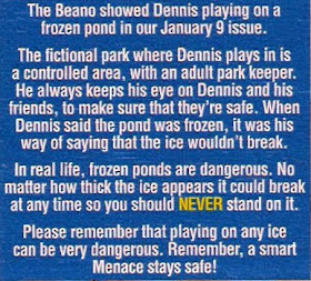
I was therefore interested to see the above panel from a copy of The Beano, after an episode in which Dennis and his pals went skating on a frozen pond.  Might've been better having it in the actual issue where the strip appeared, but better late than never.  Obviously, the person who took issue with me must think that it's 'patronising' to exercise a little social responsibility.  Thankfully, DCT are not in accord with his views in this instance. 

Monday, 27 February 2012

MARVEL ON A RAMPAGE...


Images copyright MARVEL COMICS

Here's two of the comics mentioned, but not pictured, in the previous post.  The COMPLETE FANTASTIC FOUR lasted for 37 issues before being merged with The MIGHTY WORLD Of MARVEL (putting the good ol' FF right back where they started).  It was probably one of the better comics that MARVEL U.K. ever published, so it's a shame it didn't have a much longer run.  It has a modern day equivalent in FANTASTIC FOUR ADVENTURES, published by PANINI, but I hear that, sadly, the next issue (#28) is to be the last due to low sales.


RAMPAGE lasted around 34 issues before fading away, to be relaunched a couple of months later as a monthly, featuring black and white tales of The INCREDIBLE HULK.  Despite the weekly featuring The DEFENDERS and NOVA, this title always seemed a bit lacklustre to me, probably because it was overshadowed by its FF sister publication, which I thought was a great little magazine.  What's the old saying?  "A sparrow may look beautiful - until it stands next to a peacock."   Well, I guess TCFF was the latter in that instance, though it only lasted three more weekly issues than the former, so nothing to crow about.  (These bird allusions are writing themselves now, so I'm outta here.)

Enjoy the covers. 

MIGHTY MARVEL MEMORIES AND MAGIC...


Copyright MARVEL COMICS (and relevant owners)

I can only speculate as to the reasons why, but after launching their first three British periodicals (The MIGHTY WORLD Of MARVEL, SPIDER-MAN COMICS WEEKLY, and The AVENGERS) individually over a few months, MARVEL U.K. then adopted a somewhat different approach.  DRACULA LIVES and PLANET Of The APES were both released the same week - as were their next two titles, The SUPER-HEROES and SAVAGE SWORD Of CONAN.  Perhaps they felt that two new comics would make more of an impact on potential readers than one on its own.  Who knows.


Marvel U.K.'s next two new publications, The TITANS and CAPTAIN BRITAIN, were released individually with almost a year between them, although with RAMPAGE and The COMPLETE FANTASTIC FOUR in 1977, it was back to two at a time.  (I think that the next two British Marvel weeklies released together were the THOR and X-MEN titles in early 1983, which soon merged into one mag - making it even more like the Odhams Press POWER COMIC aptly known as FANTASTIC from the late 1960s.)


Anyway, here's a selection of covers from some of the comics mentioned, simply because they're nice to look at and also bring back a lot of memories for me.  I'm sure it's the same for you, too - so feel entirely free to indulge yourself in these images of yesteryear.

Sunday, 26 February 2012

HERE COME THE SUPER-HEROES...


Images copyright MARVEL COMICS

Back in March of 1975, MARVEL U.K. released two new weekly comics on an unsuspecting British public - The SUPER-HEROES and SAVAGE SWORD Of CONAN.  We'll turn our attention to the Conan mag another time because, for the moment, we're going to look at the more successful of the two titles.
  
Initially, The Super-Heroes reprinted The SILVER SURFER from NORRIN RADD's 18 issue U.S. monthly mag from the '60s.  Taking up the slack in the back were The X-MEN, their adventures being split in twain and continued the following week.  (Seeing those early X-Men adventures was just like having the late, lamented FANTASTIC back again.)  In fact, as the Surfer's first 7 American mags were double-sized, the same approach was adopted for his adventures also, until such time as his regular-sized tales were featured.


The Super-Heroes lasted just under a year, bowing out with issue #50 (Conan only lasted 18 issues) and merging with the weekly SPIDER-MAN comic.  In its time it managed to showcase GIANT-MAN, The CAT, DOC SAVAGE, and some MARVEL TWO-IN-ONE tales of The THING and various guest stars.  It was never better though, than in its early issues, and it was sad to see it go when it eventually faded from the scene.  The name (sans hyphen) was later revived for a British monthly magazine called MARVEL SUPERHEROES in 1979, but it was never quite the same, sad to say.  There were even at least three hardback annuals by GRANDREAMS before the title disappeared yet again, for the final time, alas.


50 issues?  Is that all?  Funny how, when I look back, it seems that the comic lasted far longer than a mere 49 weeks of my life.  Surely it was around for a couple of years at least?  (Nope, I guess not.)  I still have my original issues and, sometimes, whenever I want to revisit yesteryear, I dig them out yet again and savour the sight, smell and touch of these classic comics from nearly 40 years ago.  Then, somehow, I'm magically back in the past and 16 years old once more, reliving the thrill of settling down with the latest Mighty Marvel mag from the House of Ideas!  What more could any true, dyed in the wool Marvelite want?  (Apart from a coveted 'No-Prize'.)

Anyway, as I'm feeling nostalgic, here's the first three covers to give you a taste of what I'm talking about.  Enjoy.

FIELD OF DREAMS...


The spot these children are standing on no longer exists - at least not in the form you see in the photographs.  Approximately 21 years after the pictures were taken, the foundations for amenity housing for the elderly were laid directly into the area of field where these kids once played.  I'm actually in the photos and remember with startling clarity the Sunday afternoon or early summer evening they were taken back around 1967 or so.

As you can see, we were playing cricket.  Only a short while before, I had narrowly managed to dodge a heavy cricket ball and thus avoid a nasty knock on the noggin which could well have rendered me senseless.  (Go on - I'll allow you the predictable retort.)


From left to right in the photo above are myself, Robert Fortune, Tony Tierney, Allan Robson and Kenny Tierney.  The photos were taken by Tom Tierney, who later became a regular contributor to the letter columns of the local newspaper, under the nom de plume of 'Goofy'.  If he were alive today, he'd no doubt have a blog in which to record his whimsical (and sometimes serious) observations on sundry subjects, but sadly he's been deceased for quite a few years now.

When we first moved to the area in 1965, it was Tony Tierney who introduced me and my brother to the rest of the kids in the neighbourhood.  I haven't seen Tony in quite a few years, but I still run into Kenny today from time to time*, and it was his good self who supplied me with the photos you see on this page.  As I said, the field no longer exists - except in photos, memories and dreams - dreams which increasingly seem far more enticing than the rather drab reality of the here and now.

*(Update: Sadly, Kenny passed away in March 2021.)


Photographs are marvellous things, aren't they?  Looking at a photo is like gazing through a window into yesteryear, at a moment frozen in time which grows all the more precious to us the further we become removed from it.

******

Update: (June 2013.)  The field remained undisturbed until 1988, a period of 23 years from when we first moved there in '65 (we flitted in '72).  I therefore find it rather startling to think that the amenity housing has now occupied the spot for 25 years - two years longer than the time which preceded it.  And yet it seems to me as if the three-storey building was erected only a few years ago.  The mysteries of Time, eh?  I don't think I'll ever be able to fully comprehend them.


 Long has paled that sunny sky;
Echoes fade and memories die;
Autumn frosts have slain July.

Ever drifting down the stream--
Lingering in the golden gleam--
Life, what is it but a dream?

From "Life is but a Dream" - by Lewis Carroll.

******

After posting this, I was going through some old newspapers and found this letter from my local rag, dated Wednesday 24th April - Thursday 30th April, 1996.

Goofy will be  missed

I was saddened to read and hear
of the death of Mr Tom Tierney, a
great story teller in your column
and other publications in his life.

He brought many a smile, with
his wit and local stories bringing
back many a cheery laugh.

My thoughts to his family.

Ann Robertson
Address supplied 

This post is therefore dedicated to the memory of Mr. Tom Tierney, aka 'Goofy'.  Thanks to him, the above snapshots preserve a moment from my childhood forever.

******

For more about Mr. Tom Tierney, click here.

Saturday, 25 February 2012

MORE 2000 A.D. BIRTHDAY BABBLINGS...


It's doubtless because it's 2000 A.D.'s 35th birthday this week that I've recently found myself thinking back to when I used to be a contributor to the iconic comic for several years, regularly lettering the adventures of characters like STRONTIUM DOG and ROGUE TROOPER, as well as (from time to time) JUDGE DREDD, THARG'S FUTURE SHOCKSNEMESIS The WARLOCK, SLAINE - and a whole host of others.

Unlike the way American comics were mainly lettered in the '60s & '70s - actually onto the pencilled page before inking - British comics had a different system, the lettering being done on what was known as 'patch paper' and then stuck down onto the finished art.  In the case of colour artwork, the lettering was applied to sheets of acetate film and processed separately, so that if the artwork was printed out of sync (giving a blurred, double-vision effect) the lettering wouldn't be similarly afflicted.

Most lettering nowadays, of course, is done on computer, but once upon a time letterers had to mark their guidelines on a sheet of patch paper and letter by hand within the lines.  Some letterers, like BILL NUTTALL for example, used a lightbox, with the guidelines already marked out on that.  He simply placed the patch paper over the box and lettered straight onto it, thereby cutting out having to line each individual piece or sheet of patch.  Sometimes JOHNNY ALDRICH didn't use guidelines at all, but lettered straight onto the patch paper.


Incidentally, patch paper was a generic term for adhesive paper which came in different finishes - matt or gloss - and even in various degrees of finishes.  Too glossy and the ink line got thicker as work progressed (due to the ink spreading out on the surface of the sheet); too 'matty' and the line was too thin, with the penpoint catching on the surface as if it were blotting paper.  One had to have just the right degree of gloss to be able to letter smoothly and quickly without any hiccups. TAC-TIC was the brand name of one paper, and FASSON CRACK-BACK another.

Whether it was done the U.S. or U.K. way, quite a few lettering artists used the 'rolling ruler' device in the above picture, enabling them to mark out enough lines for one or two speech balloons at a time.  I found it too restricting, preferring instead to line a full sheet of patch paper on my STAEDTLER MARS-TECHNICO drawing board (below), thereby avoiding the 'start-stop' approach employed by most other lettering artists. I usually got about four or five pages to each sheet of patch.


I remember one day, as I was lining my paper on the desk opposite STEVE MacMANUS's in the 2000 A.D. offices (Room 2012), legendary letterer TOM FRAME watched me for a moment before asking: "Do you do your lettering on the board?"  I explained that I only measured out the guidelines on the board, preferring to letter the sheet of patch on a flat desktop.  "I wondered," he said, "because the edge of the board would dig into your arm.  It would be too uncomfortable."  I agreed, but pointed out the benefits of being able to do all the guidelines in one go on a complete sheet of patch, rather than bit-by-bit as one went along.  He never bought one though, so I guess he remained unconvinced.

Tom Frame

Speaking of Tom reminds me of the ol' bumblebee paradox that bees shouldn't be able to fly because, aerodynamically, they're not best designed for flight.  Tom's lettering was a little bit like that.  Actual size, it was too high, too narrow, and a little bit scratchy-looking due to his failing eyesight.  It shouldn't have worked - but, in print, it did, and Tom's lettering is considered by many fans as integral to the 'look' of Dredd's strip as anything else which contributed to it.  Tom's best work though, in my humble estimation, was the innumerable page of lettering he did for various IPC/FLEETWAY publications back in the '60s, before his sight started to deteriorate.


I recall going to a nearby wine bar one evening with Tom and Stevie Mac, as well as SIMON GELLER, ROBIN SMITH, and PAUL AILEY (I think - might be LEATHERLAND), where I watched them play Pool as I nursed a Coke and listened to JIM REEVES on the jukebox.  This was unusual for me, because I usually worked in KING'S REACH TOWER up to at least nine at night, finishing off as many ltg jobs as I could before heading for Victoria Station and my nearly nine hours trip home.  That night, I must've been ahead of schedule, hence my being able to relax for a bit.  When the time came to head for the station, I remember sharing a taxi with Steve MacManus as he was going in the same direction for part of the way.

Sadly, Tom died from cancer in 2006, at the age of 74.  ALAN McKENZIE (a later editor on the comic) had helped him to transfer his lettering fonts onto a computer programme a few years before, allowing him to continue a career which failing eyesight might otherwise have curtailed.  It would be nice if the current owners of the comic, REBELLION, could come to an arrangement with Tom's family for permission to use his fonts on the Dredd strip, thus perpetuating the unique look that graced it for so many years.

Anyway, that's enough rambling from me for the moment.  Pick up a copy of 2000 A.D. today - before your future becomes your past!

Friday, 24 February 2012

SUPERMAN - BACK TO FULL POWER...


Copyright DC COMICS

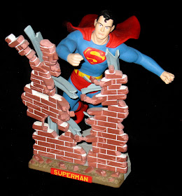
It's hard for me to believe that this comic is over 21 years old, but sure enough, it first hit the stands back in 1990 - a whole other century away, in fact.  Wow, scary!  Anyway, the more discerning amongst you will already have noticed that the cover illo is paying homage to AURORA's fantastic SUPERMAN plastic model kit, which first came out around 1964.  The model was re-released a further four times over the years, 1974, '78, and '84, the last time being in 1999.  I'm fortunate enough to have all five versions of the kit, so below is a pic of one of them, just so that you can see what a great job JERRY ORDWAY did of the cover illustration.

It looks like Jerry was using a later reissue of the kit as reference, which had a different, updated head, and not the one featured in the accompanying photograph.  Still, it gives you the chance to see what a fine job he did in capturing the power-packed pose of the mighty MAN Of TOMORROW!


The model pictured is the 1974 release, with the addition of a 1964 nameplate which was only ever included in the first issue of the kit.  Below is the box which the model came in.  I'm not 100% sure, but the box art may be by DAVE COCKRUM.

Wednesday, 22 February 2012

REMEMBERING JOHN RENWICK (UPDATED)...


John Renwick in his church office in the mid-'80s

On my answerphone is a message which I haven't yet erased - and I'm not sure I ever will.  As long as it's there, I can listen to it every so often and it's almost like he's still alive and left it only mere moments ago.  Sadly, however, he isn't, having died from cancer at the far too young age of 60 (or thereabouts), leaving a widow - Irene, and two grown-up children - John Anthony and Deborah.  The knowledge that I'll never again get to speak with him is a sad and sobering thought.

JOHN RENWICK was a minister I met in April or May of 1978 when I was a mere callow youth of 19.  (John was in his late 20s at the time, which is far younger than I am now.)  I attended his church one night, being at a loose end - and because free tea and biscuits had been advertised for after the service.  Free scoffs?  Lead on, MacDuff.

Gordon Shields (another minister), me, and John in 1978 or '79

John, originally from the Edinburgh area, had relocated to my home town sometime in the '70s (I think) and didn't stay too far away from me.  Subsequently, I would often drop in on him for a game of darts or chess (and sometimes even both), and we would sit and discuss the merits of the JAMES BOND movies and whether any singer ever had a smoother, more velvety voice than country crooner JIM REEVES.

Sometime in the late '80s or early '90s, John and his family moved to Stirling.  I spoke to him on the 'phone every so often, and on occasion met with him and Irene when they were back to visit various other friends they had in the area.  He often invited me over to his new home, and equally as often I promised to visit - but somehow the years raced away without me ever doing so, despite my best intentions.

John and me playing darts around '81/'82 - in a rather camp manner it appears, in my case

Then one day a mutual friend told me that John had been receiving treatment for bowel cancer.  I 'phoned him when I heard the news, to express my concern and to ask after him.  Somehow I got the impression that he was over the worst of it, and would make a full recovery, and if John knew or suspected otherwise he never let on to me.  (Unless, of course, I was just too obtuse to pick up on it.)

One afternoon, in 2010, John 'phoned - I missed him by the merest of seconds, but after listening to my answerphone, I called him right back and we nattered away for about 20 minutes or so, with John once again inviting me to visit and me once more promising to do so at the earliest opportunity.  I'm sure you know where this is going.  Sadly, John died not too long after, without me ever getting the chance to keep my word.  It's only now, with hindsight, that I wonder if he knew his days were numbered and the call was his way of saying goodbye in case we never got to meet again.
Poor quality photocopy of a pencil sketch of John, circa 1980/'81

What can I say?  Time flies by so quickly that it seemed John had only moved two or three years before, rather than the 20 or so it actually was.  I wish I'd made more of an effort now - had managed to get on a train and journeyed to Stirling to visit John and his family, instead of feeling guilty for missing an opportunity which is now forever lost to me.

Maybe one day I'll eventually get to make that journey and visit Irene.  And if so, I'm sure John will be there too, in spirit at least, to welcome me as I finally fulfil the promise I made to him all those years ago.
 
John and me in his church office in the mid-'80s

******

Update: Sadly, on the 30th November 2014, I discovered that John's answer-phone message was inadvertently wiped after I unplugged my telephone to facilitate a new carpet being laid the evening before.  The backup battery for preserving messages ran low during the night, and John's last call to me was lost forever.  Fortunately, many years ago, I'd recorded one of John's sermons, so I'll still be able to listen to his voice whenever the fancy takes me.  However, I'll miss being able to play his last message to me and hear him saying "Hello Gordon", as if he was just on the other end of the line and alive and as fresh as a daisy.

John & Irene on the night of October 19th 1987.  Photo by me

Me on the same night.  Photo by John

******

Another Update:  A couple of months or so back, while going through my writing desk cubicles, I found a card from John that I forgot I had.  In it he refers to music, which, in one instance, happened to be The GREAT COMPOSERS, and in the other, JIM REEVES cassettes I'd given him.  I already had the full set of Composers on vinyl, but John had the set on tape.  I asked him if I could borrow one particular tape to make a copy, as I wanted to avoid any surface noises or clicks on the record, and he kindly said I could keep the original and give him the copy.  So I did, and thanked him profusely for his generosity.  I must've also had a bit of a moan about the attitude of certain editors, which is what John is alluding to on the card, which I received a short time later.  Here, I'll let you read it for yourselves.