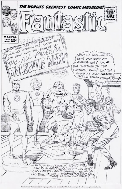
It's common knowledge that MARVEL's STAN (The MAN) LEE sometimes rejected JACK (King) KIRBY's initial cover ideas and requested that he come up with another approach. Such was the case with FANTASTIC FOUR #20, perhaps on the grounds that the good ol' FF - being covered with a coating of plaster - were not quite as dynamic (or recognizable) as Stan felt they should have been. (And a stunted ALICIA MASTERS seemingly sprouting from the back of the menacing MOLECULE MAN wouldn't have helped.)
A few years back (1997 to be precise), The JACK KIRBY COLLECTOR printed a stat of the pencils of the unused cover, and I was consumed with a desire to see it in finished form. I enlarged The THING slightly (Jack often drew him too small, compared to his original towering stature in FF #1) and "fixed" Alicia's position in the background. I also decided to render the foursome without the plaster coating, the better to be able to see them. TJCK printed it in one of their issues, but I forget which number. Once again, there are a few areas which could stand improvement (The MOLECULE MAN lettering in the cover blurb for example) and maybe one day I'll eventually get around to doing it.


9 comments:
Kirby often drew the Thing too small did he?Praise be for your Korrective Kontributions Kid to show him how it's done!
MARVEL were grateful for my contributions when I re-inked, restored, and recreated KIRBY panels and pages for their MASTERWORKS volumes a few years back. If I'm good enough for them, then that's good enough for me.
Why did you stop working in comics ten years ago
Why did you not end your sentence with a question mark?
With respect to your fine inking style, Kirby had The Thing the right size. You've made him too big. Kirby's drawn him slightly stooped there, so if he was standing upright he would be much taller than the others in your version. Bashful Benjy ain't that tall. Do you see?
I'm afraid that I have to respectfully disagree with you. Even if the THING stood up, he would still be smaller the the other members. Although I've made him slightly larger in my version, he's probably still not as tall as he should be, going by his initial appearance in FF #1.
When required for dramatic effect, Kirby would sometimes render the Thing as a towering figure - but, even allowing for "crouching", he was often portrayed as far too small in relation to other characters. This was quite a common fault in Jack's art, and was not confined to FF.
In the last panel on the last page of AVENGERS #1, the HULK (who is clearly not crouching) is far smaller than THOR and IRON MAN, who he is standing next to. And I could offer multiple examples of occasions when Jack did this.
I see what you mean about Hulk although it has to be said artists often evolve the look of their characters and Kirby changed the design of the Thing a few times during his 9 year run. Who's to say what's right or wrong except the guy who drew it? I disagree with your assessment but your inking is still first class though.
I think it may well be true that, as Jack began to identify more and more with the Thing, he perhaps started to draw him smaller than at first, the better to mirror his own small physical stature. However, in FF #1, the Thing is meant to be huge, and this is borne out by the fact that, when the opening half of the origin tale was reprinted in the first FF Annual, either Sol Brodsky or Larry Leiber redrew the top half of Ben's body to make him smaller than he was in its initial printing.
Also, if you look at FF #9 (I think) in the tale where the foursome have to vacate the Baxter Building, there are frames where Ben looks positively dwarfish in stature - yet when he embraces the other characters, he towers above them. This suggests that the inconsistency was unintentional at this stage.
Even in his Hulk stories, there are scenes where, if the Hulk stood up, he would still be smaller than Rick Jones, who was only a teenager. The fact is, great as he was, Jack was often simply not very good at maintaining the sizes of characters in relation to one another. Look at the cover of Amazing Fantasy #15 - I'm quite sure the guy under Spidey's arm isn't intended to be a midget, but that's how it looks.
I therefore suspect that it's entirely possible that at first Jack wasn't even aware he had occasionally drawn the Thing smaller than he intended, but when it was pointed out to him (perhaps by Stan) he continued with it because he had come to identify himself with the character.
One thing's for sure 'though - when he first appeared the Thing was meant to be well over 6 feet in height, and that's the version I prefer - hence my "little" amendment to Jack's page.
Thanks for your compliment by the way.
(Originally posted 15 November 2010 at 02:32.)
That should be 'smaller than the other members' in one of my above responses, not 'smaller the the other members'. Oops!
Post a Comment