 |
| Copyright MARVEL COMICS |
A cascading cornucopia of cool comics, crazy cartoons, & classic collectables - plus other completely captivating & occasionally controversial contents. With nostalgic notions, sentimental sighings, wistful wonderings, remorseful ruminations, melancholy musings, rueful reflections, poignant ponderings, & yearnings for yesteryear. (And a few profound perplexities, puzzling paradoxes, & a bevy of big, beautiful, bedazzling, buxom Babes to round it all off.)
Sunday, 23 January 2022
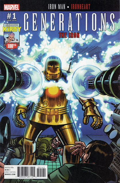
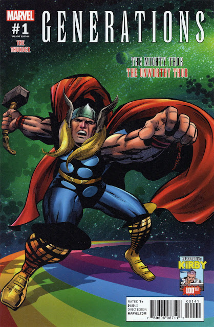
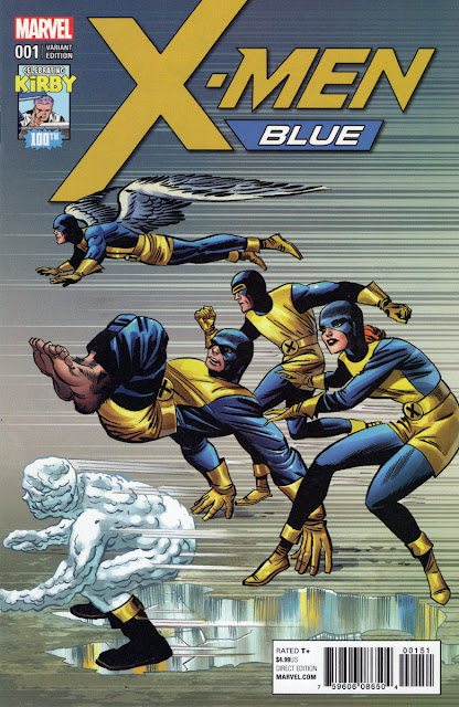
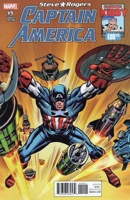
KIRBY COVER CAVALCADE...
8 comments:
ALL ANONYMOUS COMMENTS WILL BE DELETED UNREAD unless accompanied by a regularly-used and recognized
name. For those without a Google account, use the 'Name/URL' option. All comments are subject to moderation and will
appear only if approved. Remember - no guts, no glory.
I reserve the right to edit comments to remove swearing or blasphemy, and in instances where I consider certain words or
phraseology may cause offence or upset to other commenters.


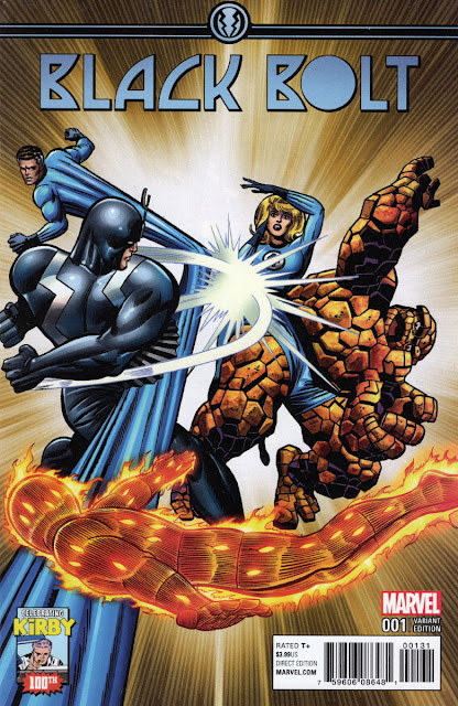
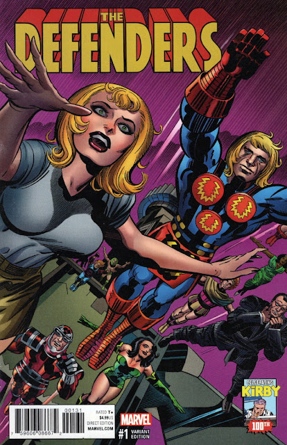
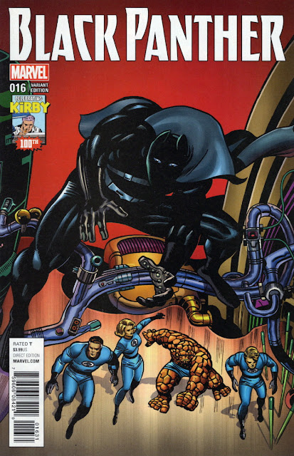
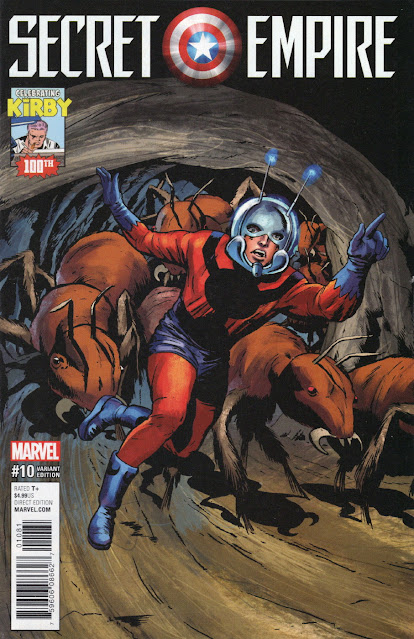
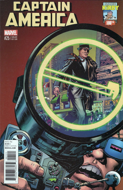
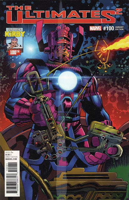
Love looking at some "King"! Thanks!
ReplyDeleteRip Off
Nae tother a' ba', RJ.
ReplyDeleteSome nice covers. I particularly like the Captain America\ Nick Fury one. The Defenders cover seems a strange ( but nice) choice as it only features the Eternals.
ReplyDeleteYeah, they're nice. Some people don't like that sort of recolouring, McS, but when it's done right, I think it gives 'old' art a new lease of life.
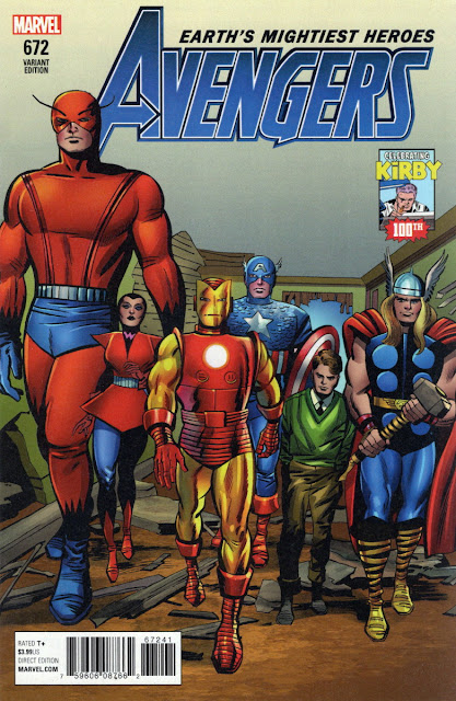
ReplyDeleteRick Jones (I assume it's him) looks tiny on the Avengers cover - even the Wasp towers over him.
ReplyDeleteWhat makes you think Rick Jones isn't tiny anyway, CJ? And remember that The Wasp is a grown woman, while Rick is just a teenager. To be frank, Kirby hasn't been consistent in the way he's drawn the characters in relation to each other, in regard to where he's placed their feet on the floor.
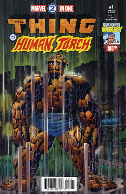
ReplyDeleteNice stuff, although some of them look a little odd out of context (the This Man, This Monster splash, for instance).
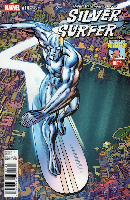
ReplyDeleteThe Silver Surfer cover looks lovely, only ruined by a logo that- in my opinion- is pretty awful.
I'd say that 'awful' is overstating the case, DS, but it was the regular logo being used on the mag at the time and readers would've been familiar with it. It does the job, I'd say.
ReplyDelete